Craft Beer Packaging
Detour Beer Co. by Weave
Craft beer has become a hugely competitive market to enter. It seems a rather obvious thing to write, but it’s quite something to have been part of the generation that saw its rise. It’s also provided a lot of great imagery for design blogs, and moved freely between both brand building and just plain visual delight. To see large fridges within...
Mama Mexa by Seachange
Tacos are a Mexican staple, consisting of a small hand-sized corn or wheat-based tortilla topped with a range of fillings. They make for perfect on-the-go food, packed full of flavour. This combination of convenience (quick to make or eat) and tastiness has seen the traditional dish rise in popularity as an ideal product to package and sell in many markets....
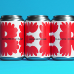
Omaka by Stockholm Design Lab
According to Sweden’s travel and tourism website, craft beer enthusiasts will discover a ‘smorgasbord’ of artisanal, eco-friendly and organic things to drink there, with more microbreweries per capita than any other country (apart from the UK). Omaka joined the scene in September 2020, at the height of the pandemic, and with a slogan to match its fearless attitude: ‘taste before...
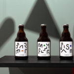
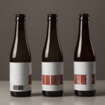
St. ERHARD by Bedow
With a desire to stand out, and in response to the extensive saturation of heritage-related visual cues throughout the German beer market, brewery St. ERHARD worked outside of the country with Swedish studio Bedow to develop a modern graphic identity for three of its brews. Farmer, Mayflower and Saison are premium beers, each of which are crafted, brewed and bottled by St. Erhard in...
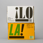
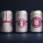
¡LoLa! by Neumeister, Sweden
¡LoLa! is a craft beer collaboration between Brutal Brewing and Supper, a restaurant that serves inventive South American food with a Swedish twist, and has locations in Stockholm, Gothenburg, Visby and Åre. The beer draws its inspiration from the fusion nature of the restaurant, and is named in honour of Lola, a woman who cooks food on a beach in Brazil and is...
O/O Long Boil Barley Wine by Lundgren+Lindqvist
O/O Brewing is a craft brewery set up in 2011 by Olle Andersson & Olof Andersson. They presently operate out of the facilities of Stigbergets Bryggeri in the Swedish city of Gothenburg, but are due to open their own brewery in the Autumn of 2017, with the intention of increasing volume and gaining further control over quality. O/O worked with Scandinavian studio Lundgren+Lindqvist, who have created packaging design for a...
Brewdog Abstrakt by O Street
Brewdog’s Abstrakt is a limited edition craft beer concept that has released 20 different varieties since it began in 2010. Each beer is bottle-conditioned (bottled with a small amount of yeast, providing further fermentation and maturation), brewed and released just once, individually numbered and known only by their release code. It is a concept described as more art than beer, as boundary pushing and blurring...

Faculty Brewing Co. by Post Projects
Faculty Brewing Co. strives to create an open and collaborative environment where visitors, of all levels of expertise, can learn about how craft beer is made with the intention helping them to navigating Vancouver’s thriving craft scene. The brewery boasts a 7 barrel, 1450 square-foot brewery with 6 fermentors, 6 bright beer tanks and 28-seat tasting room with an industrial and utilitarian interior design. It also...
Forgotten Boardwalk Brewing by Perky Bros
Forgotten Boardwalk is a New Jersey microbrewery producing uniquely flavoured, year-round and seasonal craft beer. It was set up by Jamie Queli, one of the youngest female brewery owners in the US, and draws its name from the folklore of the Jersey Shore Boardwalk. This is the foundation of an extensive new brand identity, designed by Tennessee based Perky Bros, which brings to life the sideshow...
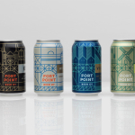
Fort Point Beer Co. by Manual
Fort Point is a San Francisco-based small batch craft beer company that references traditional styles yet is firmly rooted in the present, and has a philosophy that values craftsmanship and innovation, creativity and technique. In 2015, working with local graphic design studio Manual, Fort Point launched a new graphic identity and packaging system to unite its expanding range. Fort Point’s forward-thinking, fast-growing...
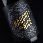
Vocation Brewery Limited Edition by Robot Food
Vocation is a UK microbrewery, established and run by John Hickling, with a range of craft beers described as having distinctive and punchy flavour profiles. Communicating the brewery’s unique personality and the crafted quality of its range rested in the hands of UK based graphic design studio Robot Food. Drawing on the beer’s tropical, fruity, floral and hoppy characteristics, the brewery’s fearless, daring and renegade attitude, and the...
O/O Brewing by Lundgren+Lindqvist
O/O Brewing is a high-end craft brewery, set up in 2011 by Olle Andersson & Olof Andersson, with premises in the Swedish city of Gothenburg. O/O worked with Scandinavian graphic design studio Lundgren+Lindqvist, who had created labels for a variety of other O/O beer, to develop new packaging for their brews. The studio revised and simplified the design system from earlier releases but continued to...