Forskningsrådet by ANTI
Opinion by Benjamin Elwyn Posted 26 January 2023
2022 was, let’s say, an interesting year for Forskningsrådet (The Norwegian Research Council). The public institution, which provides public funding for research and innovation across a wide range of fields, usually operates without controversy or intense public scrutiny. This changed in September 2021 when Norway held its national elections and got itself a change of government. And along with that, a new overseer for the council, the incoming minister of research, Ola Borten Moe.
Now, I realise this is a design platform and not really the place to discuss the latest in politics (from Norway or anywhere else). But the story has some good juice and sets an interesting scene for ANTI’s brand identity work to come, so indulge me while I spill a little tea…
Soon after taking up his post, Borten Moe fired the whole board of the Research Council for being wasteful with their cash, or so he claimed (with little evidence). The editor-in-chief of Forskning, an online publication covering science and technology in Norway, felt compelled to compare the minister to the original wild man of fire, Donald Trump. Apparently the two men shared a fast and loose approach to human resources.
In the midst of this toasty public debate about taxpayers’ money and research spending, Forskningsrådet debuted its new visual profile produced by the design agency ANTI. The price tag of NOK 6.2 million (about £500,000), visible for all to see. Perhaps awkward timing when this amount of cash might not look modest in the eyes of a taxpayer inclined to be sceptical! On the flip side, what better time to launch a refreshed identity designed to enhance the public face of the organisation? And what about the work itself?
This post includes Extended Insights for BP&O Plus members.
Find out more and sign-up here.
Appropriate to the STEM nature of its client, ANTI chose to work with a famous piece of mathematics as the basis of the identity. Dubins path is a formula which describes how to draw the shortest curve to connect two points. The influential Swiss designer Armin Hofmann notably made use of these ideas in his 1965 book Graphic Design Manual: Principles and Practice to illustrate a study in variations of ‘growing, fluid structures’. In their approach, ANTI harnessed Dubin’s equation and, together with the mathematics scientist Øystein Klemetsdal and developers from TRY, ANTI created a bespoke piece of software for generating shapes out of Dubins paths. By picking a series of random points in a grid, then using Dubins path to connect them all, the tool can generate a near-infinite number of different shapes.
Not only does the client’s field get reflected in the technicality of the design process, but we also get a neat bit of allegory. ANTI came up with the concept: ‘Connections creating change,’ to describe the way the Council serves as a connector between scientists, businesses (etc) and funding. So the points connect the paths, the paths form the shapes, and the shapes tell the story. Neat huh?


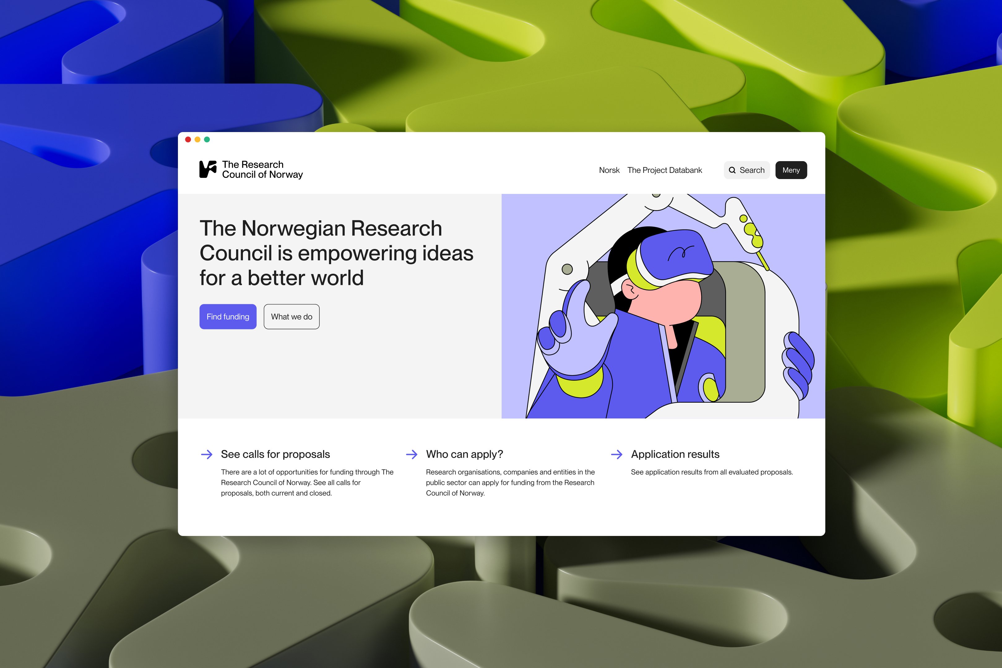
The canonical logo for Forskningsrådet, an intensely curvy abstraction of the initials N & F (N for Norway), is just one selected output of the tool. ANTI makes further use of the software to create additional forms for use as illustrative graphics for letterheads, social media posts, posters, tote bags, billboards, video call backgrounds and all of the other worldly collateral a brand might need to deploy.


Colours for all this material are derived from a palette of 132, each named after a Nobel Prize laureate. And a simple wordmark set in Neue Montreal (by Pangram) is paired with the logo in a grid system that can handle the three official languages of Norway as well as English. And the variety of output doesn’t stop here…
CATK Berlin took these 2D forms and extruded them into the trendy 3rd dimension. In this 3D expression of texture, form, and motion, the brand starts to come alive a little. More life force comes courtesy of the illustrator Camilo Huinca, who was commissioned to produce Dubins path-inspired drawings that describe the kind of projects that the Council funds.
Additional illustrations produced by ANTI, transform the shapes from the generator into playful clouds, rabbits, chocolate bars, and other easy nouns. These are used, alongside another curvy logo, to represent Nysgjerrigper (‘Curious Peter’), the Research Council’s youth outreach program. And yet another form, paired with a festive palette and 3D textures, becomes yet another logo, this time for Forskningsdagene: the Council’s annual festival.
Lastly, working with Norwegian Trash, ANTI designed four sculptural plaques made out of 100% recycled plastic. These plaques, again each with their own Dubins path drawn shapes, are used as trophies that the Research Council hands out to researchers who achieve great things in their fields.
So much stuff right? After the new minister started thrashing around, there were fears about scarcity in the Research Council’s budget. But whatever the state of their purse, ANTI has helped compensate with an abundance of graphic material. You could probably achieve the same kind of output with an identity produced by traditional means, but I wonder whether the generative nature of the design process – i.e. using a tool that could produce infinite variations – inspired a similar ambition in the studio’s output. Surely the ability to produce a unique shape at the click button would trigger the hunger of any designer; you’ve got to do something with all of those endless forms.
We’ve already seen one conceptual link between the representation and the nature of the represented (connections between things). Could this abundance be another metaphor? If you want to be seen as a productive source of innovation then why not have your brand disseminated in an equally rich variety of forms, colours, textures, dimensions, and illustrations. Maybe this extended visual system that ANTI produced acts as a graphic mirror for the bountiful output of the work that gets funded.
Generative art and design – where randomness and maths play a role in guiding potential infinite visual output – has been enjoying its à la mode moment the last couple of years. The hype around NFTs is perhaps one source of this interest. I mean, what isn’t sexy about artists with coding skills making bank selling algorithm-induced generative media? Another draw could just be the rich and expressive narrative potentials of an unsettled and shape-shifting identity.
I previously wrote about Collins’ similar approach in creating the San Francisco Symphony identity (reviewed Sept. 2022). There, the wordmark morphs indefinitely, sometimes in resonance to music. In work for the yoga brand ‘Love Supreme Projects’ (Pentagram), and a cryptocurrency custody service ‘Entropy’ (Studio Dumbar), the generative aspect isn’t so used to tell such an explicit story. Instead, in these examples, the richness and diversity of the generative outputs play roles in alluding to the brands’ respective ethoses (‘spiritual journeying’ in the former, and a ‘radical approach’ in the latter).
With a big stack of money now secured for 2023, and a grand collection of visual assets to show off with, Forskningsrådet seems to be well placed to take on the new year with confident strides. For the rest of us, let’s hope that all of the research that they fund will fulfil all our hopes and dreams and rescue us from whatever we might need rescuing from next.
Get more with BP&O Plus
Read Extended Insights, start bookmarking, switch between light/dark modes, article and Gallery Views and support our writers. Subscribe here.