smlXL by DIA
Opinion by Thomas Barnett Posted 12 October 2023

As the adage goes, ‘Give a man a fish, you feed him for a day; teach him to fish, and you feed him for a lifetime’. With this vivid paradigm of self-sufficiency in mind, we can esteem the advent of creative coding in branding, allowing design agencies to hand brands over to clients as generative tools capable of generating limitless outputs, rather than merely providing static sets of assets. However comprehensive, sooner or later these kits-of-parts fail to satisfy clients’ multifarious and ever-changing design needs. Thus, with the advent of generative design tools, brand managers have the chance to become the proverbially piscatorial masters of their own design needs.
So far so good for the client. But this innovation also goes some way to solving a vexed problem for designers: how to prevent unruly brand or marketing managers from adding their own creative twist to the immaculately crafted work. By locking the design elements into tools that allow limitless editing within certain parameters, designers can ensure that the brands they build are endlessly versatile and adaptable, yet resistant to being misused.
DIA, based in NYC and Chamonix, has brought this technology into its branding work for smlXL, a mysterious tech start-up about which little information is publicly available – except that it’s ‘a technology start-up aiming to make public computers more accessible and understandable’ and, of course, DIA’s explosive, hypnotic, undulating brand. A visit to smlxl.io yields only a black screen with the message that ‘We aren’t ready to broadly talk about what we are building, but we are hiring and happy to share everything with the right candidates’, along with links to job vacancies and to a Medium blog full of articles about blockchain technology and crypto protocols.
In the name of investigative journalism I did apply for the sole ‘Site Reliability Engineer’ job, but I’m yet to hear back. For the sake of this article then, DIA’s work must be considered in a sort of contextual vacuum, with only the barest assumptions possible for the kind of product DIA’s brand is supposed to package, and the kind of audience it is supposed to speak to
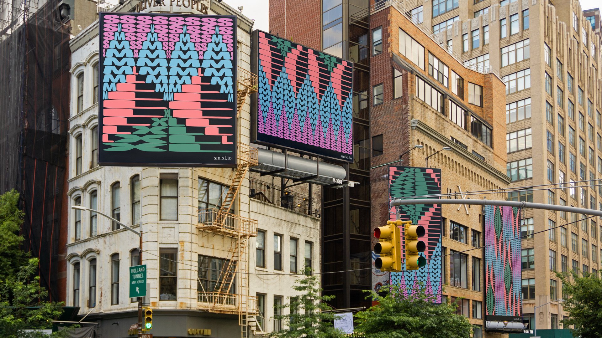
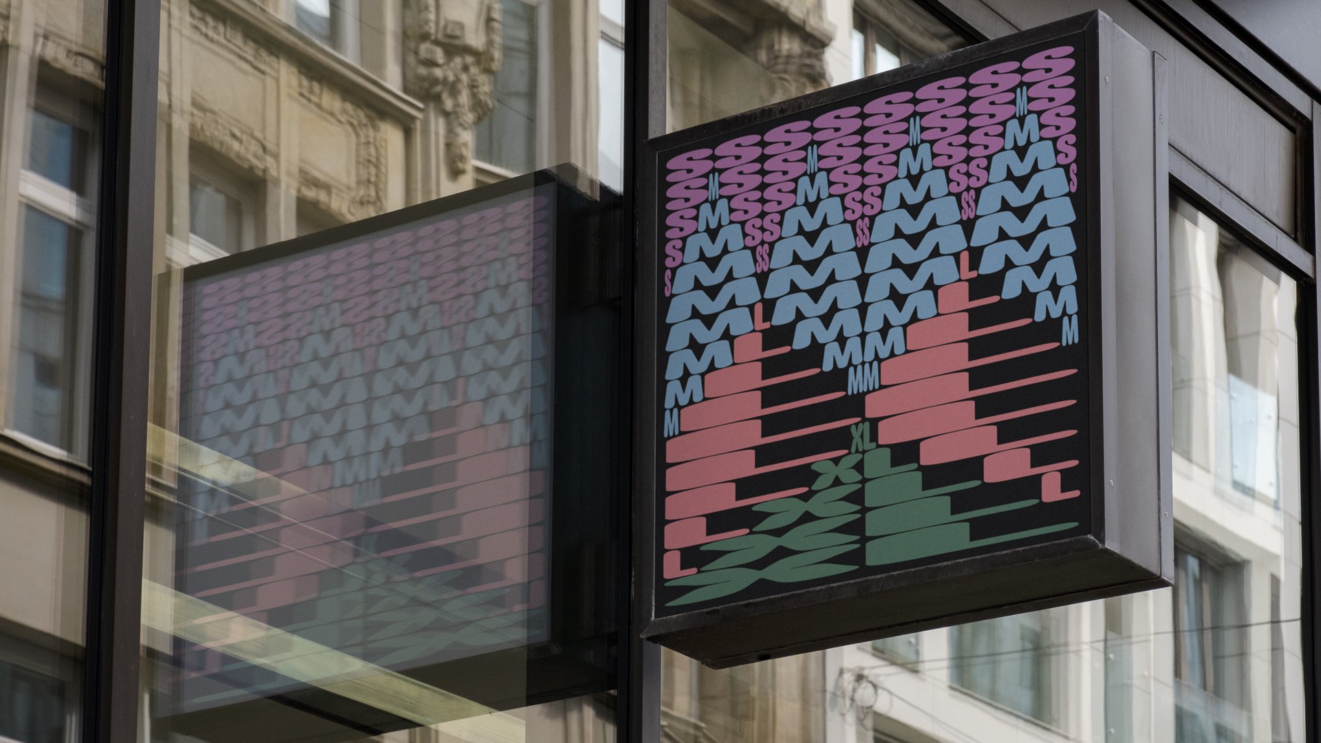
The point of this brand is overwhelmingly the creative coding and the graphic generating tool, a formidably versatile weapon capable of generating images, videos and looping animations. Repetition is the overarching formal principle, with the constituent letterforms of the wordmark serving as sole graphic forms used throughout the brand. Those five characters (arranged in four units S, M, L and XL) function as pixels, or atoms: they are the endlessly mutable base-units of matter from which everything else in the world of smlXL is made.
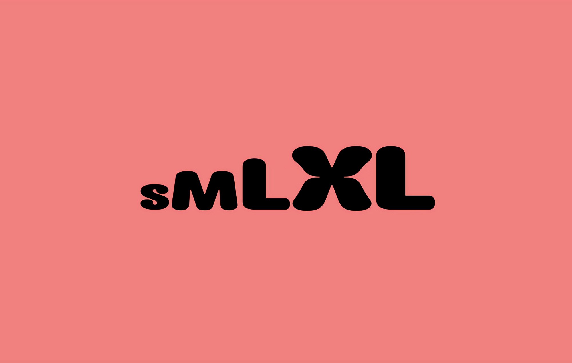
For the sake of an entry point to the overwhelming realm of infinite patterns, let’s start by looking at those letterforms as they are arranged in the logo, their default state. The staggered sizing of the lettering is a simple but effective play on the name of the organisation, and a brash encapsulation of the idea of growth, which is of course the raison d’etre of any start-up. DIA says in its case study that it ‘wanted to illustrate scale, exponential growth, and momentum’, the holy triumvirate of buzzwords in a business model where you are either ballooning or dead.
The pillowy lettering of Impact Nieuw treads the line between concrete and curiously cosy. At first glance, the lettering is reminiscent of chunky knitwear, perhaps triggered by the brand name aping clothing label sizes. There are some nice inktraps and undulating curves in the strokes of the ‘X’, though these details are missed in the other letters. This does give the X substantially more presence than the other letterforms, an imbalance exacerbated by the negative space left by the preceding ‘L’. It somewhat disrupts the rhythm of the incremental increase in size (which interestingly is incremental, rather than exponential, as per DIA’s case-study notes). But, arguably, it’s myopic to focus on finicky typographic details when the sheer scale and variety of the repetition with which those are deployed throughout the brand renders these questions relatively unimportant.
And so, to the main event: the p5js-based custom tool. Letterforms are each assigned a fixed colour within each output, arranged in columns and rows and then distorted both vertically and horizontally along each row/column so that they tessellate together in waving patterns. The number of columns and rows can be changed, and they can also be offset to create even more variety. Motion is introduced, and undulating, writhing, oscillating animations fill the screen.

This tool can accept image, video and (most impressively) live video feed inputs. I am unsure as to how many useful applications there would be for the outputs generated when video and live video is fed into the tool. The animated patterns created from these inputs become nauseatingly random and frenetic when not controlled by the adjustable grid of rows and columns, but rather by the letterforms being ascribed size, colour and position to approximate groups of similarly-coloured pixels in the the video input.
The effect works brilliantly for static photo input though. The examples in DIA’s case study show the tool being used to create bespoke branded portraits from employee’s headshots, which are then used on the teams page of their website. Helped in no small degree by a really fantastic colour palette, these portraits are genuinely fascinating, reminiscent of highly compressed bitmap images, early video game graphics and Warhol’s decaying, colour-shifted silkscreen portraits. They are beautiful, provocative typographic artworks that one would happily hang on a gallery wall, let alone an ‘our team’ page.
So many possible variations that this must be for (non-motion-specialist) in-house designers, rather than non-designers, as design thinking would still have to be applied to discern which kind of subtle nuance the pattern should be imbued with – the difference between the slow undulating ripple and the more frenetic columns and rows of movement. Application would also need an awareness of the specific context that the motion element is being used in.

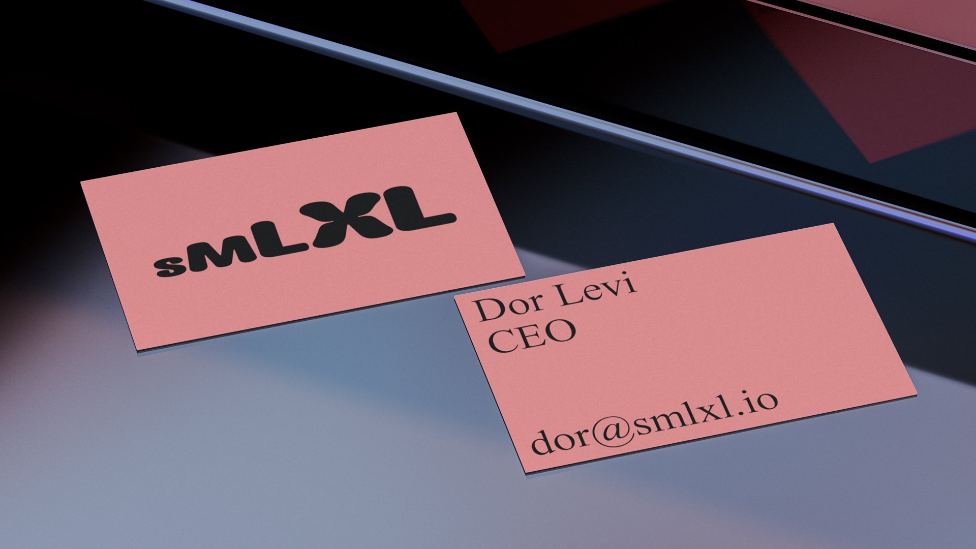
The distinctive whiff of early web design conjured by those fabulous letter-pixel portraits is heightened by the insouciantly incongruous use (by today’s standards of polite web design) of a serif typeface that looks an awful lot like Times New Roman (it is in fact Times Now by JHA). When we consider DIA’s mockup of smlXL’s website the throwback is complete: the combination of boxy simplicity with frenetic animated patterns is redolent of the hyperactive excesses of Web 1.0 aesthetics, when the epitome of good taste was smearing primitive web pages with GIFs, text animations and psychedelic, kaleidoscopic clashing colours. DIA’s work is obviously a whole lot more considered than these early, gleeful abominations; in no small part held together by that extremely well considered colour scheme.

But like early web design, this project raises the interesting question of whether something should be done simply because it can be done. For people with ADHD, autism, visual impairments or any number of other neurodivergences, this brand has the potential to be the stuff of nightmares. Considering that part of smlXL’s mission concerns accessibility, this feels like sailing dangerously close to the wind.
This concern must be caveated by recognising that as of yet there are no actual live brand touchpoints to contextualise the design, and much of the success of this brand will depend on how the generative tool is used and how its outputs are deployed. Obviously DIA wants to show off the full range of the tool’s capabilities in their case study, but if it is used with as much riotous abandon across the actual brand it may create accessibility problems. Furthermore, in a landscape where digital-first brands like Apple spend billions on accessibility, perhaps accessibility is the principal characteristic of a truly digital-first brand. If so, perhaps the pillowy, knit-like logotype isn’t the only part of this brand that seems curiously ‘undigital’.
However, this is undeniably a suitably provocative brand for a startup that will no doubt use the word ‘disruptive’ many, many times in their yet-to-be published website copy. DIA’s maximalist, claustrophobic work is a knee-jerk reaction against the ‘peak clean’ of recent web design. It is refreshing in an overwhelming way. Likewise, DIA’s skilful deployment of a brand system governed by a single generative tool shows them operating at the front-line of contemporary branding design, and deserves to be applauded.


