Frydate by Skinn
Opinion by Emily Gosling Posted 17 October 2023
Beyond its eye-wateringly strong beers, decadent chocolates, and waffles; Belgium is famous for serving up one beloved belt-buster that’s easy to eat, and deceptively hard to get right: chips.
A new Belgian homemade burger and snacks offer, Frydate, positions itself far beyond a humble chippie and into the realm of ‘Belgian frymanship’-led ‘friterie concept’. To help it achieve its ‘insatiable ambition to become the trendsetter in friterie hospitality’, Frydate drafted in Netherlands and Belgian-based branding agency Skinn to create a visual, verbal and motion identity across menu screens, digital order screens, social media content, the website, and all other visual materials.
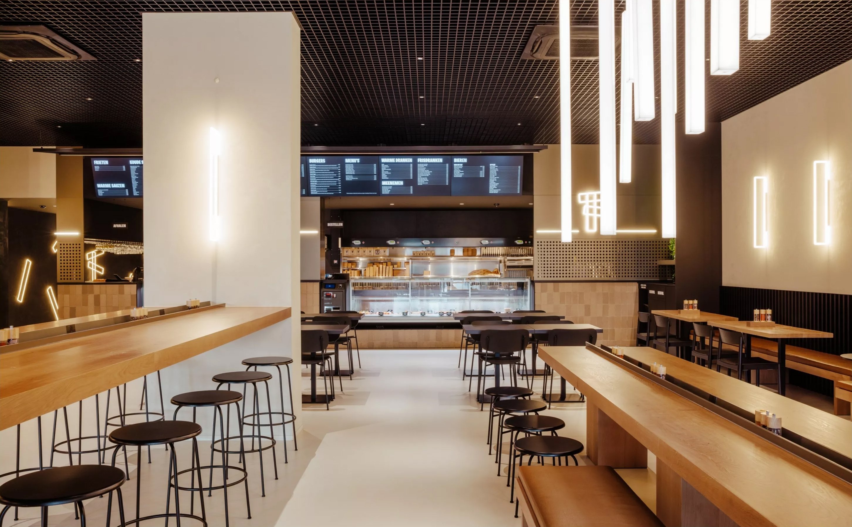
The identity does a great job of conveying exactly what’s on offer here. Chips are ultimately a simple food – nothing more than spuds and fat – but when they’re done well, you really know about it. Likewise, the Frydate branding strips everything back to simple shapes, a bold but limited colour palette, crisp photography, and a no-nonsense but playful typographic wordmark. Skinn describes the branding and brand personality as being brought to life through ‘crispy’ content that’s slightly tongue-in-cheek, and thanks to these elements, it’s hard to disagree.
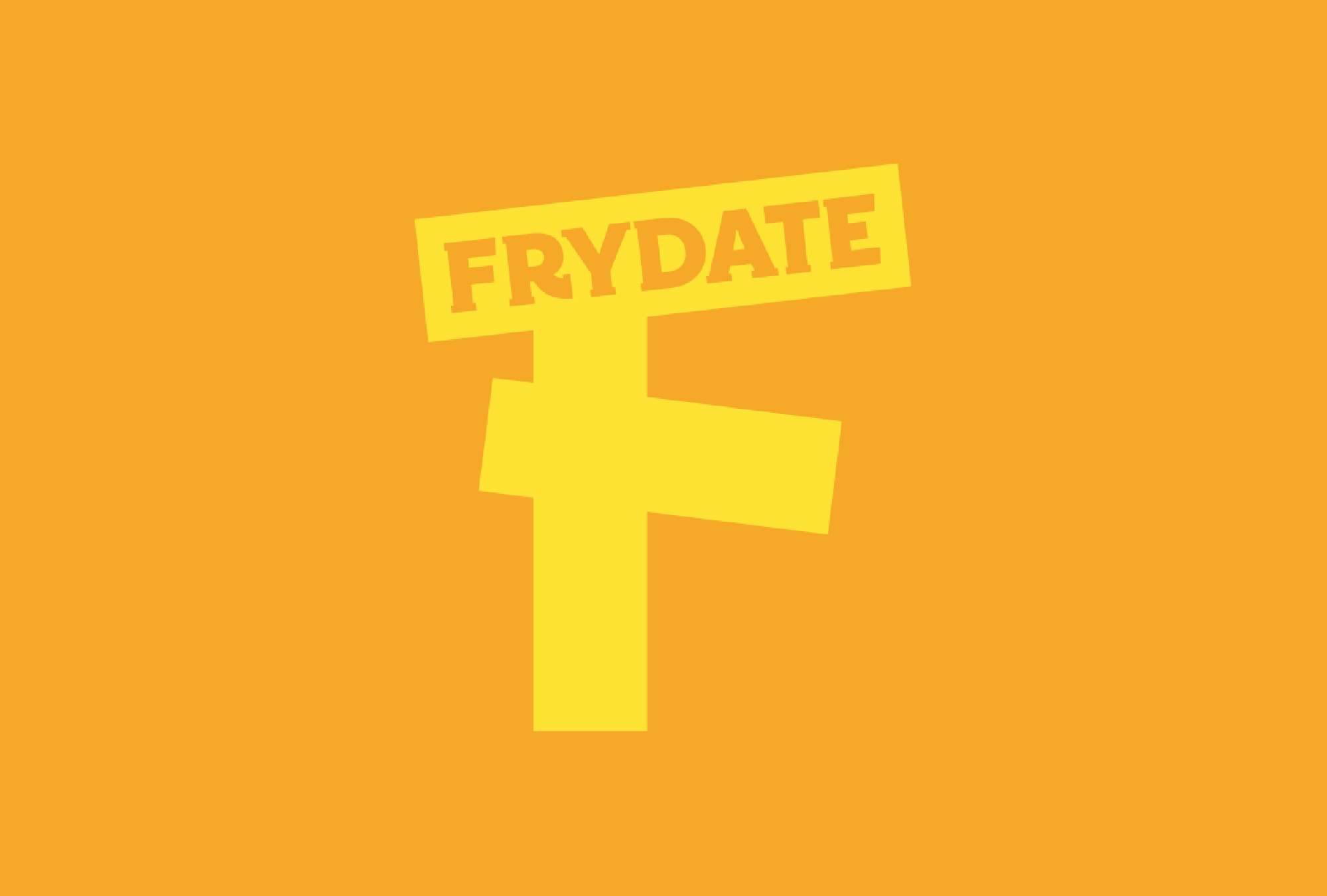
The logo, too, marries, fun and simplicity – as well as visually spelling out exactly what Frydate is all about. Naturally, it’s a capitalised ‘F’ formed of three bright yellow chips.
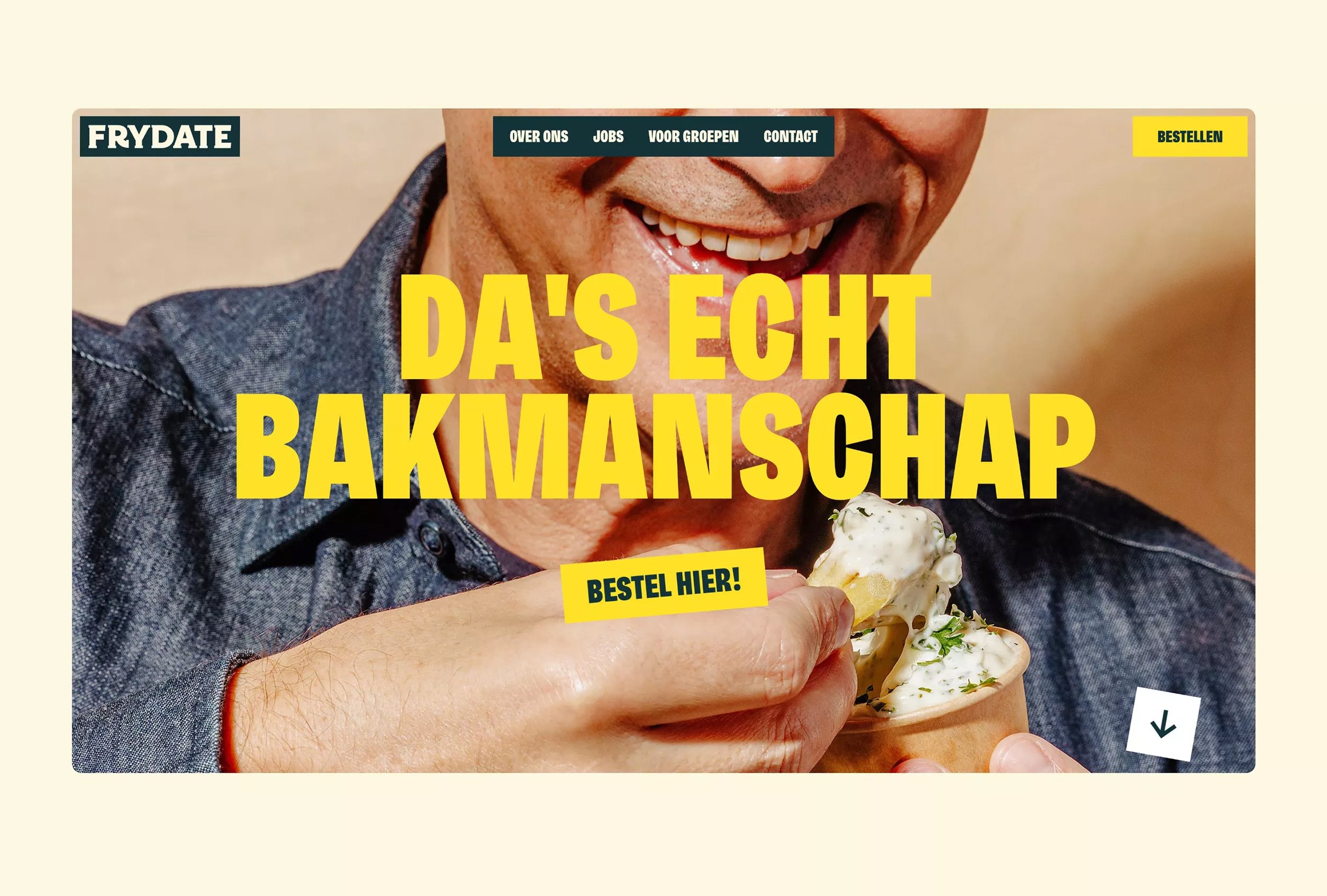
The brand language aims to ‘convey the know-how of what frying should be all about, what’s on offer is also genuinely fresh and really surprising,’ says Skinn. However, it feels like much of the website copy might have got a tad lost in translation: gift vouchers are promoted with the slightly off-kilter line ‘a gift that is always in taste’, for instance; and the brand looks to entice jobseekers with the promise that Frydate is ‘Full of growth opportunities, the crispiest colleagues and now and then some fries’. Maybe it’s just me, but a ‘crispy’ colleague implies a smelly one thanks to its ‘crusty’ implication. Sadly, I don’t speak Flemish, but hopefully the text on Frydate’s otherwise-superb posters is a little more on-point.
The name itself aims to be ‘catchy’, the agency continues, and it’s certainly memorable – if slightly confusing. Is it a play on Friday, and its associations with the start of the weekend? Is it about having a sort of date, with fries? We’re really not too sure (again, perhaps a translation glitch), but maybe that vagueness is a deliberate part of its charm.
Copy aside, the posters are very strong indeed. The colours pop, the distinctly ‘cris’p photography packs a punch, and the font choice feels perfect. Skinn chose Freigeist X Condensed Black by Berlin-based type designer René Bieder as the headline font. Always used in all-caps, the font’s mix of slightly idiosyncratic letterforms and the bold, unapologetic look typical of display sans fonts makes for a sense of warmth, fun, and expressiveness. Interestingly, while the font’s name recalls that of Frydate itself, its creator named it after the German for ‘free spirit’, since it references early grotesk fonts and was inspired by pioneering 19th century type foundries such as Caslon and Stephenson Blake.
Where the brand really comes to life is in motion. Across Frydate’s website, there’s something very joyful indeed in the animated banner; the illustrative squares of vibrant colours and high-definition, deliciously saturated food photography; the animated posters. Likewise, the logo itself is best seen in its kinetic form: the three chips fall into one another to form the ‘F’, collapsing and colliding just as chips fly out of a frying basket when flipped by a friterie pro.
The posters’ combination of the strangely satisfying jerky rhythm of old-school stop motion animation and a highly playful approach to typography is where the branding really comes into its own, and does what it sets out to achieve: it draws you in, delights, and tells you exactly what Frydate does. It neatly encapsulates the brand’s ethos of taking frying seriously, but not taking itself too seriously – something that it takes a lot of skill to distil into a single image.

