Attido by Bond
Opinion by Richard Baird Posted 18 January 2012
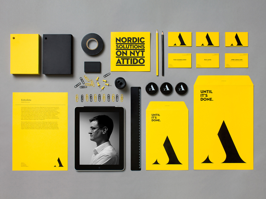
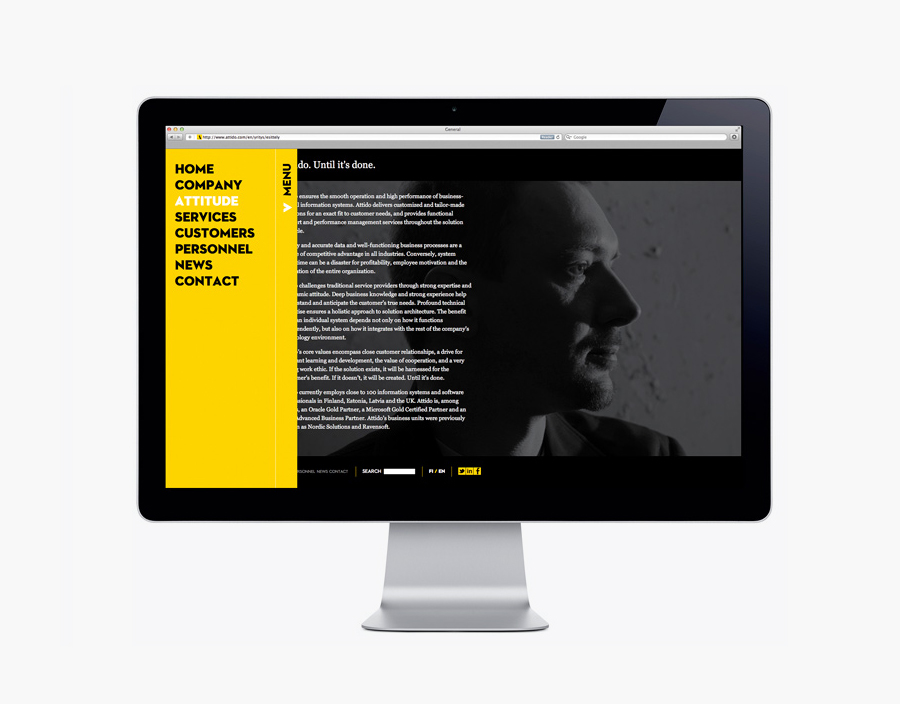
Attido, formerly Nordic Solutions, is a Finnish based consulting, development and optimisation company that focuses on the utilisation of information systems in business. Following expansion into the global market and a change in name the company approached independent design agency Bond to develop an identity that would characterise their “goal-driven and solution-centered attitude”.
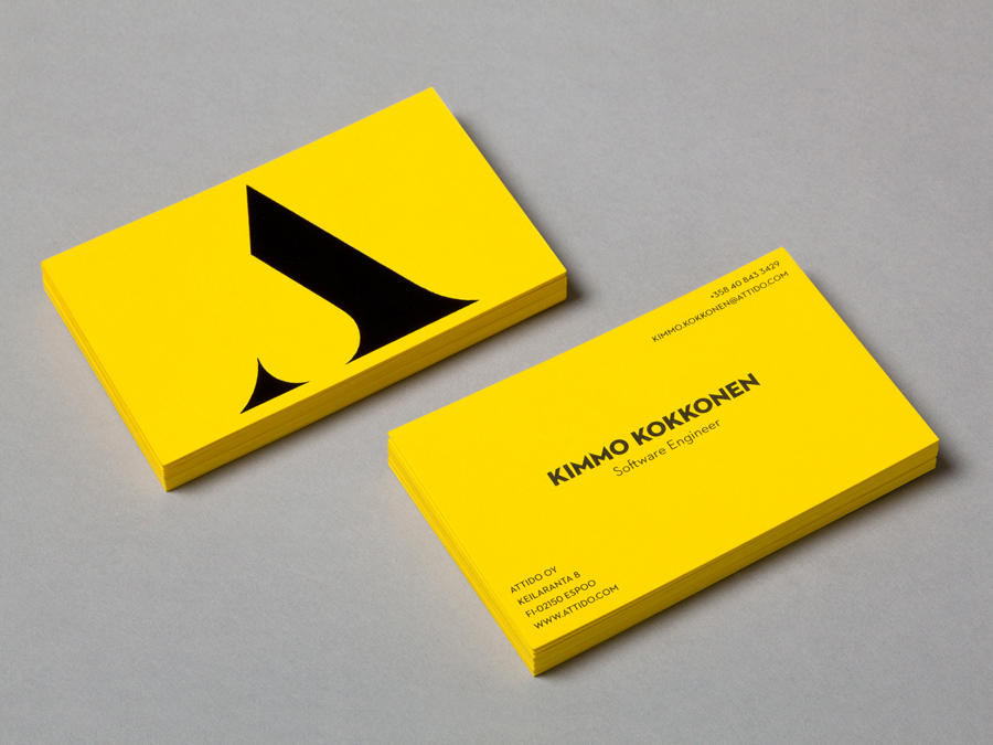
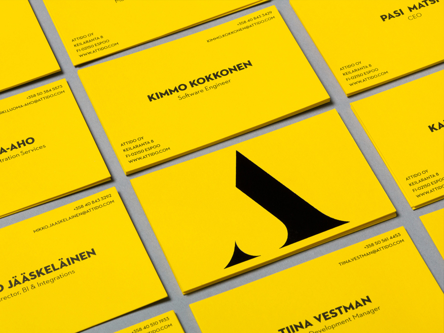
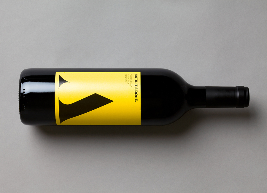
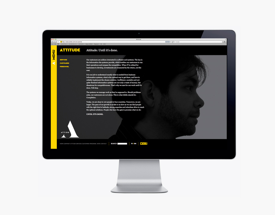
I really like the stencil-cut and over-sized build and application of the iconic A monogram and the integration of the logo-type. Its minimalistic and reductionist qualities work well to convey a focused and upward moving sensibility through its arrow like form enhanced by the absence of a conventional crossbar while the utilisation of serifs across the lower terminals add a slightly more familiar and professional quality that counters a potentially one-dimensional utilitarian aesthetic. The neutral sans-serif logo-type, accompanying typeface and simple but striking black and yellow colour palette – reinforcing the theme of functionality and the ‘until it’s done’ mantra – deliver a very serious, confident and corporate brand expression that, while distinctive could perhaps be seen as a little aggressive in conjunction with the sharp terminals of some of the letter-forms.
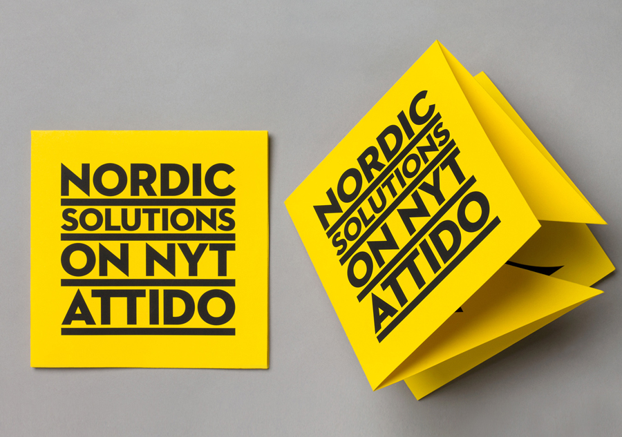
The type choice, stacked layout and colour of the collaterals appears really well executed but the heavy underlines does however remind me of Peter Saville’s work for Factory Records, which is probably why I like it so much.
