Good Food by Face
Opinion by Richard Baird Posted 23 January 2012
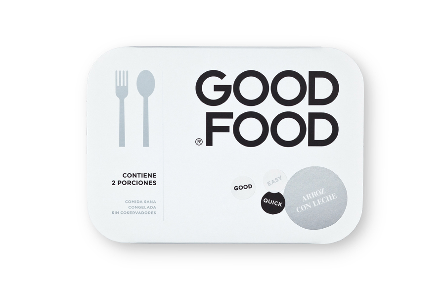
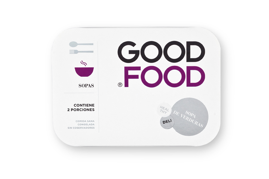
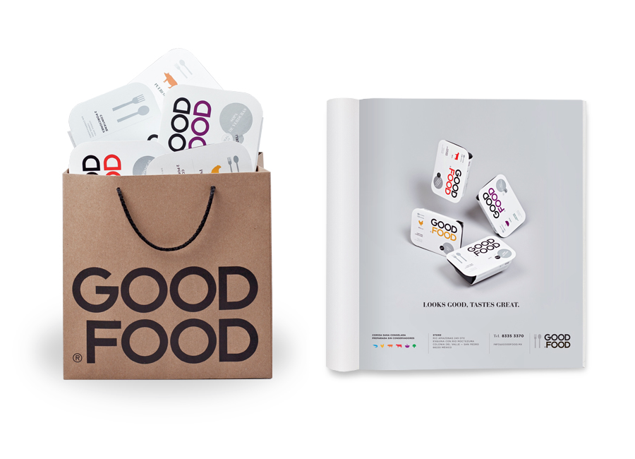
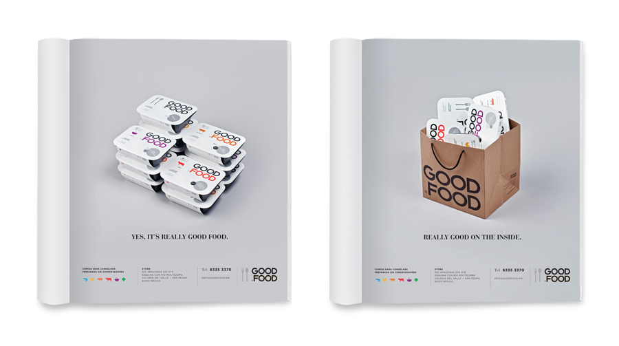
Good Food is a Monterrey, Mexico, based fast-food brand focused on creating a healthy alternative within the traditional convenience category. Their identity and packaging, developed by self-styled, ‘supermodernist’ design agency Face, mixes a minimal typographic and iconographic approach with tactile and premium print treatments.
“Good Food has the vision to bring back the taste to a fast meal. Made with really good ingredients and recipes, they offer traditional Mexican recipes in the very easy frozen food process. Face had to design a reflection of this statement with a very clean, simple, international look, to make people believe in frozen food again, now in a good way.” – Face
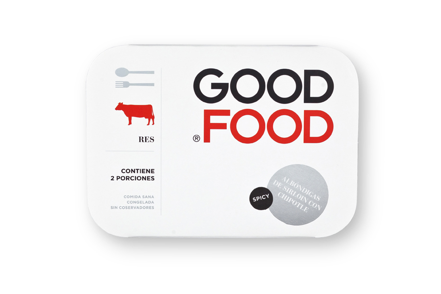
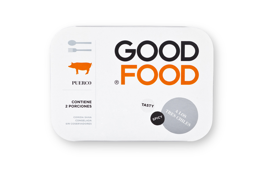
Face has gone for a remarkably brave aesthetic that steers clear of a conventional photographic direction in favour of a bold and simple brand promise of good food delivered across a very focused and almost utilitarian design solution. The logo-type, placed at the apex of a straightforward and linear hierarchy, has been executed in a way that makes the most of the circular similarities between letter forms giving a sense of consistency and a no-frills honesty.
The illustrations are kept neat and clear, perhaps a little obvious but neatly mix up the methods of communication highlighting and reinforcing functionality and ease of use as primary themes. These grid based details are contrasted with the loose placement of a number of stickers and a light tone of voice that provides texture and the element of human interaction and seal of quality in the use of a metallic silver.
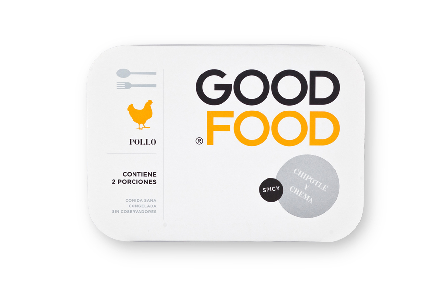
Health is communicated in the packaging’s straightforward and ‘honest’ approach and shuns a lot of the tried and tested visual techniques consumers have come to expect. As such it flies incredibly close to the aesthetics associated with own brand products, the utilisation of subtle print treatments, confident typographic variety and multiple communication methods work well to offset this perception but perhaps by only a few degrees. This is not the packaging of a gourmet meal but one that understands the world of convenience but not at the expense of quality.
