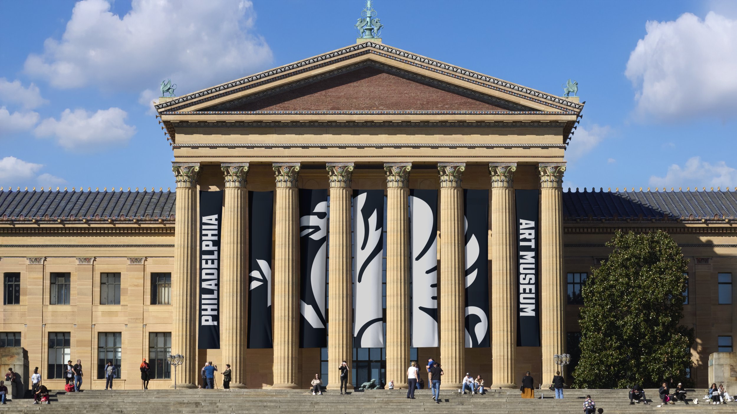
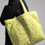
Philadelphia Art Museum by Gretel
Opinion by Emily Gosling Posted 21 October 2025
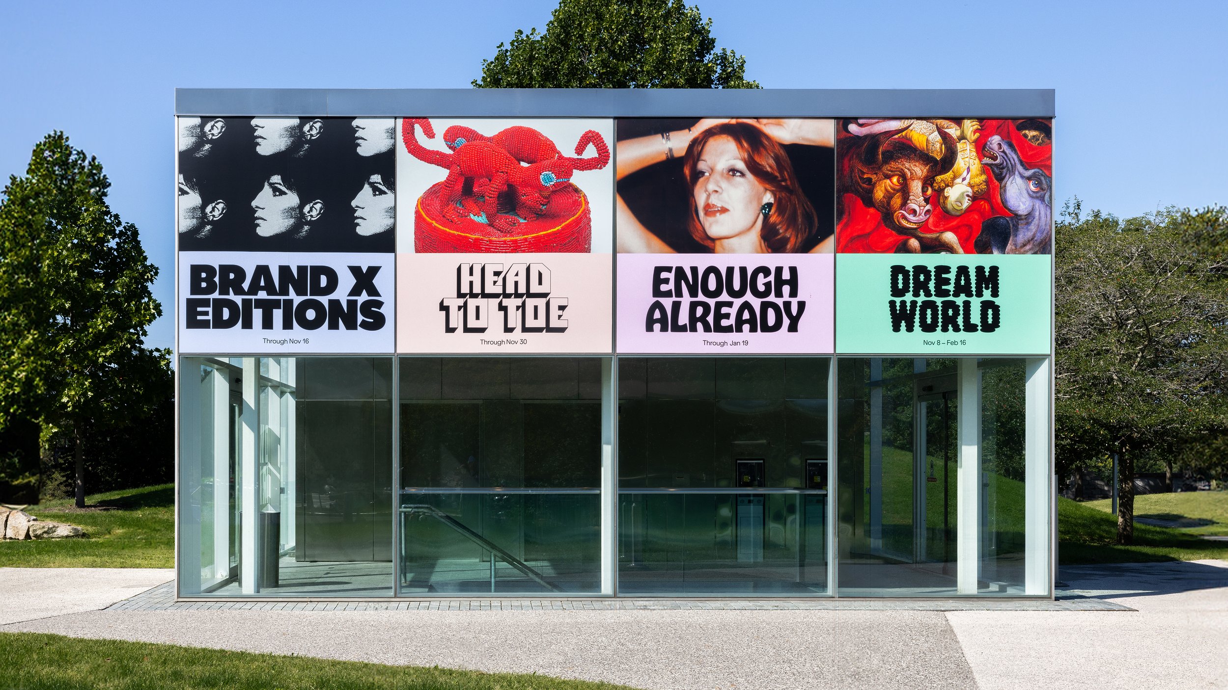
Creating museum and gallery identities must be both a dream brief and an intimidating prospect for brand designers; a poisoned chalice of sorts. We hear the same challenges time and again when agencies discuss such projects: creating a brand that’s both strong and ownable but which lets the artefacts/art take centre stage; an identity that takes an institution into the future – which feels contemporary and modern, but which respects its history and tradition; forging a look and feel which appeals to a dizzying array of audiences, ranging from potential sponsors and patrons (potentially skewing towards the corporate) to artists themselves or their estates (it’s gotta look respected, and respectful) to the many faces of Joe Public to academia to literal children and the grownups that decide what they do with their free time.
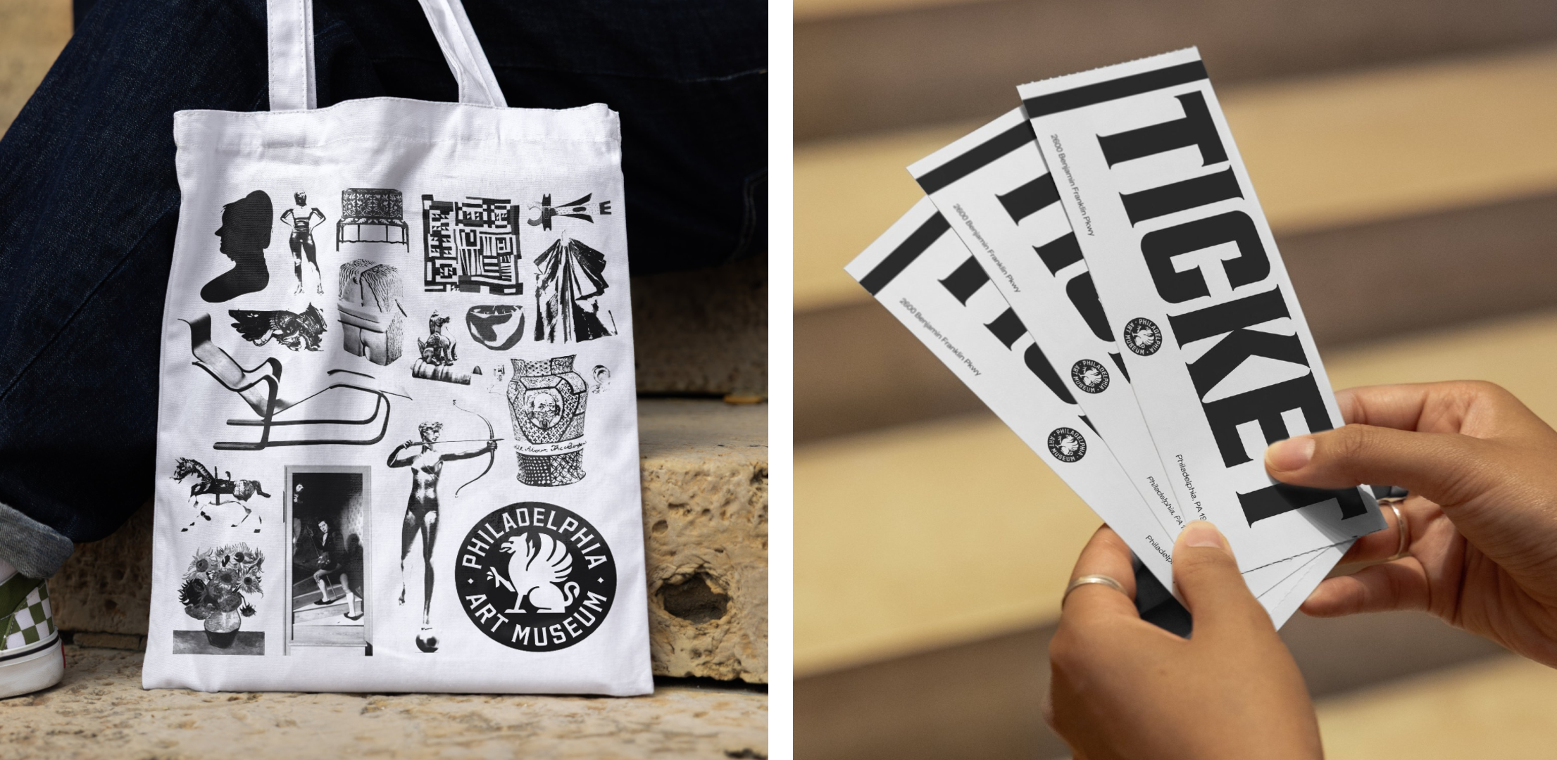
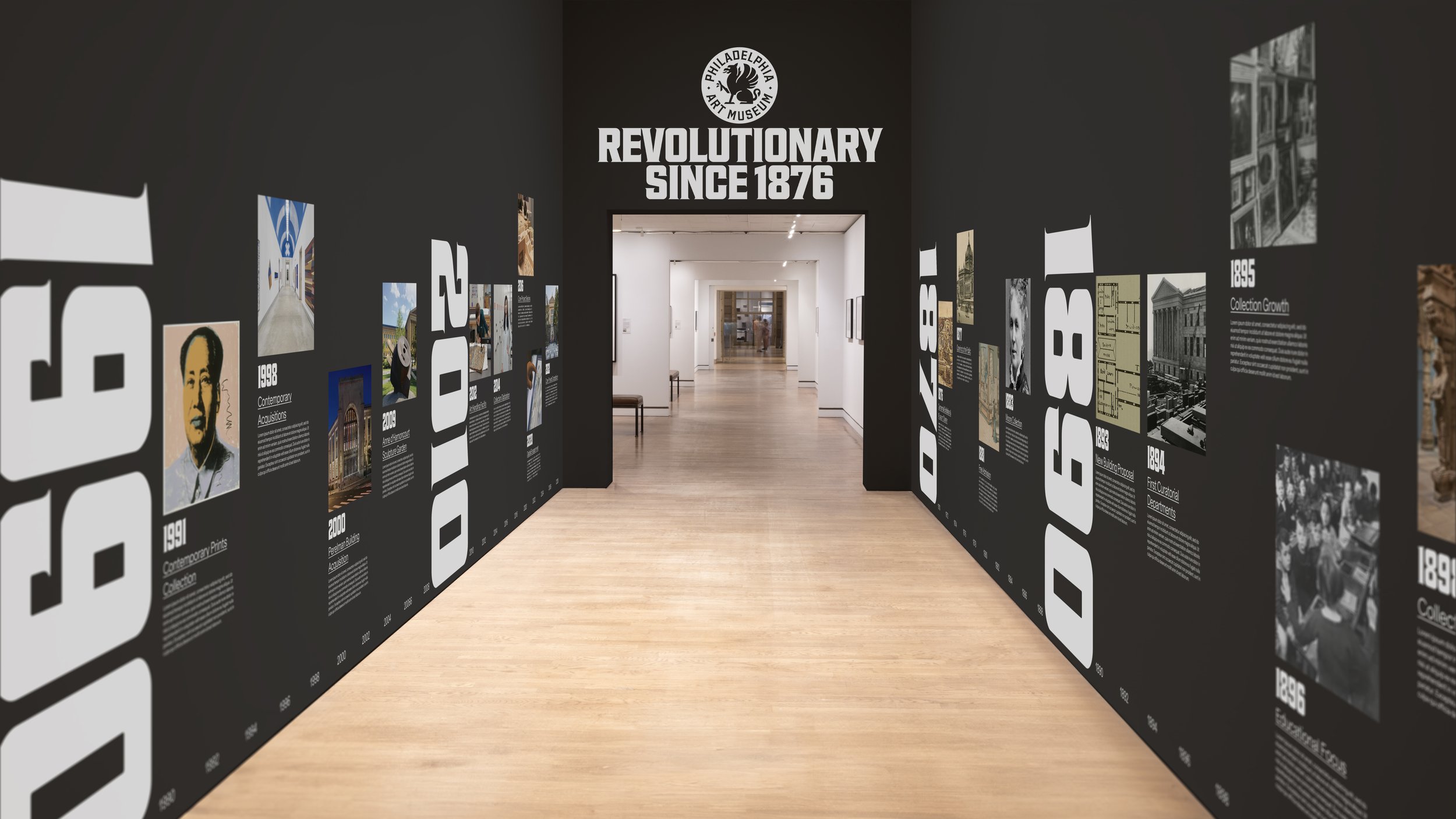
Oh, and it’s also got to be an identity flexible enough to work superbly across pretty much everything you can think of: huge building exteriors; phone screen friendly social posts; signage and wayfinding; that all-important gift shop merch. It is, as many an irritating podcasters might put it, a LOT.
The general consensus is often to err on the side of pared back – nothing too showy, nothing too wild, keep it nice and simple and probably sans serif and with sensible grids or geometric graphic framing devices, yadda yadda yadda. Accessibility. Clarity. Let the artwork do the talking, and so on and so forth.
With all that in mind, this brilliant new identity for The Philadelphia Museum of Art perhaps works so well because, or maybe in spite of, the way in which it breaks so many of these inherited ‘rules’ of museum branding.
Created by Brooklyn-based Gretel (WeWork, Mode), the new brand looks to reflect the museum’s moves to become “more collaborative, engaging, expansive and future-focused,” according to the agency.
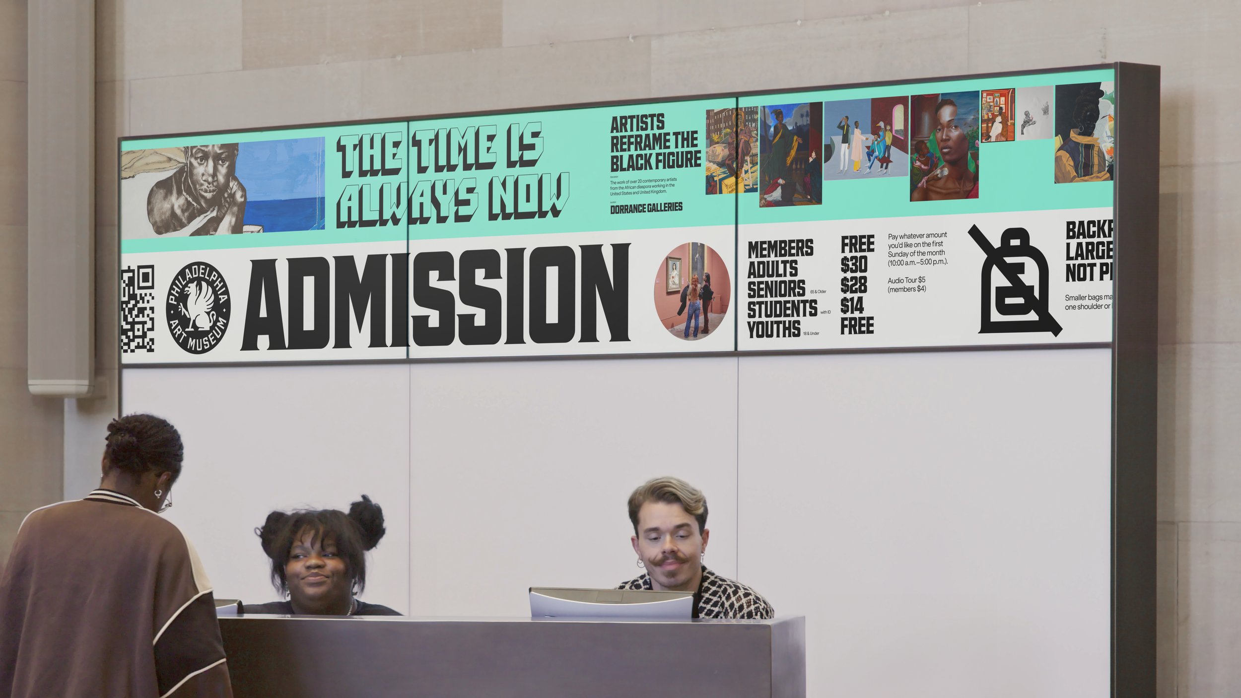
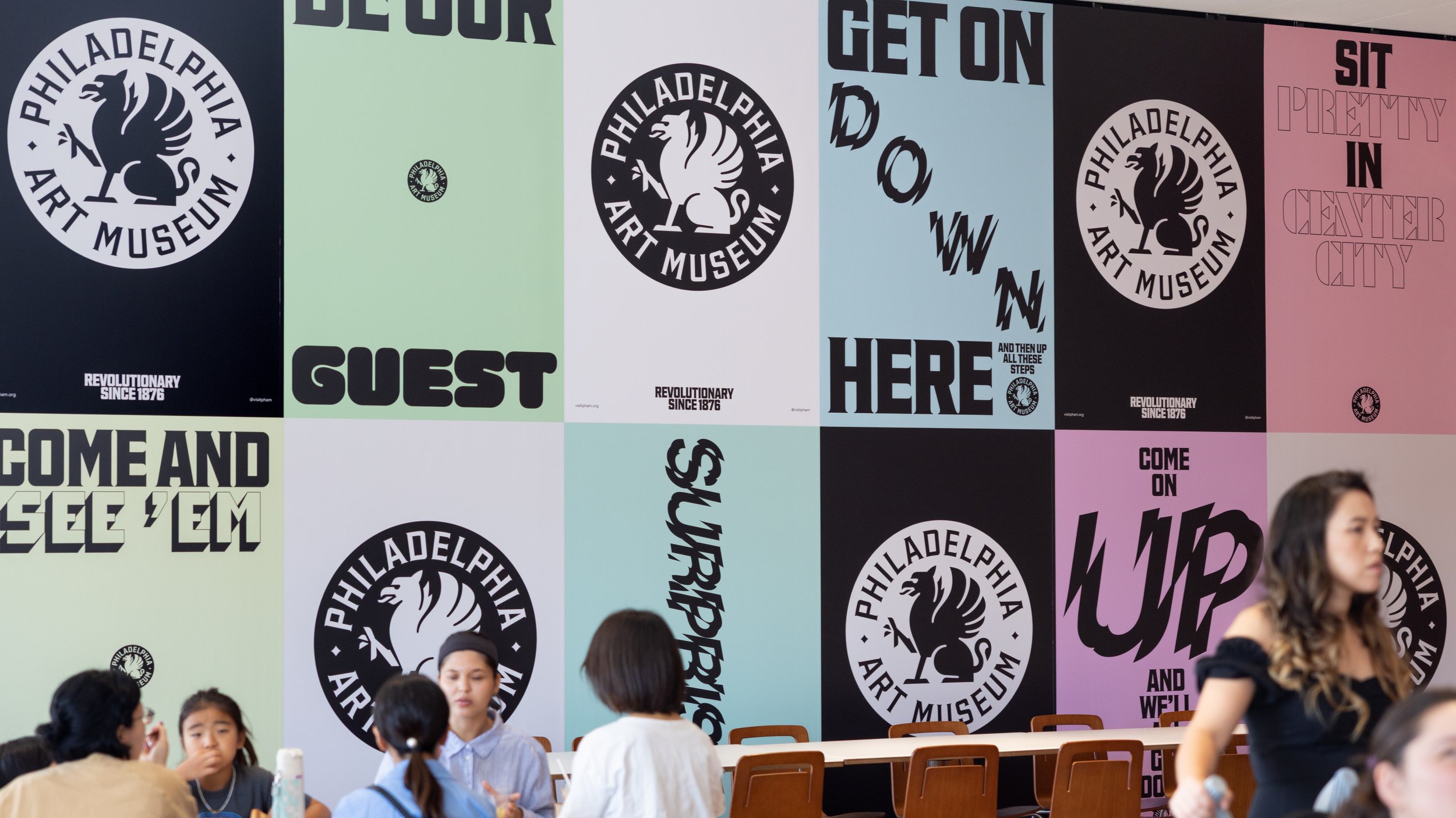
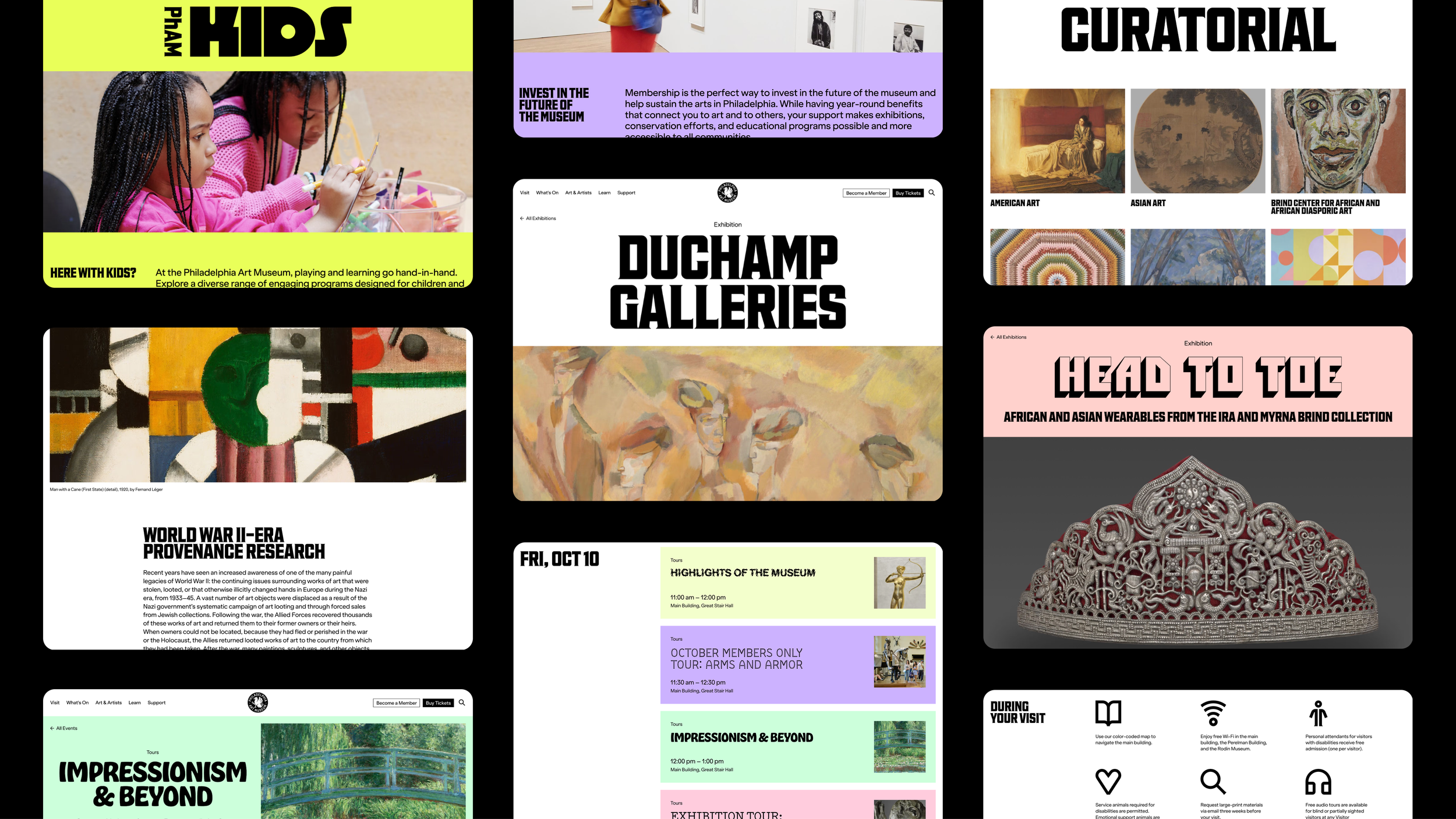
Expansive is probably the most obvious of these descriptors when it comes to the visual identity: rather than going for simplicity as a route to cohesion across multiple touchpoints, Gretel has eschewed inherited wisdom (main font, one or two supporting typefaces, or something along those lines) and instead taking a route that feels both original and very smart – a tonne of different fonts, used for different purposes. It makes sense when you think about it, and especially in line with the museum’s new strategic vision to “come down the steps and throw the doors wide open,” as Gretel explains.
“The aim is to invite more Philadelphians in, more often. And to extend that reach outward to local neighbourhoods, national and global audiences alike,” the agency continues. “[The new brand] centres the city of Philadelphia by embracing its independent spirit. Visionary and welcoming, provocative and playful, it’s designed to dissolve the walls of the museum, invite all visitors in, and emanate its wide-ranging programming out into the world.”
It all raises the question, why rely on a singular typeface to speak to so many different people, and about such multifarious things?
Typography works hard in this identity, and carries some beautiful backstories that help the bold new identity remain anchored somewhat in tradition and heritage. Gretel worked with Ryan Bugden, an independent typeface designer also based in Brooklyn, to create a new custom typeface for the institution called Fairmount Serif. Taking its name from the Philadelphia neighbourhood where the museum is sited, the typeface looks to “merge the institution’s origins as the Pennsylvania Museum & School of Industrial Arts and Philadelphia’s working-class heritage,” according to Gretel, with serif details inspired by the museum’s original seal and engraved walls.
The overarching design of Fairmount Serif draws both from the museum’s very own archives and its historic lettering used throughout the campus site throughout the 20th century. Specifically, it’s informed by a specimen of a typeface called Hess Neobold by Philly born and bred designer and art director Sol Hess (1886-1953). Hess not only lived and worked in Philadelphia his whole life, but also studied at the PMSIA (Pennsylvania Museum and School of Industrial Art) for three years before becoming Frederic Goudy’s successor at Lanston Monotype.
The result is a striking font indeed, one that feels both classical and industrial; historical and contemporary; literary and ripe for more outlandish display uses. In short, pretty much a dream font to anchor the typographic voice of a museum that needs to convey its heritage proudly while dragging itself into the here and now and beyond – just the right balance of grounded and expressive.
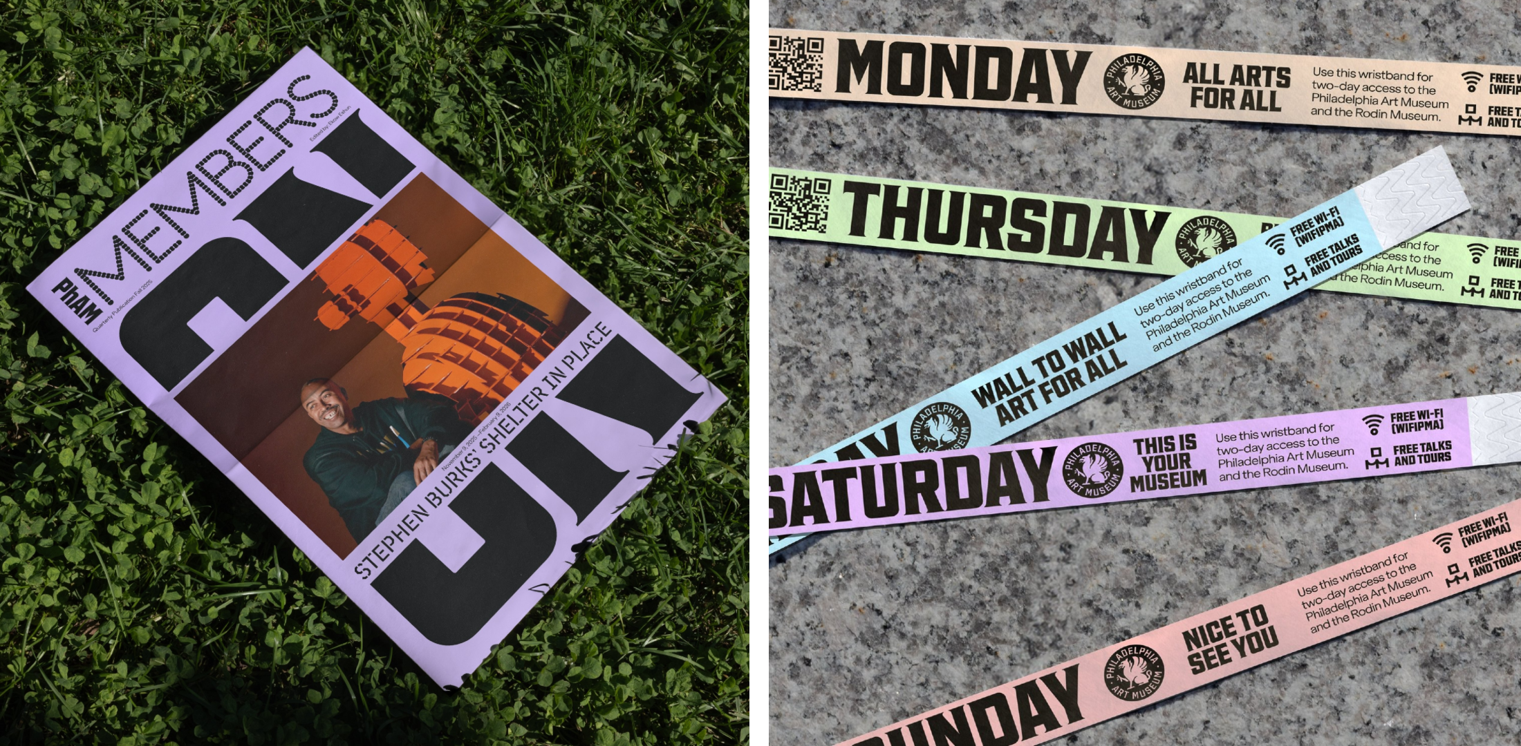
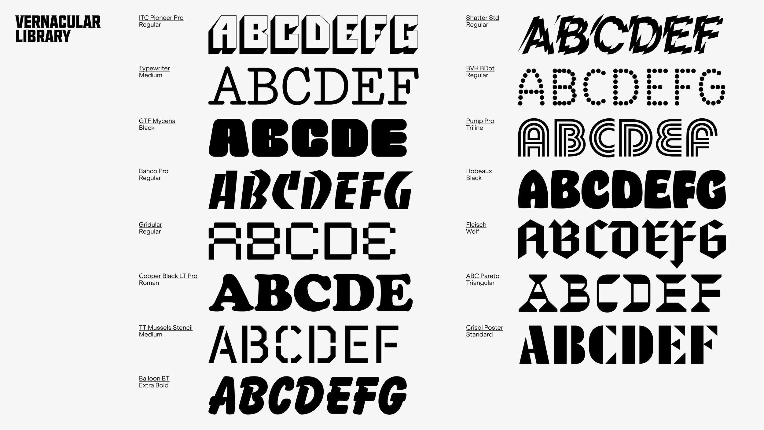
There’s no such thing as a secondary typeface here: instead, as mentioned above, Grtetel opted to “curate” a suite of “vernacular typefaces inspired by the visual texture of the city to give the brand punch and personality,” as Gretel puts it. In this context, ‘vernacular’ refers to the way in which these fonts borrow from or mirror the visual language of Philadelphia’s storefronts, restaurants, murals, and street vendors. These reference points haven’t just informed the brand’s type: they’re palpable across the way Gretel has selected the new colour palette, the mechanics of the motion design, the identity’s materiality and its tone of voice.
According to Gretel, the library of fonts will expand over time to include additional custom faces commissioned for flagship exhibitions. The aim is “to keep the expression fresh, lively and surprising,” and we have no doubt that it’ll achieve that. It’s a bold move, however, since surely a brand with longevity is one that’s robust and singular and instantly recognisable. In less capable hands than those at Gretel, perhaps things could veer into the territory of the confused or diluted or just scrappy, but here, the main thrust of the brand is more than strong enough to allow for an approach which now seems thoroughly sensible rather than outlandishly brave.
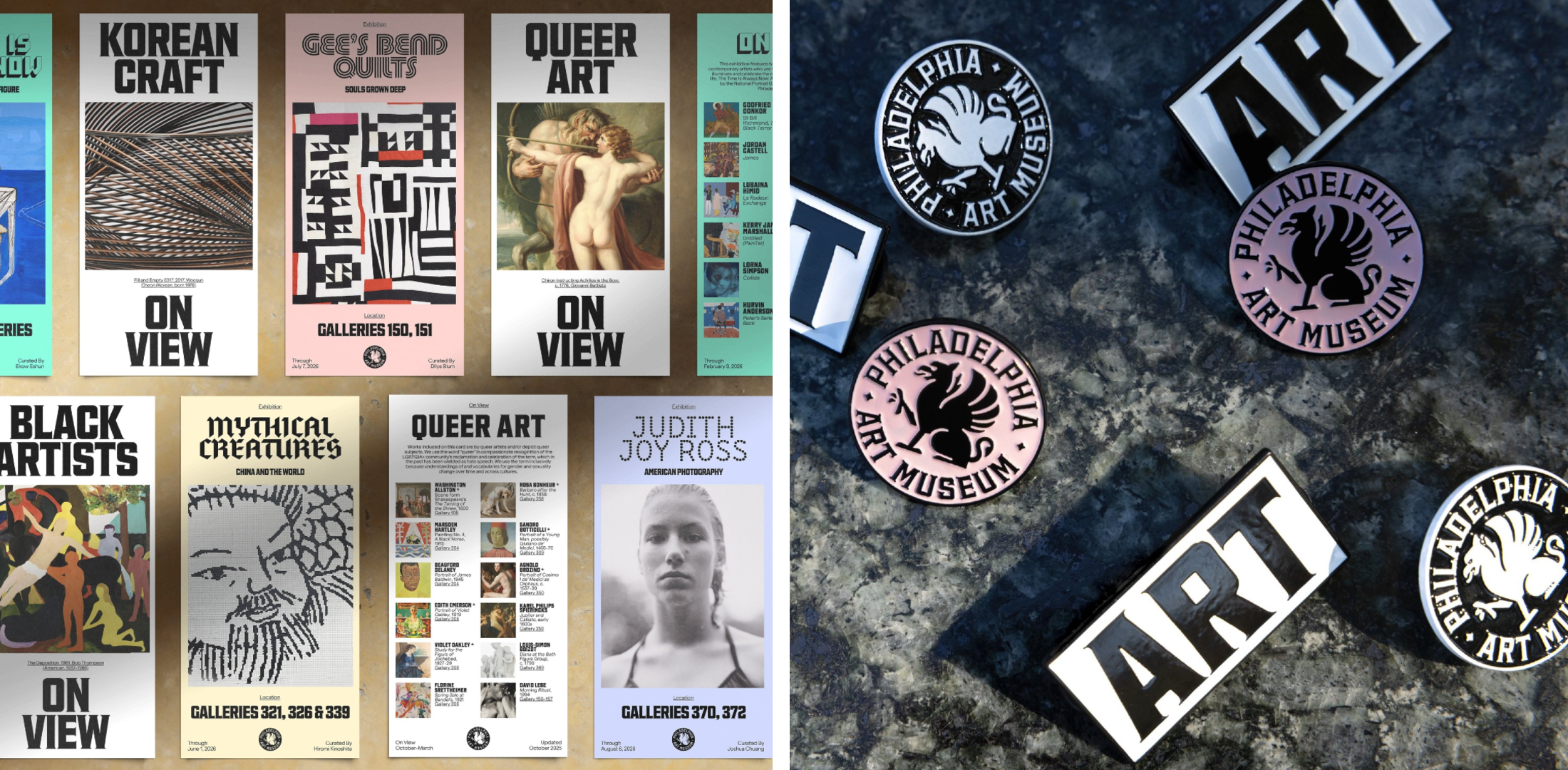
The new logo is powerful for sure – I’m not convinced it looks like a museum logo, especially in its roundel form and the way it looks on merch like pin badges, but perhaps that doesn’t really matter too much. Alongside the new wordmark the star of the logo is a revived Griffin, a character that stretches back over 70 years of Philadelphia Art Museum’s history and acts as, says Gretel, “an iconic and mythical protector of the arts”. It’s certainly the most overt reference to the museum’s heritage, but the sharp lines and stark black and white make it feel timeless rather than backward-looking.
A real masterstroke is in the naming, or more accurately, the shortening of the name. Gretel was smart in opting to use what was already handed to it on a plate, and set in stone a casual moniker much of the city had been using already: PhAM. it’s pretty perfect here: contemporary, playful, approachable, inclusive, but also just a literal (almost) acronym of Philadelphia Museum of Art.
The branding achieves singularity through its resolute overarching “Philadelphia front and centre” positioning. Everything comes back to what makes the museum what it is: the city itself, and what has made and continues to make Philly and its artistic output iconic.
