WeWork by Gretel
Opinion by Richard Baird Posted 11 February 2019

Founded in 2010 and headquartered in New York, WeWork began as a workspace provider and has grown to offer a broader infrastructure of community management and support, event programming and virtual network management for small and large businesses, entrepreneurs and freelancers.
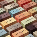
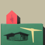
With significant and rapid growth WeWork worked with Gretel to align its visual identity with its purpose. “Framework”, a graphic route that functions as a visual metaphor for WeWork itself, replicating its activities and behaviours, is a responsive and dynamic structure that responds to any spatial format in new and interesting ways, on screen and in print, governing and linking, alongside a simple colour palette and imagery, all of WeWork’s communications. These include small and large format posters, signage, magazine and website design.

WeWork is described as being the frame that supports and empowers its members and allows new business communities to thrive. The programmatic nature of visual identities and that of space and people converges in a series of interactions between titles, body copy and imagery. Type, in its placement within corner text boxes, in its relationship to image, defining and dividing the space of the page in a multitude of ways, captures the essential performative nature of a WeWork space and its capacity to be reconfigured over and over again.


Single colour set over a white background emphasises type as frame, as does the correspondence between headlines and copy. The creation of space out of functional and communicative pieces of content, both image and type, and a clear awareness of the notion of paratext, draws meaning and visual recognition from the absence of something, type and image function as illusory contours. It is this definition of space, as well as the imposition of image on text and vice versa, never overlapping but jostling, establishes a distinctive and cohesive visual language that does not need the logo to be recognisable.


Much of the character of the work comes from its programmatic nature rather than its meticulously crafted execution. The system is the governing principle not the designer to spend time perfecting arrangments, as such, there is a looseness and made quality with some combinations of type and text appearing rushed and busy, and other occasions where it feels refined and elegant. It remains consistent yet always in flux, fitting for a co-working space of activity and change.
Design: Gretal. Opinion: Richard Baird. Font: Garamond Serial (Logotype)