Project Send by Foreign Policy
Opinion by Emily Gosling Posted 30 October 2025
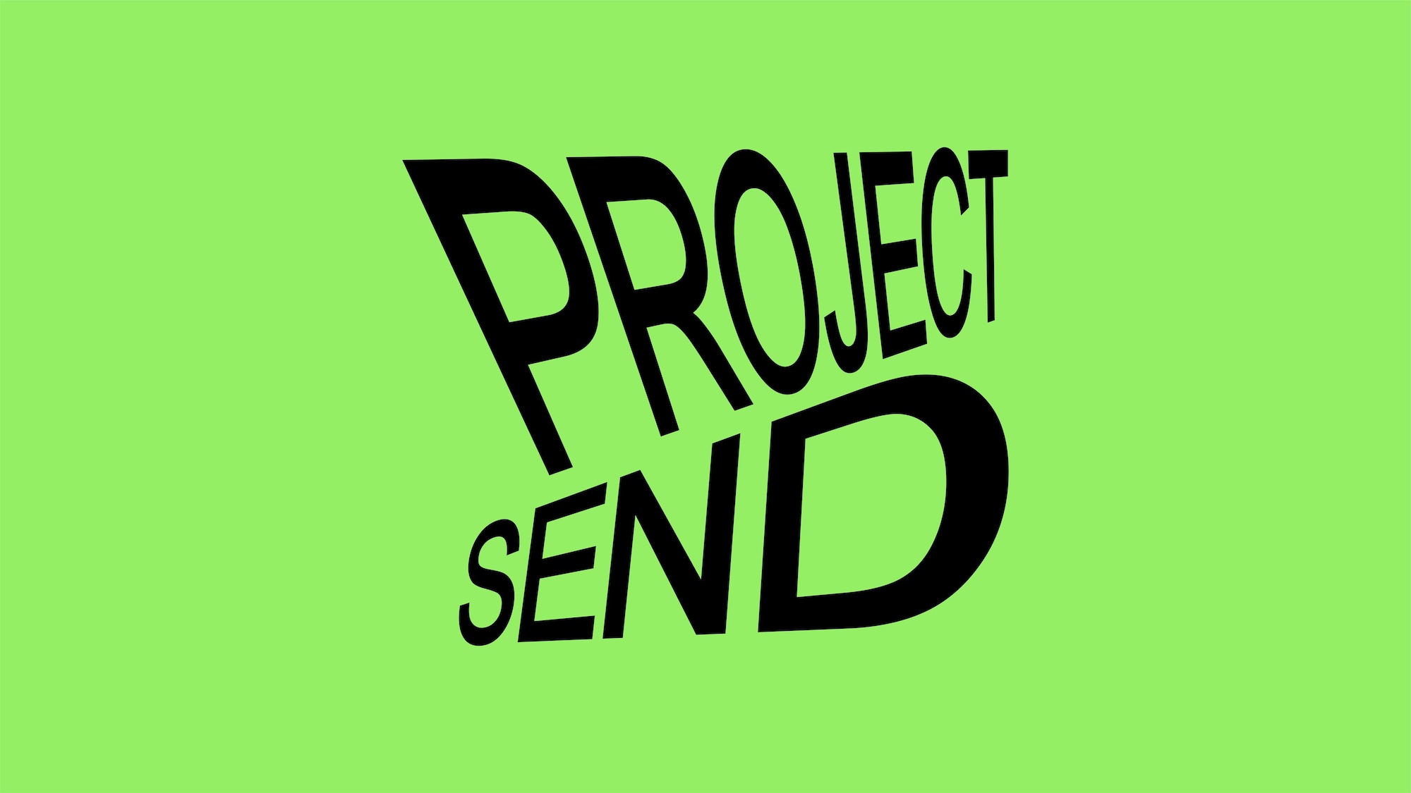
Since their advent, kinetic and variable type have become a familiar part of the lexicon of brand design. It’s little surprise really: they offer a way to make an identity consistent yet dynamic; uniform but multifarious; endlessly flexible with countless opportunities to modify mood, tone, and messaging.
But few projects seem to use kinetic type as a way to visually represent what a brand is and what it’s all about – artwork imitating life, as it were. Here’s a lovely exception: the identity for Singapore-based climbing gym Project Send by branding and design studio Foreign Policy (Critical Mass, Gallery & Co., Park Bench Deli).
Project Send describes itself as a “gym for every climber”, with a focus on making climbing “More than just a workout – it’s a journey of growth and connection… From building strength and resilience to fostering community bonds…”.
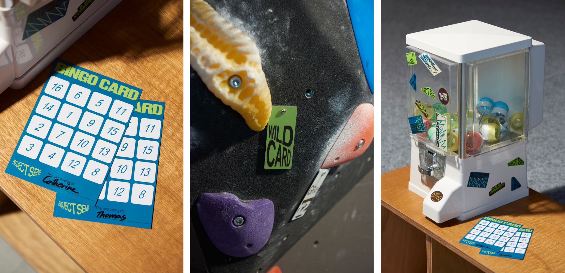
It’s that notion of community that seems to set Project Send apart from standard gyms, which are so often characterised by a thoroughly individualistic sort of language, both visually and verbally – the whole ‘making gains’, ‘do you even lift bro’ barely disguised machismo vibe (or worse, the much-maligned ‘beach body ready’ approach of shaming people into morphing themselves into a limited, barely attainable physical archetype).
The climbing world as promoted by Project Send is a far cry from all that though, and as Foreign Policy puts it, the brand identity design and concept “embody the gym’s fundamental principles and distinctive approach of building the gym as a community of climbers”.
It does this by way of using a modular but highly flexible system: a community is a unified single entity, but the people that form it are individuals – they’re varied and unique, but come together to form a whole. That’s exactly what this identity does too: it’s ownable thanks to a limited but considered suite of fonts, a striking palette of colours that’s diverse but not overly expansive, and a clearly defined overarching approach to how it communicates visually and in its brand tone of voice.
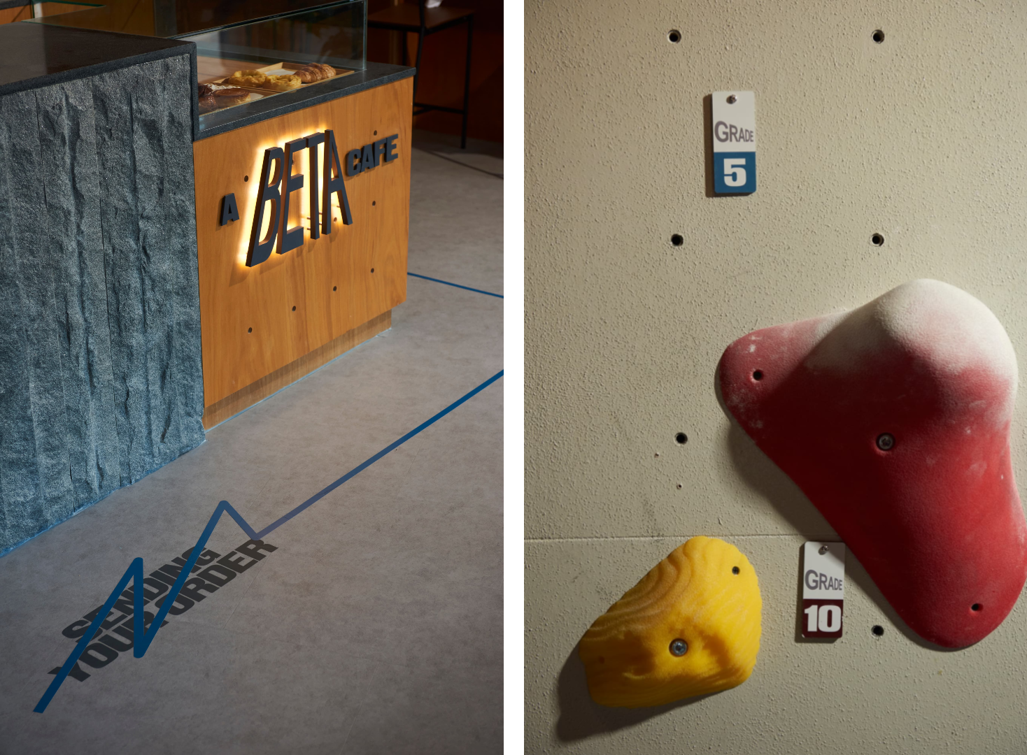
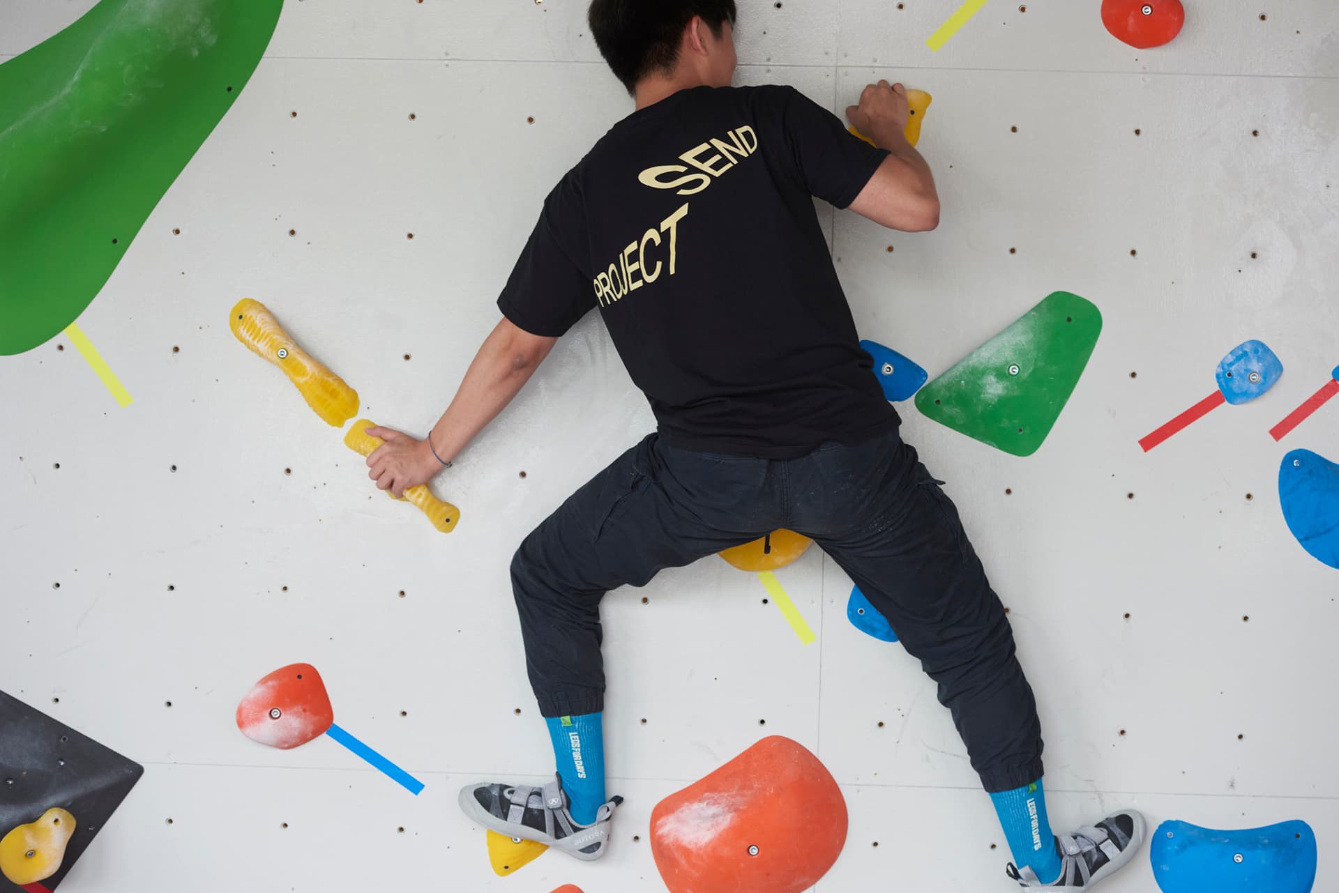
And again, the way the visual identity behaves mirrors Project Send as a brand: climbing is about flexibility – often on a literal physical level, as in it forces you to contort or stretch your limbs into strange arrangements in order to actually ascend, but also mentally, having to navigate different possible routes and how to approach them and – as the name suggests – ‘sending it’ even when it feels scary.
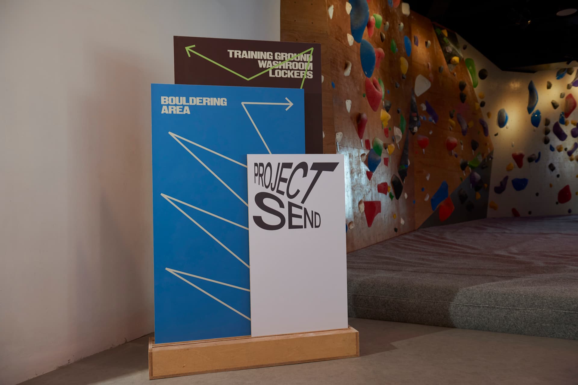
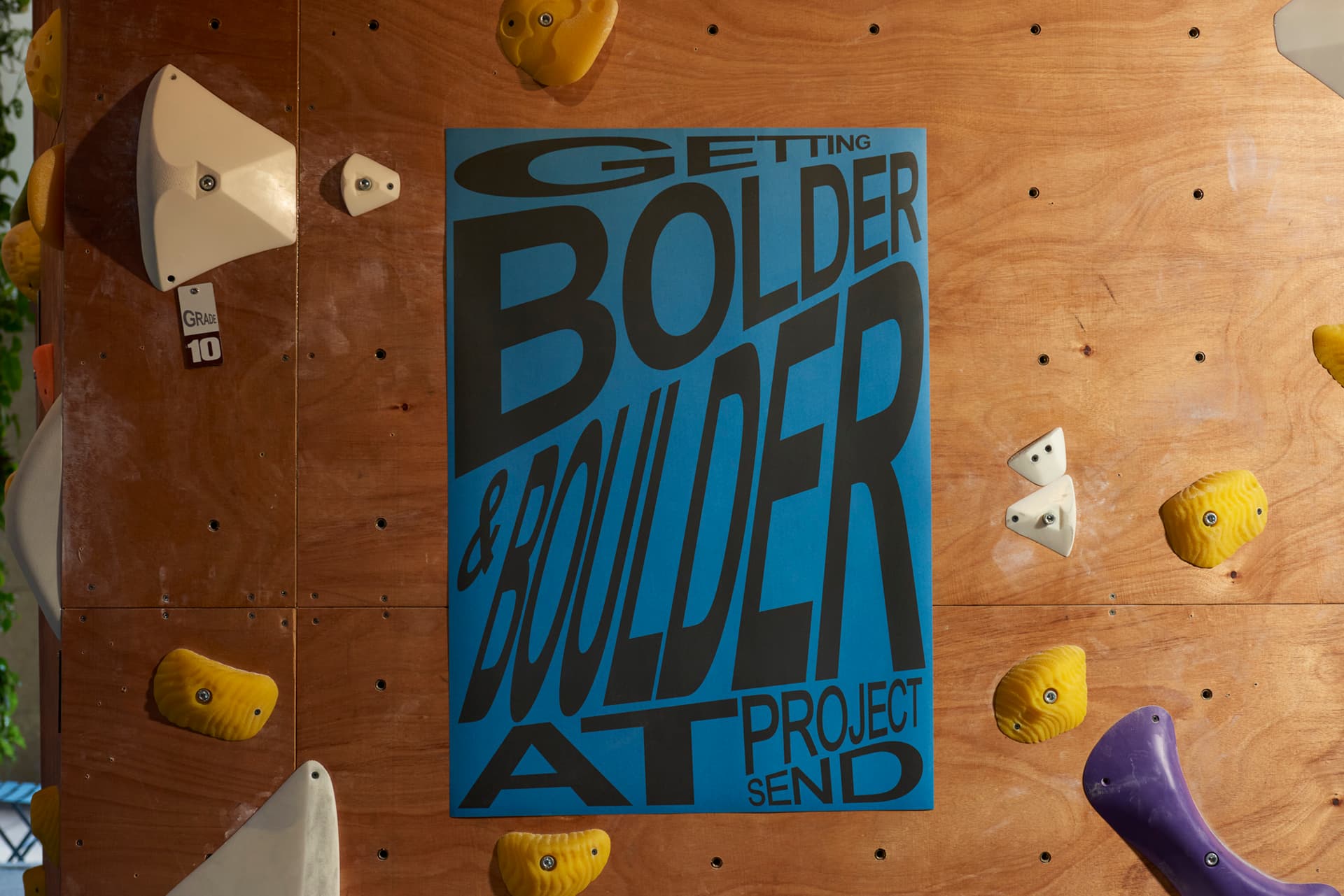
The flexibility plays out in the ways that the wordmark and logotypes shift and stretch, typographic compositions rearrange, and colours expand or compress depending on context. This sense of elasticity also serves to underline the gym and its community’s messages around the idea that progress is not linear but iterative, built on repetition, exploration, and failure.
The main brand typeface here is KTF Rublena by Kyiv- and Hanover-based Kyiv Type Foundry. It’s a nice choice from Foreign Policy: Rublena speaks directly to the dichotomy at the heart of climbing – strength and precision. A weighty grotesque with heavy-set proportions, minimal contrast, and an assertive geometry, there’s a sense of physicality to the dense, blocky letterforms – compact yet expansive, commanding but never aggressive.
Balancing that strength is variable typeface Inter by Swedish designer Rasmus Andersson. Inter’s tall x-height and generous spacing make it ideal for wayfinding, small-scale text, and digital communication, while its neutral rhythm offsets Rublena’s blocky weight. Where Rublena pushes outward with boldness and energy, Inter keeps the system legible, open, and quietly efficient.
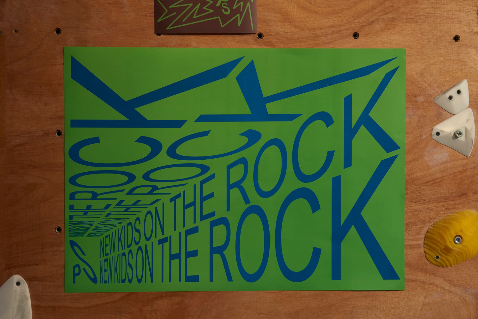
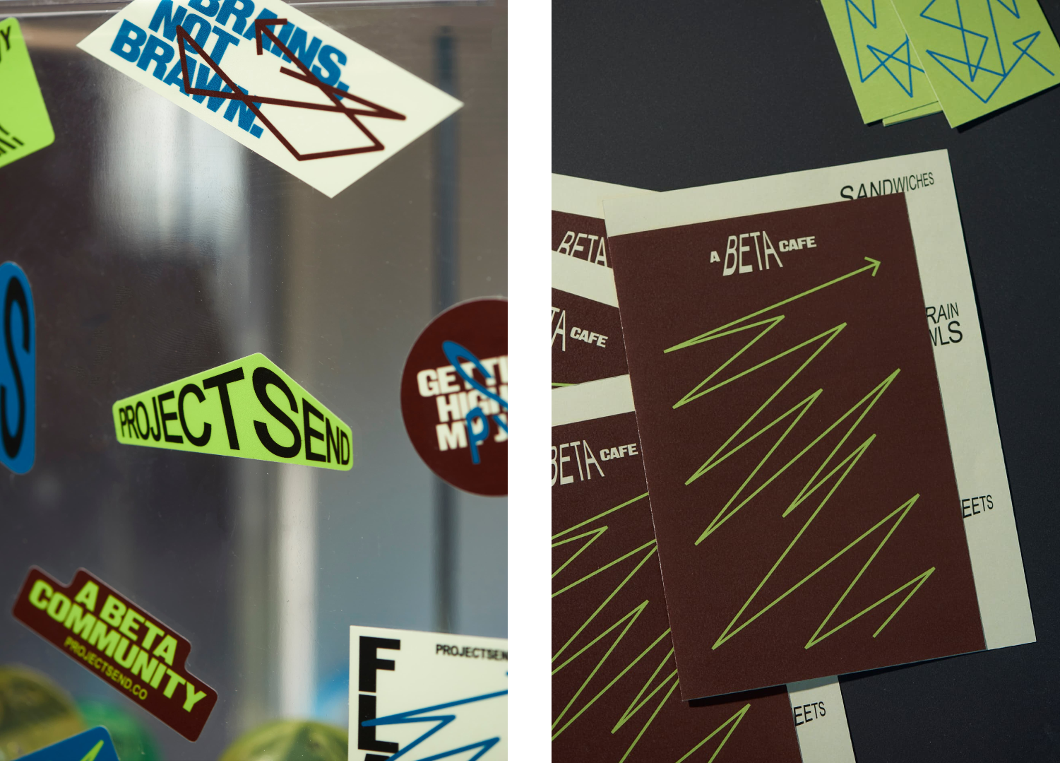
The colour palette is a refreshing change from the shouty tones usually associated with fitness brands, a set of vibrant hues such as cobalt blues, coral reds, and electric greens tempered by neutrals and soft greys, perhaps a nod to the climbing walls themselves. The brighter neon tones lend themselves beautifully to digital applications but also to physical touchpoints like printed posters and even the wayfinding within the space, giving everything a sense of freshness and energy. The overall impression is one of movement without chaos – a brand that can energise without overwhelming.
The only aspect I’m not too sure on is the copywriting, but then again, as someone not in the climbing scene, perhaps I’m missing the point. The use of ‘Beta’ as a sort of adjectival non-pun is confusing, but I do like other punny turns used on posters such as ‘getting bolder & boulder’.
Overall though, Project Send’s identity demonstrates how a design language can translate physical experience into visual form without resorting to cliché. The kinetic typography, in particular, is a rare example of movement used meaningfully – it’s an identity that doesn’t just look dynamic but palpably feels it.
