Critical Mass by Foreign Policy
Opinion by Richard Baird Posted 6 September 2018
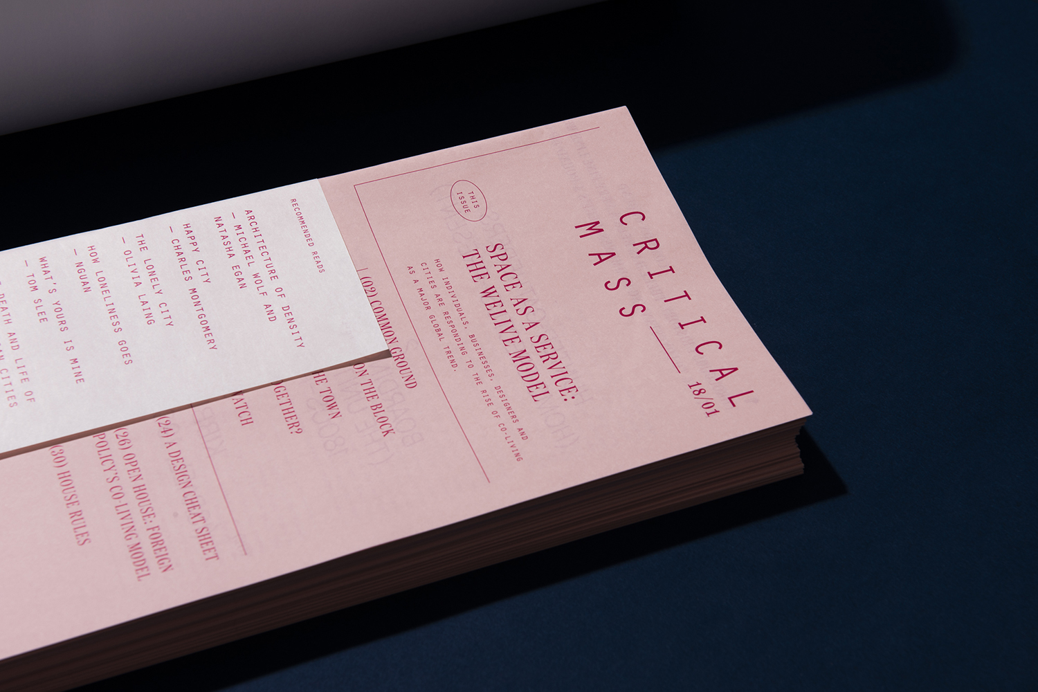
Critical Mass is a biannual magazine that explores a brand’s ripple effect across the globe, from patterns in consumer spending to environmental implications. It intends to showcase, in its curation, commissioning and design, how a brand’s living legacies extend beyond mere aesthetics and profit margins in the face of fast-moving and ever-changing global consumerism. Issue 1 explores the lines blurred between artistic expression and commercial endeavour in a series of texts around Japanese contemporary artist Yayoi Kusama approached from a variety of angles by different authors.
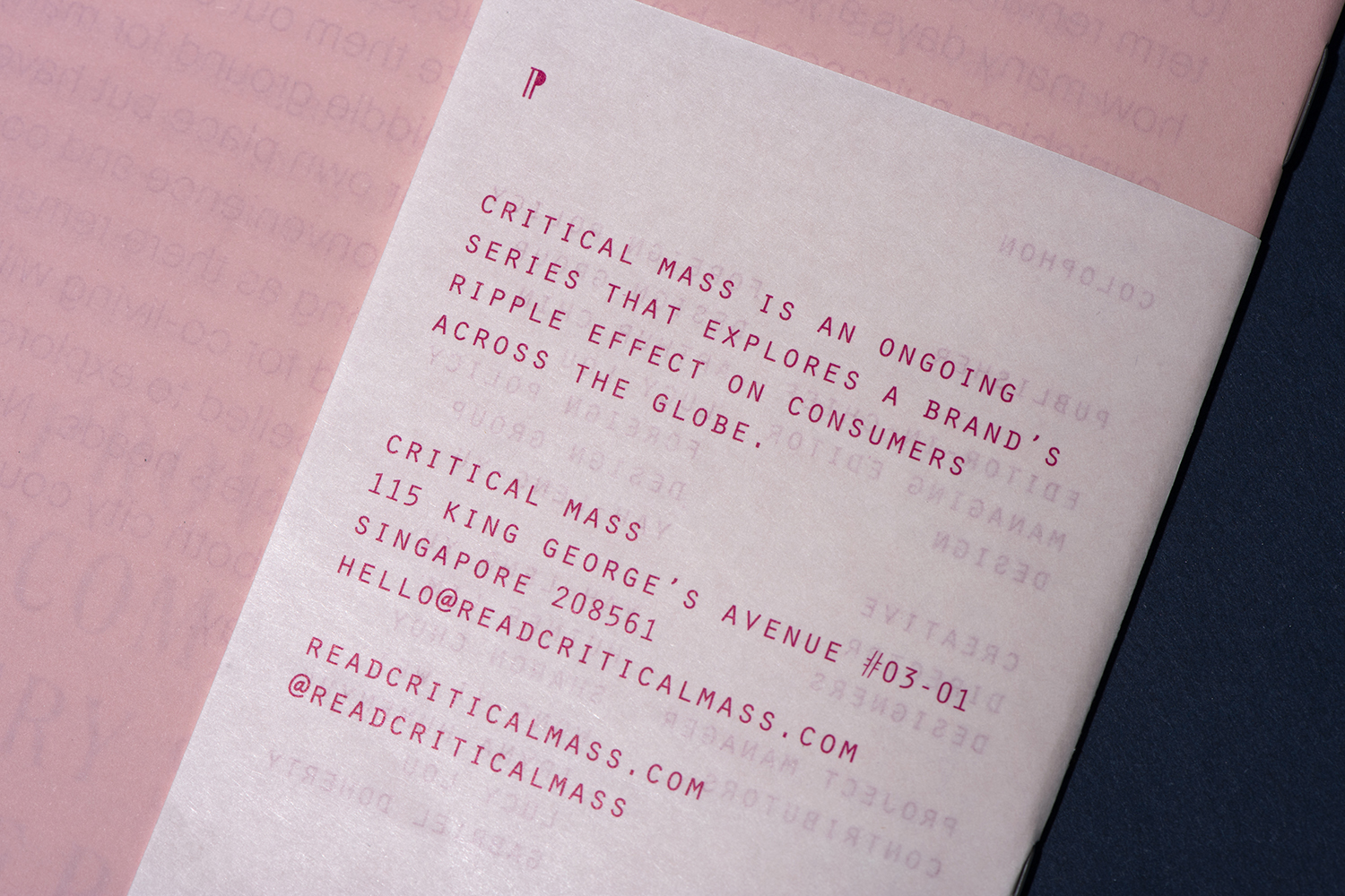
The magazine is designed and published by Singapore-based design studio and think tank Foreign Policy and takes the form of a slim staple bound booklet of 32 pages. Although light, it is an insightful document that is materially and graphically distinct. Texts move comfortably between the micro and the meta, complete easy reads and those that are more challenging, propositions for continued thought. There is pleasing breadth drawn from a singular focus.
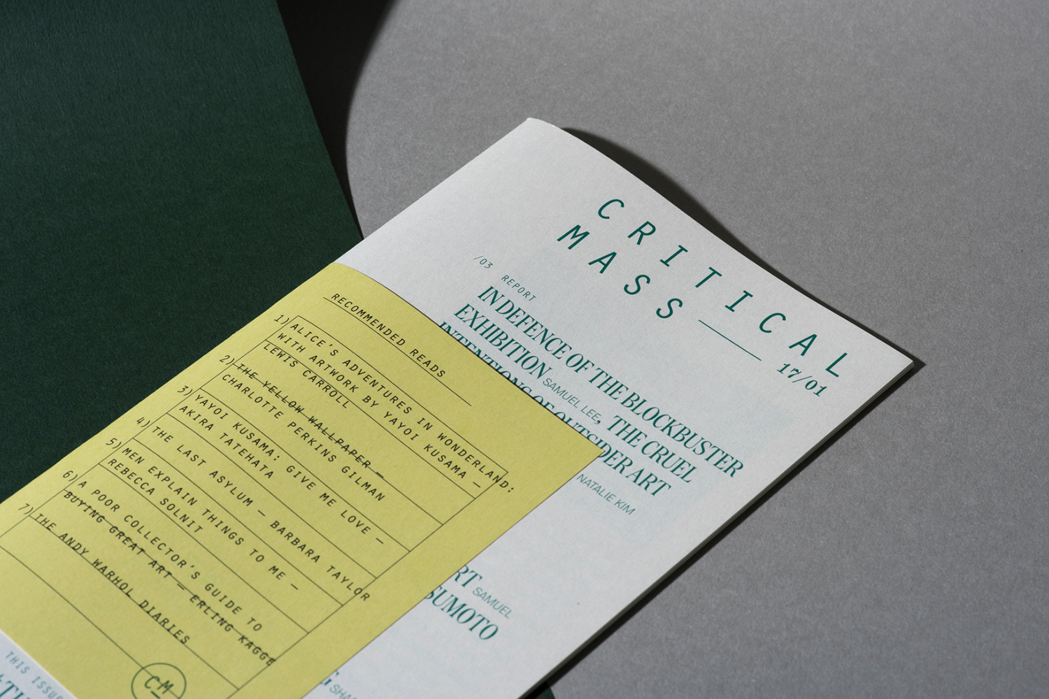
Foreign Policy, through Critical Mass, explore the concept of designer as producer and the notion of total project; a synthesis of content, graphic design and material form. Also check out Real Review. They push the potential of paratext; the reinforcement of word through the critical and essential relationship between photos, drawings, captions, type and typesetting, material composition and weight, further learning (recommended reading) and function (a space for notes). These last two are particularly interesting, offering a provocation to engage beyond the magazine, providing a space (or rather a gesture towards) the synthesis of ideas on the part of the reader. Of course, all magazines use some form of paratext, however, the degree to which it is pushed here marks the magazine out. As it is lighter than a typical design/arts publication the interplay of intangible and material value is a necessity.
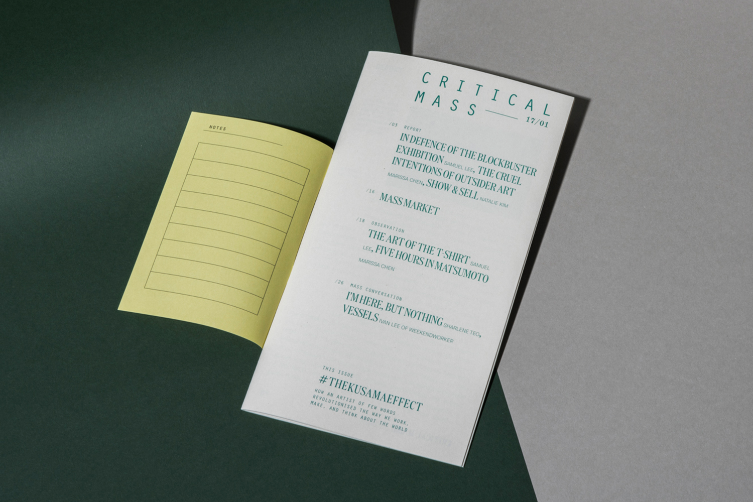
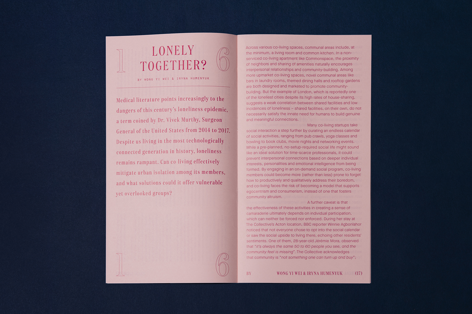
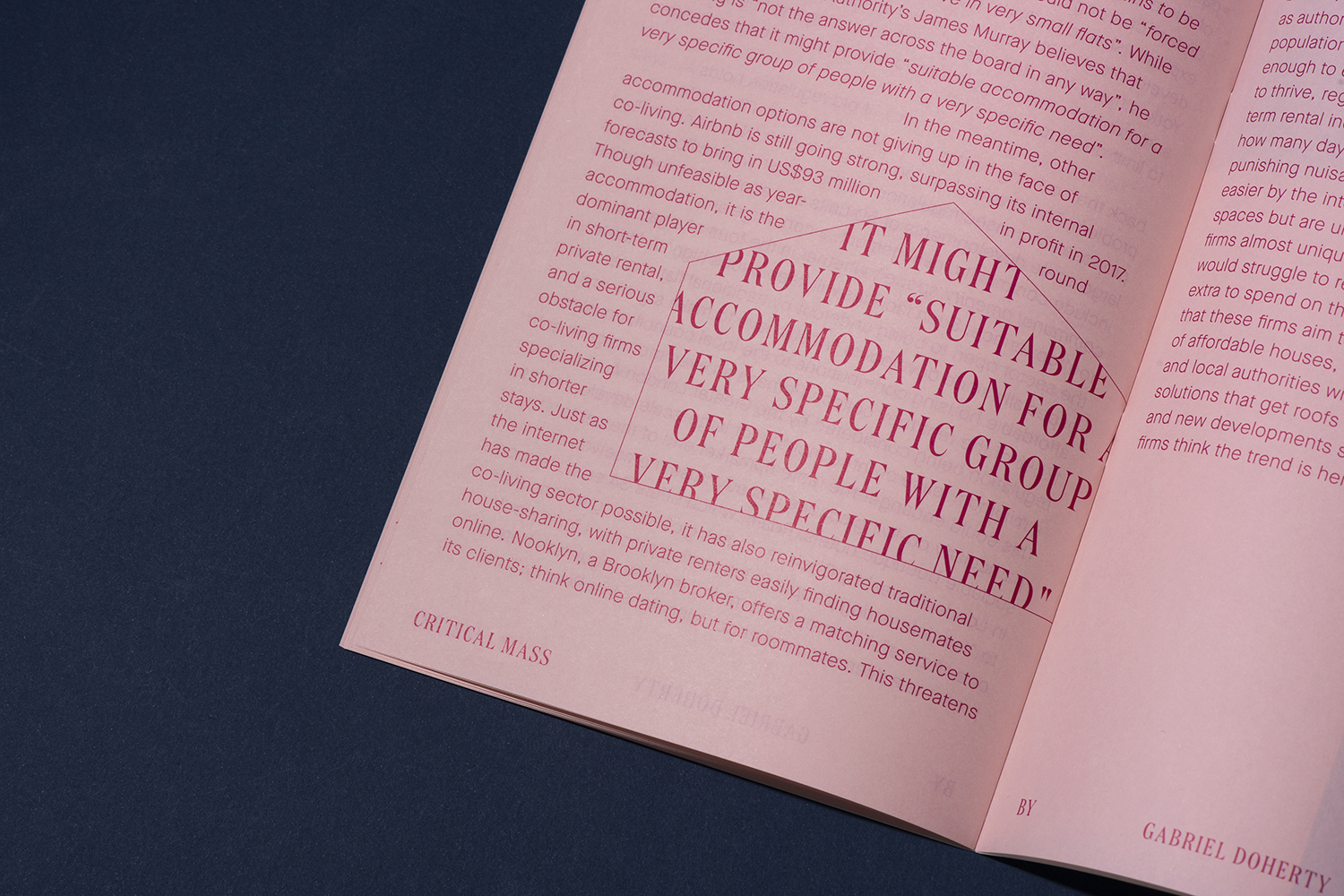
The magazine’s graphic and material form is characterised by some lovely moments of contrast, a neat expression of cause and effect. This can be seen in the short cover over slim pages, different materials and colours and significant type contrasts; the mechanical, the carved and the humanist. Much of the arrangments play with an interesting intersection of independent zine or experimental course pamphlet (read: non-format and post-modern) and that of architectural journals (insets for paragraph breaks creating voids and evoking a sense of structure and pragmatism).
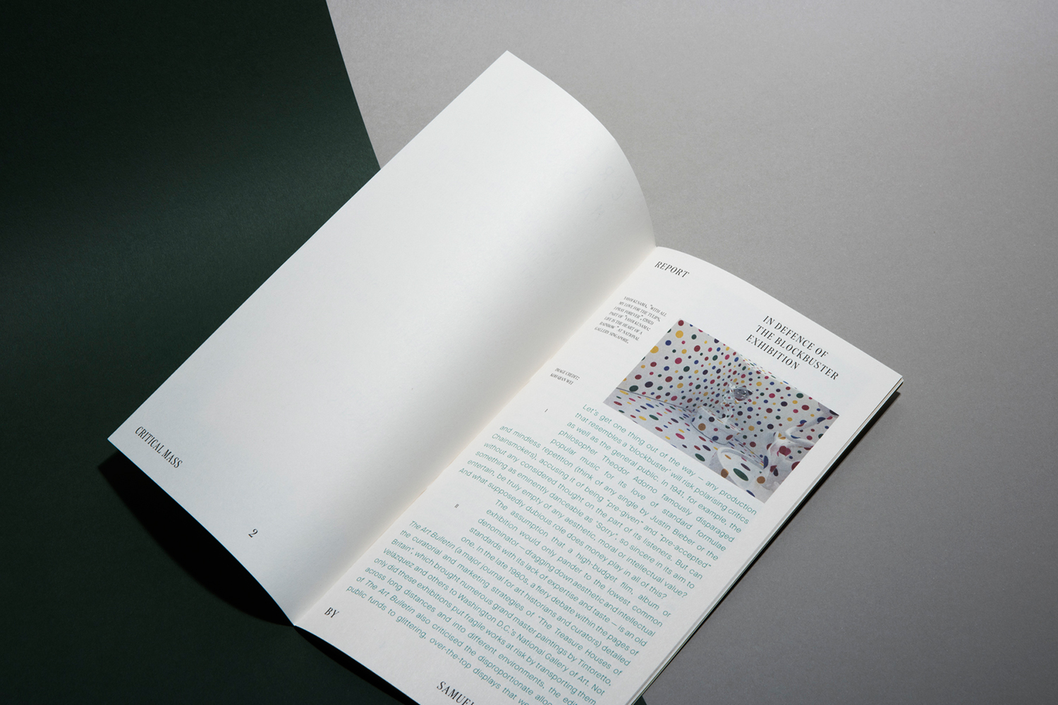
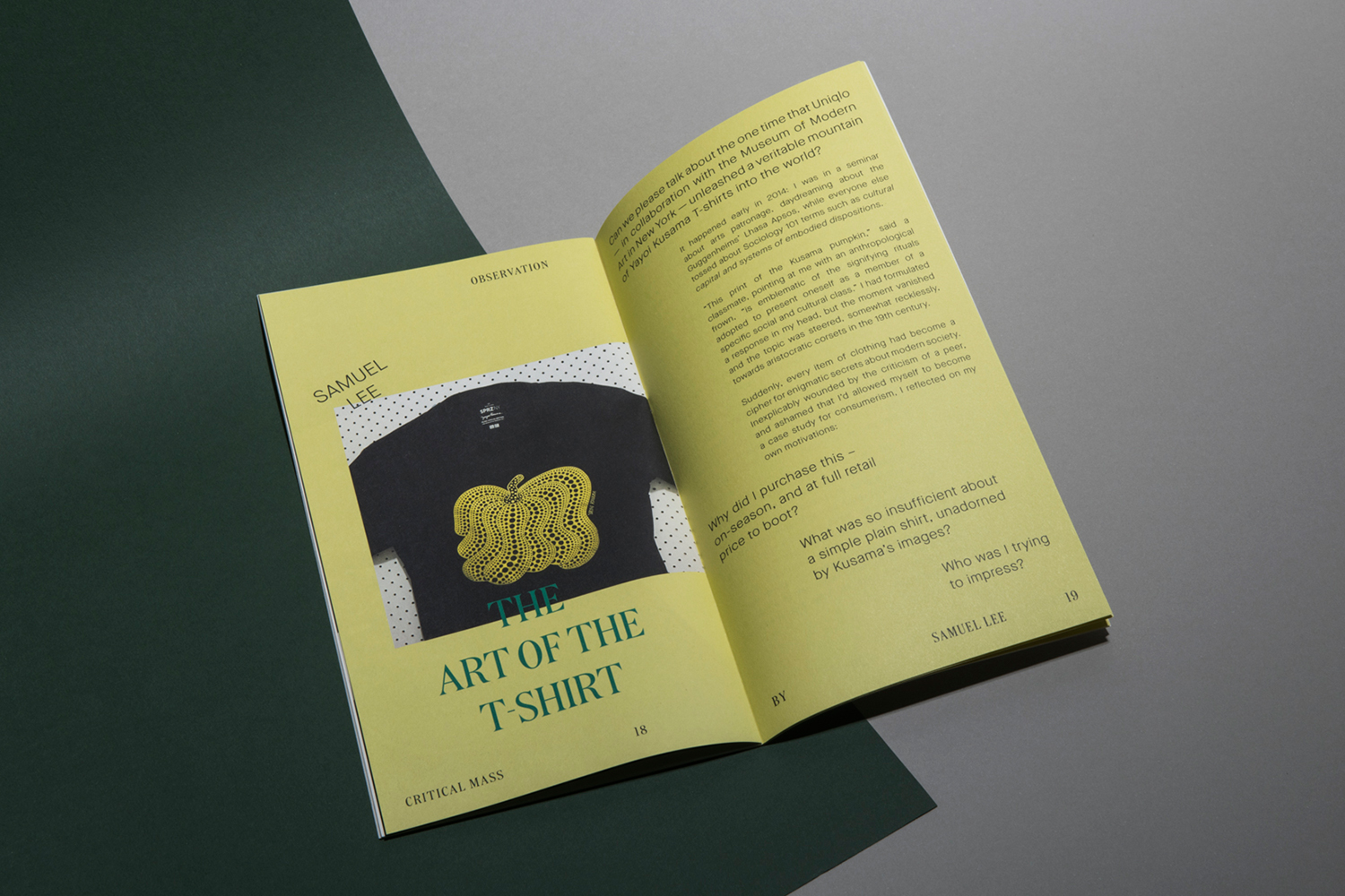
Layout is an enquiry into the structured, the sequential, the imposition of one text on another, a backwards and forwards, and the non-format college and entanglement of text and image. This lends the publication a pleasant balance between insight and play that brings a lightness and conviviality to some thoughtful pieces. There is a dialogue between text and delivery mode that builds to something greater, a spirit of intellectual exploration and creative experimentation. The proposition appears to be that there is essential synergy between the two, something that designer as author and designer as producer can bring to light. The format also conveys this in its slim proportions and material lightness, clearly designed to be moved around and shared.
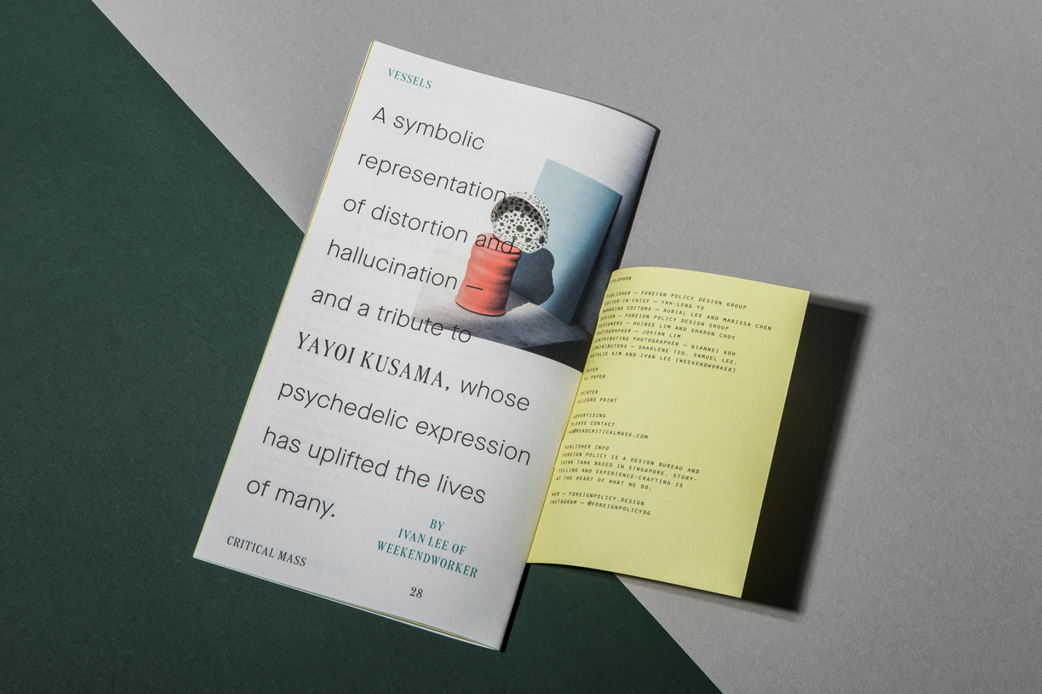
Critical Mass Issue 2
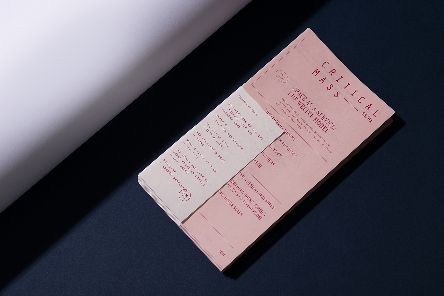
The second issue investigates how individuals, businesses, designers and cities are responding to the rise of co-living as a major global trend. It also, in its colour and materiality begins to look at how the magazine can adapt to changing content, to reconfigure itself, to maintain an obvious contunuity yet respond to the changing nature of content.
Design: Foreign Policy. Publisher: Foreign Policy. Opinion: Richard Baird.
