Current State by Werner Design Werks
Opinion by Emily Gosling Posted 6 November 2025
Current State is a skincare line launched by sisters Emily and Lanie Parr a couple of years back, which aims to “disrupt the status quo”, according to Werner Design Werks which created its boldly multicoloured branding.
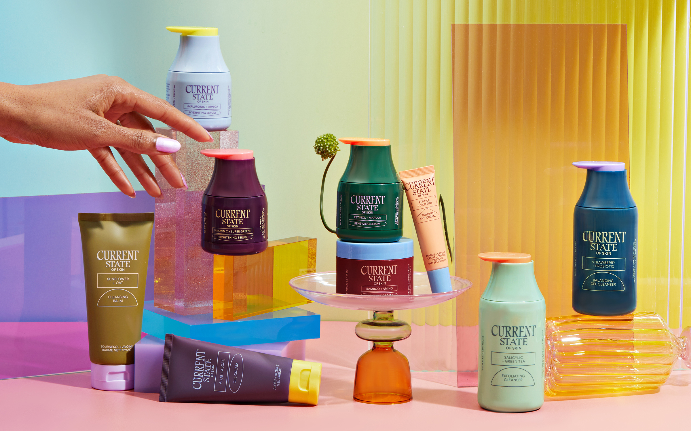
There’s a lot to love about this packaging and brand design – not least, that expansive approach to colour. It seems that Werner Design Werks took this tack as a response to the brand’s central ethos of “no set skincare regimen – give your skin what it needs when it needs it. No typecasting – products are defined by skin type because your skin is not always the same.”
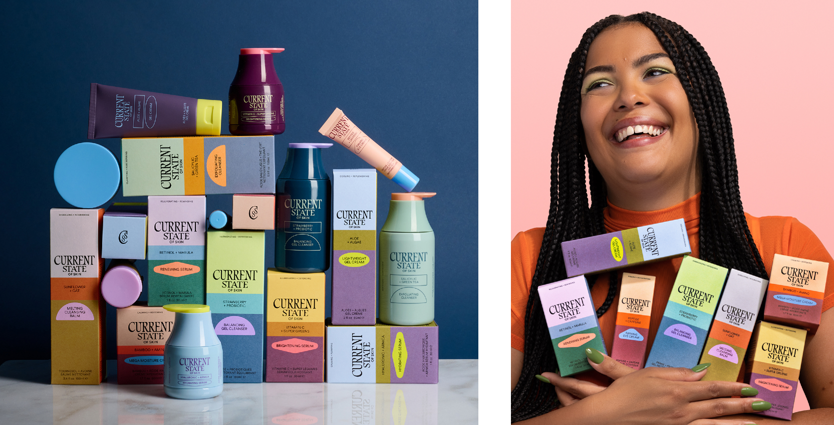
As such, the Minnesota-based studio opted to use “not one muted brand colour,” but “an explosion of 30+ colours based on product features.” Werner Design Werks continues, “Bold colour creates shelf-impact and encourages you to mix and match based on your skin’s needs.”
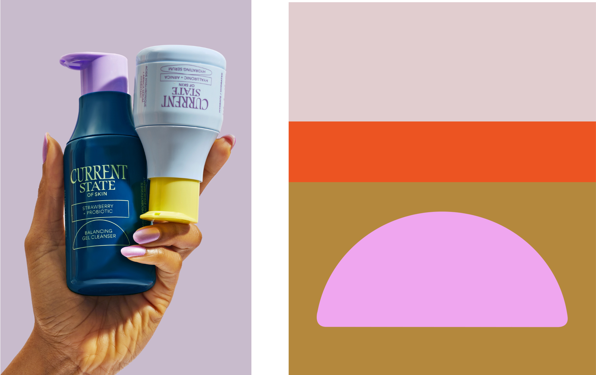
And this is where one of my few criticisms of this project comes in: if the colours are based on product features, how does that work? What are we looking for? How can consumers browsing shelves easily recognise or find what they’re looking for? In purely decorative terms, or as a strong visual identity system, the multifarious hues work brilliantly – but it’s unclear how they fit into any sort of information or product hierarchy.
However, where so many beauty brands opt for pared back to the point of being medicinal – especially in the post-The Ordinary era of identity design for makeup and skincare – it’s great to see something that veers in the other direction, yet still looks slick and trustworthy. In recent times there’s been a raft of beauty brands that take minimalism beyond sophisticated and into the territory of just plain boring, so you have to applaud WDW for very blatantly eschewing all that in its work for Current State.
The branding is playful, but not daft; different, but still sits comfortably within its category – a quality that should not be underestimated for brands like this, stocked mostly in huge-name stores (in this case, Walmart).
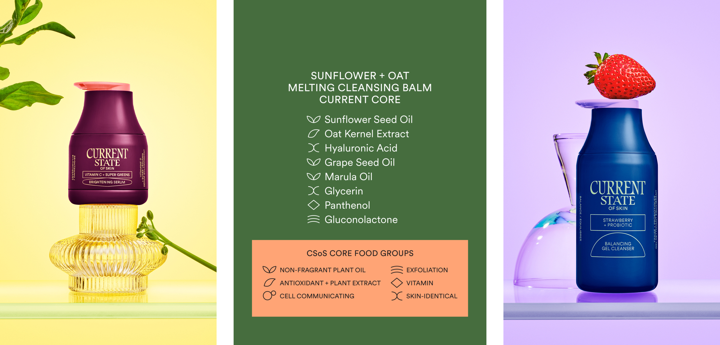
Aside from the colour system, the identity is kept pretty simple: there’s that lovely wordmark, and otherwise the typography is understated, prioritising legibility and clarity. It seems that both on-pack and online Werner Design Werks has opted for a lighter weight of LL Circular by Swiss foundry Lineto.
It’s a smart choice indeed: the geometric sans serif “marries purity with warmth and strikes a balance between functionality, conceptual rigour, skilled workmanship and measured idiosyncrasy”, as Lineto puts it, which is pretty much exactly what you want for a brand like Current State.
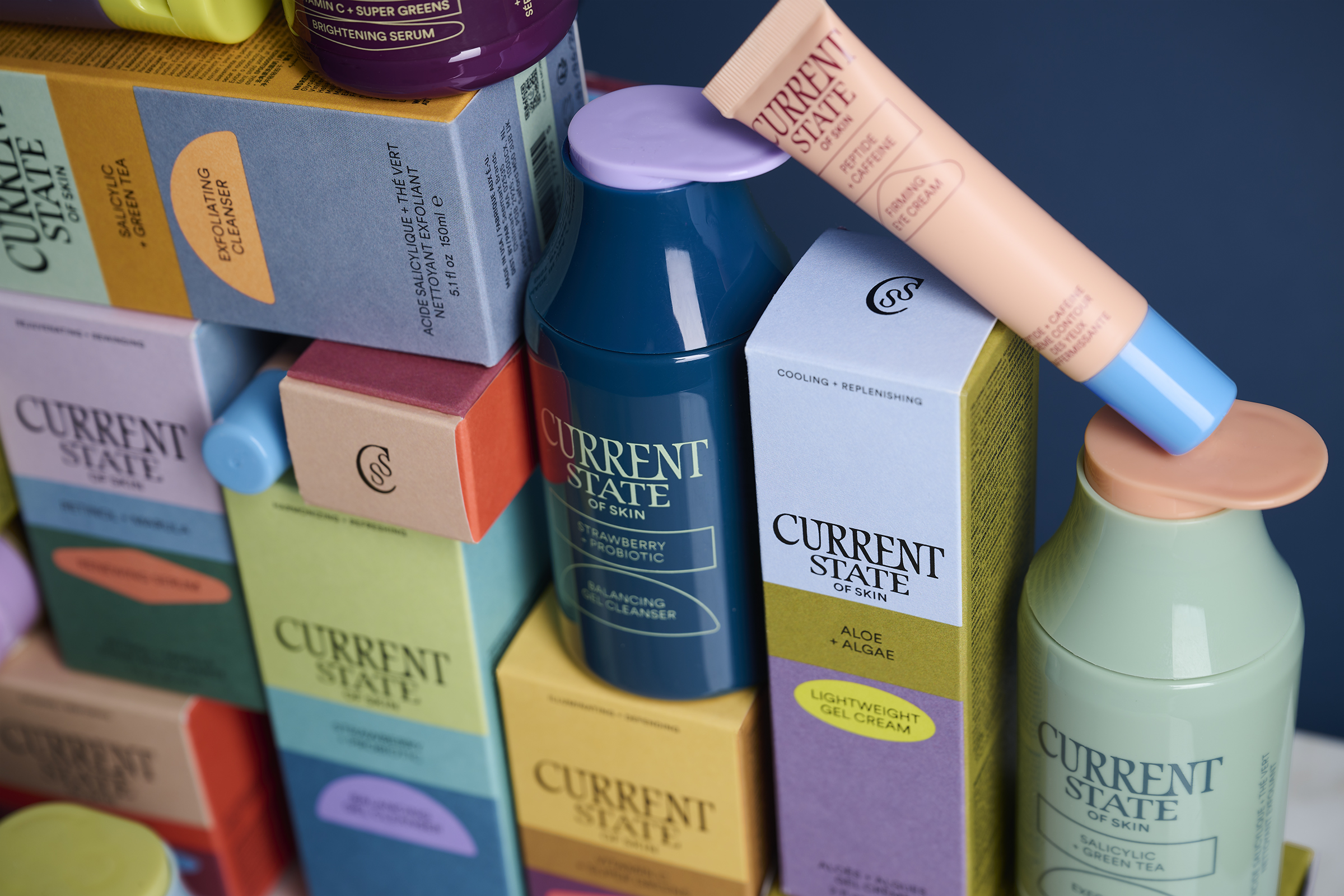
The structural packaging is also just different enough: it feels modern, and elevates what is in fact a range sold at an accessible price point to feel a lot more high end than its stocking in mass retail stores would imply at first glance.
The fun, slightly quirky shapes of the 3D packaging also work towards a branding aim we’ve been hearing a lot more about over the last few years: the power of showing products off on home shelves, as opposed to just being a standout on store shelves. There’s no doubt most people wouldn’t be shy to have these bottles and pots on show at home; they remind me a bit of a less experimental version of Seachange’s designs for Twyg.
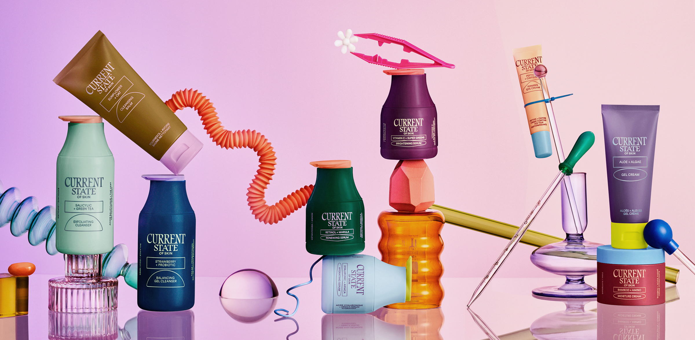
When it comes to the product imagery, the art direction is really lovely, but does run the risk of veering a wee bit too close to the sorts of very obviously AI-generated tableaux churned out on Canva et al. Indeed, if we didn’t know the products did actually exist, I’d certainly question their existence in the physical world from some of the more out-there imagery. It’s a shame how quickly AI has made us question pretty much everything we see on the internet, though, but that’s a conversation for another time and place.
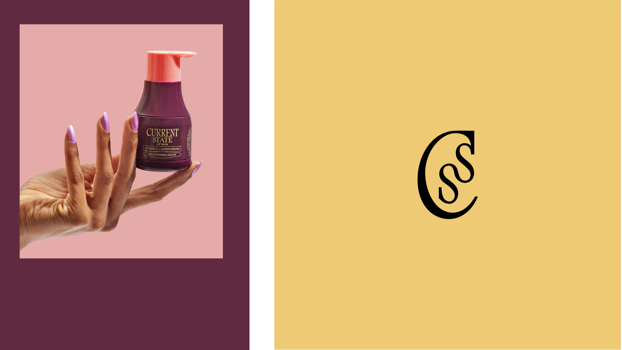
The project’s case study on Werner Design Werks’ website shows a monogram-type logo – a C with, slightly confusingly, two interlocking ‘s’ shapes snaking down inside it. I say confusingly because as far as I can tell, Current State’s initials would be a ‘C’ and ‘S’, but nonetheless it looks pretty.
And perhaps the confusion doesn’t matter all that much: from the images online (I’ve never seen the range in person as it’s only sold in the US and Canada), the monogram is barely used – instead, Current State’s wordmark does the heavy lifting here, and so it should. It’s delightful: I don’t know what the typeface is, or if it’s bespoke to the brand, but the weird conjunctions between letters and the almost fin-de-siècle-esque flourishes are sublime – a really refreshing turn for a beauty brand in that it’s unafraid to genuinely be a bit different.
