The Huntington by Base Design
Opinion by Emily Gosling Posted 15 January 2026
There’s a particular kind of challenge that crops up again and again in cultural branding – not obscurity exactly, but partial recognition. The sort where an institution is famous for one thing, quietly exceptional at several others, and yet rarely understood as a coherent whole.
The Huntington, a century-old cultural and research institution in Southern California, sits squarely in that territory. Known – if at all – for its gardens, it has long struggled to communicate the breadth of what it actually is: a research library spanning ten centuries, an art museum with nearly 50,000 works, and botanical collections spread across 200 acres.
Little of that was being communicated however. I’d never heard of The Huntington prior to covering this project – and unfortunately, neither had a lot of people – which was a key problem that Base Design (Hanbury, Murray’s Cheese, Divine Farmer) needed to address in its new visual identity and branding for the museum.
It’s a very English-sounding name isn’t it (and one that personally instantly reminds me of Huntington Life Sciences, the main target of the many strongly worded letters I wrote as a suburban child with a weird animal rights obsession…I digress. But ban animal testing). In fact, it’s a reference to Henry E. and Arabella D. Huntington, who created The Huntington in 1919 as a way of transforming their private estate into a public institution, making their vast collections of literature, art, and plants accessible “to promote the public welfare.”
The organisation continues, “By cultivating dynamic scholarship, creating innovative programs for students and lifelong learners, and sharing its extraordinary resources, The Huntington invites all on a journey of discovery, insight, and connection.”
The rebrand forms part of The Huntington’s first comprehensive branding initiative in its 100-plus-year history, driven by the institution’s “One Huntington” strategic plan.
Prior to the rebrand, the institution was known as the rather unwieldy ‘The Huntington Library, Art Museum and Botanical Gardens’. While that does outline exactly what it is, and comprises, it’s far from grabby – and paradoxically likely hinders rather than helps in terms of recognition and public understanding.
While Base Design describes The Huntington as “the jewel of Southern California”, thankfully there’s no attempt to ‘Californianise’ the brand with sun-drenched clichés or overt West Coast laid-back, shorts ‘n’ vest informality. Instead, the system balances a sense of institutional gravity with a quiet contemporary confidence – closer to the idea of a “hidden gem”, which Base uses as its core positioning. “One of one. Rooted in California. Framed for a wider world,” as the studio describes it.
![]()
Base Design describes one of the central aims of the project as to highlight The Huntington’s “360° nature as a place where nature and knowledge meet to enrich the human experience”.
The foundation of the new brand positioning and resulting design work is the idea of a “hidden gem”, says Base, “treasured, layered, quietly extraordinary.”
A new ‘H’ monogram replaces an earlier, more ornate mark that leaned heavily on botanical motifs. The redrawn version is deliberately pared back: two stylised pillars flanking a central, gem-like form.
![]()
According to The Huntington, those pillars point “one toward the past and one toward the future”, symbolising the way its collections continue to be studied and reinterpreted over time. It’s an idea that could easily become overwrought, but the execution is restrained enough to keep it grounded. The geometry is clear, the negative space does real work, and crucially, it scales cleanly – a practical concern given the institution’s push towards greater digital agility.
Typography plays a similarly important role in walking that line between heritage and forward motion.
The main typeface used for the wordmark and all other headline copy is Moulin by Commercial Type, which is based in New York and London – a contrasting sans serif with “an asymmetrical flared design with a distinctive rhythm”, as the foundry puts it. While the letterforms were influenced by “Adrian Frutiger’s underappreciated Icone from 1980”, Commercial Type continues, it also feels classical thanks to the sculptural appearance of its letters, as if chiselled into stone.
Moulin is an astute choice here. Its flared strokes and slightly idiosyncratic proportions give it a sense of materiality that nods to carved inscriptions and architectural lettering; it feels at home alongside centuries-old manuscripts and oil paintings, but doesn’t look out of place on a phone screen or wayfinding sign. There’s a lot of this sort of type around at the moment, working better for some applications than others, but it seems particularly befitting of The Huntington as an institution that’s thoroughly heritage focused but gently being dragged into the here and now.
Supporting type for larger swathes of copy is set in Messina Sans by foundry Liuzi Type, which is based in Bern, Switzerland. And very Swiss it is too: Messina is a gorgeous contemporary take on 20th-century International Style typography – clean, modernist and resolutely adaptable. In short, it’s timeless, and serves its purpose extremely well here on The Huntington brand.
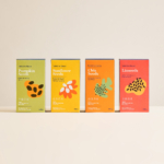
Colour is handled with similar restraint. The palette is anchored in The Huntington’s longstanding institutional green, but expanded into a broader range that Base describes as pulling from “pigment and plant life”.
Rather than rigid brand colours, the system allows for gradation and variation – hues that shift subtly, like light moving across foliage or oil paint. This flexibility is particularly effective in applications where art, archival material and photography sit side by side, allowing the brand to frame content without overpowering it.

What’s notable about the project is its ability to do a lot with a little: there’s no bombastic storytelling layer, no visual gimmickry designed to grab attention in isolation. Instead, the identity is swan-like: working blummin’ hard under a calm surface – creating connections between different parts of the institution and different functions by reducing friction and creating something holistic – a system that can stretch across signage, exhibitions, digital platforms and merchandise without losing coherence.
As The Huntington itself puts it, the new brand doesn’t change its mission or programmes, but offers “a more cohesive and engaging way to share our legacy and future goals”.
In that sense, Base’s work feels appropriately calibrated. “The challenge was not just to design a brand, but to shift perception. The brand needed to bring its richness into clearer view,” says the agency. As such, it doesn’t attempt to rebrand The Huntington as something it isn’t, nor does it fetishise its history. It simply gives the institution clearer tools to articulate what it has always been.