Yes we Makan
Opinion by Emily Gosling Posted 19 February 2026
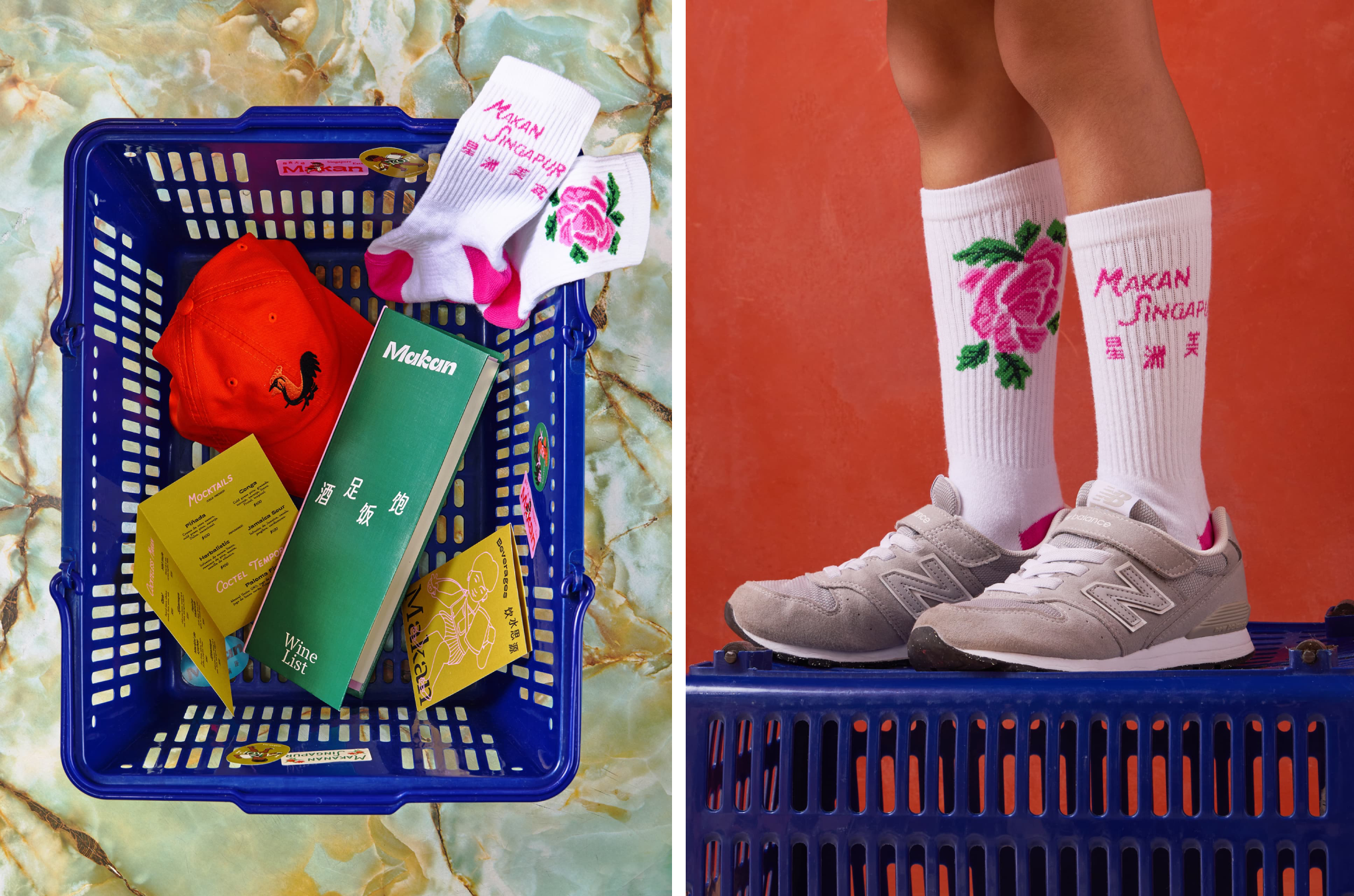
The chintzy rose; the bright but slightly dusky pink; the multifarious wordmarks; the apparently haphazard, painterly decorative flourishes; an approach to letter sizing that’s borderline unhinged – the branding for Makan has the potential to be all kinds of terrible.
Instead, it’s absolutely the opposite, thanks to the deft hands at Foreign Policy (Park Bench Deli, Project Send, Critical Mass).
Makan is a Singaporean restaurant based in Mexico City that combines the two cultures weirdly seamlessly. That’s thanks in part to its founders, Mexican Mario Malváez and Singaporean Maryann Yong.
Their paths crossed in Singapore, and Makan was eventually born thanks to their shared “drive,” according to Makan, “to dive deeper into Southeast Asian cuisine and take their experience beyond borders.”
Transcending borders – indeed, the art of taking two things and creating a totally new, third whole in that Brion Gysin/William Burroughs cut-up way – feels beautifully analogous to what Foreign Policy has done with the branding for Makan: never “leaning on clichés,” as the agency puts it, but instead “translating culture… The identity begins with vernacular”.
That means that it never defaults to tried and tested, sad, boring, and frankly largely inaccurate visual signifiers of Asia – which makes sense, considering that Foreign Policy itself is from Singapore.
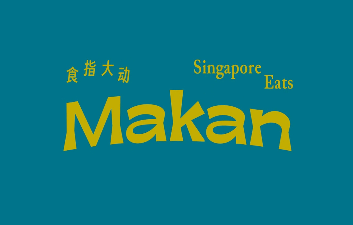
As such, the Makan identity takes its cues from more subtle, yet pointedly specific influences – the real life, living and breathing elements of Singaporean and Mexican life – the everyday objects, materials, colours and patterns that feature in and act as backdrop to quotidien existence.
“From Singapore, that means utilitarian ceramics, shophouse typography, market packaging, traditional floral wedding trays, rooster bowls,” Foreign Policy explains. “From Mexico, the same lens applies – street markets, hand-painted signs, tiles, colour-blocked walls, domestic patterns, and the visual confidence of public space.
“Makan doesn’t try to look like every other global restaurant. It stays grounded, specific, and legible – Singapore, spoken with a Mexican accent.”
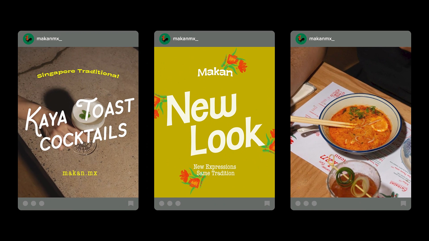
If the elements that inform the identity sound manifold and sprawling, that’s because they are – and all for the better as the sum of many parts that make a decidedly playful but resolutely classy whole.
That means the colour palette is loud and proud: vivid bubblegum pink, fire hydrant red, deep green-turquoise, mustard yellow.
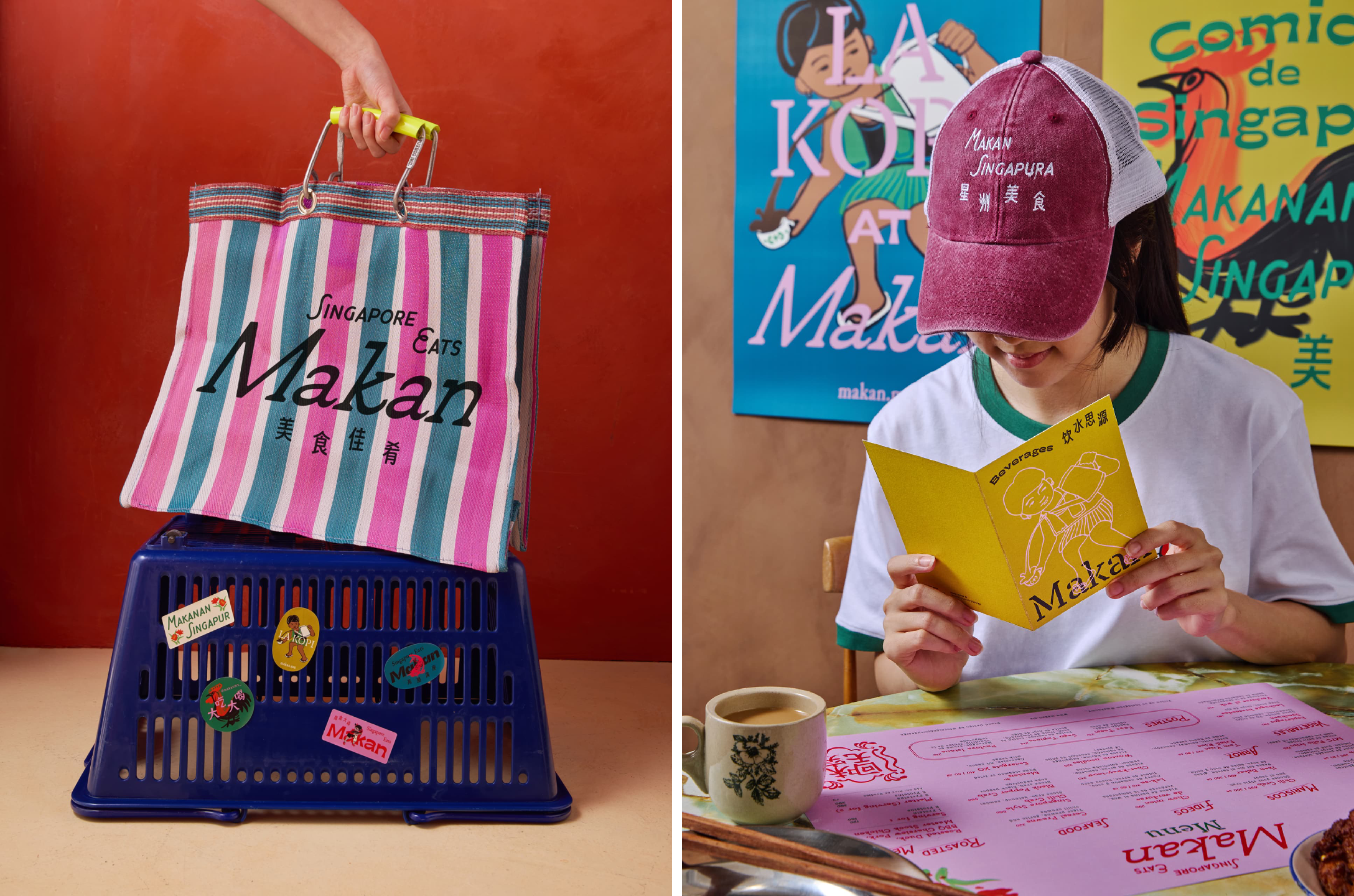
It means that illustration is expressive; it expands or contracts depending on the touchpoint or situation – sometimes gentle but defined linework; others painterly depictions of a proud rooster; sometimes more decorative and pretty. Yes, pretty – not a word often used in a positive sense to describe brand design (a lot like the much-maligned ‘nice’ as an adjective) – but here, meant in a way that’s pure, and positive.
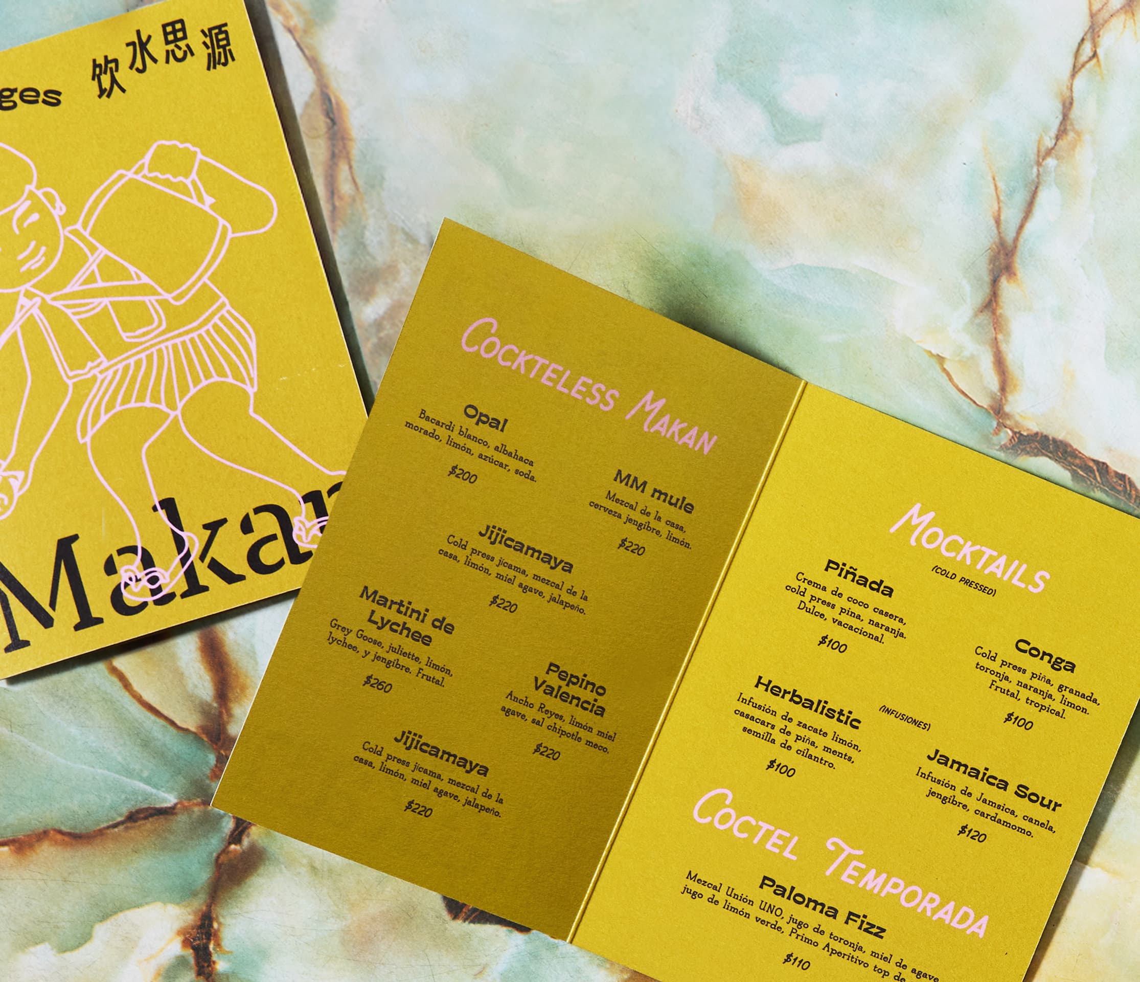
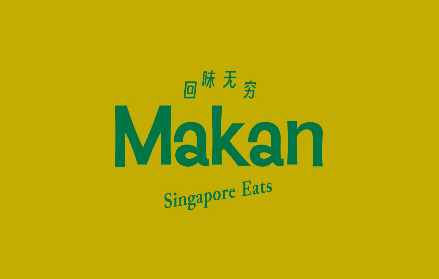
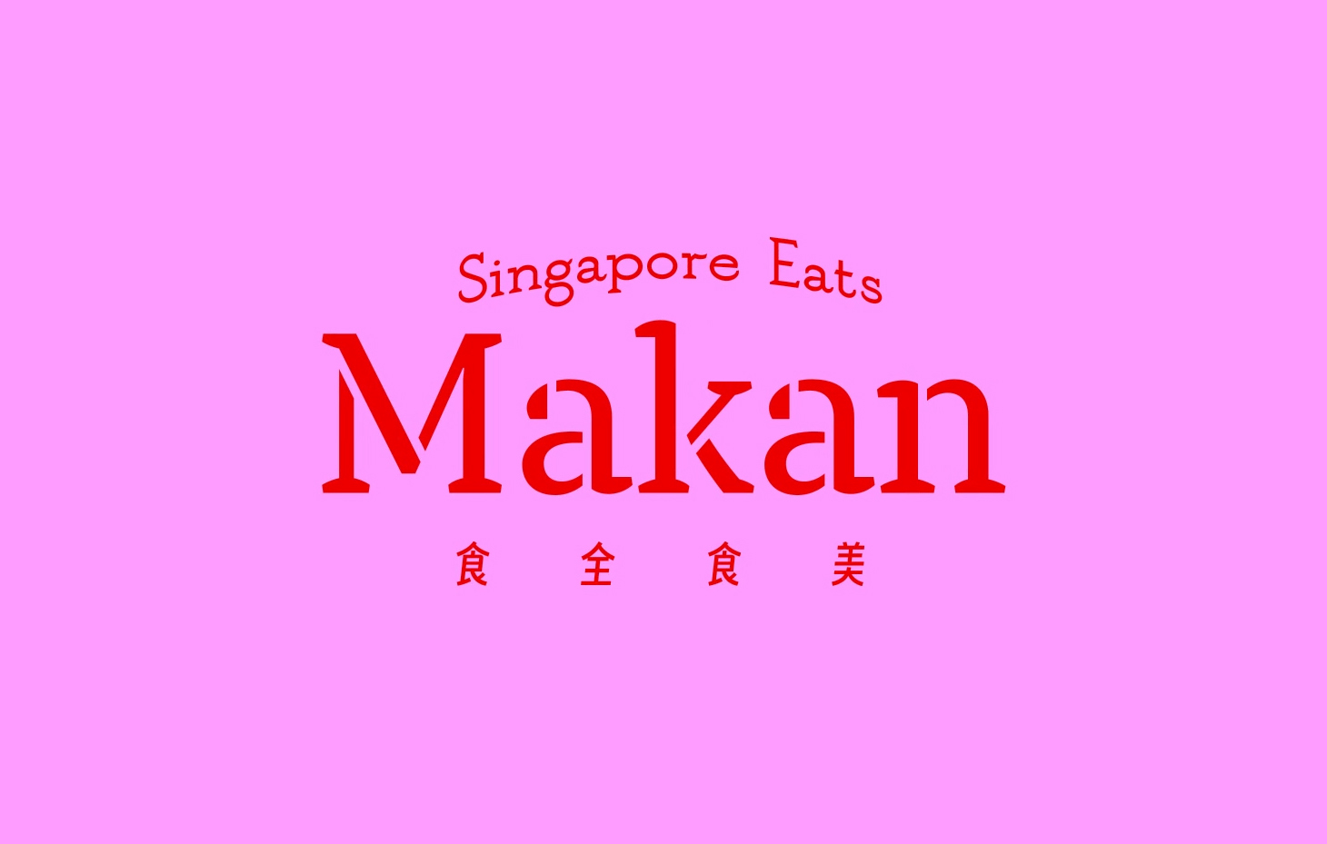
Likewise, the approach to typography eschews all inherited wisdom about any sort of singular, unifying brand mark – instead, wordmarks and logos are set in all manner of fonts and colourways that are hugely varied in style.
Rather than diluting the identity, however, this variation only strengthens it – and shows how a strategically rigorous tone of voice for a brand, especially something like a restaurant, can – when done well – transcend the inherited wisdom of using one logo, one brand font, and so on.
Throughout the brand, seemingly endless fonts make an appearance: there’s the old classic American Typewriter; Smiley Sans by Shanghai-based Atelier Anchor; Moche from Toulouse and Paris-based foundry Pépite; the sublimely odd letterforms of Nanook, designed by Lucas Le Bihan; Adobe font Chippewa Falls – a real masterstroke here – Makan makes it look actually quite nice, where to me at least, this font seems almost universally vile. The same can be said for another Adobe font used here, Baileywick Gothic – usually looks terrible, but here, somehow it works. How on earth Foreign Policy selected these typefaces, I have no idea, but they’ve managed to do an excellent job.
Completing the stable of fonts is open source font Junicode; TT Tricks Stencil by foundry TypeType; and finally, Getai Grotesk, designed by Sylvester Tan and released by foundry Death of Typography– a display typeface inspired by the unique calligraphic Chinese characters found in Getai (歌台) culture. Getai sounds absolutely fascinating: unique to Singapore, it’s described as a form of popular, boisterous live street-show stage performances primarily held during the Hungry Ghost Festival (!).
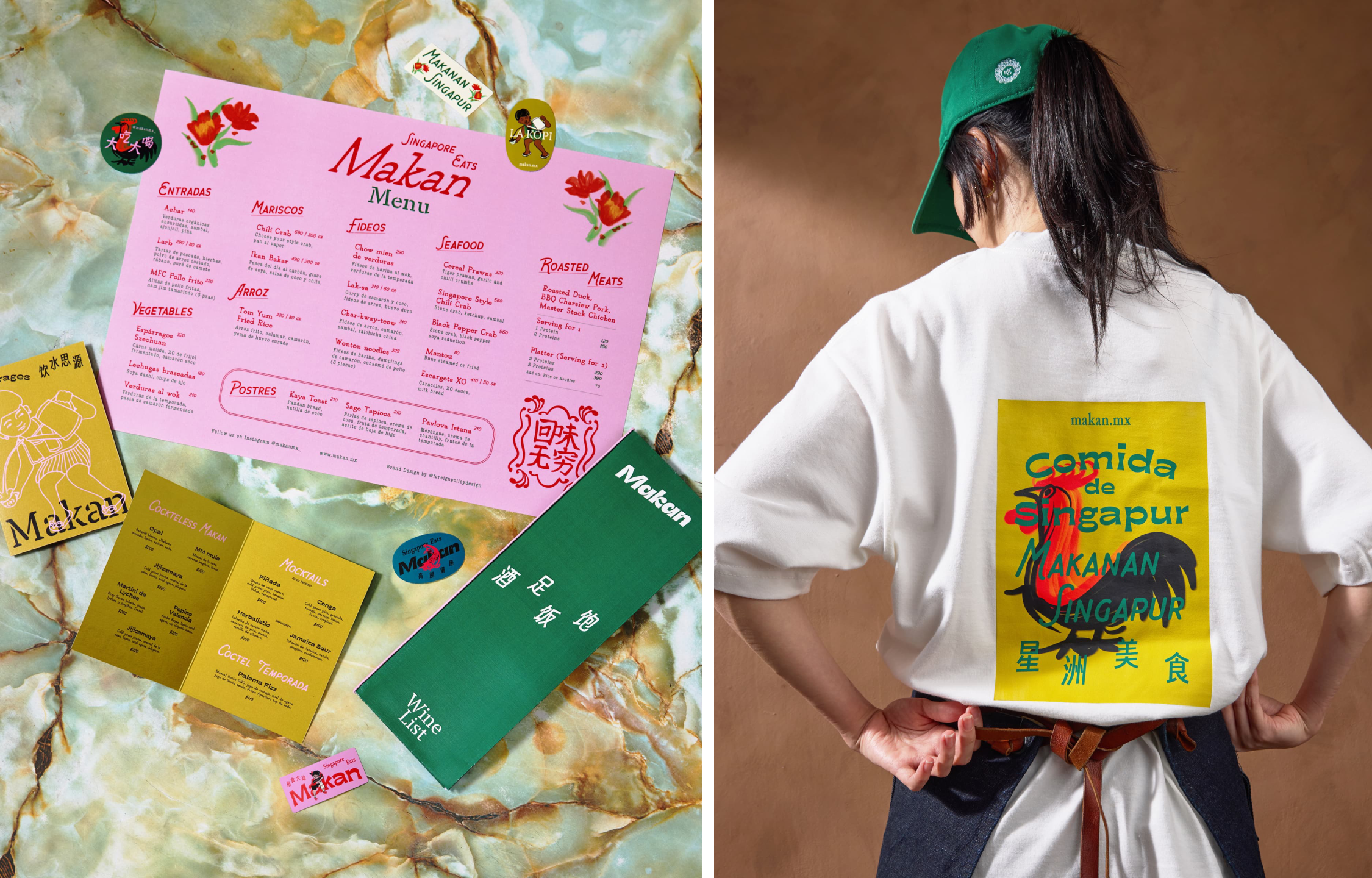
It could all so easily look cheap and tacky – instead, it’s quite the opposite.
More often than not, those things that ape hand-wrought – the depressing regularity of B&M-baiting scripty serifs imploring us to live, love, and laugh; the faux-naïf stylings of some cafe in Dulwich luring in the lucrative gaggle of yummy mummies and their balance bikes and their all terrain buggies and their effortlessly chic silhouettes, post-partum be damned – each and every one feels slightly hideous, in its own (ironically) unique way.
All such facsimiles of everything that’s crafted by actual human hands – that’s artisanal but parochial, ‘pauvre’ but aimed squarely at the rich – are usually depressingly predictable, so obviously mass-produced or patronising in their pretence of being something they absolutely are not.
It could feel everything everywhere all at once; and while there’s no doubt it’s joyfully, unabashedly maximal as all hell, but it’s never, ever thoughtless, throwing everything at something and hoping for the best. Instead, the colours are so thoughtfully paired, the illustrations so well placed, the typography combinations so skilful but it’s totally gorgeous with it.
