CX by Moving Brands
Opinion by Richard Baird Posted 21 February 2012

CX, formerly Cloud Experience is a provider of cloud based storage that, much like Dropbox allows you to upload and sync content across multiple devices. As part of a rebranding exercise, CX approached international brand development agency Moving Brands, to create a new name and visual identity solution that would move them away from the generic and ‘more commoditized companies’ and establish them as a more social proposition.
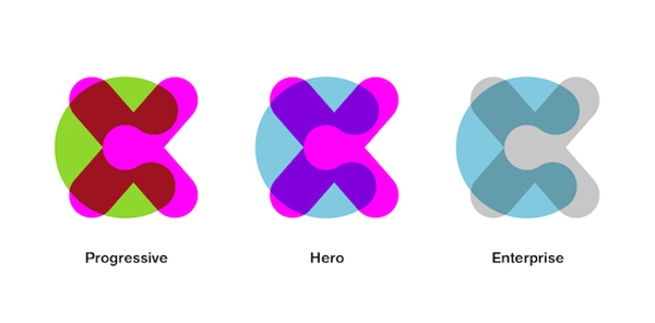
“Cloud Experience had already invested heavily in the domain name, so a thorough naming process working within these limitations led to the solution of ‘CX.’ The aspirational and user-focused strap line “Cloud to the Power of X,” suggests an offer that encompasses all you expect from the cloud, magnified to the infinite power.”
“For this technology led but consumer-focused organization, a believable, human Brand Narrative was critical. ‘Content comes to life’ reflects CX’s ability to bring simplicity and excitement to the way we share and store content in a moving world. Defining Behaviors such as ‘geektastic,’ ‘simple’ and ‘obsessive,’ gave shape to the character of the business and how the experience they deliver comes to life.”
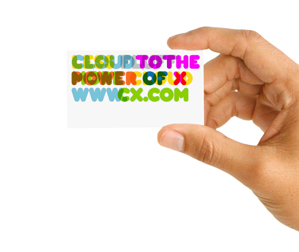
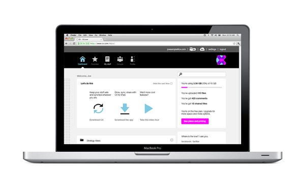
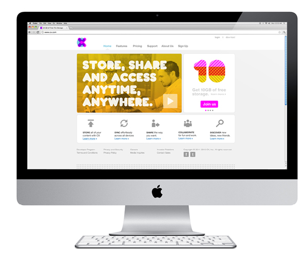
“The visual identity system was driven by the important relationship between the copy and graphic language. The vibrant core assets are complemented by a library of color and pattern elements. A bespoke typeface was created that includes a built-in open-type iconographic system. The unique graphic language is supported by a tone of voice and messaging system built of the Brand Behaviour and Brand Character attributes. A system of curated photography completes the system.”
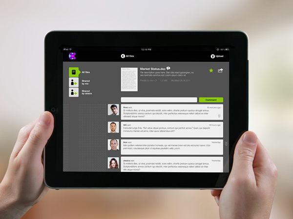
“The UX underpins the products ‘social’ credentials, and was designed to be scalable, with added functionality and user experience to be implemented as the business matured.” – Moving Brands
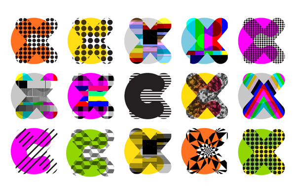
The inflated weight, rounded terminals and use of transparencies across a contemporary monogram establishes a clear sense of accessibility that, juxtaposed across a broader and more geometric set of assets delivers a stylised and more consumable representation of technology that feels responsive and experience driven.
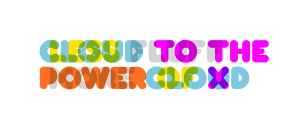
The accompanying and proprietary typeface appears a little familiar and perhaps conventionally ‘social’ but has some nice little quirks and succeeds in delivering a bold and engaging aesthetic to the simple functionality of storing and retrieving data.

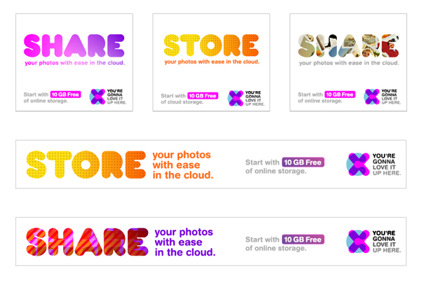
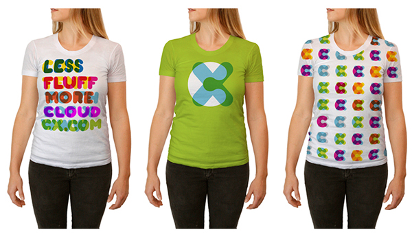
The iconography is easy to understand and sharper than the logo-mark and introduces an appropriate contrast and divide between style and function while a vibrant and energetic colour palette in conjunction with transparencies and miss-aligned overlays creates interesting layers of information across the collaterals.
The result is a far more people-centric and tangible repackaging of a predominantly invisible commodity that compared to the stark functionality and interfaces of its competitors should have broader appeal.
