An act of restitution
Opinion by Emily Gosling Posted 26 March 2026
Caffè Nazionale is a historic bar on Piazza Libertà in Arzignano, a small city in Veneto, Italy, which was the social heart of the town – a place for conversation, card games, billiards, and the daily ritual of an espresso at the bar – for generations, before falling into closure and decline.
Having first opened in the 1950s, the Caffè closed in around 2018 but in May 2022, the local administration launched a revitalisation project with the goal of preserving the Caffè’s historical character.
Its relaunch was driven by a partnership between entrepreneur Marco Mettifogo, pastry maker Andrea Poli, and architecture practice AMAA – whose cofounder Marcello Galiotto is himself a native of Arzignano.
It was Galiotto who approached Bolzano-based Studio Mut (Inside Lottozero, Inn Situ, Innsbruck International) with a pretty open brief to create this absolutely charming brand identity, which so beautifully expresses the idea at the heart of Caffè Nazionale’s reopening – an act of “restitution, giving the café back to the people it belongs to,” as Studio Mut founder Martin Kerschbaumer puts it.

Now open seven days a week from 7am until midnight, with a coffee at the bar costing just one euro, that idea of being absolutely for the people is ingrained across absolutely everything – and captured in the copyline or “motto”, as its creator Studio Mut puts it, that underpins the new look and feel: “Se magna, se beve, se sta ben,” which translates as “You eat, you drink, you have a good life”.
The typographic foundation of the identity is drawn directly from the Italian streets around the dazzlingly beautiful 19th century piazza on which Caffè Nazionale is sited: references include panini vans, parking signs, salumerie food store fronts, barbershops, laundries, pizzerias, and car repair workshops – it’s all about that vernacular approach to ensure Caffè Nazionale’s identity feels not like the launch of a snazzy new Instagrammable brand/‘destination’, but something that’s always been part of the fabric.

Dialect phrases drawn from everyday Veneto speech appear throughout the identity system, reinforcing the sense of localness without ever tipping into the kind of folksy nostalgia that can easily become sickeningly twee.
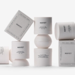
These typographic influences were converged into a bespoke handwriting font created by Berlin-based artist and illustrator Stefan Marx with Swiss type foundry Dinamo. The loose, sprawling, faux-naif letterforms could easily, in the wrong hands, veer into slightly daft, childish territory. But these are absolutely not the wrong hands: Studio Mut’s beautifully human, yet still irrefutably classy identity is deft in knowing when to let things run wild and when to gently pare them back. As such, this lettering just works.
The secondary font is, wisely, far more utilitarian: Helvetica Neue Medium provides the much-needed quieter, more neutral counterpoint to the handwriting typeface, used for things like larger swathes of supporting information – the admin stuff, if you like – where the vernacular lettering packs the personality.
The entire brand identity is carried by minimal colouring, another reason that elements so characterful they’d likely be far too much in other settings, words so well. Just black, white and red are used for absolutely everything – a palette that boasts the blunt but charismatic confidence of a painted shop sign.
In a slightly unusual turn for an eaterie, Studio Mut has implemented a brand mascot: the griffon, or “grifone” in the creature’s native tongue here. Well less implemented, more used a figure that’s long been part of Caffè Nazionale and given him his due place as a central part of the identity.
The mythological creature “combining the body of a lion with the wings of an eagle and the tail of a snake” stands on a column outside the café and has long been a fixture of the Piazza Libertà. “It used to be poorly drawn – surrounded by three stars – on the door of the former caffé,” says Studio Mut. “We saw in it the perfect starting point for a mascot: an image of the place, already embedded in collective memory.”

![]()
Stefan Marx was responsible for reinvigorating the griffin, creating a newly more everyday character that shakes off its heritage as a heraldic symbol and reimagining him as a regular at the bar.
Rendered in Marx’s distinctive wobbly black linework against stark white backgrounds, the griffin gets up to all sorts – carrying an espresso, sitting with a newspaper, moving through the ordinary rituals of the café day, and evolving throughout the design system to give the whole thing a real sense of vitality.
There’s a gorgeous contrast here between a palpable sense of energy and controlled clarity – it’s an absolutely unified brand across everything from signage to packaging boxes, sugar sachets, crockery, napkins, stationery and more – but one that’s effervescent with beguiling tensions. At times, it’s deliciously unruly; yet it never veers from the sophistication of classic Italiana.
Studio Mut’s skill here is in creating a brand identity that doesn’t really feel ‘designed’ at all; instead, it bears a sensibility of the accumulated visual language of a place that has always been exactly this way.