Goofy, playful and knowingly a bit silly
Opinion by Emily Gosling Posted 31 March 2026
Design systems are often spoken about in terms of those moments of ‘surprise and delight’, but often, there’s little either surprising or delightful to be found.
Blurr Bureau’s new brand identity for Yes! Apples, however, is so brimming with surprise and delight that those moments become the entire timeframe here: the Easter Eggs absolutely abound here, for the brand design nerds who fawn over Standards Manuals and the everyday grocery shopper alike. It’s a beautiful thing to witness: truly Smile in the Mind after Smile in the Mind.
Yes! Apples is described as a collective of small, family-run orchards in New York which blends “upstate craft and downtown excitement,” according to Blurr Bureau (Society de la Rassi).
It’s an interesting premise as a branding project: we rarely think of fruit in terms of ‘brands’ competing with one another – varieties, sure, like Gala or Red Delicious – but not, say, Tango or Fanta.

And that was at the root of one of the main challenges presented in the design brief: to not only transform “a forgotten fruit into (arguably) the best snack in existence,” but to “turn Yes! into a nation-wide household name that proved to retail buyers that branded produce could actually move product”, says Blurr.
“Apples have been around forever – in history books, pop culture, every lunchbox. Yet most shoppers see them as boring commodities, and for buyers, too easy to white-label,” the studio continues. “Could we bring apples back into the cultural zeitgeist? Could we break through ubiquity to prove New York-grown apples were better than any other?”

It seems to be a resounding yes, in answer, fittingly. Indeed, Yes! Apples couldn’t be more New York if it was Lady Liberty herself, feeding a subway rat dollar-slice pizza and yelling “I’m Walkin’ Here!” at a yellow cab, being driven by all of The Ramones, in the back of a shot in The Godfather.
But unlike that protracted sentence, Blurr’s branding takes everything that’s archetypically New York – even leveraging no shortage of cliches – and truly elevates them into a melange that celebrates the State in ways that are both overt and obvious, and more subtle.
Just look at the names of the colours in the brand’s new palette: Big Apple Red; Grand Central Green; Upstate Olive; Baseball Blue; Liberty Green.
However, what’s really smart here is that Blurr has seamlessly married these shoutier ‘I AM FROM NEW YORK’ aspects with wittier, quieter signifiers. And, crucially, with tropes that all come back to what Yes! Apples actually is, and the products themselves – their oft-forgotten “superfruit health benefits”, as Blurr puts it, things like their fibre content, their status as a genuine ‘whole food’, the fact apples are a readymade, easily carried, brilliantly convenient snack.
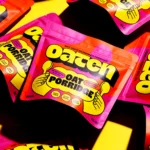
Those product-led promises are conveyed largely through some clever riffing on those tiny, but often rather gorgeously designed PLU stickers, which carry short copylines around things like flavour, fibre content, ‘naturally hydrating’, ‘low glycemic’, and so on.
These stickers inspire the entire graphic system, acting as frames, illustrative flourishes, functional holding devices, and more; acting as the more busy, outwardly consumer-facing aspects of the identity.
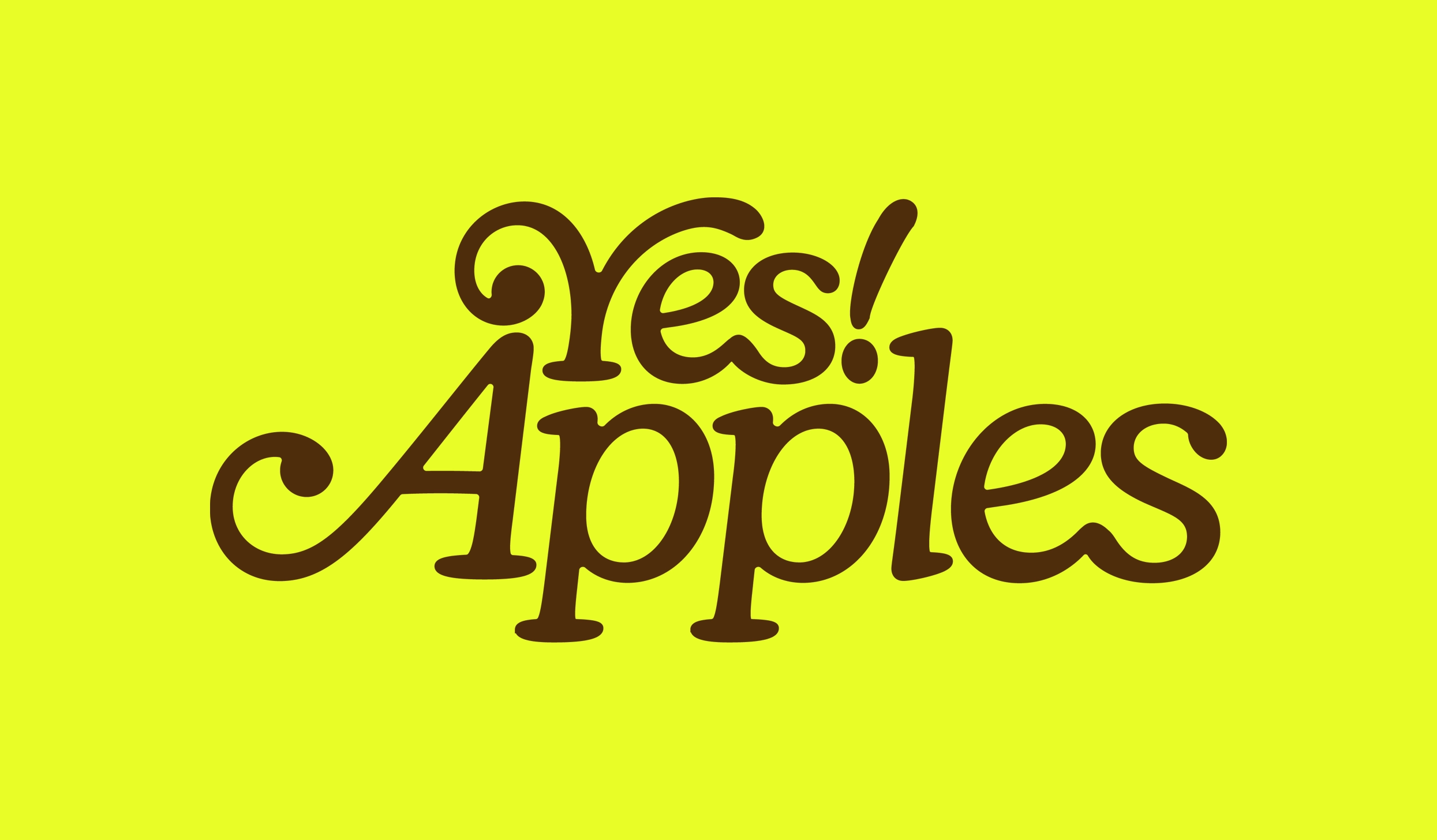
The absolute masterstroke to me, however, is that sublime wordmark and logo: lettering set in Fraunces by Undercase, and Old Style “wonky” font as its creators have dubbed it, and an overt homage to Ed Benguiat’s iconic Bookman Swash for ITC – best known as the “Thank You For Shopping With Us” font that forms a vernacular typographic backbone to all things grocery-related in North America.

The wordmark is superbly flexible, and looks just as great as the full Yes! Apples wordmark as it does when truncated to ‘Yes!’ and contained within a simple apple-shaped frame.
It’s just so goofy and playful and knowingly a bit silly, yet still manages to present a cohesive and confident brand within a perfectly unified system – no mean feat, since all this could so easily tip into the territory of being too infantile and Early Learning Centre-ish.
The main other typeface used as a brand font across most applications aside from the wordmark and longer swathes of copy (which uses Standard by Swiss foundry Grilli Type) is Perfektta by Prague-based foundry Displaay in its Black and Regular weights.
The whole thing brings together some of the most celebrated design tripes of the last century and some of the most recognisable, yet underrated. There’s the riff on classic New York plastic carrier bags in the type, the homage to Milton Glaser’s iconic I <3 NY, the reverent take on underappreciated design classics – the humble fruit sticker.
Blurr terms the aesthetic “eerily nostalgic” with its “Schoolhouse Rock yellows and browns, your favourite middle school teacher’s tone of voice”, as the studio terms it. But it feels like a lot more than that: it’s faithfully cliche-ridden in the best possible ways, it absolutely answers the brief and then some.
Whether or not you’ve even been to New York, let alone appreciate those multifarious little design cues, it’s all just really gorgeous – you can’t help but smile with an identity like this.