Makebardo’s charming illustrations for Cairo cafe/music venue E11VN just about rescue a rather hideous brand name
Opinion by Emily Gosling Posted 21 July 2026
It’s never fun being negative about a project – it’s far more gratifying to show really great work, genuinely exciting or useful brands and organisations – and get under the skin of what makes them so.
Obviously, a fair bit of this comes down to subjective taste; taking our own experiences and interpretations and cultural backgrounds and personalities and all that into the conversation. And as such, there’s no doubt there’s some good stuff here, but I struggle to get past the (in my opinion, at least), very very very terrible name of this brand: E11VN.
It looks like a Leytonstone postcode. Or a number plate. Or a knock-off perfume, the sort of thing sold by those shouting men who manage to somehow hold court outside American Candy shops on Oxford Street, surrounded by excitable plants and promising us a “steal”, or a “deal”, or the “sale of the century”.
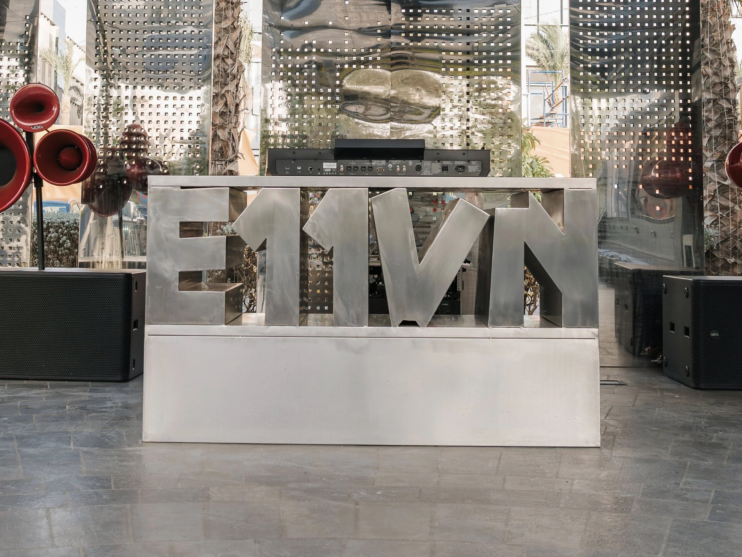
 It’s not only an irritating combination of uppercase lettering and numerals, as well as that rather 2010-ish trend of skipping out vowels for no good reason – but it’s also just ugly to look at. It’s all angles and confusion. It took me wayyyyy too long to realise it’s probably just pronounced ‘eleven’, but honestly who knows. Maybe the building is number 11? It’s really anyone’s guess.
Or maybe I’m in the wrong here, as it seems E11VN isn’t an unusual moniker: in a bid to find the brand’s website, I’ve discovered a California-based media agency with that name, as well as a clothing brand which sells things like t-shirts with words like ‘Manifest’ written on them, a fitness ‘performance training’ platform (just $79 for a two-day online plan!), and a sportswear company. Perhaps I’m just being overly grouchy – there’s clearly something in being called ‘E11VN’, otherwise surely all of these businesses would be called something else, right?! Surely.
The E11VN we’re talking about here however is a cafe and music venue sited at a newish development in Cairo, Egypt, called The Drive by Waterway (which rather hideously bills itself as a “strikingly exciting new concept that transforms the traditional notion of a drive-thru, into an innovative food and beverage hub”. Call me jaded, but isn’t that just basically a load of caffs, with more cars? I’m struggling here.
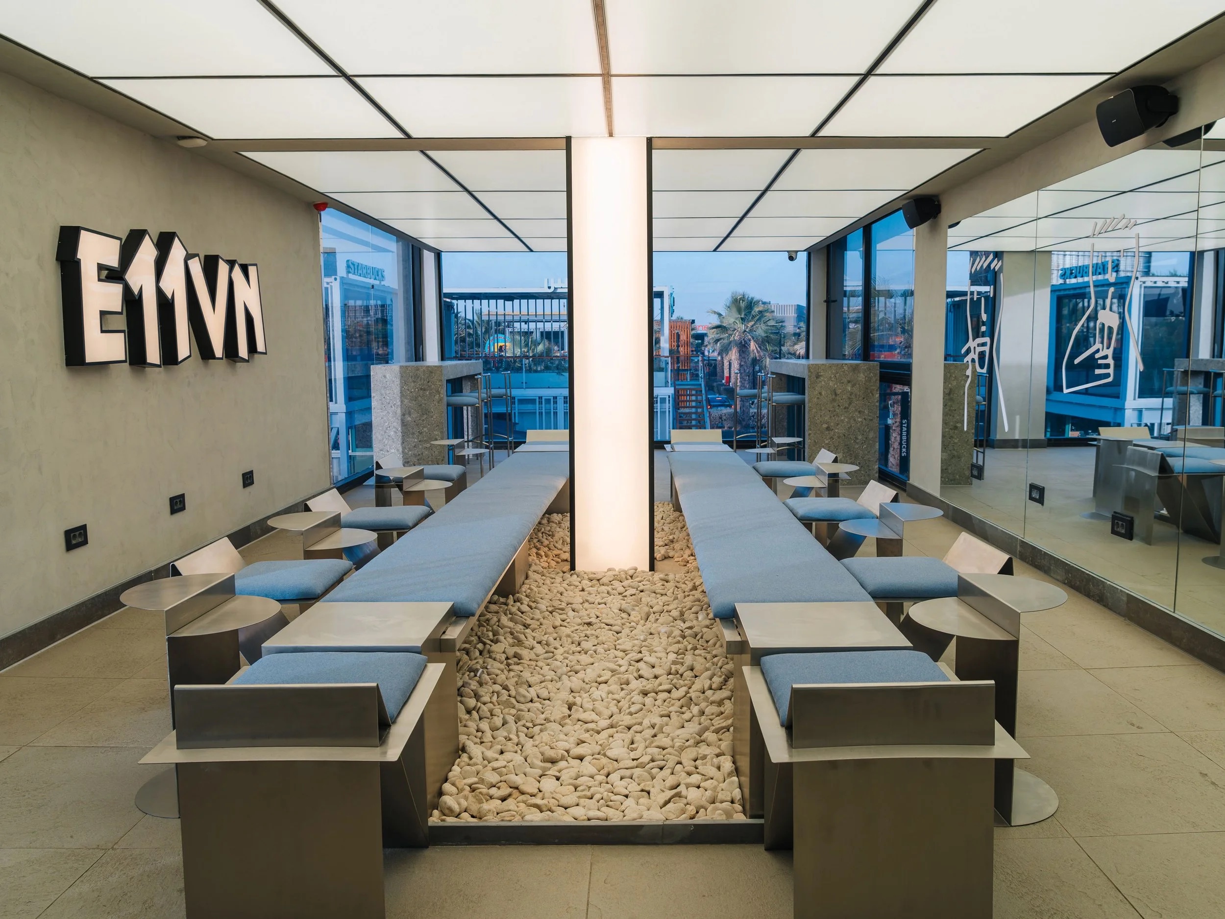
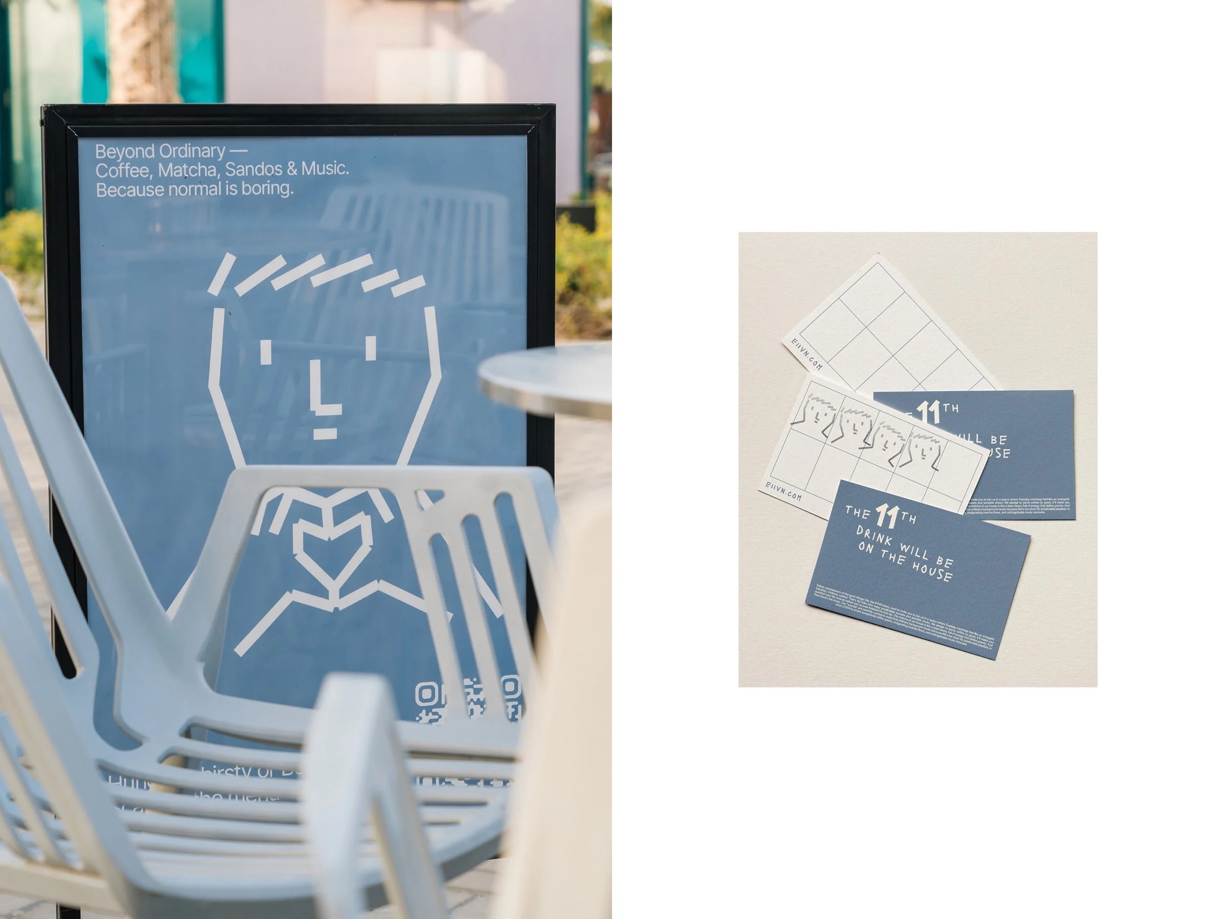
Where I’m struggling the most, however – and possibly the thing that has clouded my judgement rather unfairly over this whole project – is the way E11VN insists on describing its offer: “Beyond Ordinary — Coffee, Matcha, Sandos & Music”. Sandos. Really? Sandos?
It’s very hard to get beyond anyone using the term ‘sandos’, which I can only assume means sandwiches, in the parlance of the sort of person who tells everyone else they’re ‘quirky’, or wants to do things like ‘silly hat day’ at work, and goes to indoor crazy golf/axe throwing venues/The Greatest Showman-themed bottomless brunches. As food goes, I’d argue sandwiches are among the least ‘beyond ordinary’ meals you could possibly imagine.
The use of the terms ‘sandos’, and the name E11VN, then, are undoubtedly the two elements of this whole thing that piss me off the most about this brand. And it’s likely that neither are the fault of Makebardo (Still Waters), the New Zealand design agency tasked with creating the E11VN brand identity.
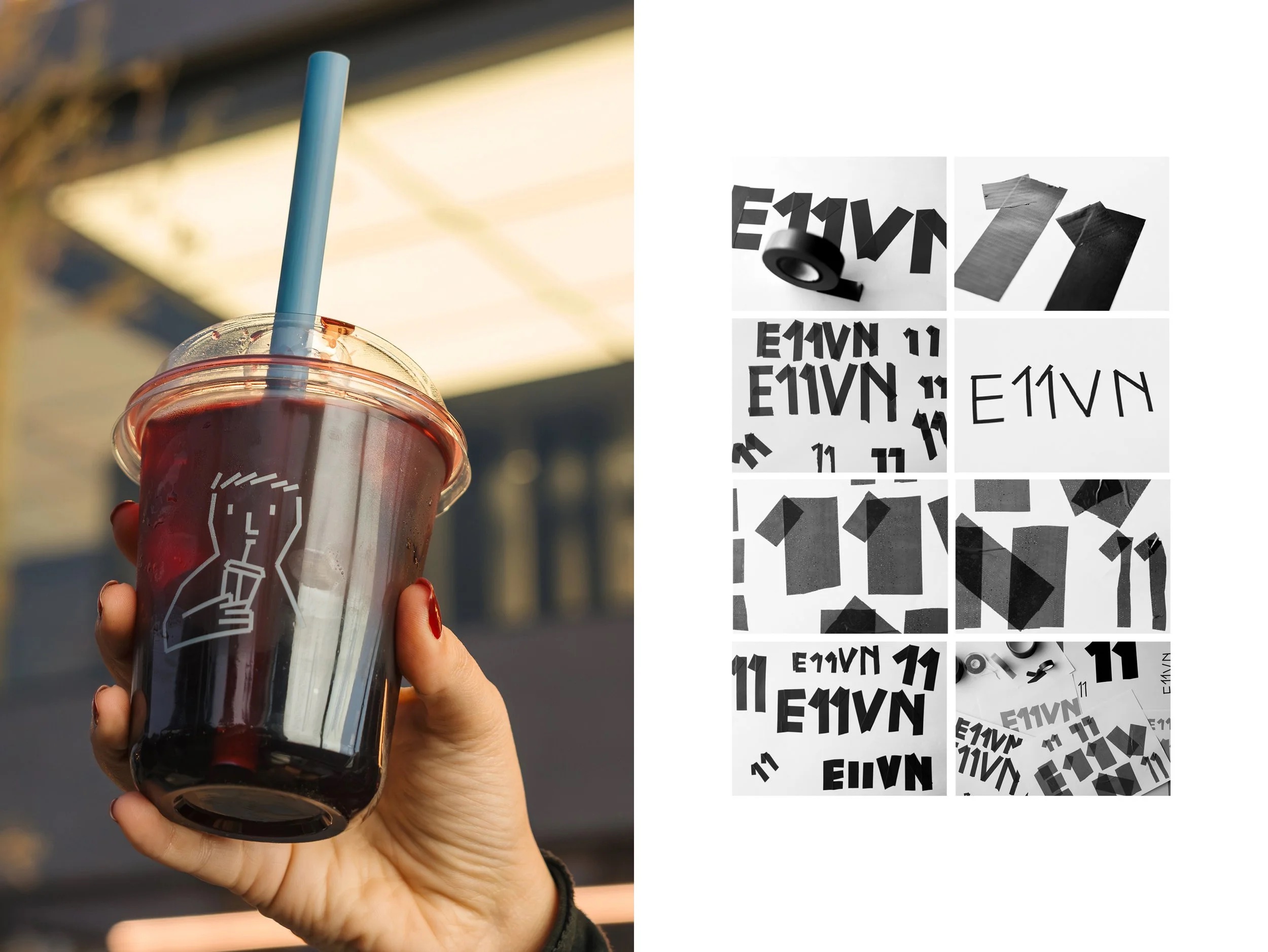
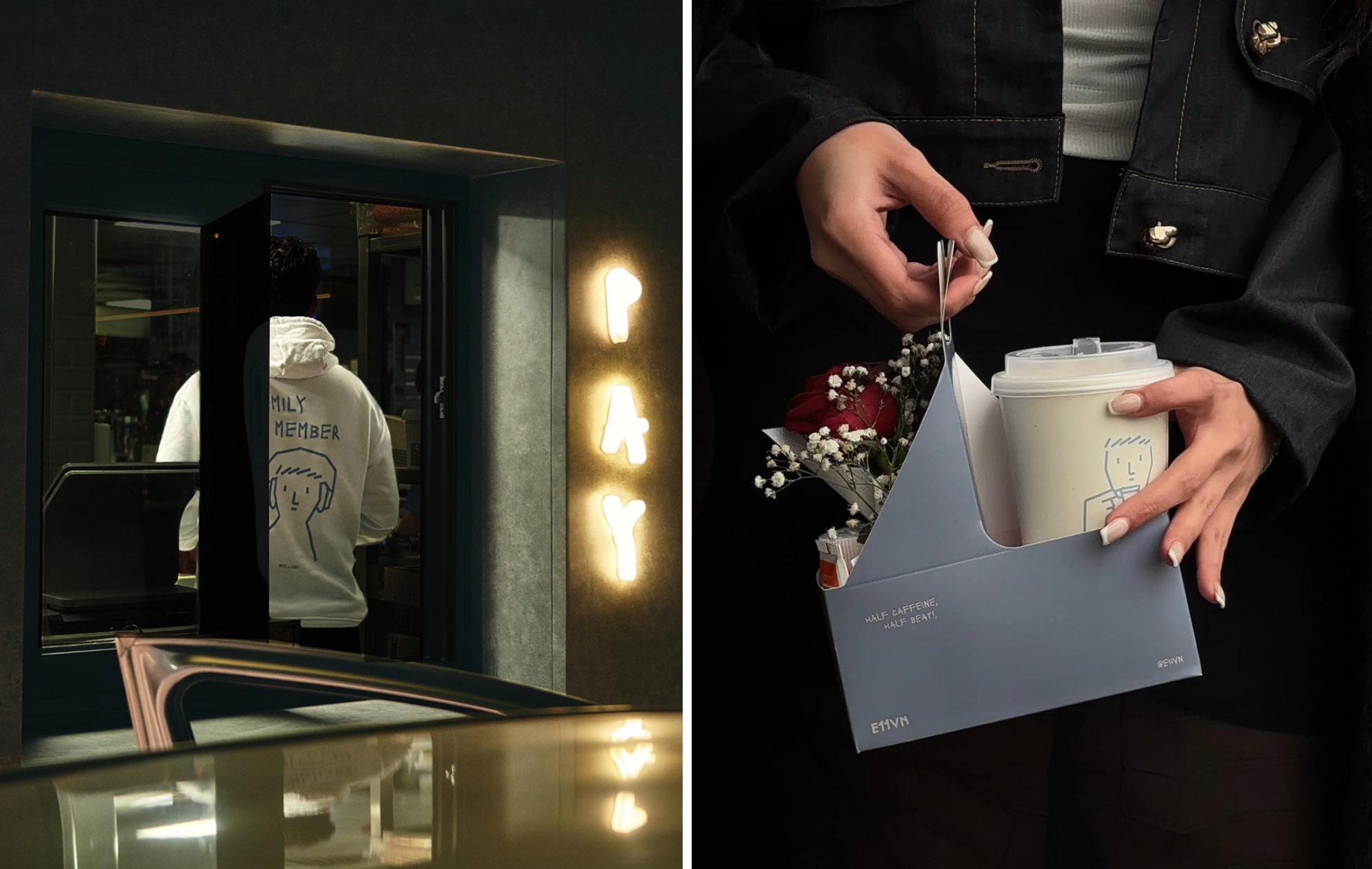
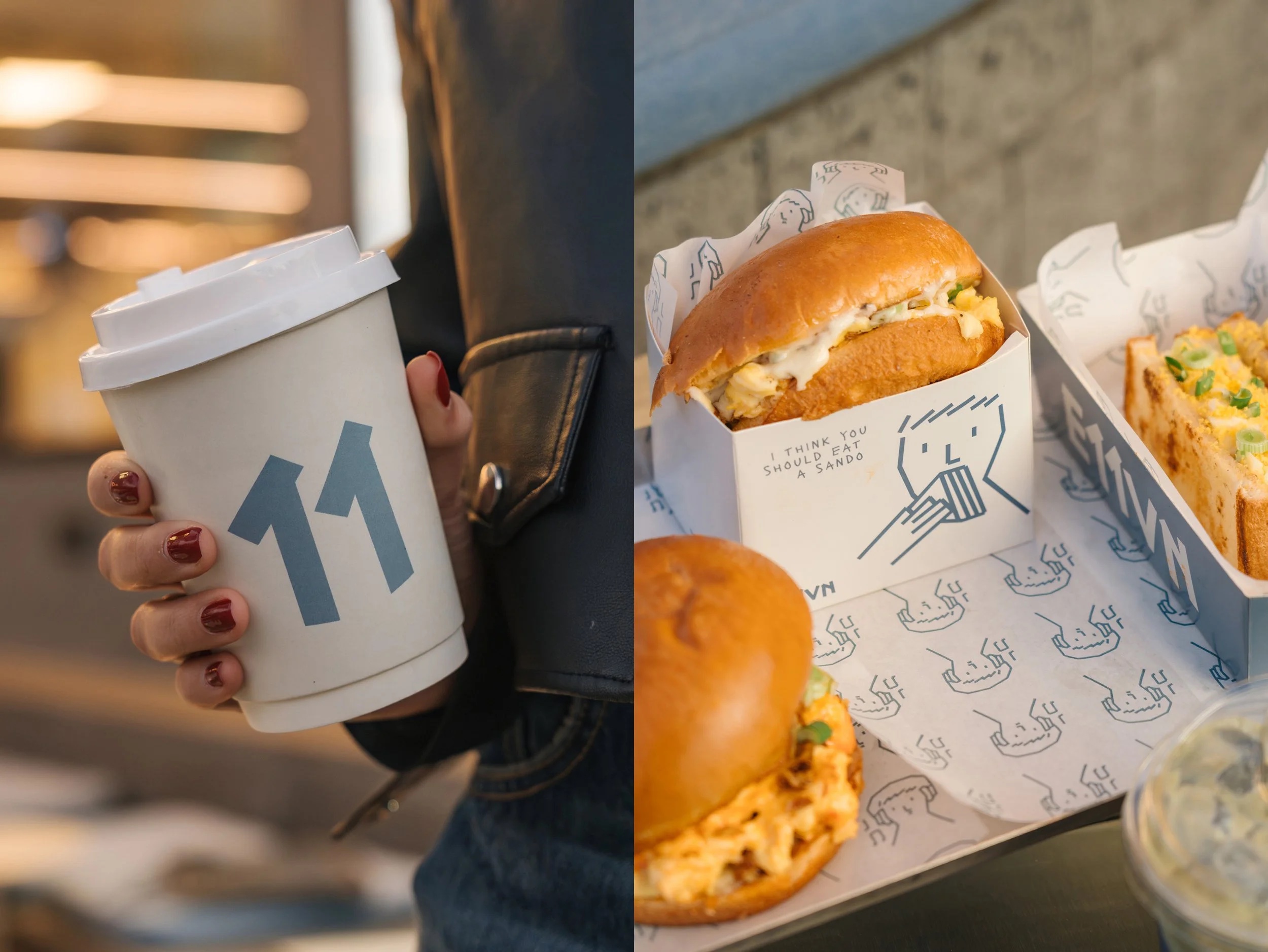
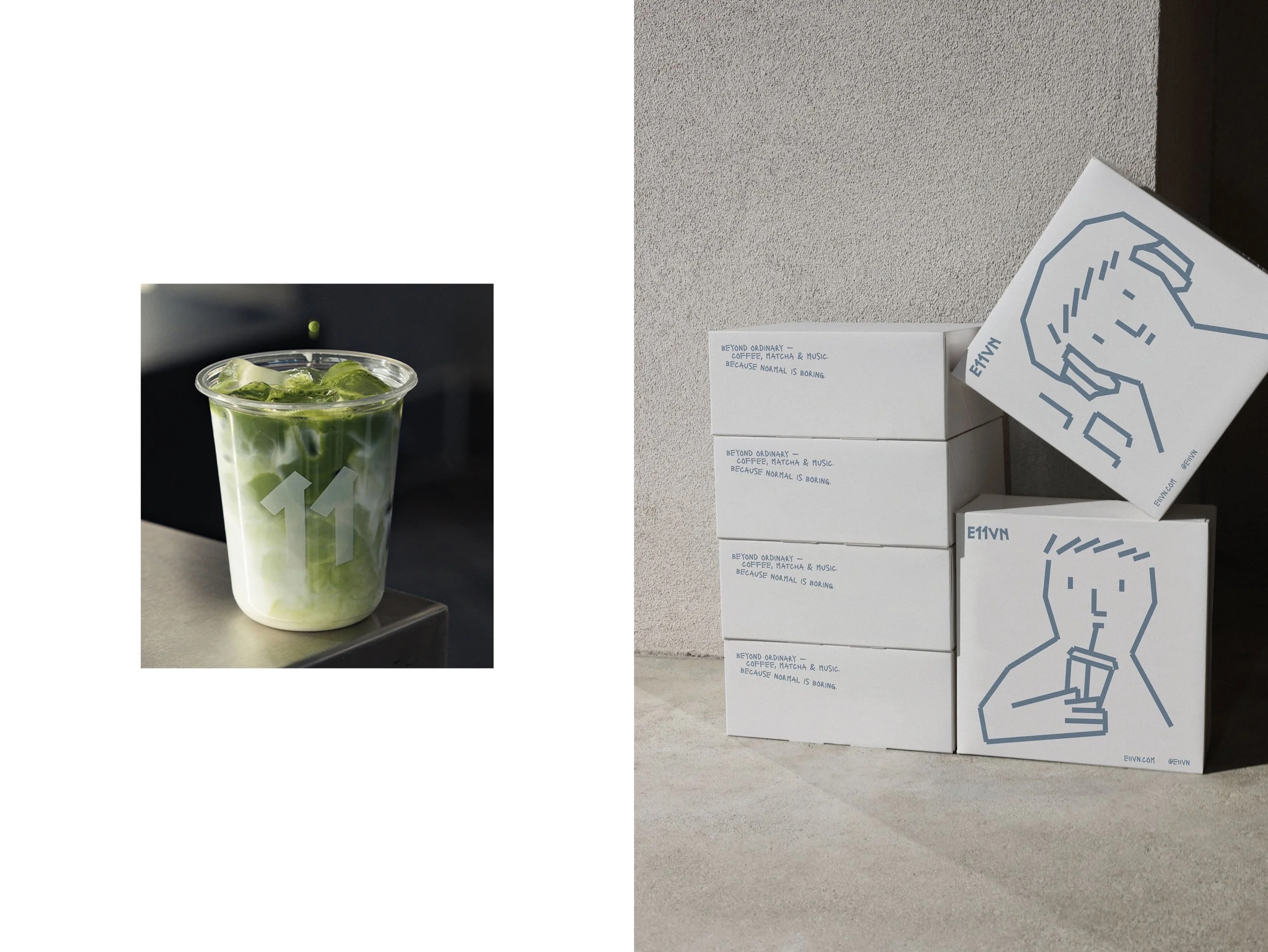
 Because let’s be clear: there really are aspects of this identity that are really lovely and warrant being celebrated. The packaging is gorgeous, as is the illustration concept which is as smart and flexible as it is ownable, cute and charming.
The wordmark, however, fails to make this thoroughly ugly word much more palatable. But at least it has an interesting concept behind it.
Much of the visual language here – including the wordmark and its shortened, more monogram-like version which simply uses ‘11’ – borrows from the appearance of physical tape, using thick, slightly raggedy strips that nod equally to gaffer tape on a stage floor and the sort of analogue, handmade rituals that surround specialty coffee.
It’s a smart enough conceptual bridge which reflects E11VN’s unity of two rather different worlds – cafe culture and live music venues – and I really like the tangible sense of materiality that carries throughout the wider identity system. Where the name itself is almost robotic in its vowel-avoidant inanity, Makebardo’s opting to use a more raw, rough-around-the-edges aesthetic neatly epitomises what the agency says is the brand’s core concept of “binding” sound and flavour.
Where the identity really comes into its own is in the gorgeous, infinitely expansive cast of loose, tape-drawn characters. They bring an immediacy and warmth to everything from cups to bags and menus. The bright blue on white backgrounds gives a nice sense of lightness and levity to the brand design while concurrently giving everything bags of personality. Thanks to the illustration system, things feel lively, and alive – you know, like coffee does, and like live music – both watching and playing – does.
These illustrations are very deftly drawn: simple without feeling simplistic, distinctive without trying too hard, and importantly, flexible enough to carry the brand across an enormous range of applications.
That sense of tactility is what elevates the project. Rather than polishing everything into oblivion, Makebardo leans into rough edges, wonky lines and visible human touch – it actively celebrates imperfections – likely a move made all the more bold in the context of a site based in what looks to be a rather shiny, faintly dystopian Dubai-esque new development.
And once you’ve sucked up and accepted the E11VN name itself, there’s really a lot to admire here: a beautifully resolved packaging system, a genuinely ownable illustration style and a visual language that’s coherent, flexible and full of personality.