Vans didn’t need reinventing – Accept & Proceed’s new brand identity understands that
Opinion by Emily Gosling Posted 11 August 2026
I love my Vans almost literally to death: the little black, three-hole plimsolls are so well-loved that there are holes in both big toes, and on the right side, actual horizontal tears across the top. They’re sun-bleached to the point of almost unrecognition, holey as hell, ripped up and yet still, so unbelievably comfortable that I can’t bear to part with them yet. But when I do, I’ll buy an identical pair – a cycle I’ve been repeating for at least the past decade.
There’s absolutely no way I’m the only one that’s become such an accidental devotee to a particular kind of shoe by Vans – it’s a brand that feels so perennial and entrenched in culture that it’s almost a neutral, never out of style, always (well pretty much always) appropriate.
Vans – as with arguably its most direct peer, Converse – feels like it’s never not cool. You’d assume it doesn’t need to really do a tonne of work when it comes to its brand, with its position in culture and fashion and its total immersion in the canon of ‘decent trainers’.
But all brands need to take stock at some point – even such hardy perennials as Vans – and its time had come. So it looked to London-based design agency Accept & Proceed, which has previously worked with brands including workwear icon Dickies, and on projects such as Nike’s House of Innovation.
Vans was founded in 1966 by brothers Paul and Jim Van Doren, at their eponymous Van Doren Rubber Company in Anaheim, California. The first shoes were made and sold directly from the factory, and it wasn’t long before local skateboarders began adopting them thanks to their durability and the sticky rubber soles.
What started as a practical relationship between shoes and skaters became something considerably more culturally significant – in no small part thanks to a smart move in the 1970s when Vans actively sought input from skateboarders Tony Alva and Stacy Peralta.

Over the following decades, Vans became increasingly difficult to separate from the worlds of skateboarding, music, art and youth culture. Crucially, though, this wasn’t really a culture Vans had to manufacture (though, to a point, it definitely has helped that along) – people have long taken the shoes and customised them, made them their own.
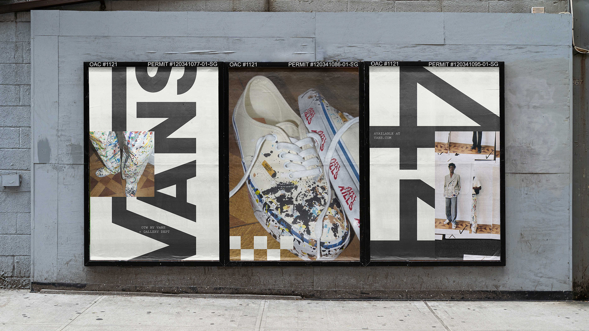
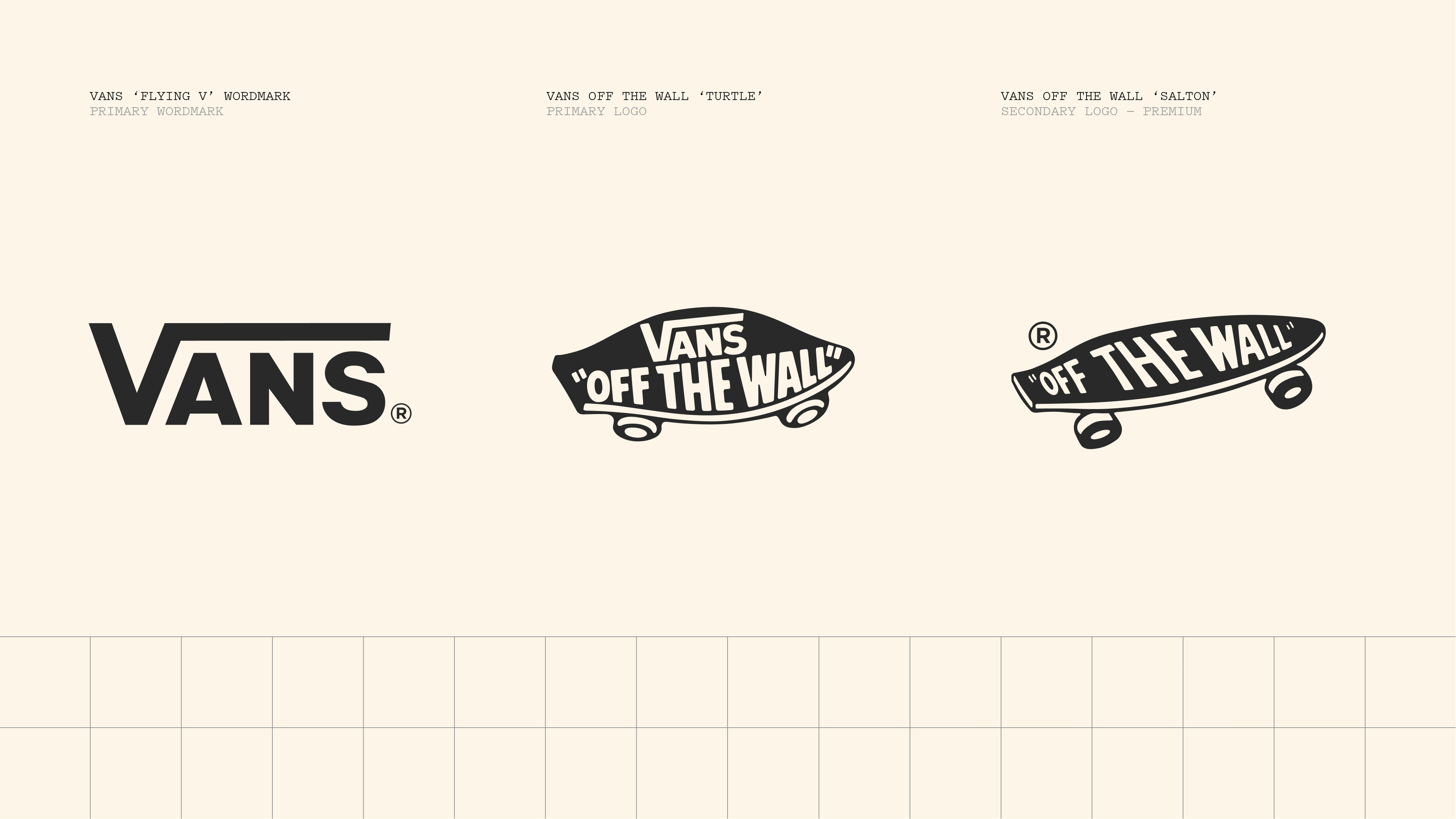
That history is important to Accept & Proceed’s approach to the new identity. It would be outright daft to try and reinvent the wheel with a brand like this, with such strong heritage and such unmistakable, instantly recognisable design details; and so accordingly, the studio was brought in not to create anything radically ‘new’, but instead to bring some order to an identity that had become fragmented over decades of different owners, products, audiences, and applications.
This was all about stripping things back – and Accept & Proceed has done so incredibly skilfully. Accept & Proceed initially audited the brand across its product portfolio and communications, looking at what actually made something feel like Vans and, perhaps just as importantly, what didn’t.
The resulting system establishes a clearer distinction between the things that should remain consistent and those that can change; while the conceptual idea underpinning it all is dubbed ‘Our Canvas. Your Way’.
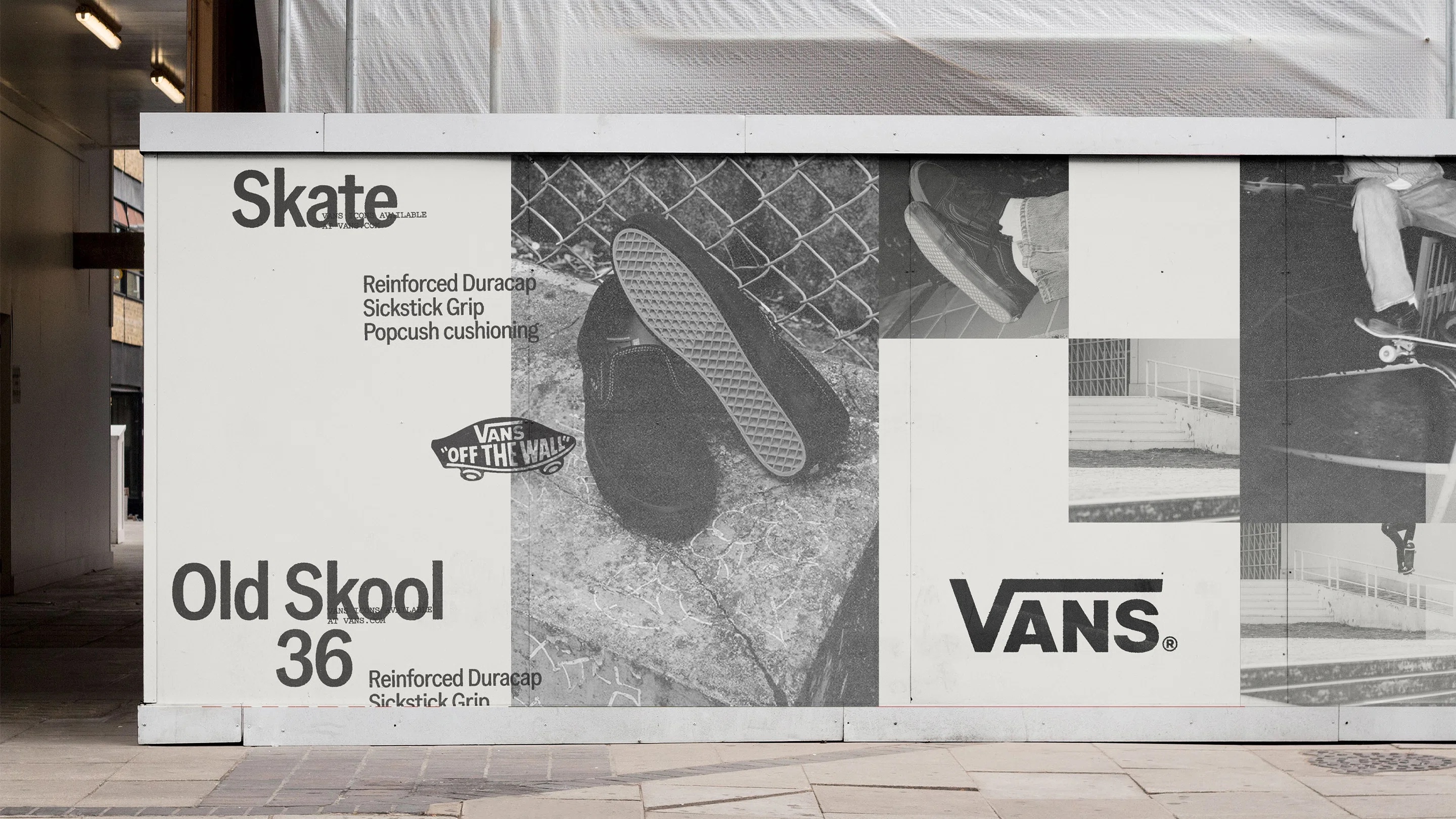
This is a nice summation of what Vans has been doing for almost as long as it’s existed: its shoes have, for decades, functioned as a canvas of sorts that many devotees customise, draw on, scuff up, and generally make their own. Accept & Proceed has essentially turned that behaviour into a principle for the brand system itself.
It’s a very clever brand system in terms of how it locks down what needs to be locked down; defines what needs to be defined; pares back what needs to be pared back – but all without making everything too rigid to the point of losing what makes Vans so, well, Vans.

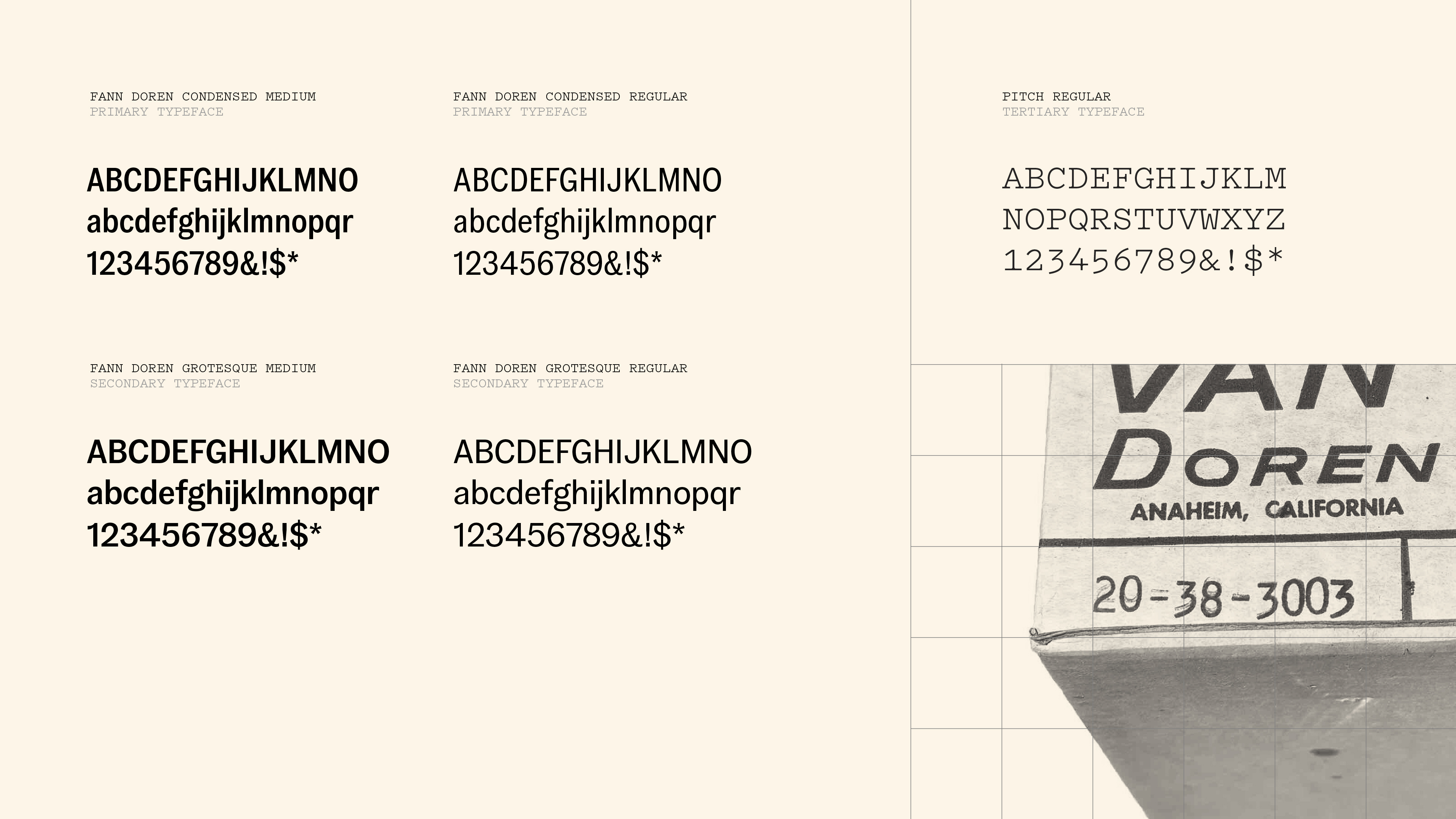
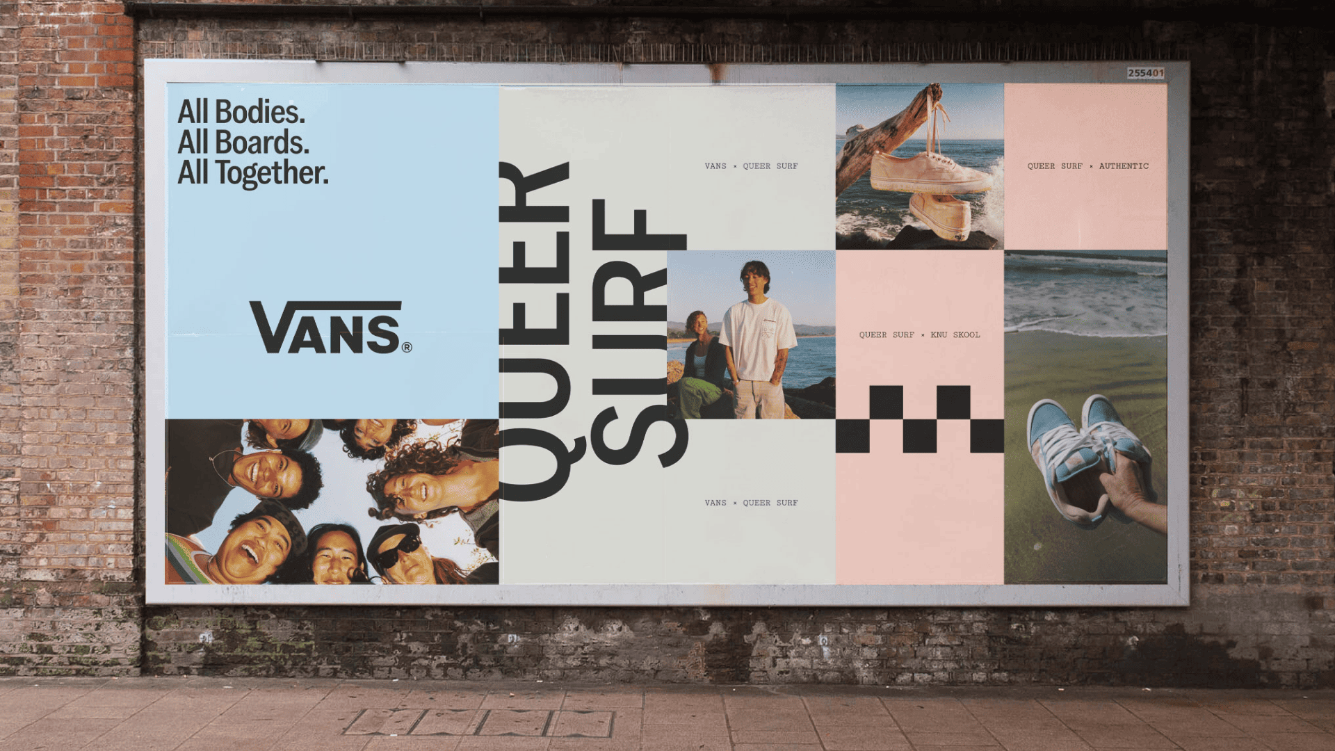
The main brand typeface here is Fann Grotesque by London foundry Colophon (which is now part of Monotype) – a good choice, thanks to its marriage of workhorse grotesque elements and contemporary feel. It’s sturdy without being particularly heavy-handed, with proportions and details that allow it to operate across everything from punchy headlines to more informational applications.
There’s a straightforwardness to it that feels appropriate for Vans – modern enough to avoid looking nostalgic, but without the slickness that might make the brand feel overly polished.
Accept & Proceed opted to use two different weights of Fann Grotesque – Regular and Medium – creating a subtle sense of hierarchy and rhythm while maintaining clarity and consistency.
The tertiary font is Pitch by Wellington, New Zealand-based Klim Type Foundry. As a font based on typewriter lettering, it has an inherently functional, slightly mechanical quality; yet is also packed with personality.
The contrast between Fann and Pitch does a lot of work here – the former somewhat solid, sensible; the latter more distinctive and characterful. However, there’s nothing particularly radical about this typographic pairing, and that’s probably the point.
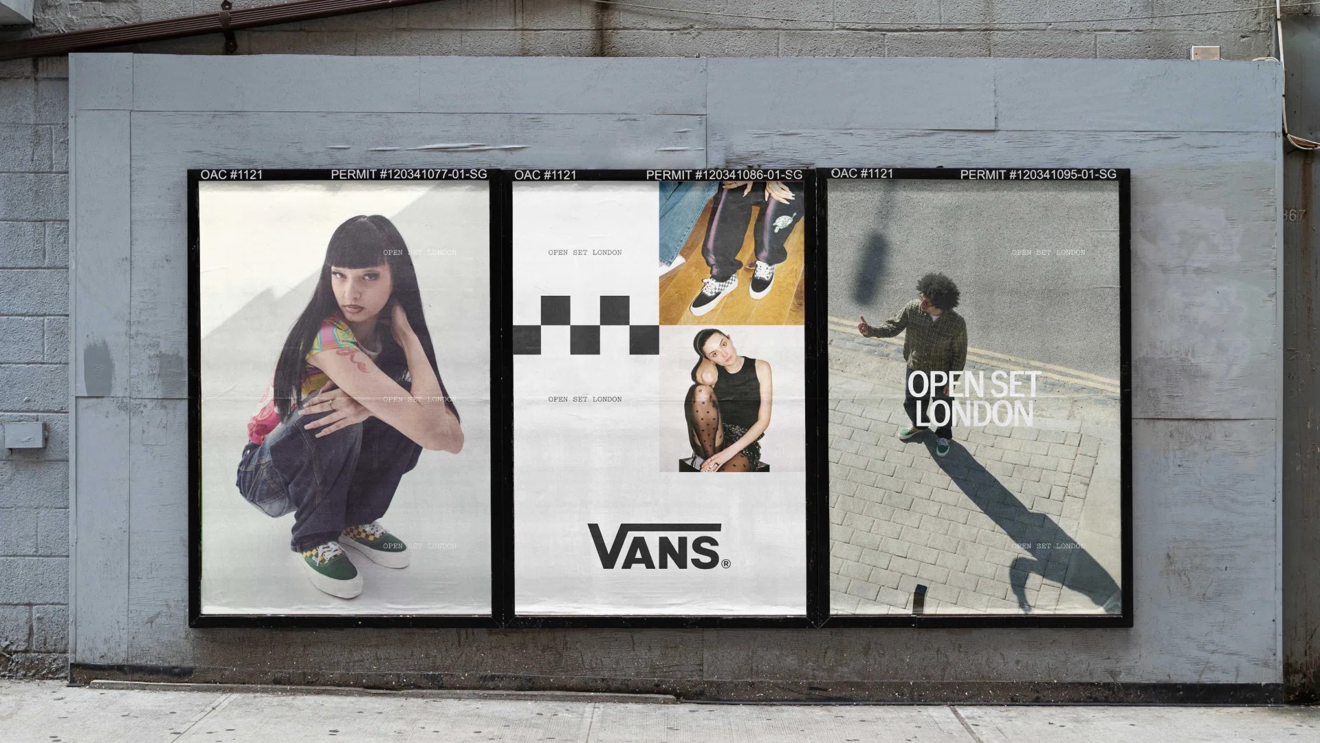
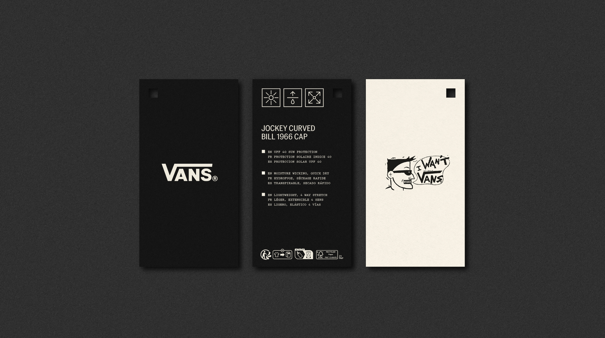
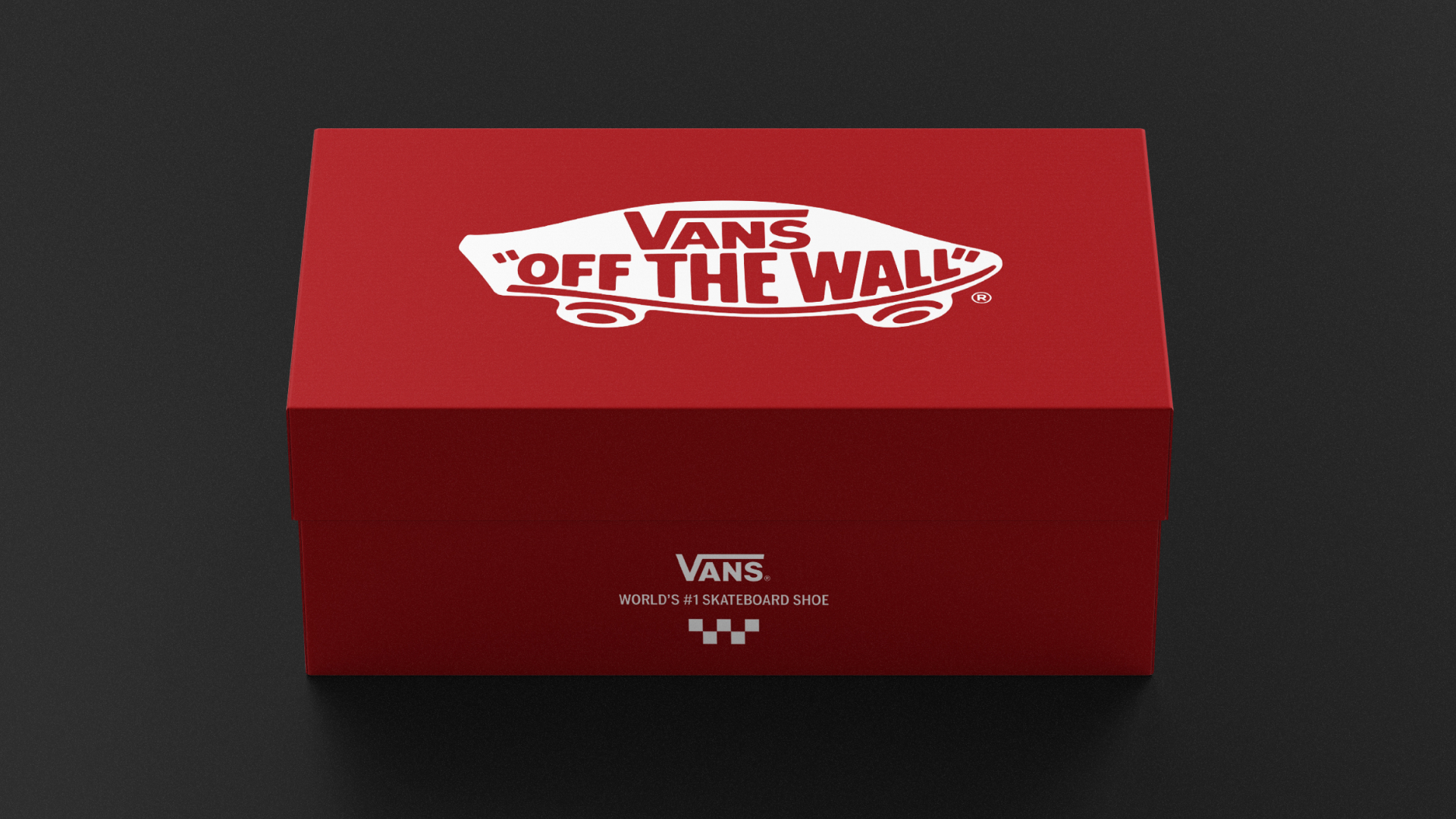
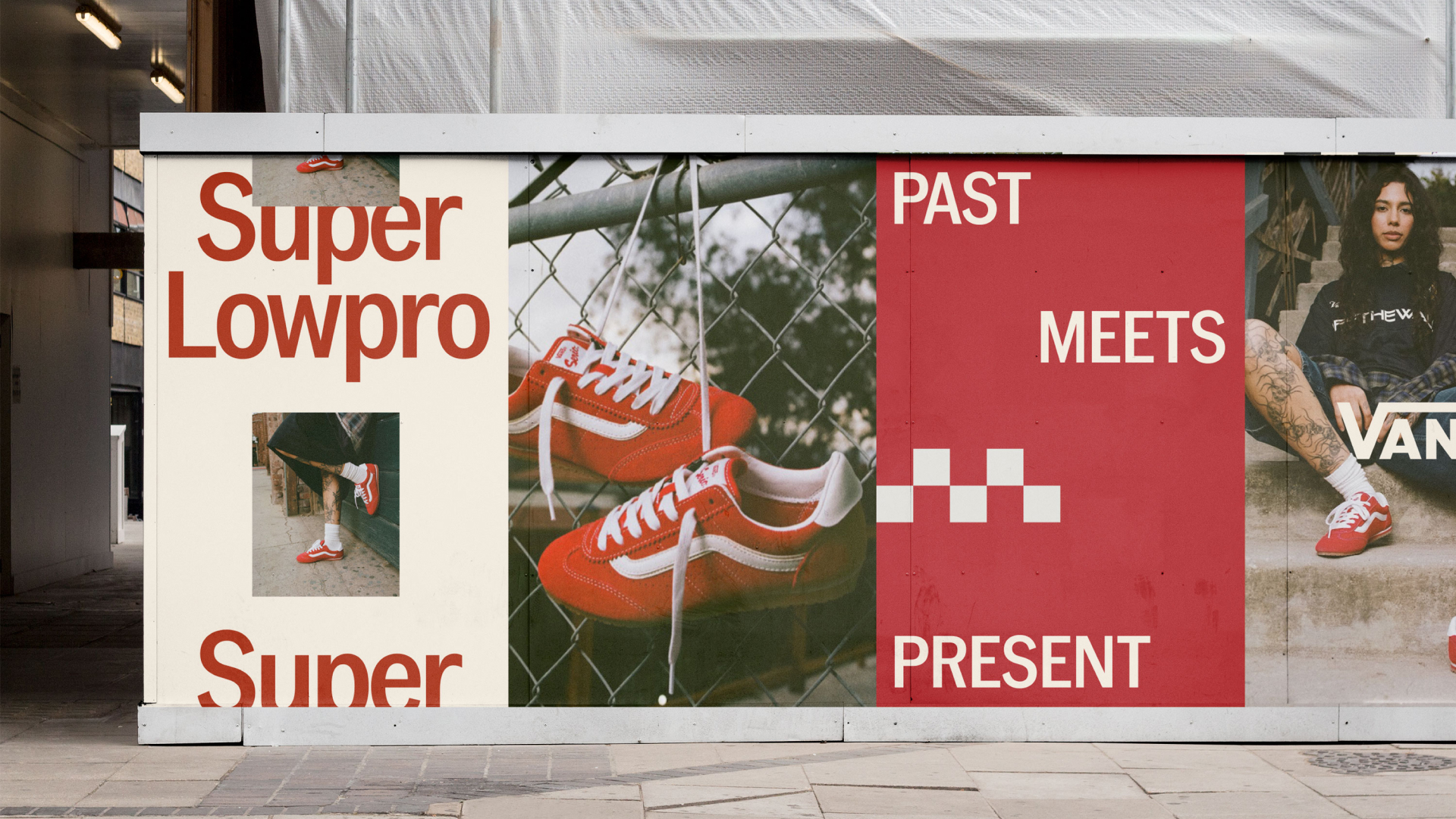
The same thinking runs through the colour palette. While perhaps best known for its two-tone style, monochrome checkerboard patterning, Vans has always had an unusually broad relationship with colour; but now, when it comes to the brand itself, things are a lot more neutral. The new palette is based around a certain shade of beige, black, white, and a pop of that distinctive, letterbox-bright Vans red.
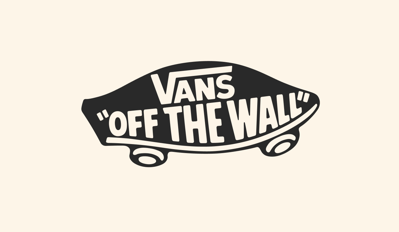
Among the most charming aspects of this new identity are the iconography and illustrations, which are both part of, and anchor, the entire brand and visual language. The illustrations – all thick black linework and a slight air of shonkiness – feel as though they’ve been there forever. The chunky pennyboard is the star of the show, acting as both illustration and an integral part of certain logo lockups, where it serves as a framing device.
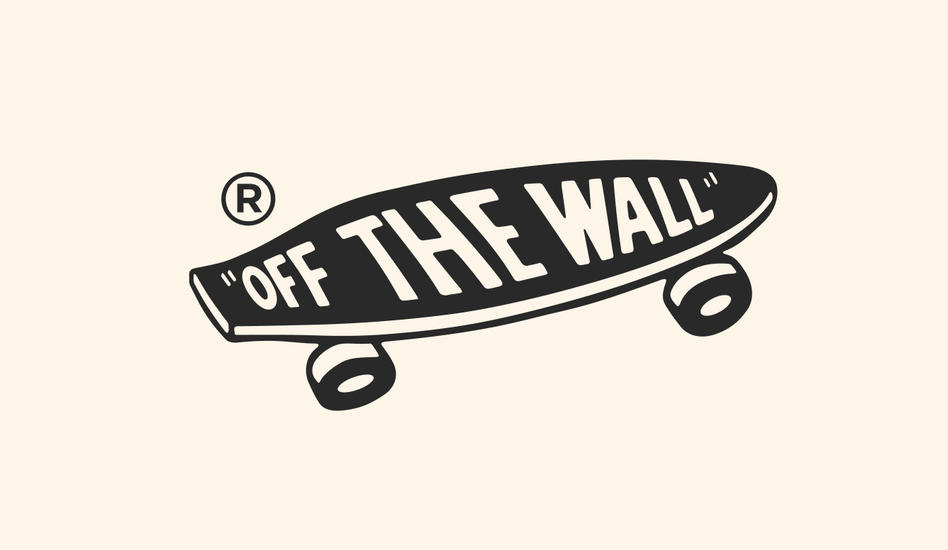

The icons meanwhile are a lot more functional, with Accept & Proceed creating a suite of graphics that are, again, minimal and monochromatic, straight out of an old-school standards manual.
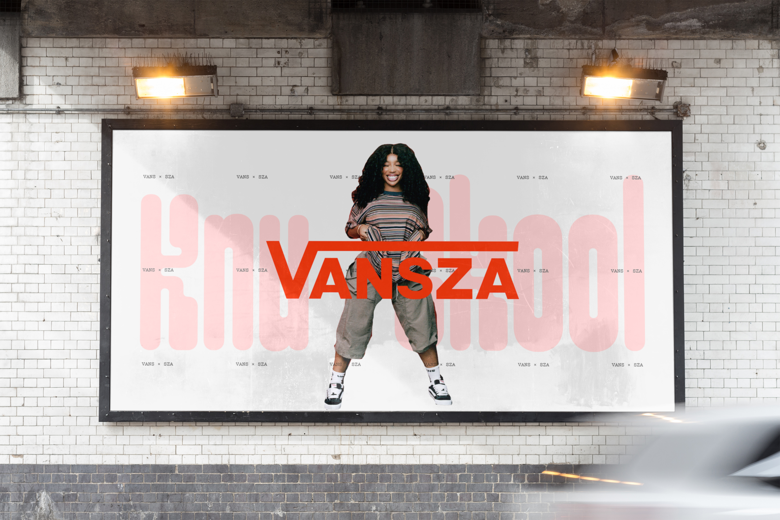
The overall design system here works so well because it merges functional, strict foundations that enable the brand to operate globally in a totally consistent way, with a more expressive layer that can shift according to audience, product and context. It means Vans can be unmistakably Vans without every piece of communication having to look exactly the same.
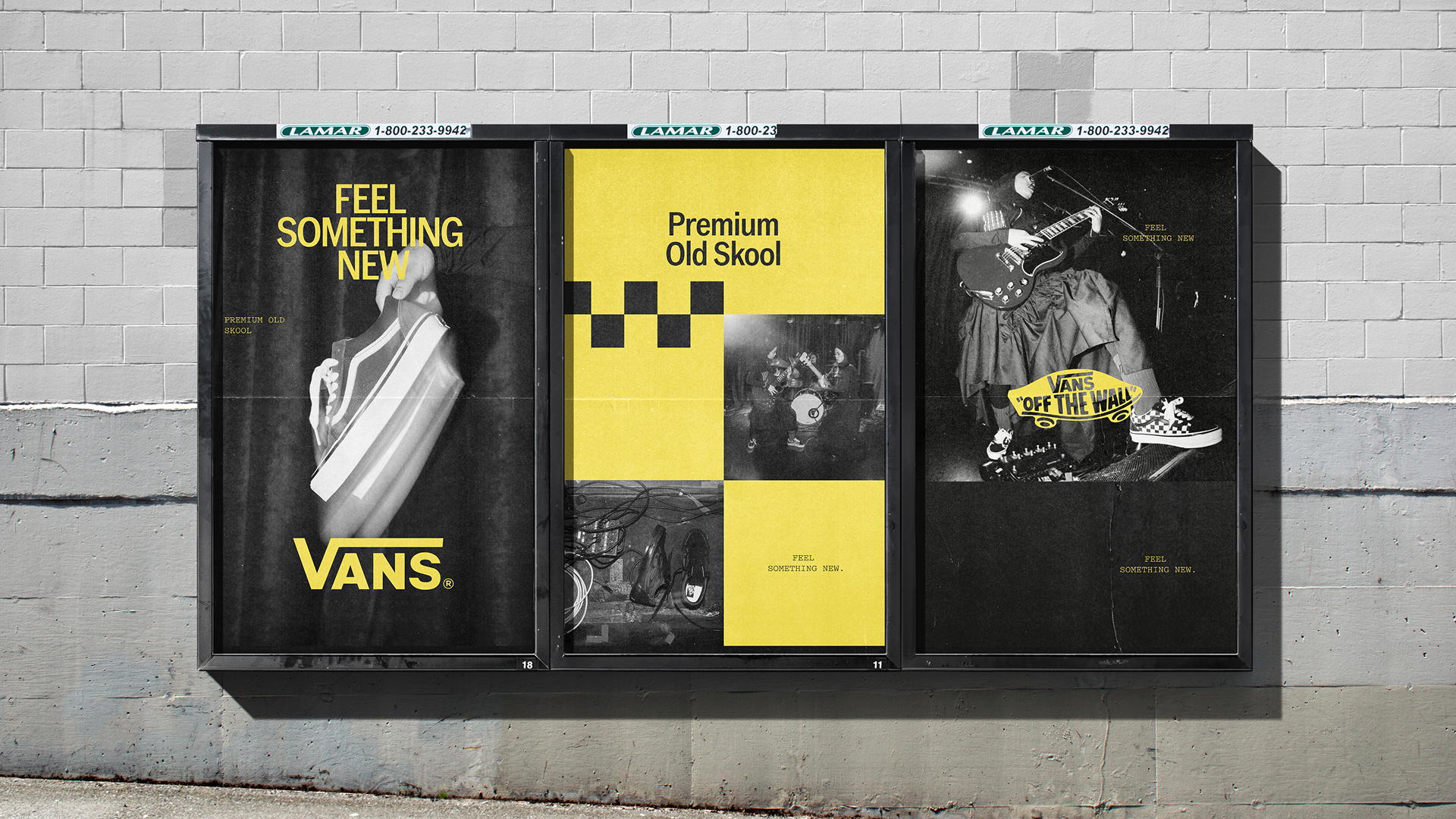
This approach is particularly useful for a brand with cultural relevance spanning not just its central skateboarding community, but also music, fashion, and art. Trying to give all of those audiences one tightly controlled visual expression would probably make the brand feel less relevant rather than more.
Accept & Proceed hasn’t attempted to convince us that Vans has suddenly become something it wasn’t before; it’s instead excavated the elements that have enabled the brand’s lasting success, and built a newly cohesive system around those things.
Indeed, Vans shoes are arguably at their best when they’ve lived a little. While my own pair has probably, if I’m honest with myself, lived a little too much; they exemplify something that Accept & Proceed has recognised so well – that familiarity and personalisation are central to Vans, but that some things need a touch of tidying up after a few years.