Mouthwash Studio’s identity for eyewear brand Bonnie Clyde might be confusing, and infuriatingly historically inaccurate – but it’s ultimately rather lovely
Opinion by Emily Gosling Posted 27 August 2026
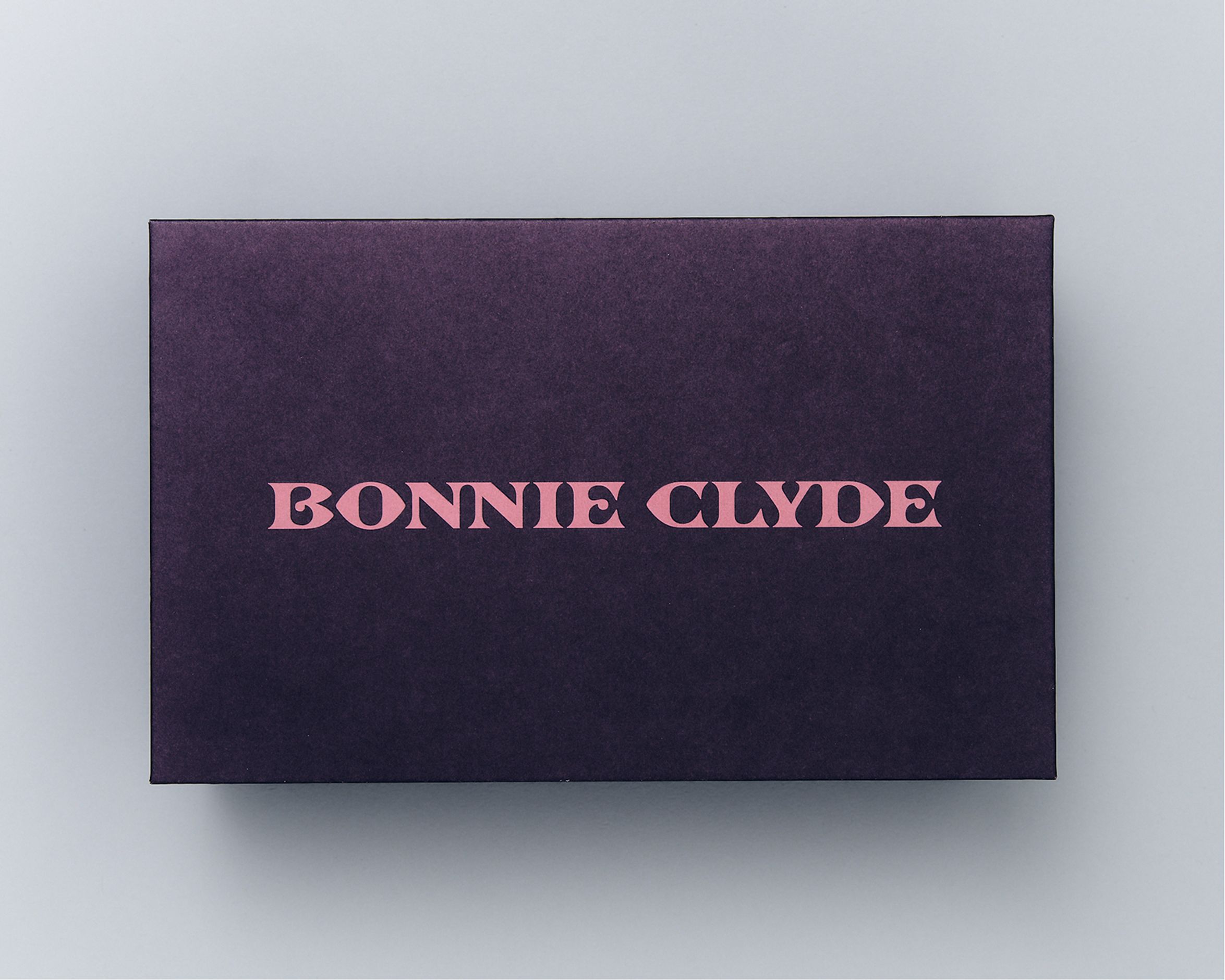
This is an identity that’s not very easy to instantly get your head around – arguably, at a glance, it’s downright confusing. Sometimes it comes on strong all antiquey – like the branding equivalent of once-beloved UK high-street also-ran Past Times – at others, it’s all Trewley Precious lash brand partnership, all hearts and dusky pink and half-arsed girly girly stuff. Then it slaps you in the face with weird lo-fi video art direction, sort of louche camcorder shots out a train window for no apparent reason.
It could be said, then, to be – in the most simple terms – a bit all over the shop.
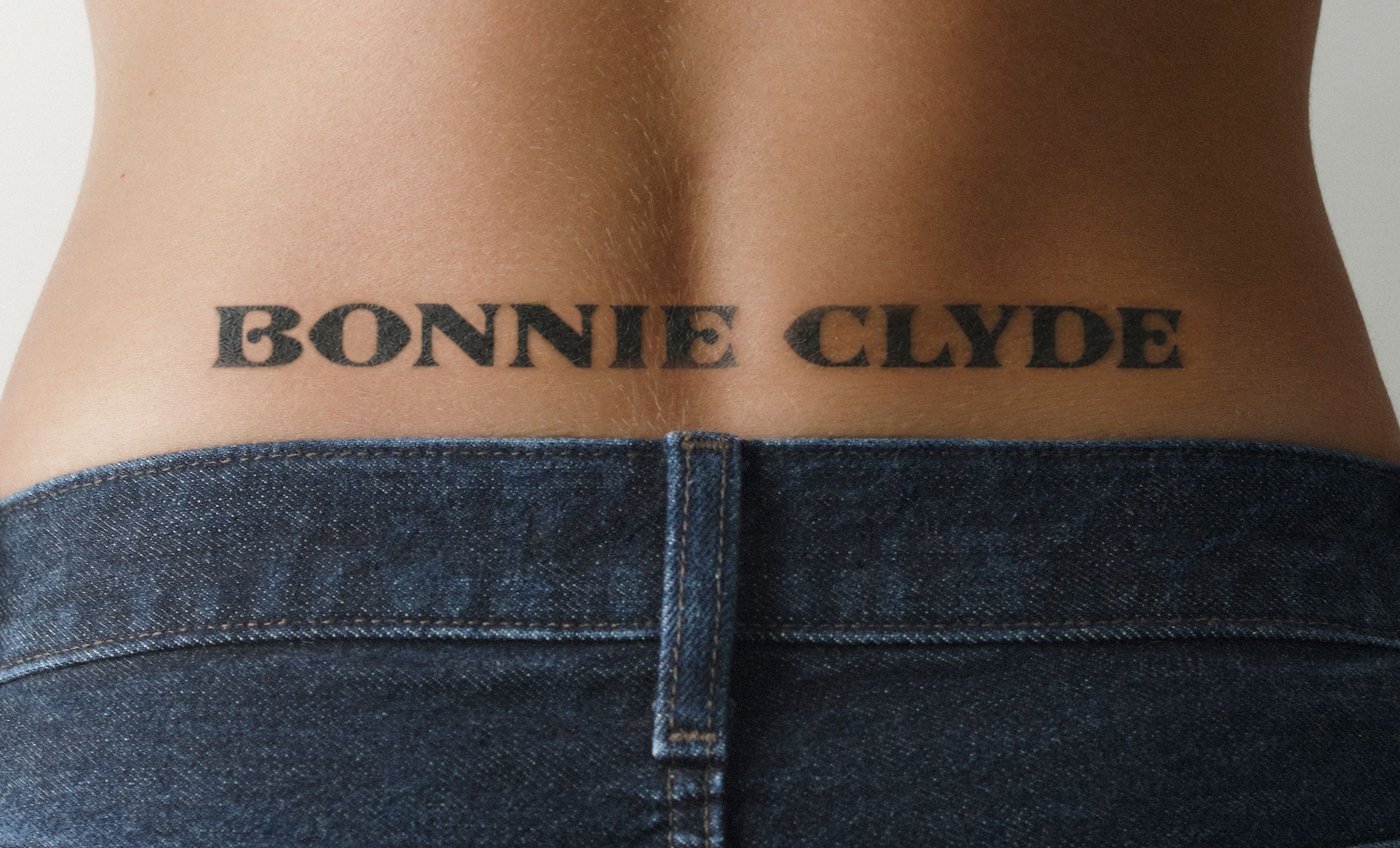
However, thankfully for both Bonnie Clyde (the brand in question) and LA-based creative agency Mouthwash Studio (the designers behind said brand), identity design often comes to life not on first glance, or instantly, but once it’s had a bit of time and space to live and breathe. It does, in fact, make sense. There’s just a fair bit of stuff knocking about here, and it’s one of those delightful things that you realise is more than the sum of its seemingly disparate parts.
Mouthwash Studio (Seed) worked across the narrative, strategy, digital design, and graphic identity for Bonnie Clyde, dubbing the result a “new vision of romance in the eyewear category”.

The studio was brought in to work on the brand after it unexpectedly exploded in popularity thanks to Bonnie Clyde frames being sported by one Hailey Bieber – terrifyingly cheekbones model, socialite, and wife of chart-bothering pop child Justin. With the brand then growing at an unprecedented rate, it became crucial that it protected the very things that made it hip in the first place – “its eccentricity, romance, and sense of character,” according to Mouthwash.
The studio, then, was tasked with giving the entire identity some clarity and distinction, building on its Bieber-accelerated momentum and creating a strong foundation for the brand that can support its growth and build on its sudden cultural currency with something robust enough to give it some lasting brand equity now and into the future.
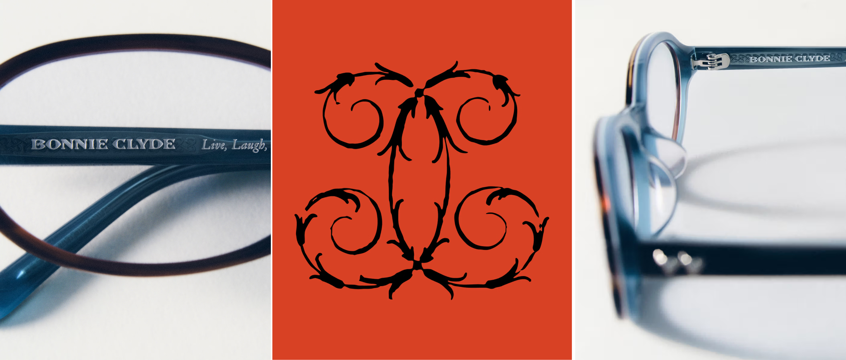
Mouthwash initially dug into researching the culture and consumers around the brand, noting that eyewear competitors tend to overwhelmingly veer towards minimal, sleek and restrained identities; while broader fashion trends reveal a growing appetite for romance, fantasy, craft, detail and self-expression.
The studio says that it took the brand’s existing, undoubtedly evocative name – Bonnie Clyde – as a jumping off point, before which, somewhat confusingly, dovetailing into, er, Shakespeare?!
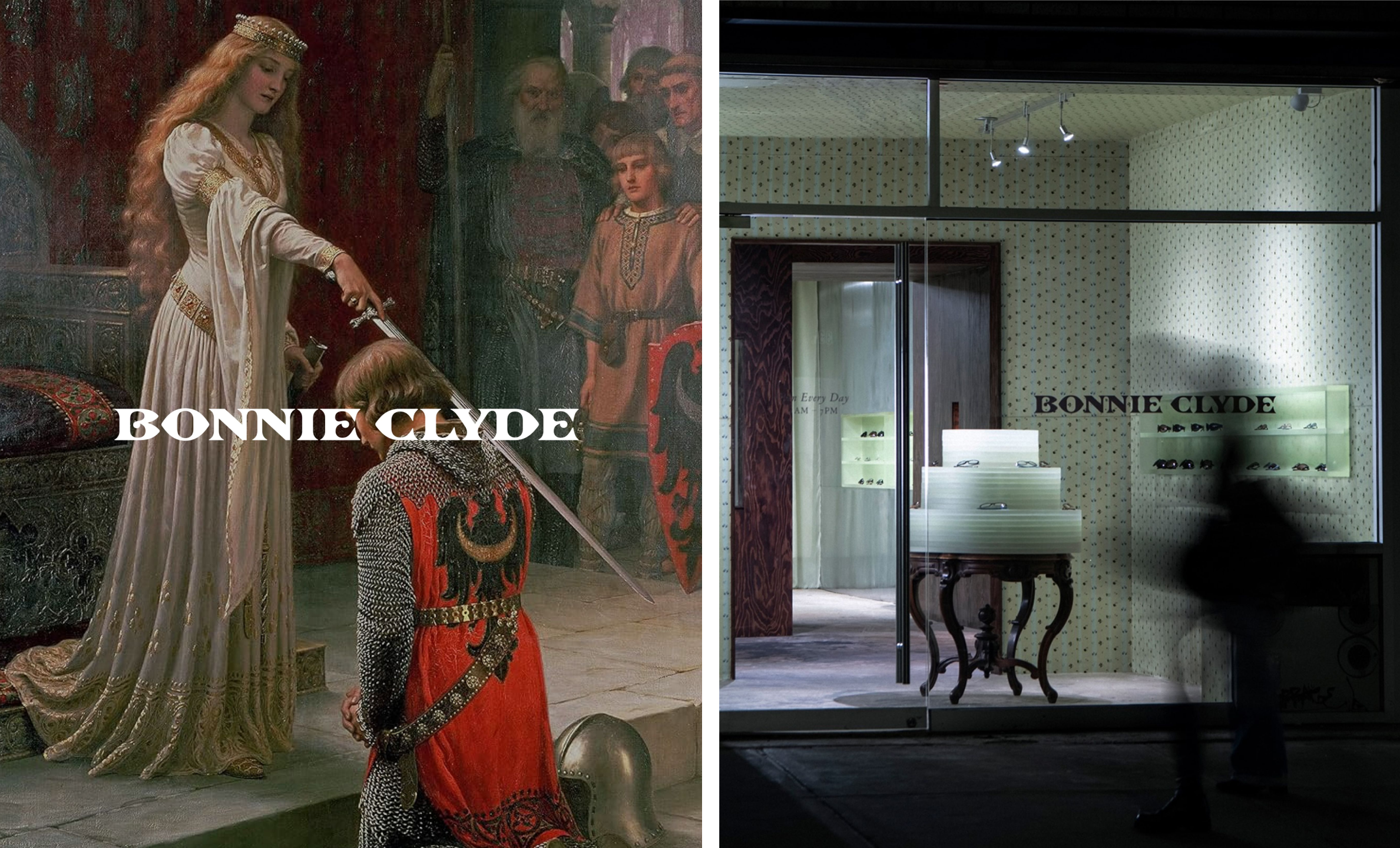
This is where things get both confusing, and arguably, rather confused. Mouthwash claims to have looked to create what it describes as a “Shakespearean world” – one that could accommodate romance, irreverence, artistry, intimacy and playfulness. I really have no idea what Shakespeare has to do with most of this, especially since Mouthwash then talks about focusing on and referencing Medieval iconography, folklore, fantasy and historic artworks which then feed into a broader visual language of symbols, motifs, typography and storytelling details.
This irks me a fair bit, since it prods at both my pedantic self and my English lit grad self – Shakespeare is not, by any stretch, Medieval, in either language or time period. The Medieval period is certainly broad, but it is not so broad that it doesn’t unequivocally end before Shakespeare was born.
Does that matter? Maybe, but ultimately, probably not when it comes to discussions of what is, overall, a really lovely piece of brand design. Whatever confused logic the references come from, visually, and when put together this skilfully, they do work. Indeed, the aim was not historical accuracy or nostalgia, but a kind of contemporary mythology – and Mouthwash has definitely achieved that.
The primary font here is Henry by Lyon, France-based foundry 205TF – a contemporary interpretation of Garamond, which takes the proportions and character of those historical forms but with notably slim, narrow and delicate qualities and Art Nouveau-ish flourishes in its leaning ‘z’, winding ‘a’, and curved ‘t’.
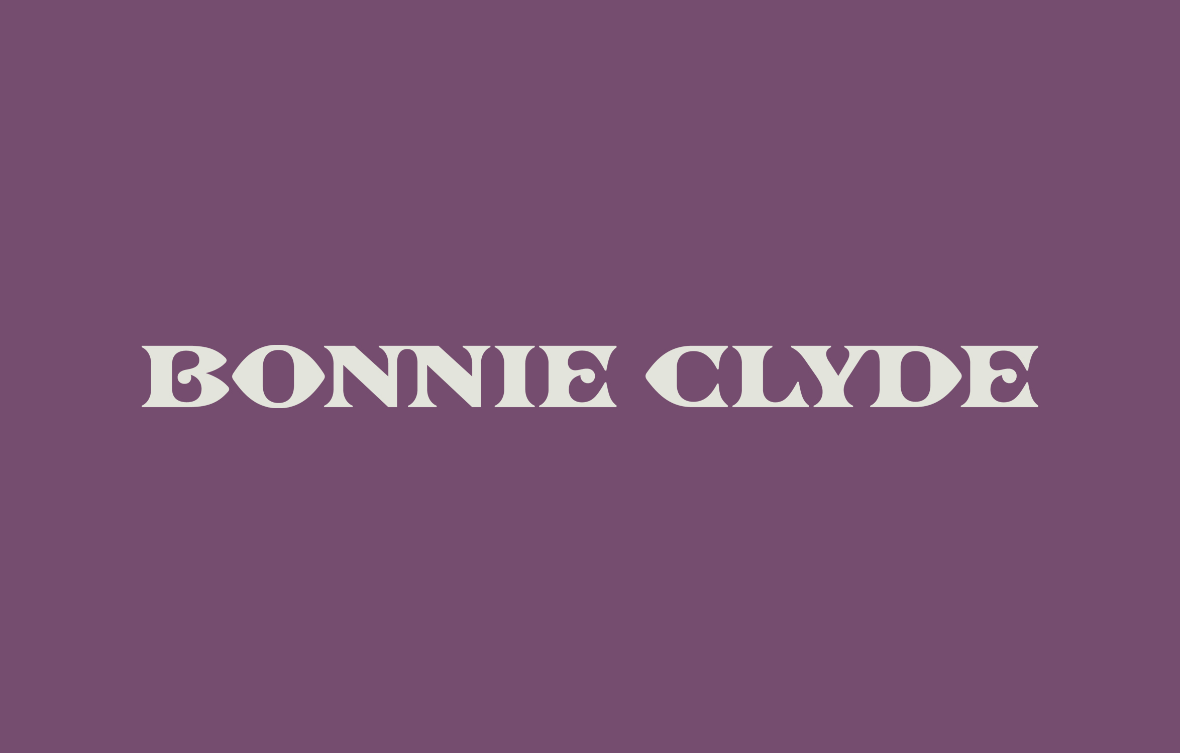
That subtle but palpable Ye Olde character helps establish the romantic, literary side of the identity without pinning it too firmly to one period. Alongside it sits a custom wordmark, developed through research at the Herb Lubalin Center, Cooper Union’s type archive and the Rare Book Division at the New York Public Library.
The team looked at everything from the Gutenberg Bible to early Shakespeare texts; with a particular interest in Lombardic letterforms – those distinctive, decorative uppercase letterforms used in medieval manuscripts and inscriptions. These reference points were then translated – and translated well – into something sharper and more contemporary. It looks great, all in all.
The primary colour palette is sophisticated in its neutrality and restraint – arguably dancing on the line we might call boring, but pulling it off – with shades ranging from white, off white and ‘creme’ to ‘grass’, ‘olive’ and ‘sage’. How does it pull it off? With a far broader secondary palette, which includes some far bolder and, for want of a better word, girlier hues.– pinks and purples and lilacs and a couple of primaries thrown in for good measure, along with some nice cooler tones, more minty blue-greens, and suchlike.
It’s this ability to move between the restrained and the excessive that seems to hold much of the identity together. Layouts can feel clean and fashion-y one minute, then suddenly become crowded with ornaments, illustrations and decorative details the next. The result is less a rigid system than a toolkit for constructing different moods within the same world.
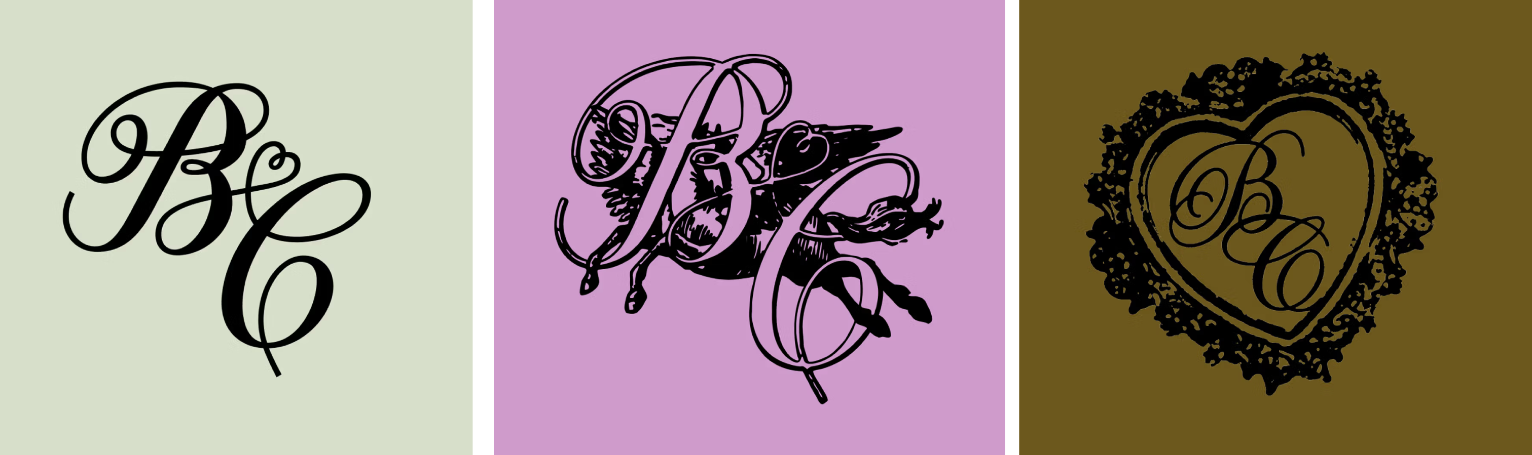
One of the nicest, but perhaps most subtle aspects of this project is the illustration, for which Mouthwash commissioned LA-based Nick D’Apolito. The result is a suite of illustrations and icons including cherubs, lockets, doves, dragons and other motifs. These are deployed in smart ways across the identity, yoking the brand into a singular look and feel without having to rely on the wordmark or typography alone.
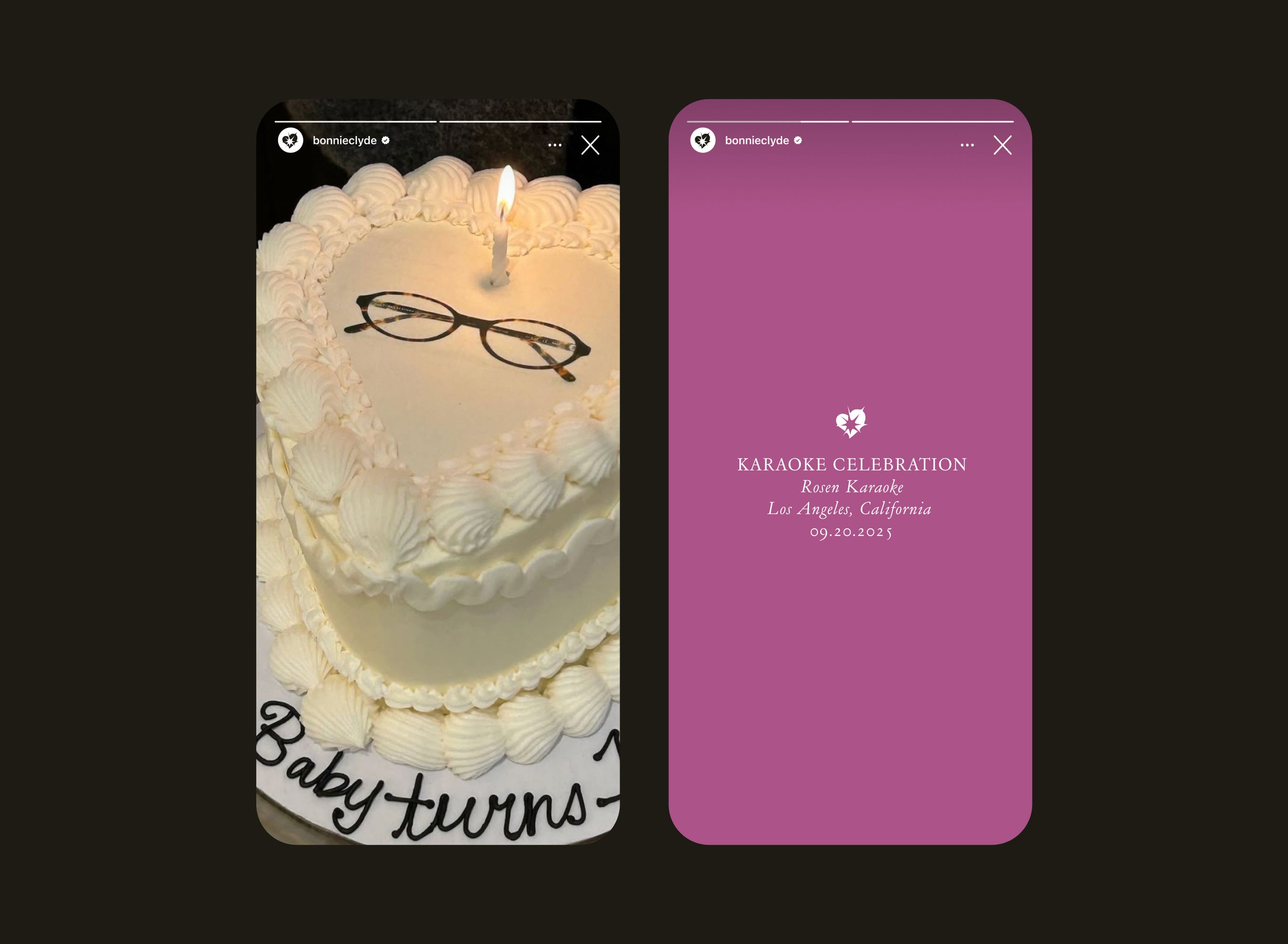
Mouthwash Studio brought in Brian Kanagaki and Zac Serrano for the brand photography, while the video was created by Suzie Maez. This is where the identity gets dragged resolutely into the 21st century, but also becomes pretty sprawling: amped-up, super-produced campaign imagery sits alongside iPhone shots, candid moments, behind-the-scenes material, and more deliberately lo-fi content.
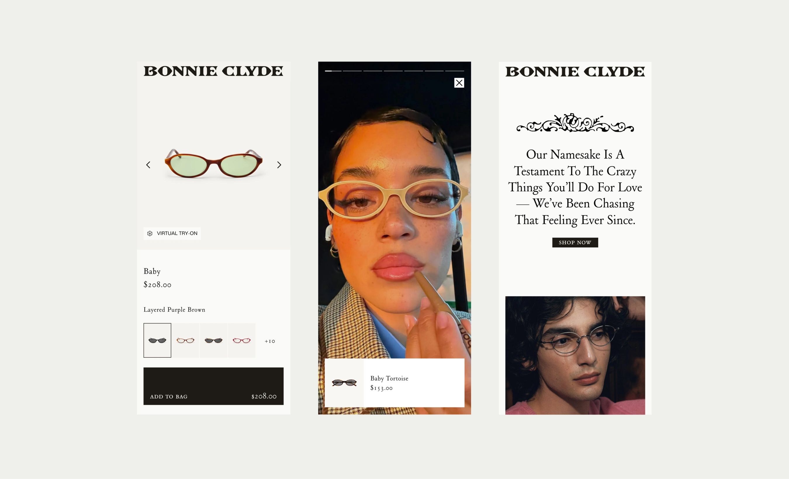
A key aspect of the project was overhauling the digital e-commerce experience. Here, the site looks to keep the browsing and purchasing aspects – you know, the most important stuff, ultimately – nice and straightforward, with collections, frame shapes, and styles made easy to navigate, but with a little boost from augmented reality-aided try-on technology.
It’s here that maybe the identity truly comes together and makes the most sense. It’s certainly busy, occasionally bizarre ,and not always immediately coherent. There are moments where the historical references, girlish colour, lo-fi imagery, and romantic symbolism might be a bit much – all jostling in a way that’s less-than-comfortable. But that skilfully inbuilt inconsistency is also what, in the end, makes Bonnie Clyde feel like a fashion brand rather than another boringly minimalist, sanitised eyewear label.