Oral Care Shelves…Where Good Design Usually Goes To Die
Written by Richard Baird Posted 9 September 2026
Nothing makes you question the state of your gums quite like the oral care aisle in Boots. A visual rinse with the hygienist. Cold whites, clinical grids, and packaging so sterile it could double as anaesthetic. Design drills away any spark the second you enter.
There’s a reason for all that sterility. Oral care has spent decades selling efficacy, protection and professional reassurance. Cavities, plaque, sensitivity and gum disease aren’t exactly a designer’s dream brief, so the category borrowed heavily from healthcare and seems reluctant to give the codes back.

Meanwhile, almost everything else in the bathroom has loosened up. Skincare became colourful and desirable, deodorant discovered personality, period care stopped pretending periods were something to whisper about and even toilet paper managed to get itself an Instagram account.
Smart Life Co shows up with a sparkly smile.
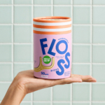
Out goes the icy palettes and microscopic type. In comes stripes, colour, and charm. Floss that actually looks fun. Toothbrushes you’d leave out on purpose. Design Womb built a brand that’s clean without being clinical and sustainable without the self-righteous tone.
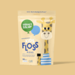
From bamboo brushes to biodegradable floss picks, every SKU speaks the same bold, bright language. Confident colour blocking, playful type, even the tongue scraper gets a glow-up.
This is feel-good design with real eco chops. Refill-ready formats and compostable materials without the self-righteous sustainability spiel.
This is how you rebrand rinse-and-spit.
Which other brands are brushing up on the boring bits?