Evo by Saffron
Opinion by Richard Baird Posted 5 April 2012
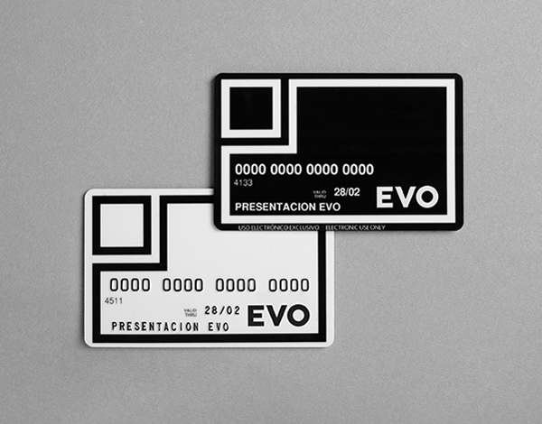
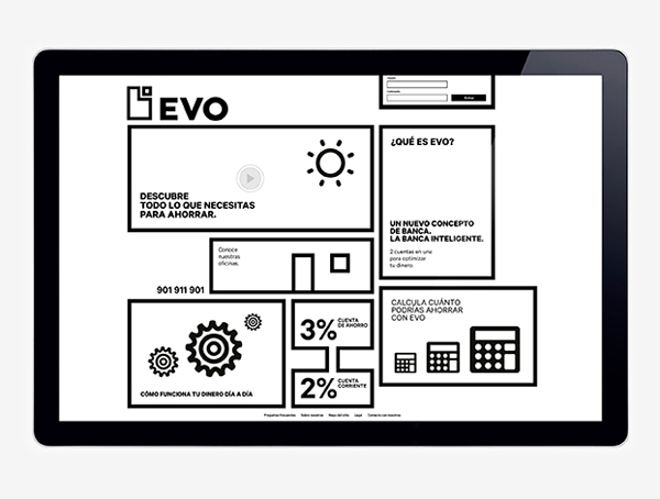
March saw the launch of Evo, a new bank with a customer first proposition and over 120 planned branches across Spain. Evo’s identity, developed by international design agency Saffron, utilises a geometric and monochromatic approach to visualise a clear, honest and understandable banking practice and its single product offering.
“Evo offers only one product, integrating a traditional savings account with a current account, each dynamically feeding the other to deliver the greatest possible return to the account holder. A simple, straightforward approach to banking, helping you save without you even noticing – a new banking model for a new context.”
“Saffron developed the new brand from scratch – from brand strategy and naming through to visual expression. The name sets the bank apart from its competitors, conveying the step forward that Evo represents to the banking world. The creative concept responds to the same spirit that created Evo’s business model – essential, smart and unconventionally classic. The bank is presented in its purest form, no frills or fancy promises. Evo’s identity is centered around an iconic symbol that alludes to its offer – two accounts in one – with a simple yet sophisticated colour palette that leaves the superfluous aside.” – Saffron
This is an incredibly restrained identity solution that clearly communicates product simplicity through the elemental union of two forms, a geometric typeface and a black and white colour palette. Together these deliver a stark two dimensional quality that really visualises a back to basics proposition and the duality of the account without the confusing details, add-ons and superfluous visual and written detail that cloud the banking sector.
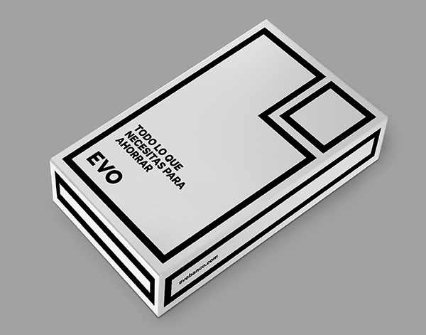
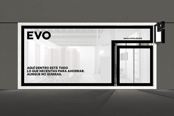
The logo-mark is well proportioned and appropriately expands depending on its environment unapologetically dominating each application with the vinyl shop front being a particular highlight. This no-frills quality of execution across each of the touch-points has a level of design sophistication that clearly draws from modernistic art and design movements, cues that really help it to avoid appearing cheap but rather bold, distinctive and perhaps a bit authoritative but in a positive no-nonsense way.
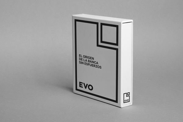
The black and white colour palette alongside the geometry of the mark has a very utilitarian and slightly socialist and homogeneous ‘one bank for everybody’ quality that feels incredibly appropriate for our times while also carrying a slightly clinical sensibility that cuts through the emotional insincerities of modern day bank advertising.
