Tom Organic by Truly Deeply
Opinion by Richard Baird Posted 5 June 2012
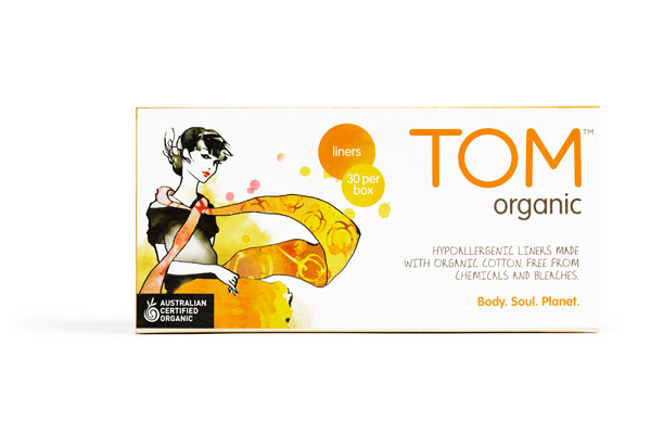
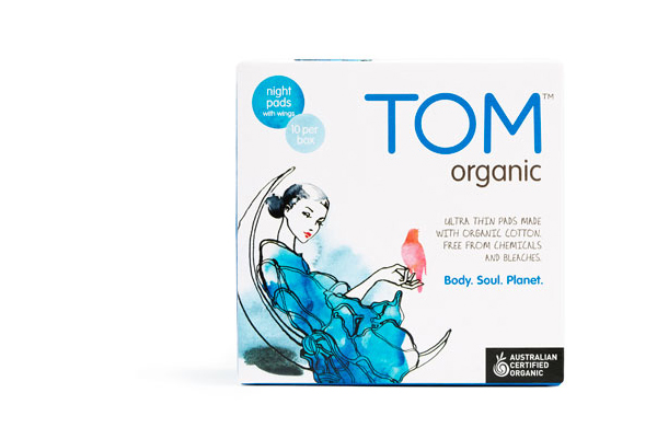
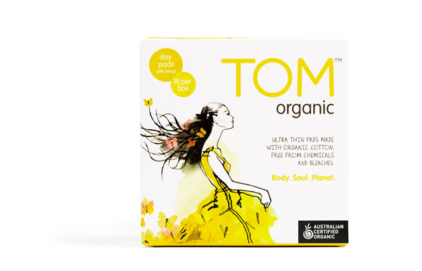
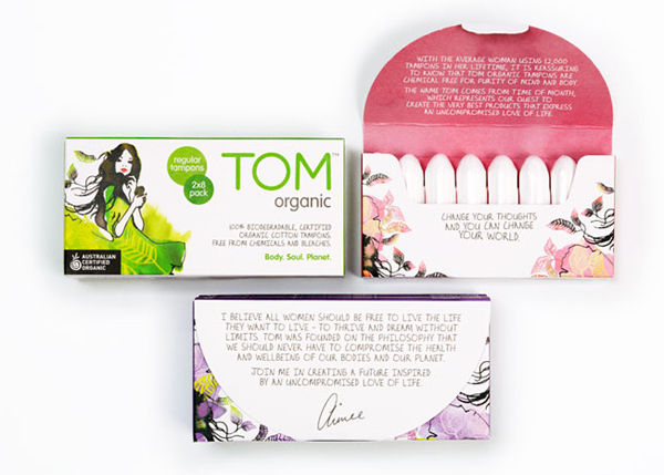
Tom Organic is the first and currently the only range of 100% biodegradeable feminine hygiene products accredited by the Australian Certified Organic association. Melbourne based design studio Truly Deeply, working in collaboration with freelance illustrator Sarah Carter-Jenkins, redeveloped Tom’s packaging proposition, launched this week, with a new, vivid, illustrative and simple typographic solution that helped to secure national distribution.
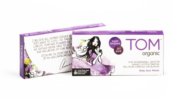
“Working closely with founder Aimee Marks, our strategy and design teams defined and brought to life the genuine ‘eco-chic’ cred, spirit and personality of TOM. Through a brand definition process, re-tweak of the TOM brand identity and a fresh packaging design story, we have transformed TOM’s on shelf presence into a glowing, confident brand. The visual language of the packaging design is further supported by layers of evocative brand story telling that illustrates Aimee’s commitment to walking the talk as the category’s leader in environmental sustainability.” – Truly Deeply
“The visual cues of the packaging design combine a stylish, contemporary femininity, a healthy dose of interest and intrigue with a secondary visual language of eco-sustainability. The result is a range of fresh packaging that not only stands-out in the feminine hygiene category, but connects with TOM’s traditional audience, whilst attracting a new, broader set of customers.” – David Ansett, Chief Creator of Brands, Truly Deeply
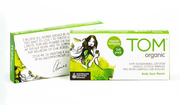
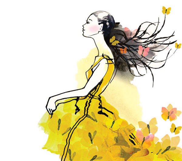
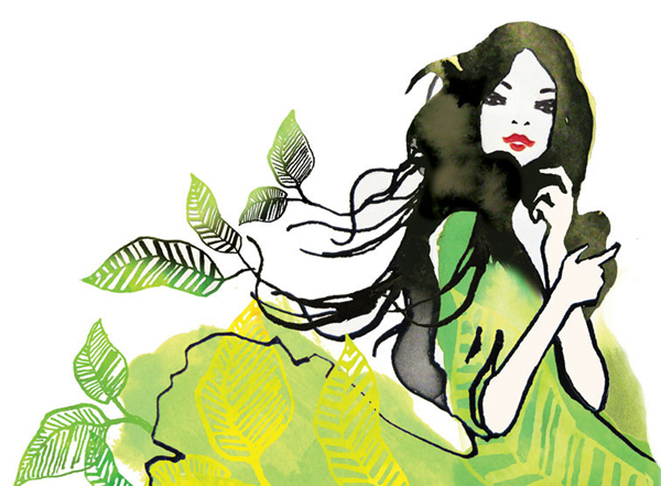
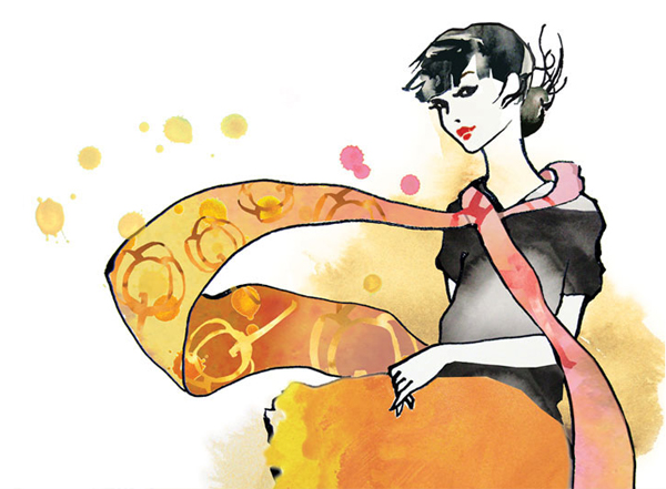
I really like the sharp juxtaposition of art and design, achieved through a combination of a simple geometric type and organic detail, that neatly resolves both functionality and lifestyle. The illustrative work is really well executed with a bright colour palette (appropriately set against a clinically white background), sweeping line detail and clear brush strokes that give it a personal and positive sensibility. The motion captured through the clothing and hair balances freshness and a carefree, confident attitude while the flora and fauna lightly draw in the brand’s natural and sustainable achievements. Each has a subtle and underlying fashion sensibility that suggests style (without restriction), independence and, through the variety of characters, the uniqueness and individuality of both the consumer and the product range. A typeface constructed from consistent line weight and geometry offer a reassuring contrast to the illustrations to keep the product looking reliable and founded on a strong scientific understanding of consumer need and material technology. The rounded terminals and mix of uppercase, sentence case and handwritten elements have an informality and friendliness that keeps the type from becoming too clinical and ties them to the images.
