Chow by Studio h
Opinion by Richard Baird Posted 19 June 2012

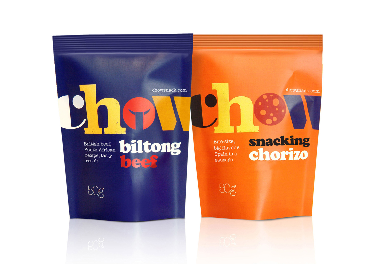
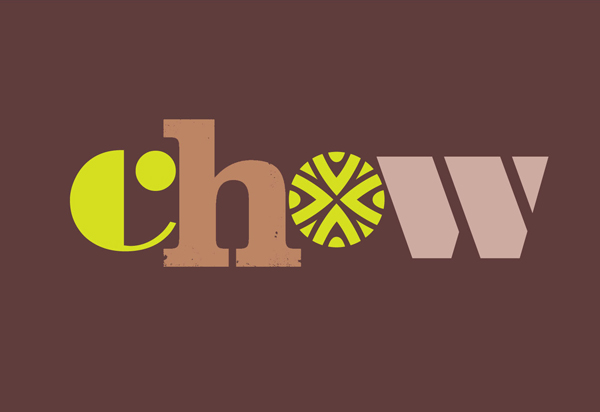
Boutique design agency Studio h was recently commissioned to develop the visual identity and packaging for UK based snack food brand Chow and its first three products, Mini Chorizo, Beef Biltong and Queen Green Olives. Based around a non-format, cut and paste, mixed typographical approach and stamp texture, the design solution establishes a confident, quirky and playful brand personality while capturing the handcrafted quality and unexpected flavours of the product.
The combination of serif and sans serif, stencil cut and geometric detail mixes the contemporary with the traditional and an underlying sense of commodity that makes the packaging distinctive and expressive with very few elements. Its bright but rich colour palette neatly avoids the child-like or synthetic and works very well with the weight of the letterforms and clear surrounding space.


