Central Magazine by Leon Jorge
Opinion by Richard Baird Posted 30 May 2012

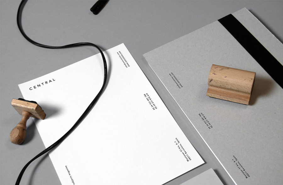
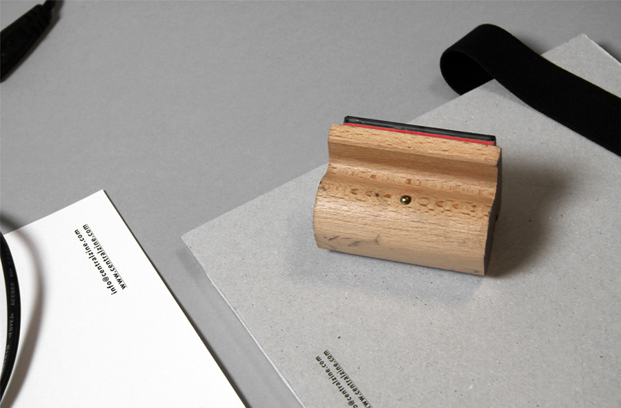
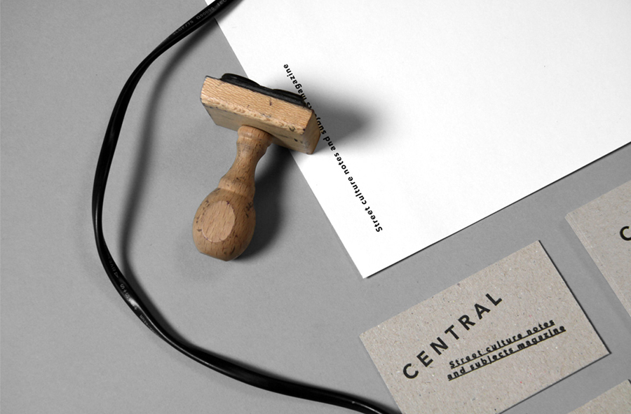
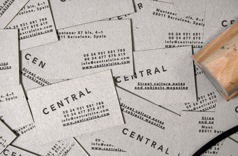
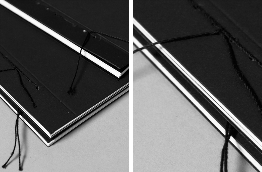
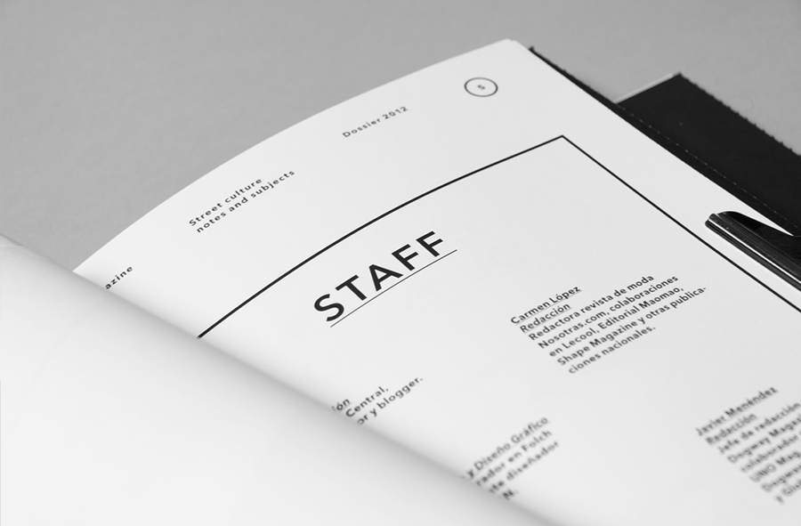
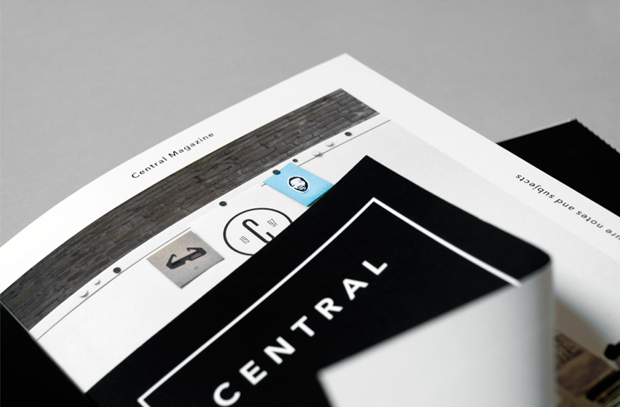
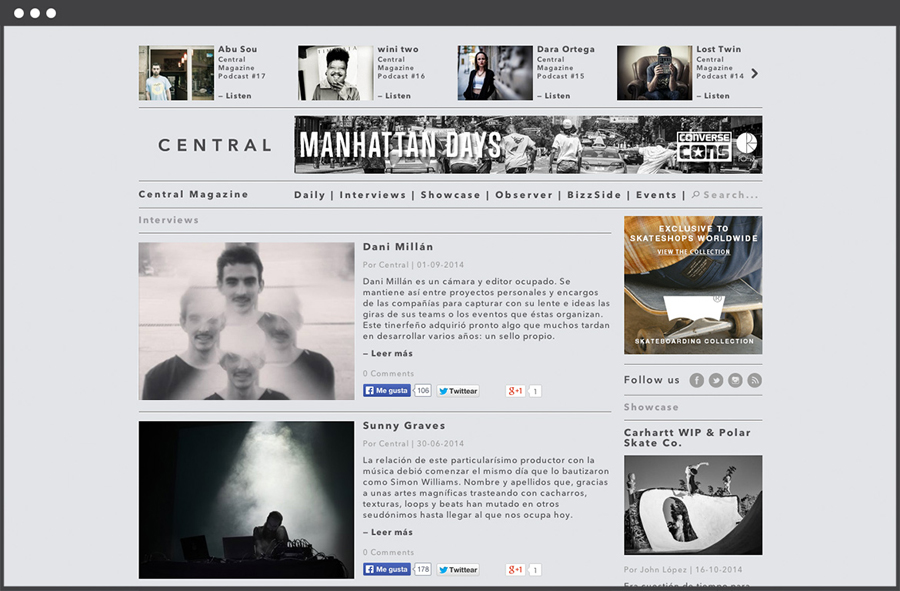
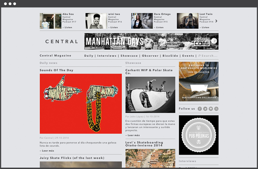
Central Magazine is a Spanish based art, design, fashion and pop culture print and digital magazine. Their identity, designed by freelance graphic designer Leon Jorge, mixes a bold sans serif logo-type, an uncoated material choice and stamp based print treatment to capture the craft and the grounded, homespun themes of the publication.

The logo-type, constructed from an all caps, broadly spaced humanist sans-serif, is a really simple but well executed that along with a modernist grid based letterhead layout, appears formal and professional. These sensibilities are juxtaposed alongside a non-format, hand-stamped approach to the business cards mixing the professionalism of the logotype with a subtle, individual and hand finished character. The mixed-fibre uncoated substrate has a tactile, craft and elemental quality that, like the stamp aesthetic, links business and good journalism with a personal, honest and a down-to-earth straightforwardness. A heavy black background and fine line borders of the editorial work introduces a subtle high-fashion sensibility that adds further depth to a simple but solid visual identity.
