Blanca by Lo Siento
Opinion by Richard Baird Posted 17 December 2012
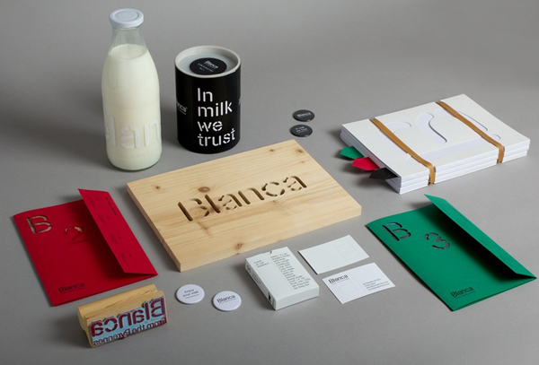
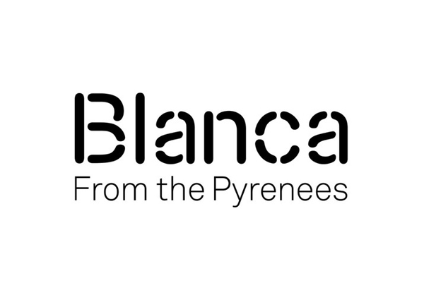
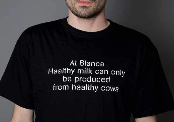
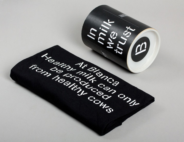
Blanca is a ‘dairy hub’ created to ‘mediate between two extreme poles of the industry; [milk] production and [consumer] knowledge’ and to ‘produce honestly, think critically and consume responsibly.’ Based around a simple stencil cut logo-type solution executed with a monochromatic simplicity and subtle craft cues, Blanca’s visual identity, developed by Barcelona-based brand and graphic design agency Lo Siento, manages to infuse and visually convey the disparate perceptions of commodity and care.
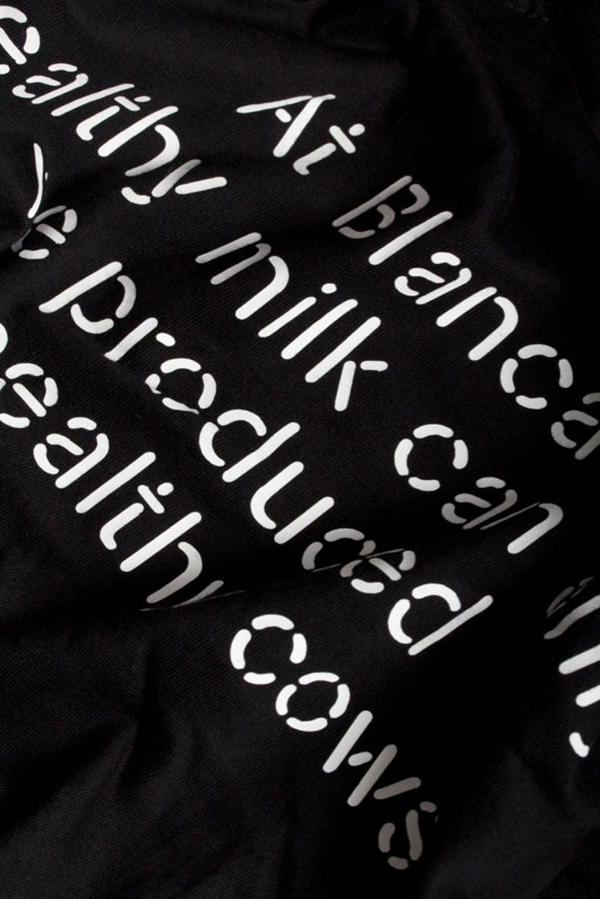
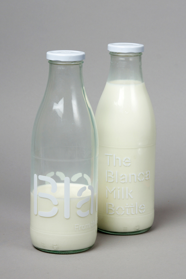
Constructed from a single, consistent line weight, rounded terminals and a monochromatic colour palette, the logo-type manages to resolve, albeit in an expected (but clearly communicative) manner, the themes of agricultural industry, commodity, simplicity and functionality. The additional cuts and sentence-case rather than uppercase characters give it a slightly more proprietary and accessible quality that in conjunction with the black and white colour palette perhaps references the marks of Holstein-Friesian cows.
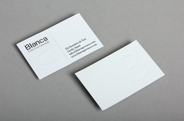
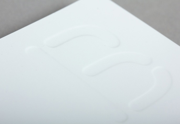
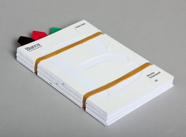
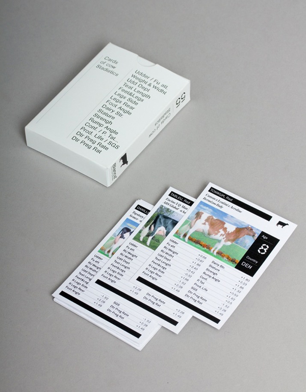
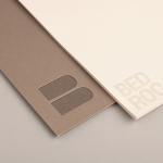
These contemporary utilitarian qualities have been appropriately tempered by the crafted, tactile finishes of die cut and uncoated material textures, hand stamps, a blind emboss, screen print, badges and stickers across the collaterals. Choices that introduce a sense of personal care and responsibility to the commoditised perceptions of the dairy industry.
