Agricola by Mucca
Opinion by Richard Baird Posted 14 March 2013

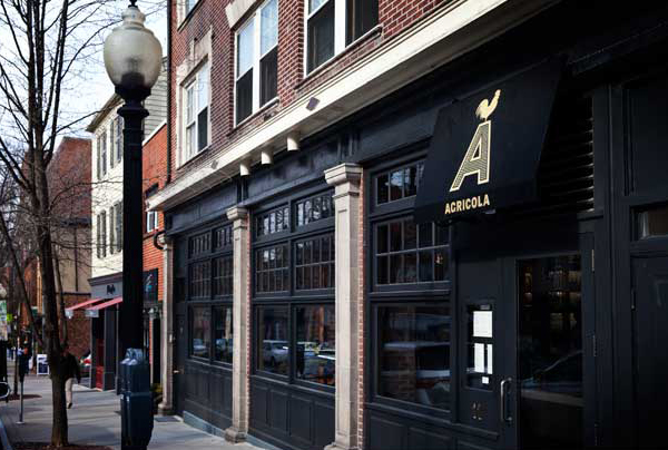
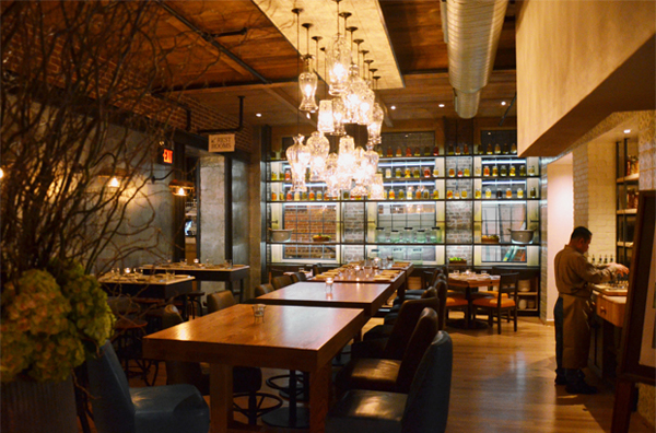
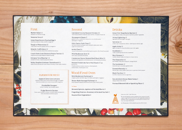
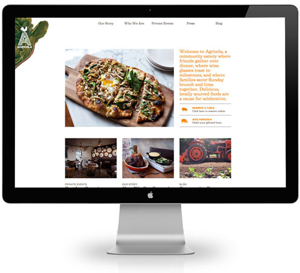
Agricola is a restaurant located on Princeton’s Witherspoon Street that offers simple, rustic, American cuisine – created by executive chef Josh Thomsen – that is based around fresh seasonal flavours, local produce grown on their 112 acre farm and a selection of regional beers. Multidisciplinary design agency Mucca was responsible for translating Agricola’s ‘farm-to-table’ concept into a visual identity that extended across a website, signage and printed collateral, and would compliment the earthy materials and intimate lighting of Seed Design’s interior.
“We began by defining Agricola’s unique assets: it has a community of local growers, a 200-seat location, and is in close proximity to its sister farm (a fifteen-minute drive away, to be precise). From this foundation, we created a Community Eatery where authenticity is a cause for celebration. We developed a visual language that is both sophisticated and down-to-earth, as well as flexible enough to stay in sync with the seasons. We collaborated with Seed Design on the interiors, creating a welcoming atmosphere with touches of farm-inspired décor. And finally to bring this sense of craft and customization to the web, we created a website with small, bespoke touches and a custom-built CMS.”
– Mucca
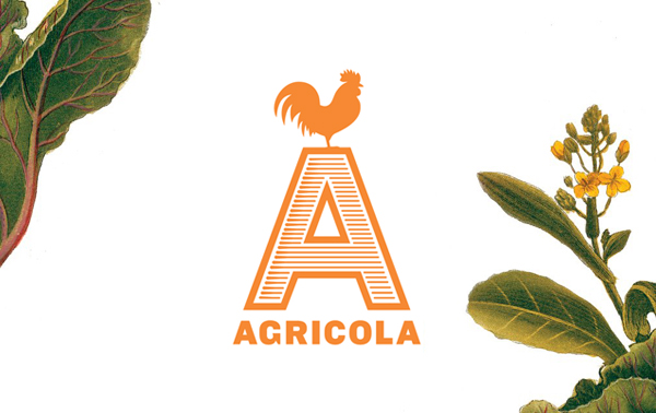
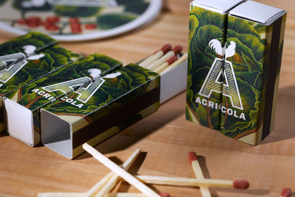
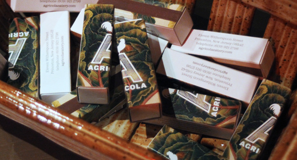
The combination of a large uppercase A with old-fashioned etched shading, bold, well-spaced but fairly neutral sans-serif logo-type, the warmth of a sunrise orange and the playful flourishes of a cockerel and pig – their stacked and triangular resolution sharing the qualities of a weather vane on top of a spire – delivers a straightforward union of traditional craft cues, agricultural efficiency and familiar farm-yard forms that appropriately places communicative weight on the authenticity and provenance of the restaurant’s ingredients and dishes.
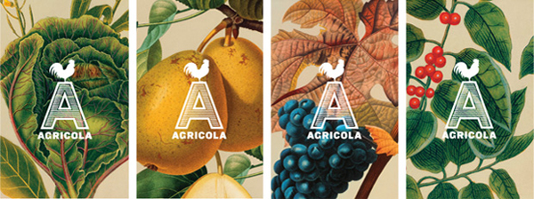
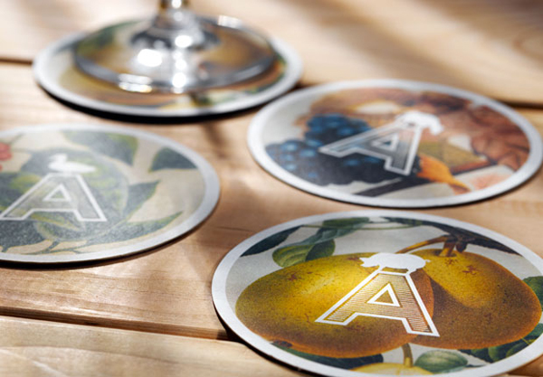
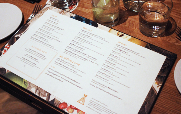
The crisp vector silhouette of the mark is juxtaposed alongside the rich, hand drawn illustrative detail of fruit and vegetables. Their organic texture, depth, light and shade, mixture of tone and aged quality – very much like scientific botanical observations of the 17th 18th and 19th century – appropriates a period authenticity that neatly resolves the traditional values of good natural quality and gives these a coherent, contemporary quality through through the combination of full bleeds, borders and white space.
