Regional Associates by Commando Group
Opinion by Richard Baird Posted 11 September 2013

Regional Associates are a dynamic, interdisciplinary and international architecture and research consultancy “committed to developing new models for the integration of environmental, social and economically sustainable projects” within the fields of eco-tourism, public infrastructure and private residential projects.
Regional Associates’ new visual identity, designed by Oslo based multidisciplinary and international design agency Commando Group, reflects the consultancy’s decentralised, flexible and mobile approach to architecture and research through an expanding and contracting monogram device that fits a variety of formats in print and online, a sans-serif logotype and the edge painted detail of the business cards.
Commando Group’s solution comfortably fits within the conventions of architectural identities, a well spaced sans-serif efficiency, practicality and functionality with subtle humanistic qualities. The expanding line detail in print and online, linking the letters of a monogram, although a little abstract functions well to convey a sense of flexibility without appearing unnecessary superfluous. This line element also runs around the edge of the business card as a painted finish that adds breadth to the concept and a sense of higher quality.
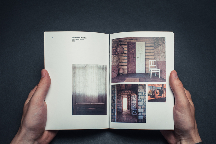
Their environmental and sustainable industry focus is, from what I can see from the project images, limited to their brochure work rather than being an integral part of the brand identity, perhaps a missed opportunity to add a little more communicative dimensionality, but as a whole, appears neat and well executed with the website providing further information.

