Noam by Graphical House
Opinion by Richard Baird Posted 28 October 2013

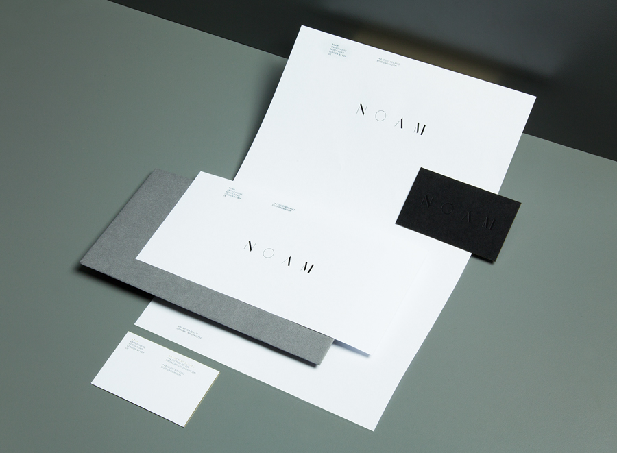
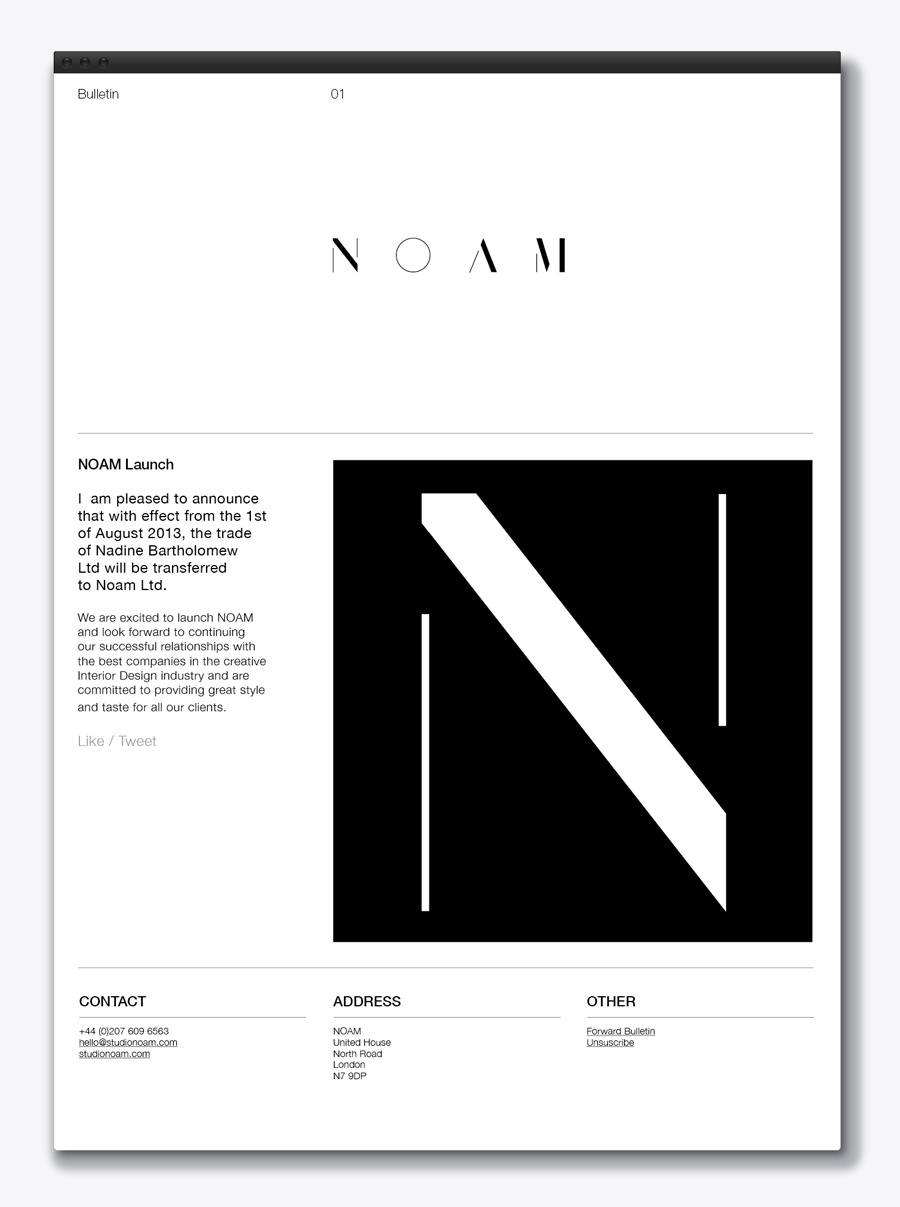
Noam is a London based interior design firm that specialises in luxury finishes. Graphical House recently developed a new brand identity for Noam which they describe as understated and articulating “the precise and deliberate attention to detail, material and finesse present in the environments created by the firm”. These values resonate through the high quality materials and print finishes, and offer a communicative and aesthetic counterpoint to the reductionist sensibilities of the logotype and website.
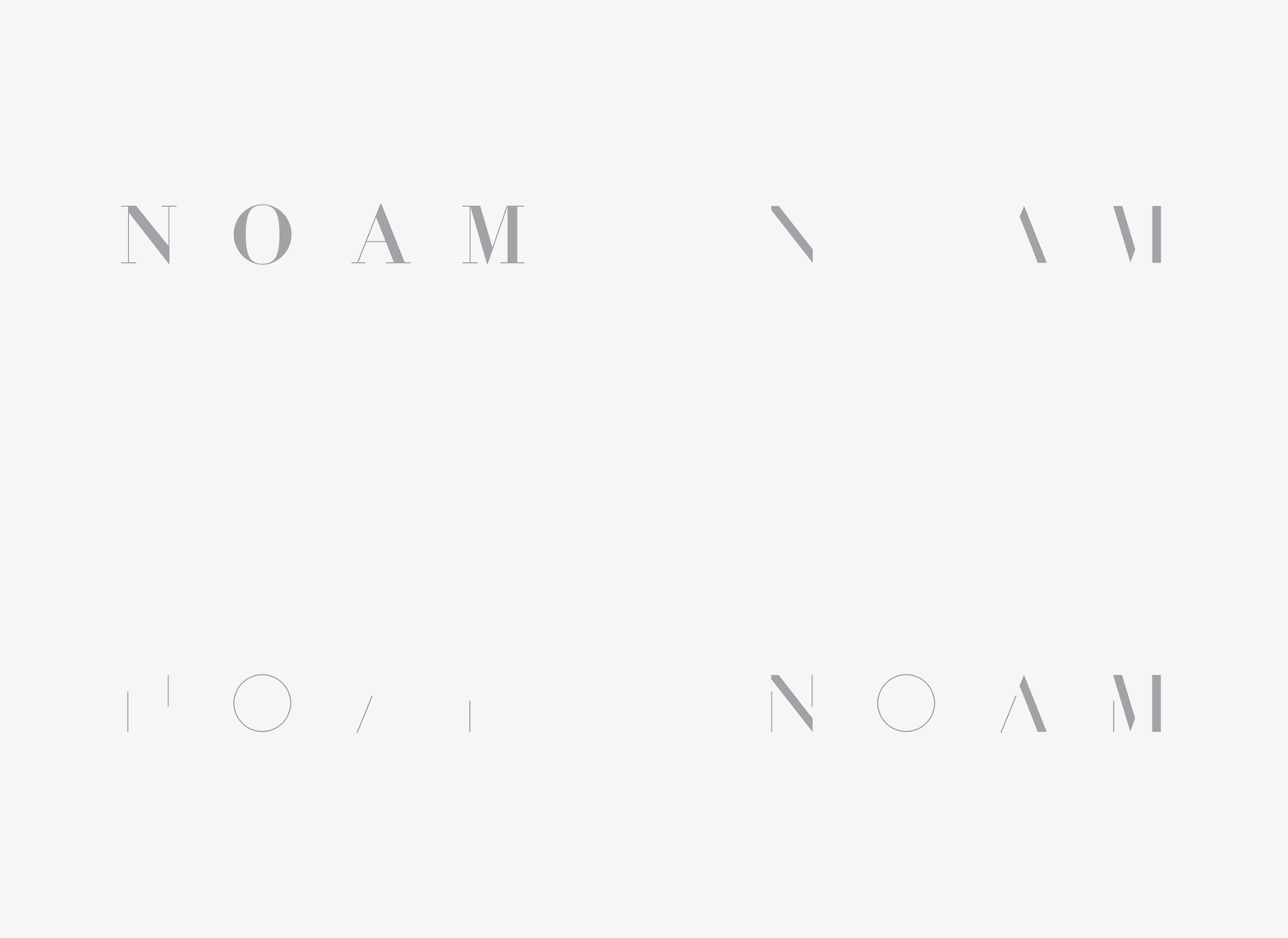
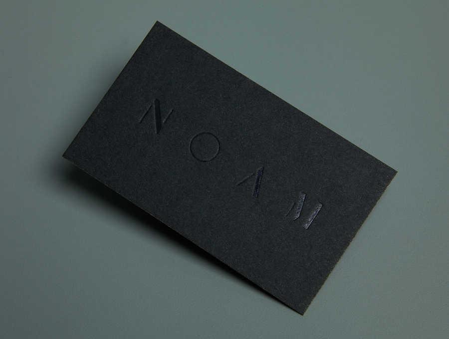
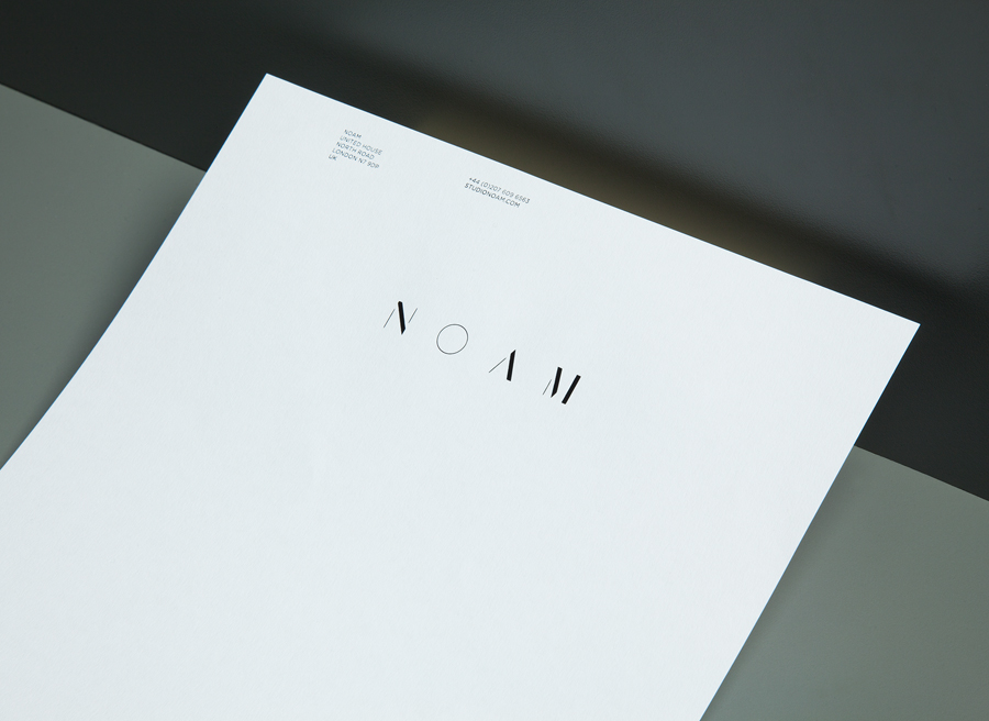
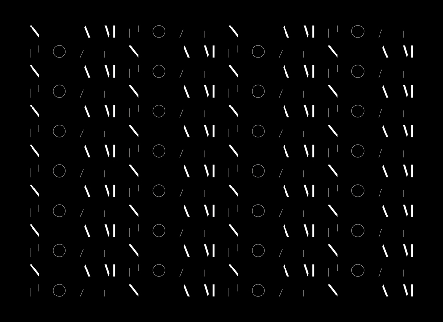
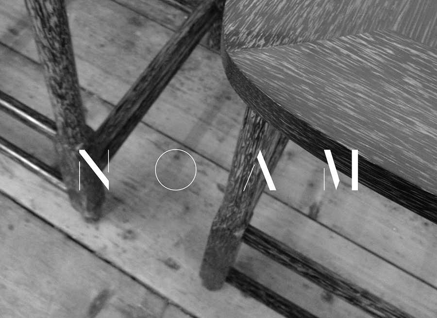
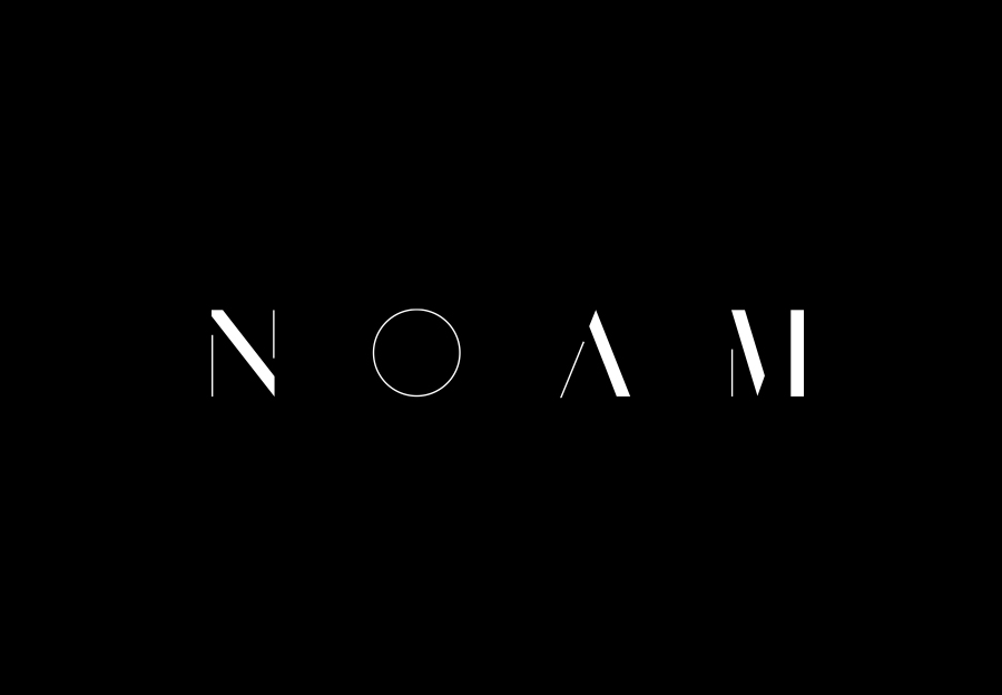
Graphical House’s reductionist approach to the logotype – which sees sans-serif characters being shaped from a modern serif whilst retaining the two distinctive stroke weights – works well to pick out and highlight the geometric and elemental forms of the name, establish a subtle architectural undertone, and deliver an interesting mix of classic foundation and contemporary efficiency, a theme that also resonates through the almost stencil cut utility. The juxtaposition of light and heavy line widths extract a sense of light, shadow and dimensionality from some of the characters whilst also conveying the idea of both bold and finer detailing. It is a solution that, through the activity of reduction, adds detail without becoming abstract or neutral.
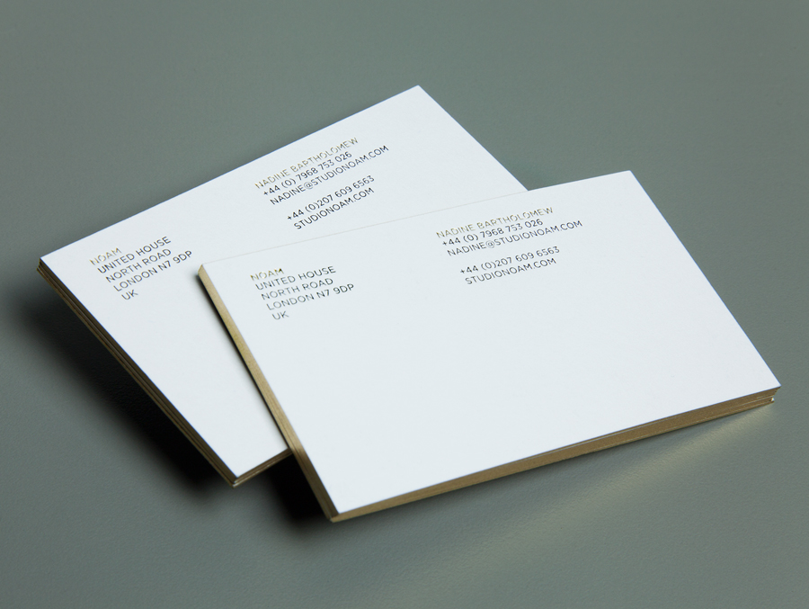
The elemental qualities of the logotype function well to amplify the print and material features of the stationery. Gold gilded edges, black foil deboss and the texture and weight of the boards introduce and convey the more luxurious aspect of interior design. The conceptual and aesthetic gap between logotype (reduction) and print (inclusion) is significant, delivering a nice communicative balance between structure and furnishing.
