Oggu by Design Bridge
Opinion by Richard Baird Posted 18 May 2011
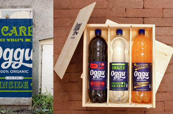
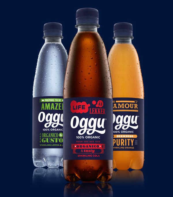
Oggu is a Dutch brand of soft drink, the first European brand to use only 100% organic ingredients and owned by Organic Beverages. They approached the Amsterdam office of Design Bridge to develop a name, identity and packaging for their premium range. Based around the idea of ‘Delicious Purity – with a twist’ the name is a combination of the words organic and gusto (taste in Italian).
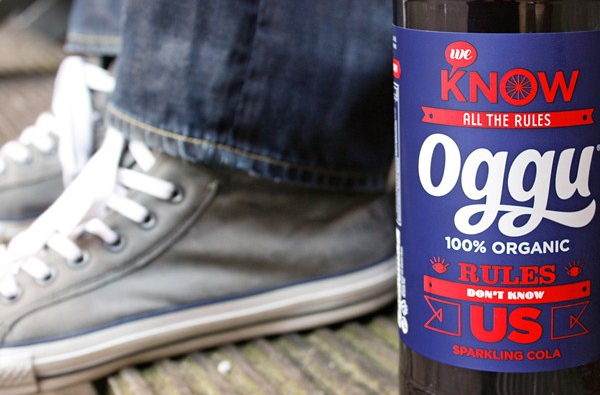
“Oggu needed to be a true Euro-brand so we introduced a witty mix of European languages and gave each flavour its own fun, t-shirt style slogan, using deliberately unrefined and quaintly retro graphics. Overflowing with eccentric brand personality, Oggu avoids taking itself too seriously by playfully engaging with consumers whilst still communicating passionate commitment to its pure, organic provenance.”
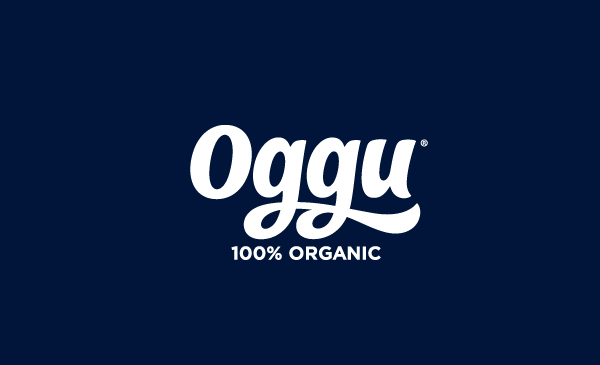
I really like the character of this new range which feels like an intelligent step away from the sticky and sweet sensibility associated with other brands. The packaging utilises the current and popular trend for retro mixed type and illustrations that give both a traditional yet modern appearance. The word-mark is a wonderful example of strong typographical work that is well rendered and conceptualised to fit well within the label hierarchy and style of the brand.
