Triumph & Disaster – On The Road by DDMMYY
Opinion by Richard Baird Posted 7 July 2014
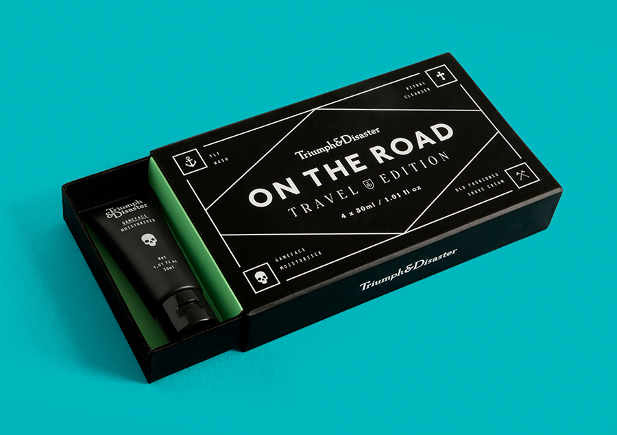
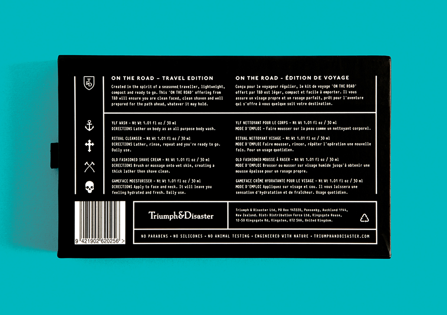
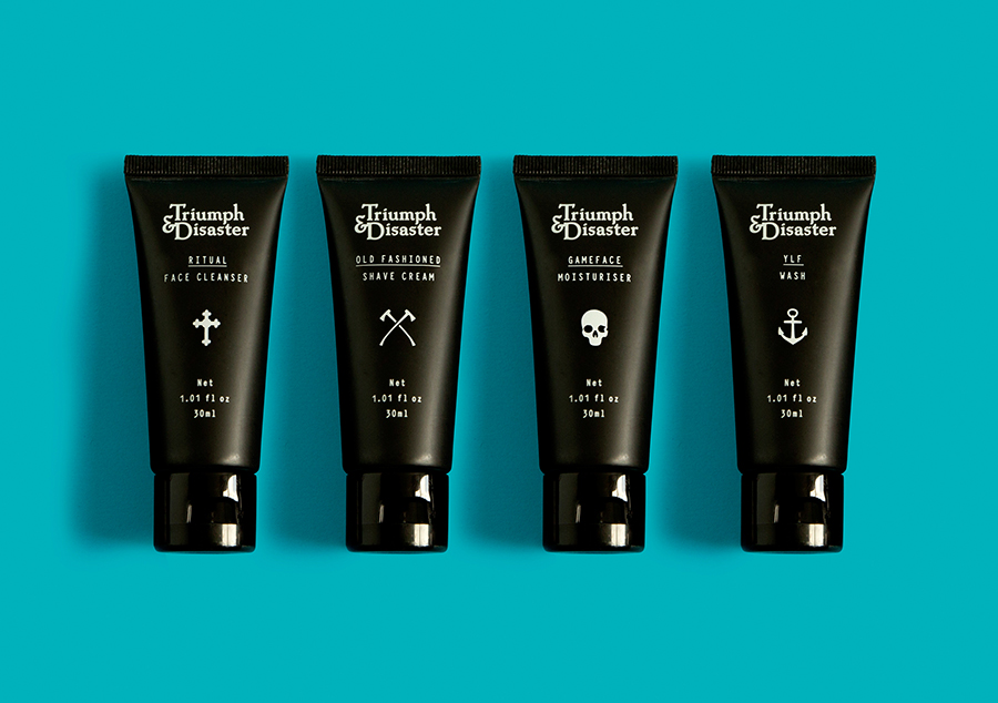
Triumph & Disaster (T&D) is a male skincare and accessory brand that appropriates the traditional grooming experience associated with the past and fuses it with the high quality, natural and scientifically formulated expectations of today’s market. T&D’s packaging, created by New Zealand based design studio DDMMYY, references and confidently brings the type-heavy, heraldic detail, and traditional structural and material choices of the past into the present with a clear communicative consistency and an unusual but distinctive white on black colour palette. DDMMYY continue to work with Triumph & Disaster and have recently published images of their packaging solution for the brand’s latest travel kit On The Road.
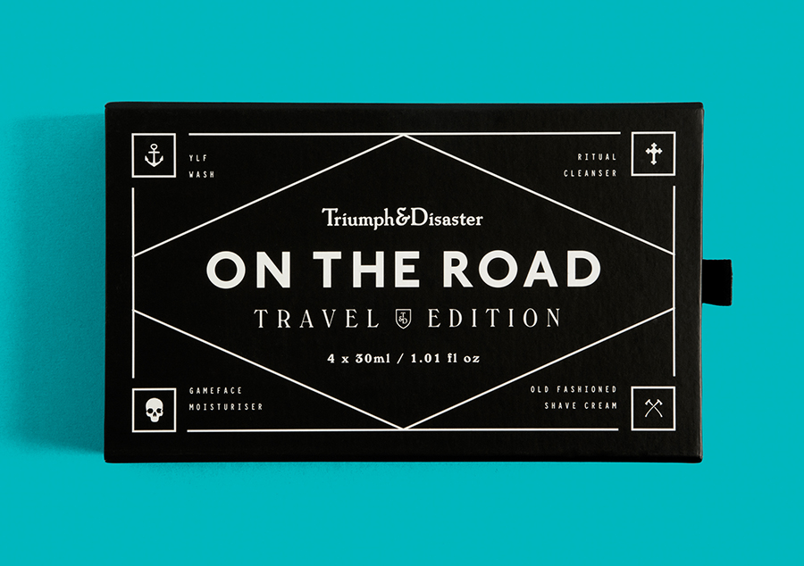
A simple tray and inlay solution provides a larger canvas for many of details created by DDMMYY and established across T&D’s original line of products. These include a typographical contrast of classic serif flourish and the contemporary functionality of a light monospaced serif as well as the white over black colour palette.
The introduction of another sans-serif, far bolder and geometric in its build, the small iconographic assets of an anchor, cathedral cross, skull, the green of the inlay — the first use of colour — slide out draw and the fine lines and borders, appear as an interesting mix of tarot, biker, tattoo, and board game references that add character, further contrast, and a subtle mysterious dimensionality alongside the more retrospective elements and contemporary functionality.
Design: DDMMYY
Opinion: Richard Baird
