Signet 100 HB Pencils by Well Made Studio
Opinion by Richard Baird Posted 11 December 2014
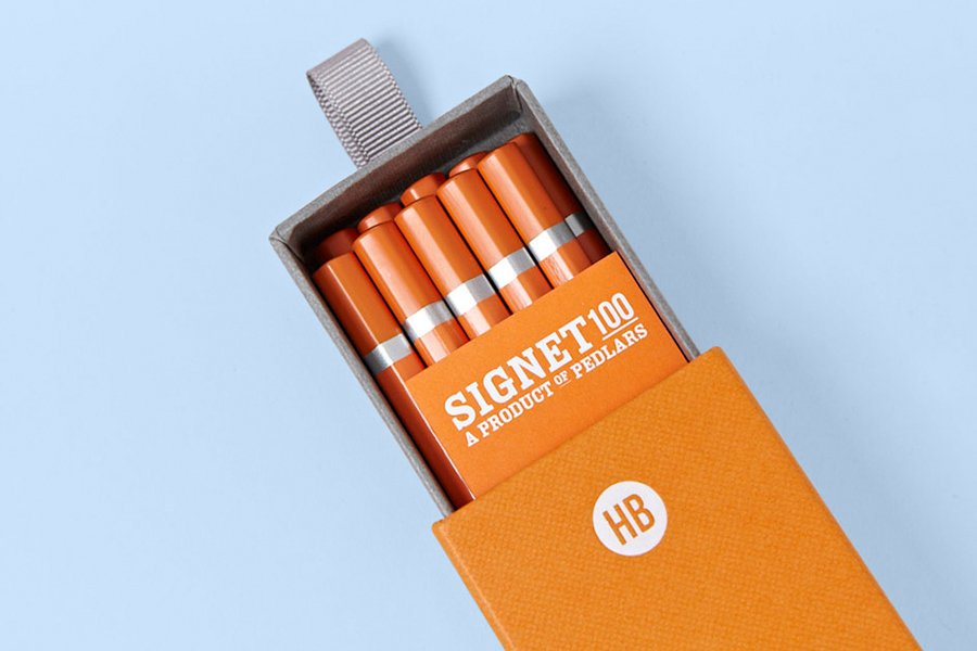
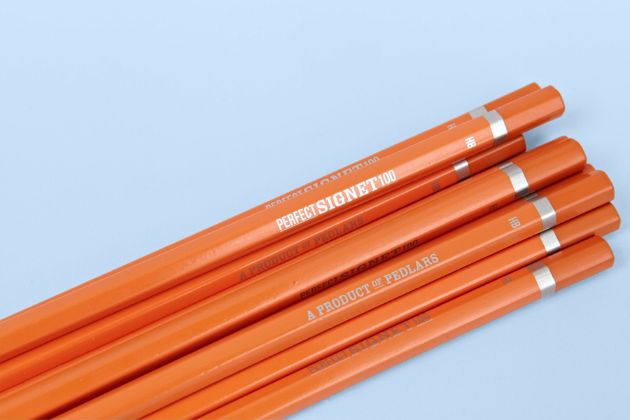
Signet is a new pencil range developed by British home, outdoor and lifestyle retailer Pedlars, who applied their expertise to an own-brand product line following a lengthy international search for the perfect pencil. 100, the first of the Signet range and launched in November this year, is made from American basswood, finished in orange with a silver foil detail and crafted by a long-established family-run business in the Czech Republic.
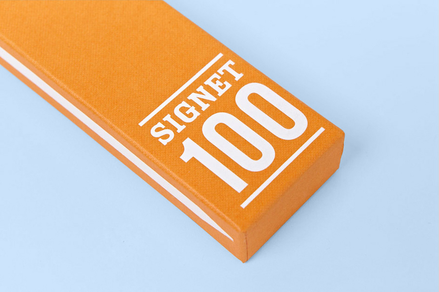
Well Made Studio were given an open brief by Pedlars to select the pencil finish and develop a complementary visual identity and packaging treatment. Informed by modern typography from the mid-20th century with consideration given to future ranges, and using a bright orange board and white ink, the studio looked to create a solid and minimal solution that would stand out from what they describe as a market of fussy vintage-inspired competitors.

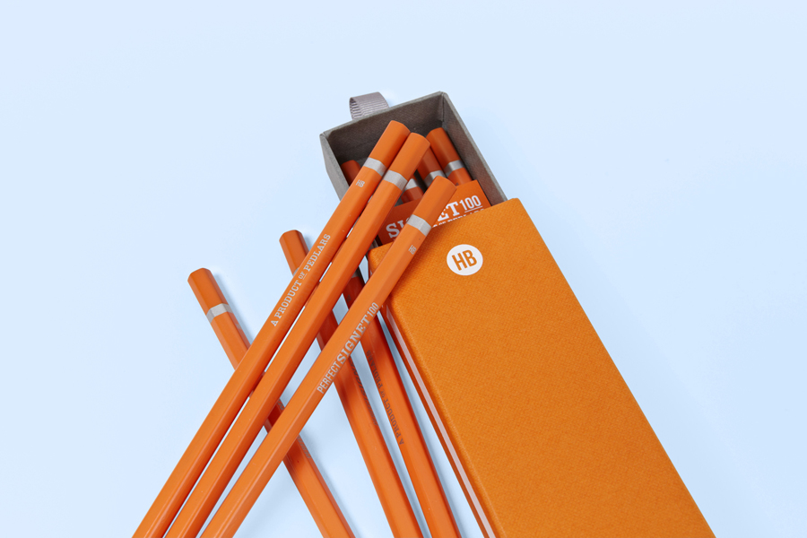
The brackets, weight, serifs, stroke contrast, underline and slightly off spacing of the logotype and its variations, in conjunction with a condensed sans-serif, secures a period, handset, hot metal type charm. Alongside the heavy grey board and tray of the structural design, these elements contribute to a distinctive, robust and industrial sensibility that appears utilitarian and retrospective in its inspiration without appearing disingenuously vintage.
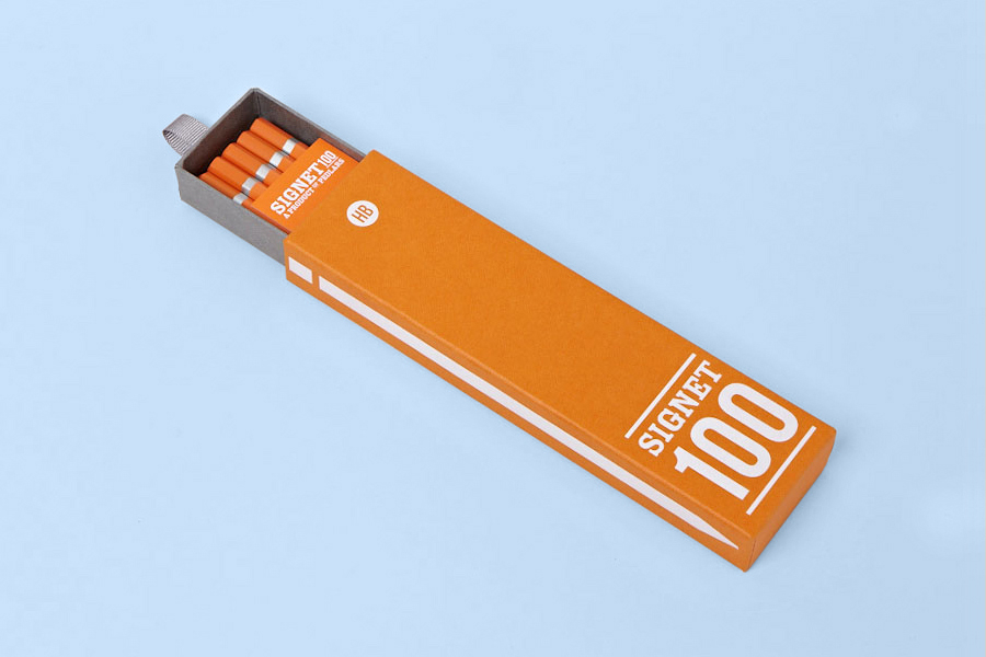
The stacked and vertical lock-ups of the type across the box and pencils add a small aesthetic variety and further communicative intention — drawing on perfection and origin as a Pedlar product — to what is a largely reductive approach. This is only slightly undermined by what feels like a superfluous pencil illustration along the side panel. The bright orange and Buckram surface emboss of a Colorplan sleeve, white foil and ribbon, round off the industrial with a current, tactile and crafted quality.
The result, through the physical experience of structural choice, material texture, weight and print finish, instead of an excess of type or image, effectively resolves the long-standing basic utility of the pencil with its new luxury position, and its broad use by creatives, craftsmen and engineers in a way that is inferred rather than read.
Design: Well Made Studio
Opinion: Richard Baird
Fonts Used: Cam & Bebas Neue
