Marbella Club by Pentagram
Opinion by Richard Baird Posted 17 March 2015
Marbella Club is a hotel, spa and golf resort located in the Spanish coastal city of Marbella, on the shores of the Mediterranean sea. Built as the private residence of Prince Alfonso of Hohenlohe-Langenburg, and converted by the prince into an exclusive, private hotel and retreat in 1957, Marbella Club has a significant heritage, one that has played host to royalty, stars of the silver screen, and legends of the music business.
While perhaps some of the glamour of 1950’s and 60’s Hollywood has left us, Pentagram’s new brand identity treatment, directed by John Rushworth and coinciding with Marbella Club’s sixtieth birthday and recent refurbishment, captures some of the qualities of the period and confidently plays with nostalgia, glamour and legacy with a current precision. This occurs in print through texture, colour, photography and symbology, and online with a detailed timeline component.
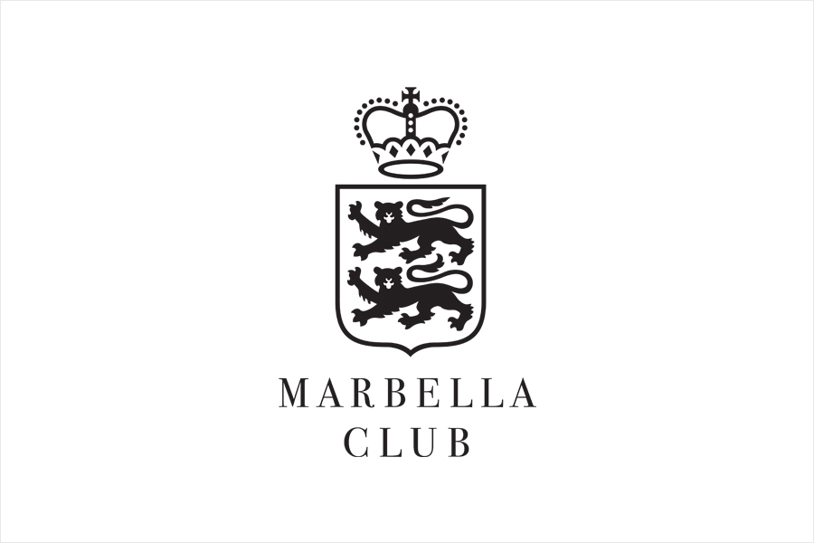
The logo effectively draws together the themes of heritage and aristocracy, and the hotel’s luxury and exclusive positioning through the familiar, communicative and timeless forms of a shield, crown and the typographical flourishes of a serif. These have been rendered with a more recent vector precision, good use of space, line detail and appropriate reduction, without undermining the values it looks to convey. Although often disingenuously appropriated, shields and crowns remain an effective asset when appropriate, and built upon through storytelling. Pentagram acknowledges this with a thorough and well-written timeline online.
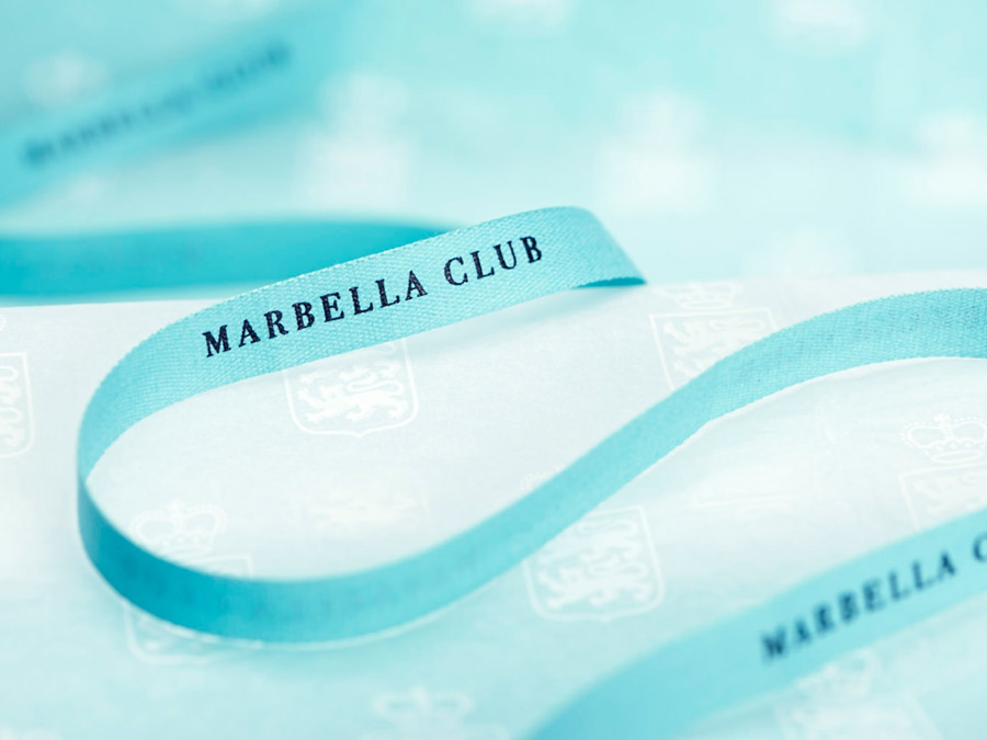
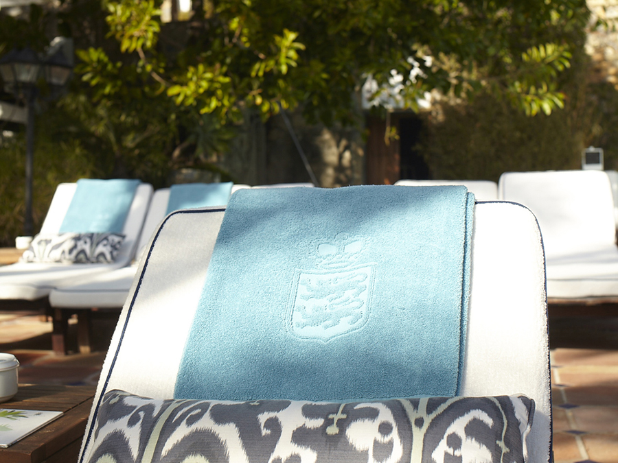
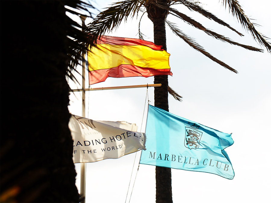
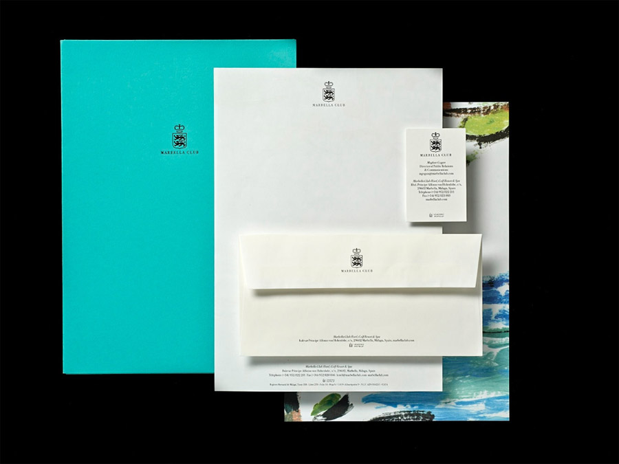
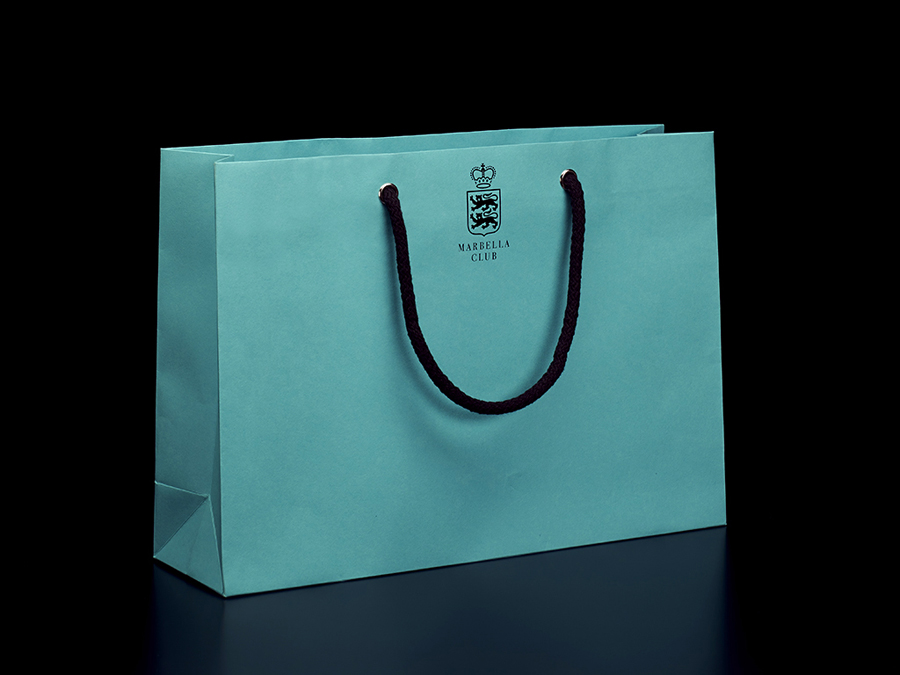
Stationery layouts and shopping bags are classically straightforward in their layout, application of the shield and logotype and block foil print finish. An aqua blue adds a more recent, distinctive but still retrospective quality to these, drawing on poolside lounging, which then plays out across and ties together a variety of other printed assets.
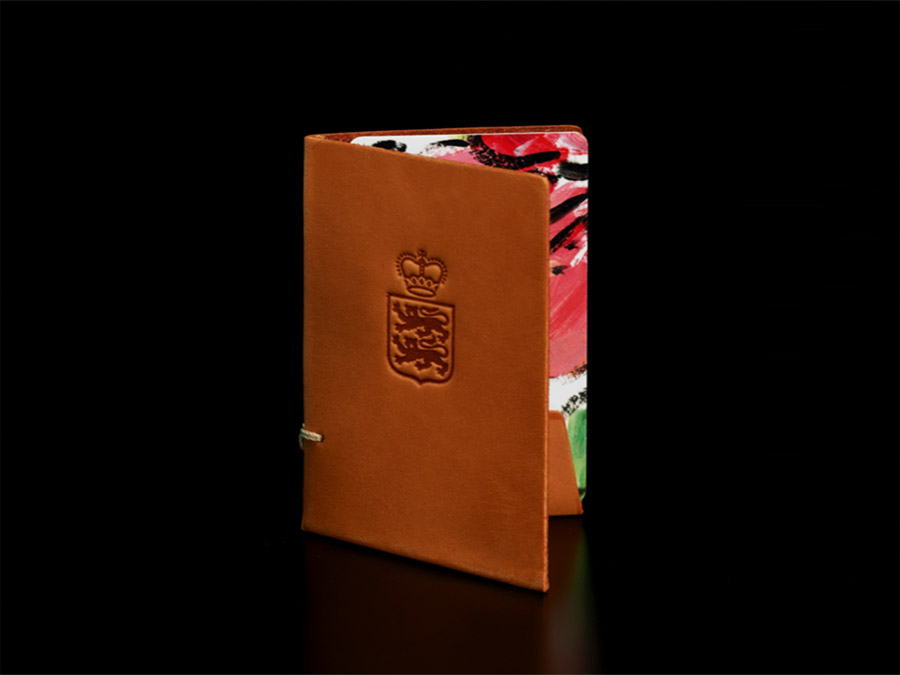
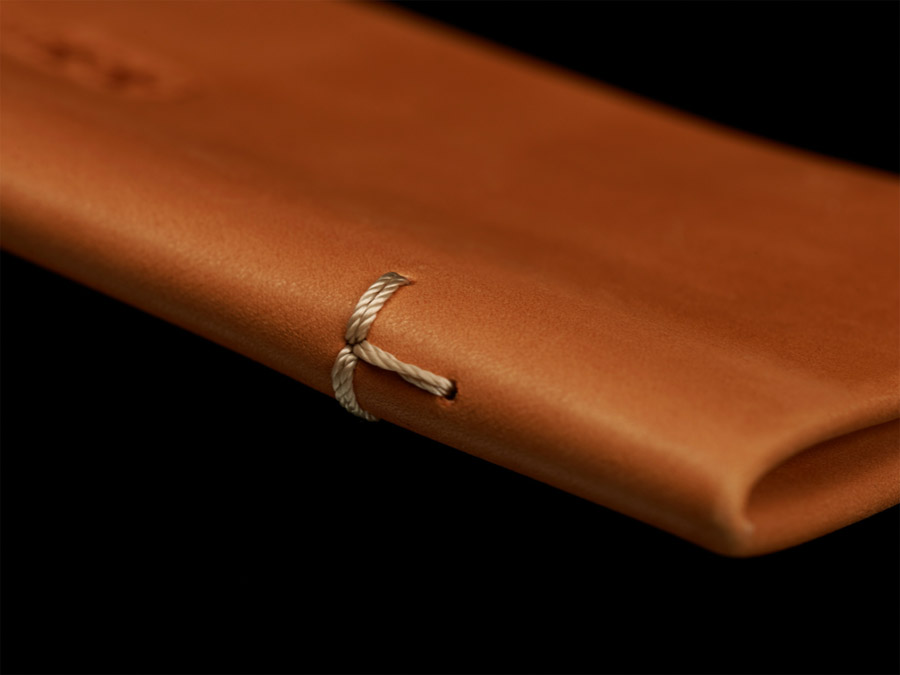
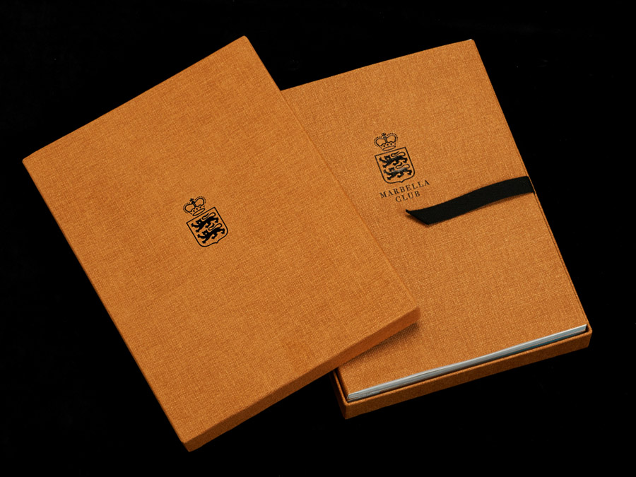
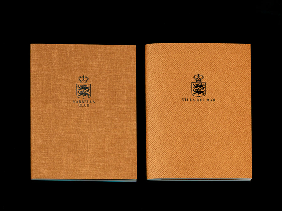
While the shield clearly implies significant heritage and a royal connection, the warm light brown and aqua blue colour palette, recent and retrospective photography, and the hessian and undyed leather material textures of the brochures and keycard wallets, bring the identity further forward but not entirely into the present. It mixes sandy beaches with poolside and sea views, the colour and textures you might associate with 70’s furniture, alongside the high quality and craftsmanship associated with open stitches and further block foil.
A contrast of full bleed and bordered photography, a mix of saturated colour, black and white, and scenes of hotel luxuries, personal snapshots and kitchen images do a good job of dipping into and bringing together the long history of the hotel, the environment, the warmth of its location, its services and leverages the glamour and interest in the lives of the famous. This also runs throughout the composition, tone, model styling, objects, fashion and content of the photography online.
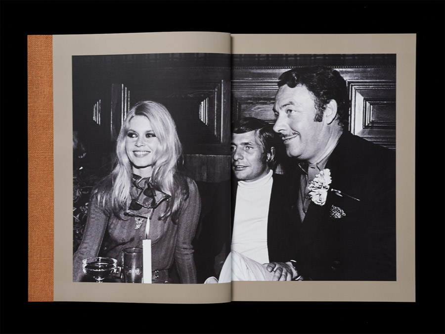
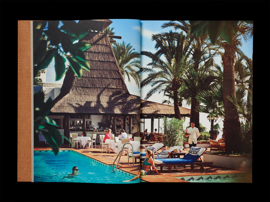
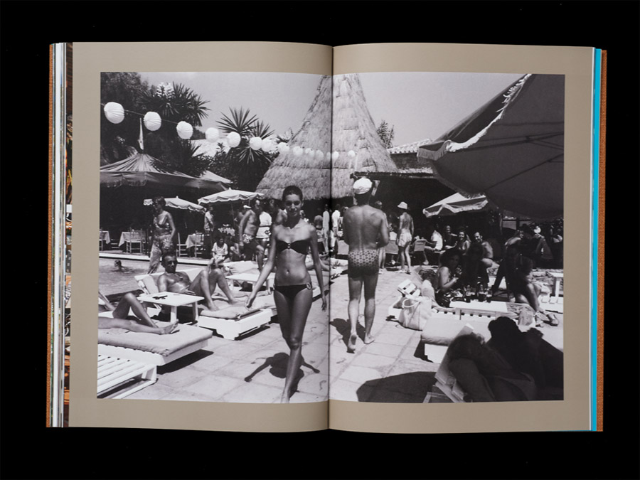
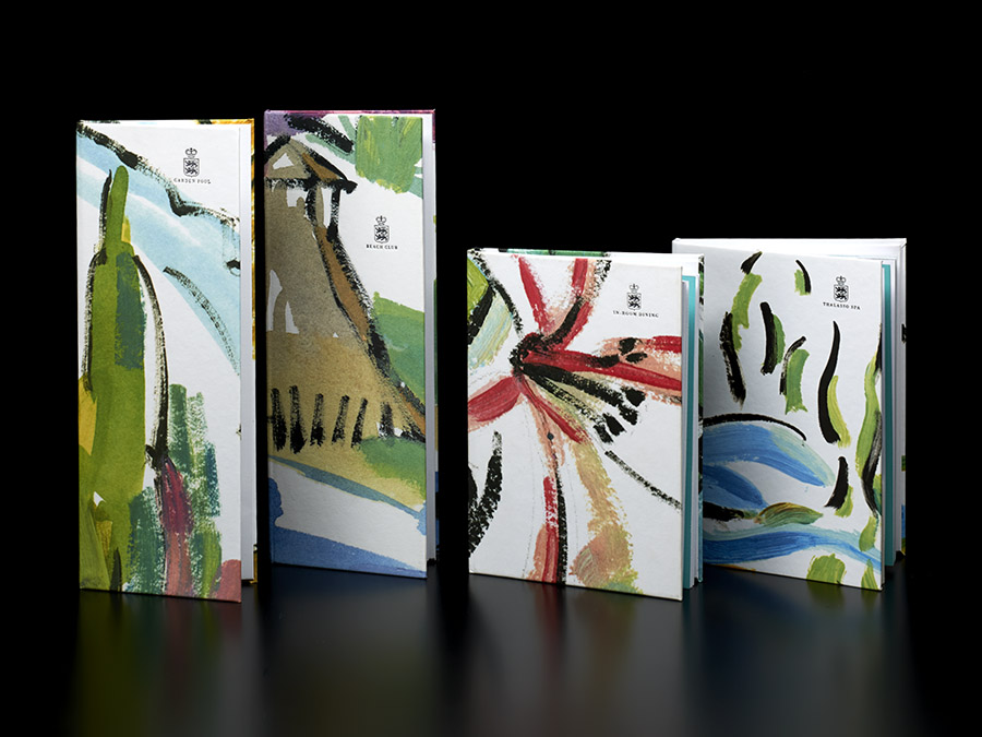
The illustrative detail of the menus, capturing the flora of the resort’s tropical gardens, introduces colour, visual texture and an element of the arts, pulling the identity forward but again have an element of the retrospective about them. These are simple with some great motion and brush detail in the strokes, a watercolour palette befitting of the warm climate and enhanced with plenty of white. While the photography and identity are formal the illustrations temper this and introduce significant contrast with a layer of conviviality and individual expression that feels right for a holiday destination. More from Pentagram on BP&O.
Design: Pentagram
Partner-in-charge: John Rushworth
Associate & Designer: Jane Plüer
Designer: Jonathan Arundel
Opinion: Richard Baird
