Decontoured by Bunch
Opinion by Richard Baird Posted 10 April 2015

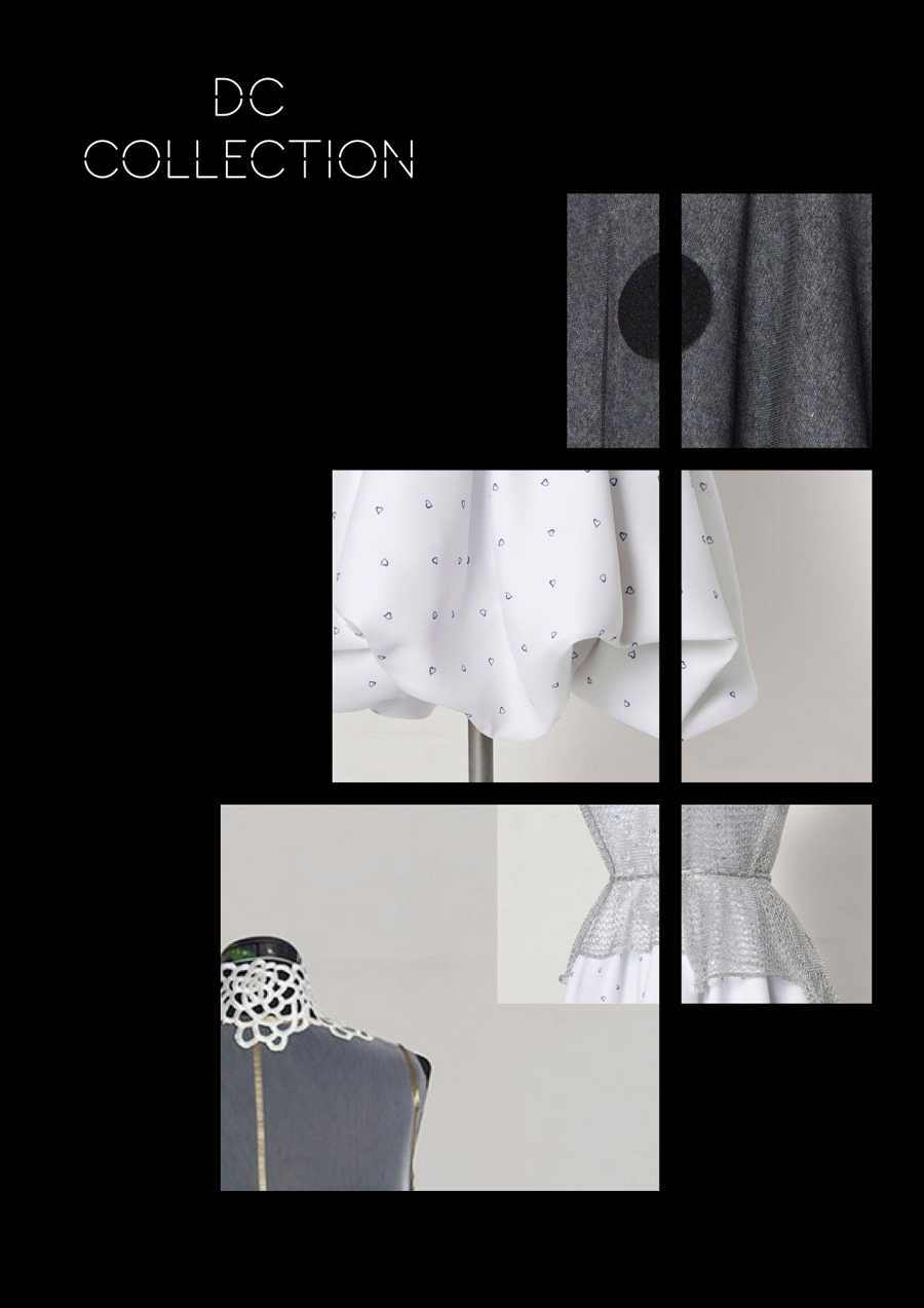
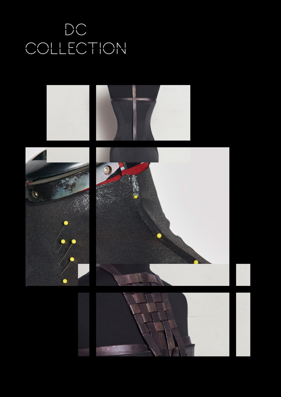
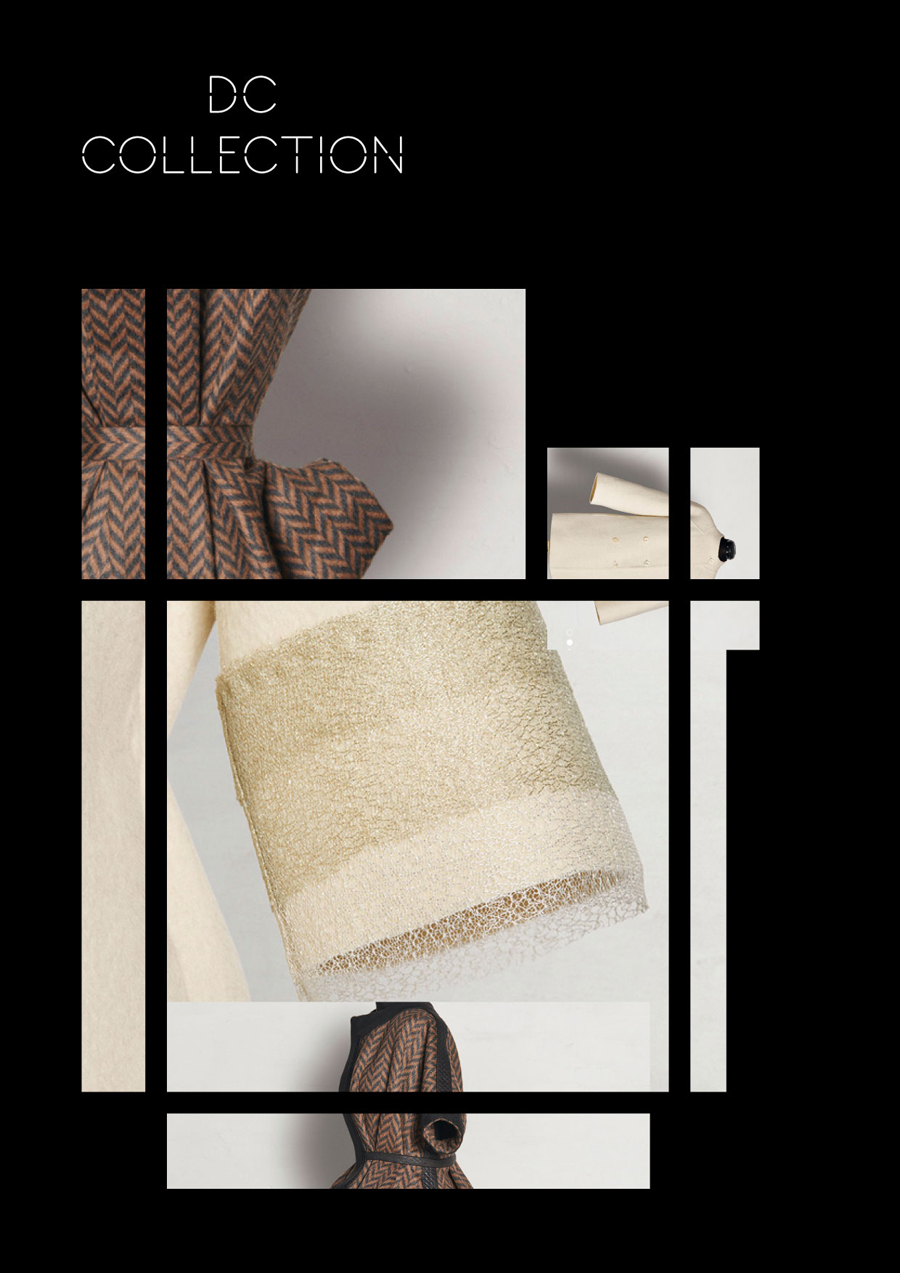
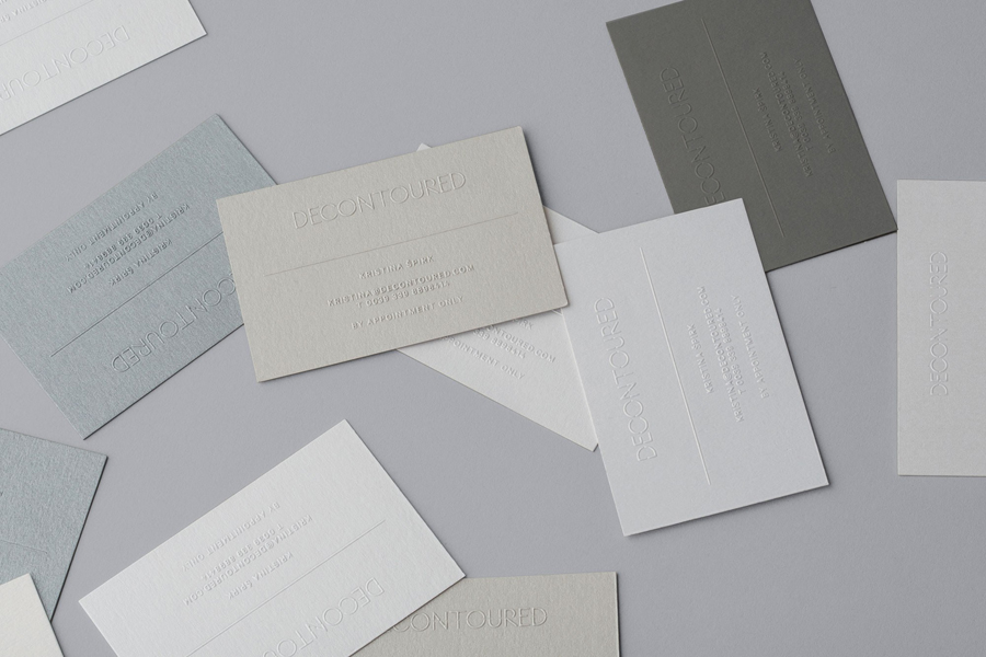
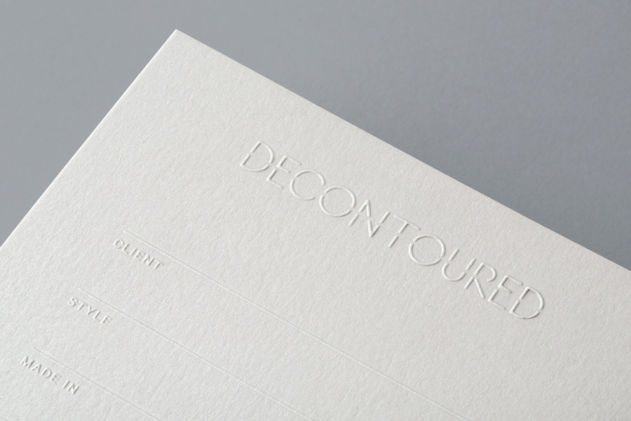
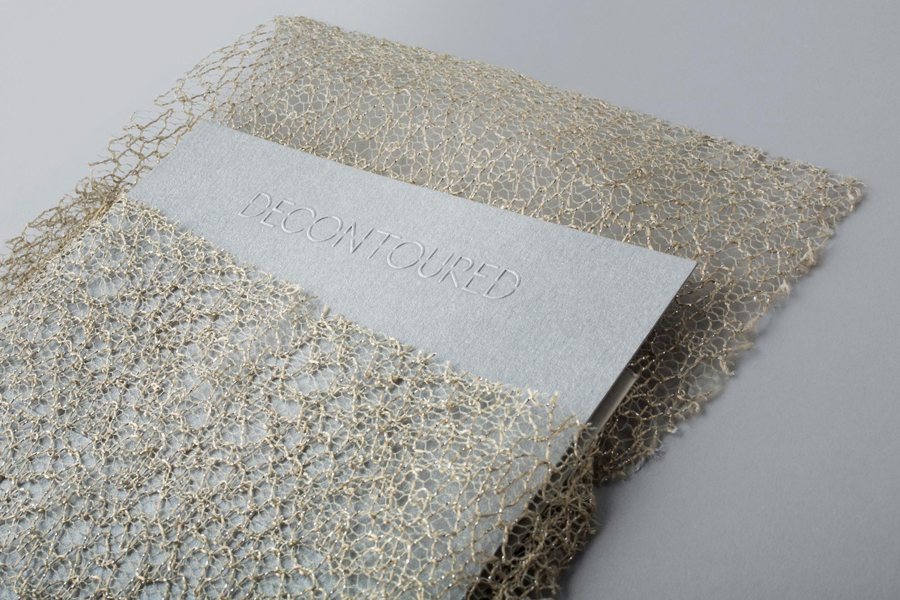
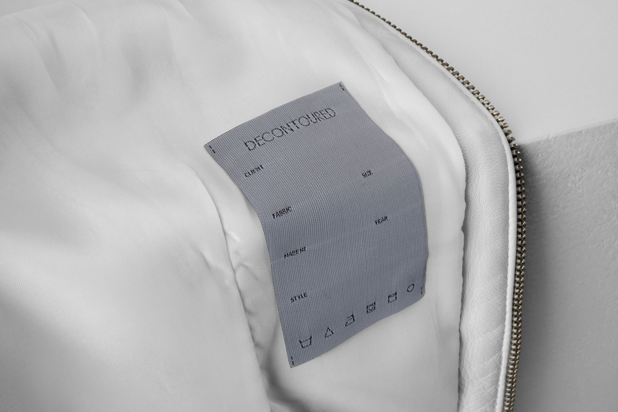
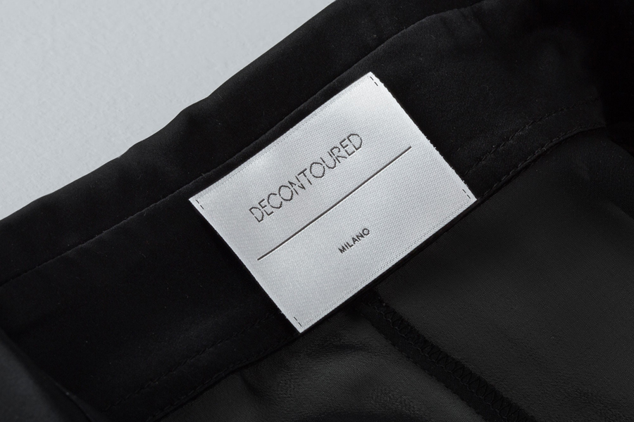
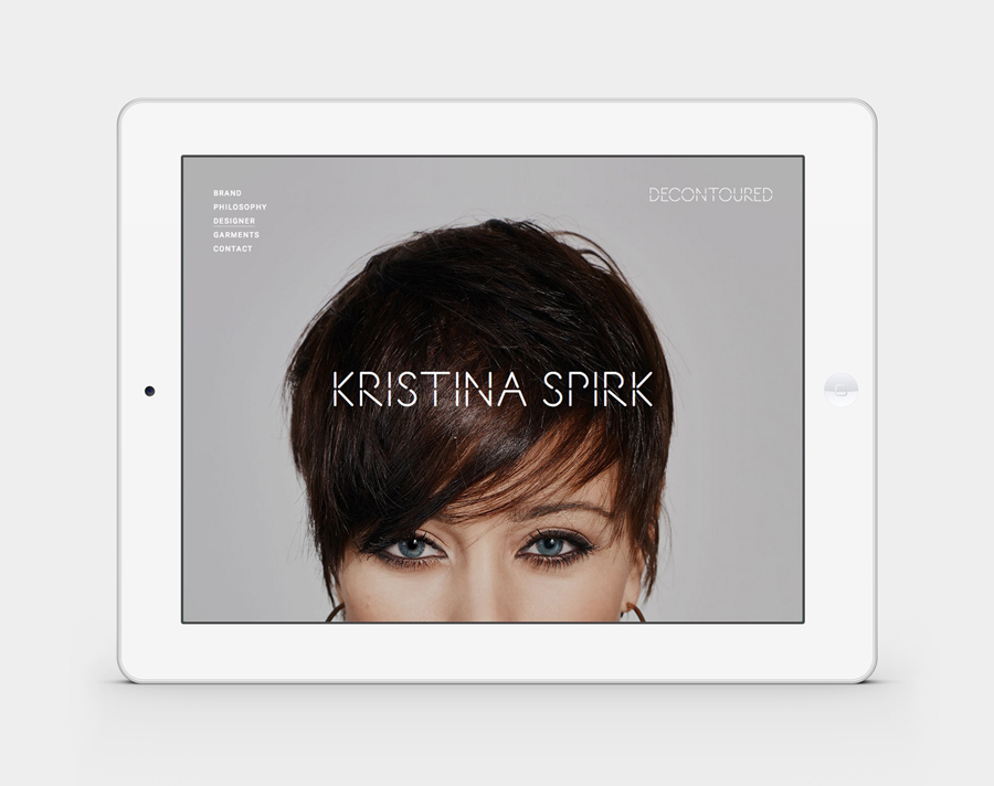
Decontoured is a Milan based, by appointment only, fashion label that provides a bespoke service for redesigning existing garments. Its philosophy is firmly rooted in an aesthetic sustainability and value that transcends seasonal fashion trends, and acknowledges a shift in consumer behaviour from the mass-market towards conceptual products and personalised practices. The label’s approach is one of collaboration, craft, innovation and sustainability, and celebrates beauty in imperfection. These values are drawn together and conveyed throughout its new brand identity treatment designed by Bunch, using custom typography, garment detail, photography, material choice, print finish and contrast. The project also included labels, business cards, posters and website.
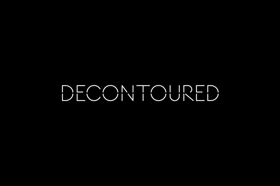
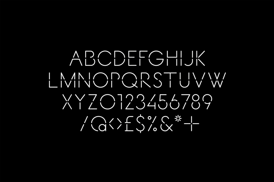
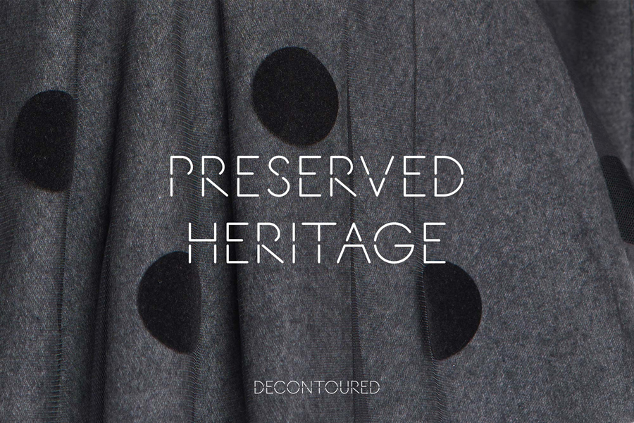
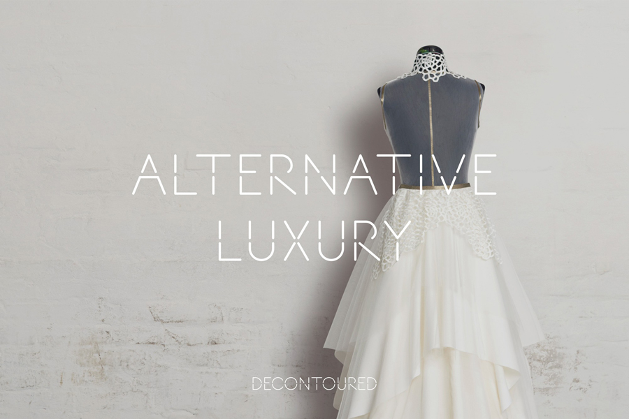
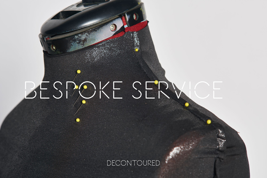
Based around a custom typeface of geometric, monolinear and stencil cut uppercase characters, an ad campaign of cut, cropped and reassembled images, photography of material detail and process, the urban sensibilities of uncoated concrete grey boards, distressed backdrops and the high quality of a blind emboss, Bunch’s brand identity is one of contrast and texture. It effectively juxtaposes the utilitarian alongside the ornamental using disparate assets and their associations to enhance visual impact and communicative value. The themes of bespoke service and customisation runs throughout the project both as a subtle subtext in the project specific design of the typeface Fragmenti, and the more literal visual cues of cut images and mannequin. More from Bunch on BP&O.
Design: Bunch. Opinion: Richard Baird.
