Bubu by Bob Design
Opinion by Richard Baird Posted 26 August 2015

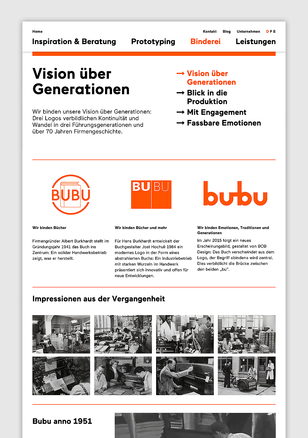
Buchbinderei Burkhardt, now shortened to Bubu, is a family-owned binding specialist established in 1941. It is now run by third-generation family members and has locations in the Swiss cities of Zürich and Mönchaltorf.
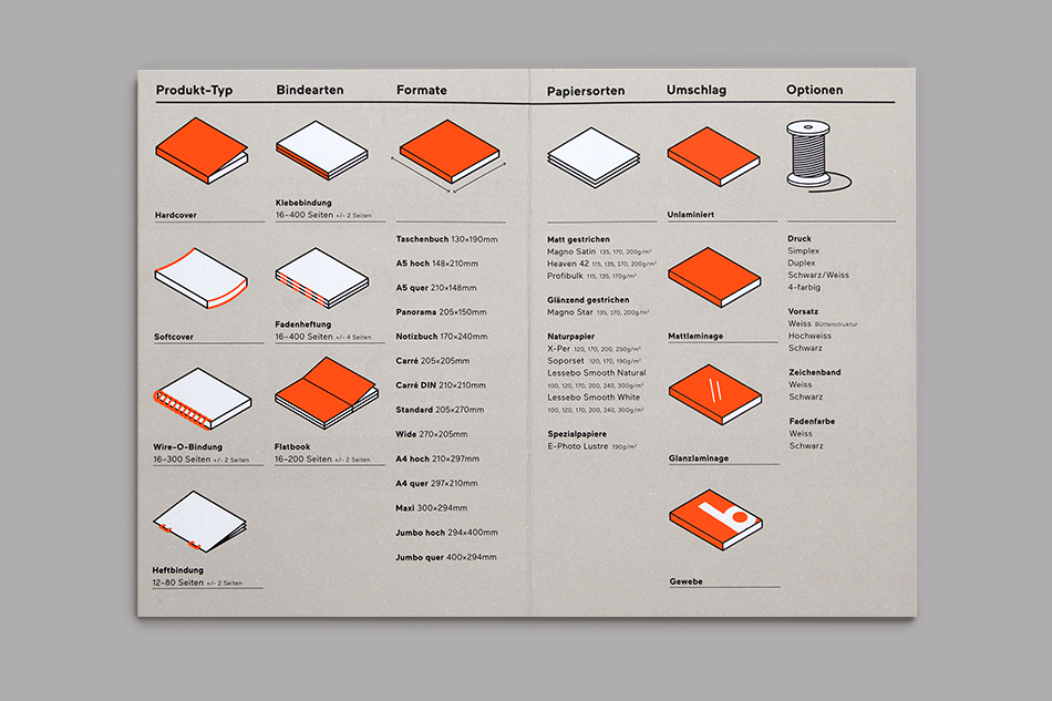
Bubu provides consultancy and prototyping services, curates an extensive binding library of over 2000 books, and offers a wide variety of soft and hardcover binding techniques. These include the familiar and utilitarian such as comb, staple and glue, and extends to the more traditional crafted processes of thread, thread and knot, and lock stitch.
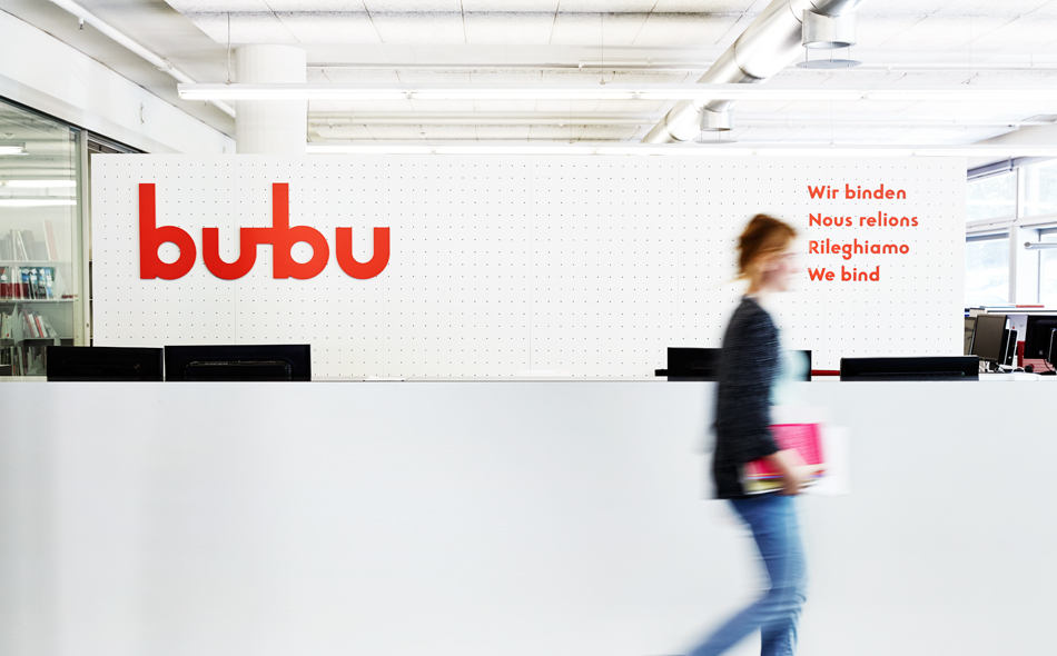
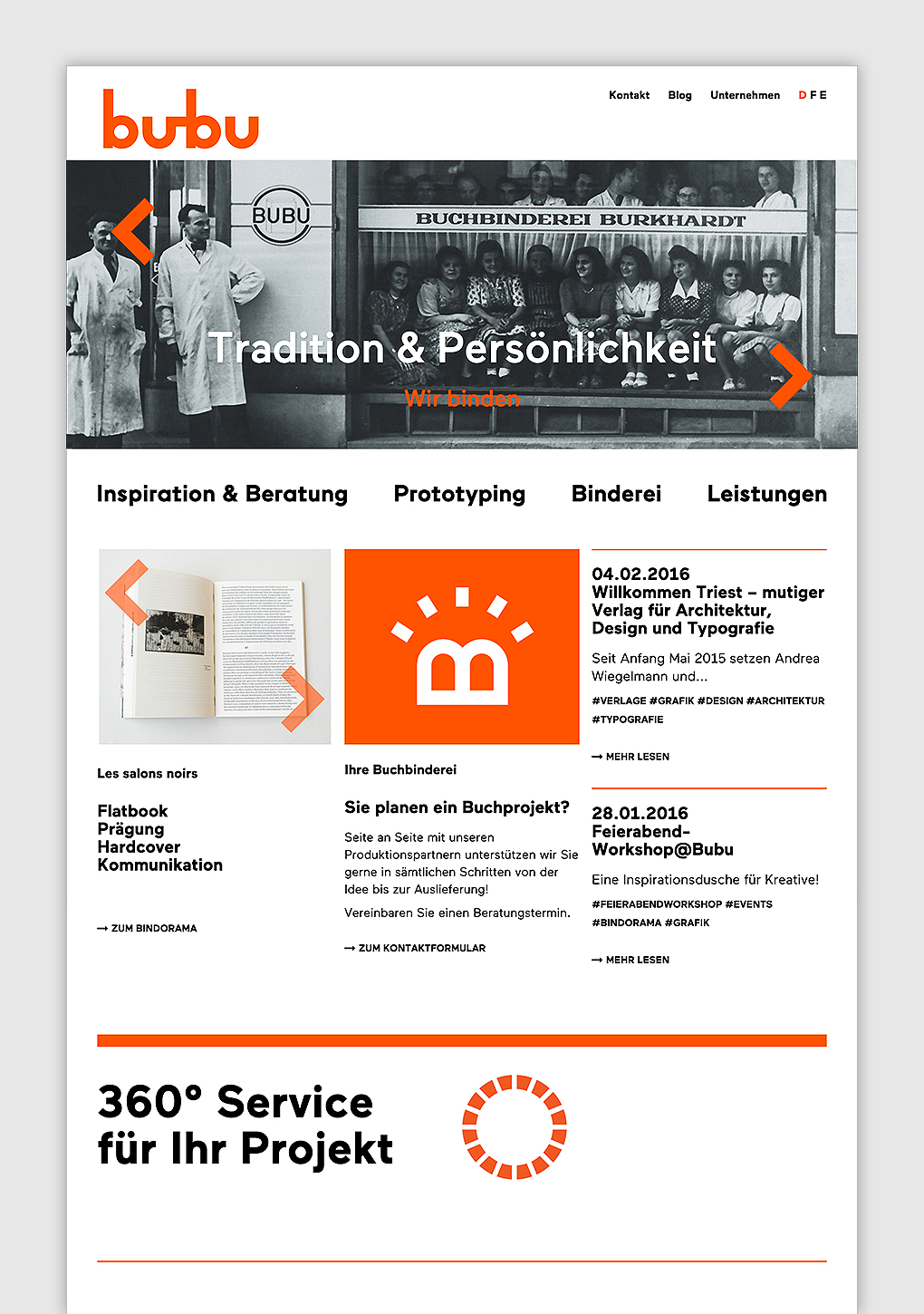
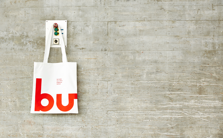
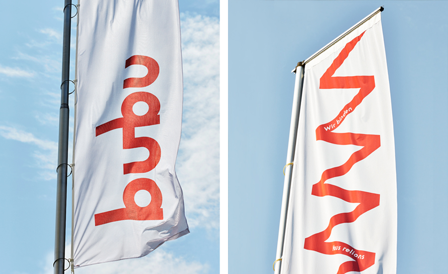
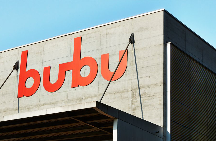
Bubu worked with London and Zürich based graphic design studio Bob Design to revise its visual identity and link digital and print based communications. Assets included logotype, business cards, envelopes, packaging, signage, vehicular graphics and web design. This post was updated 13/05/16 with a bunch of new project images.
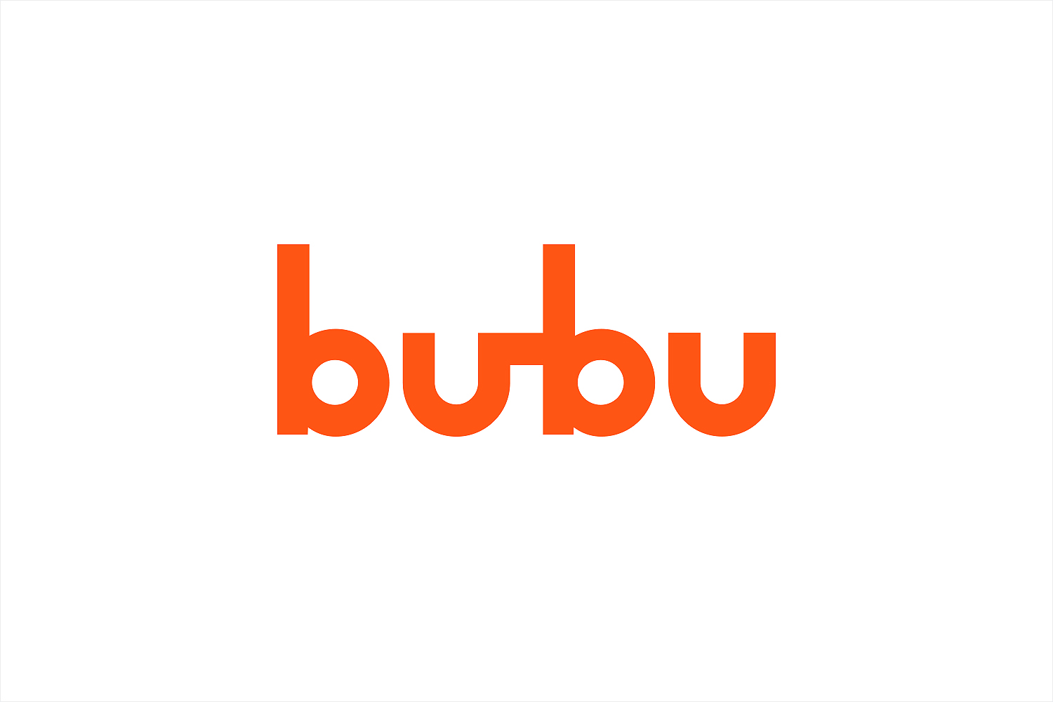
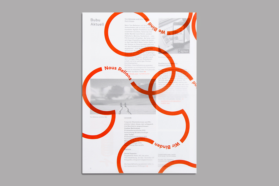
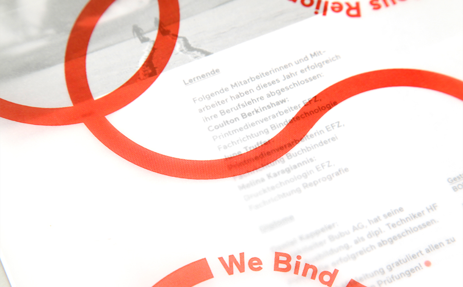
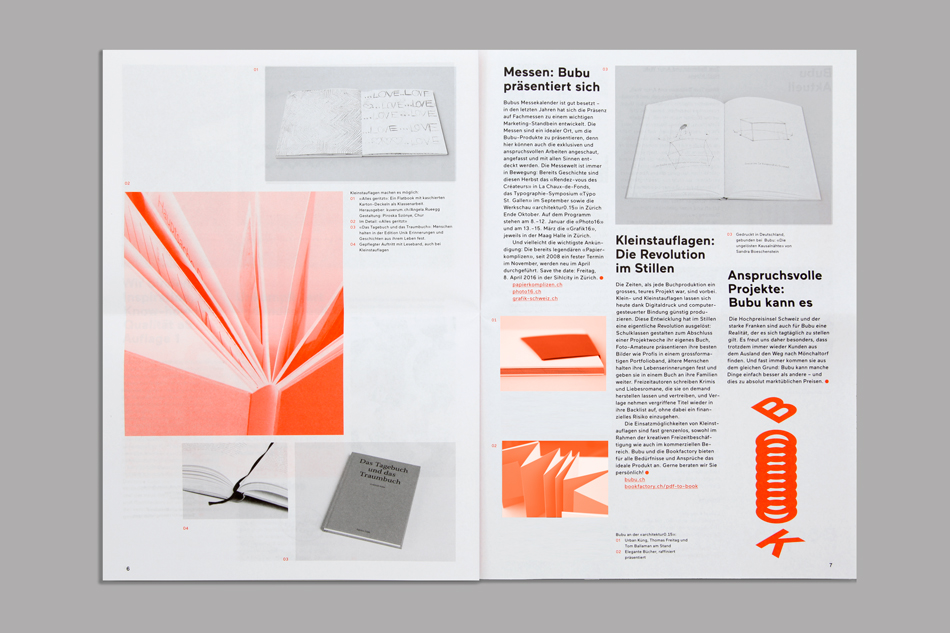
Bob Design’s approach is aesthetically simple in its form language; an neat translation of the physical, universal and often unseen fine binding detail of books into a prominent, proprietary and playful graphic asset. It retains some of the equity from Bubu’s previous identity through a “ub” ligature, references its Swiss roots with an impactful single red ink across white board, and draws out and emphasises the basic functionality of book binding services through geometric form, font choice and few inks.
The identity favours aesthetic impact over communicative nuance and, for the most part, leans more towards utility and reduction rather than heritage, tradition or craft, however, this plays out more appropriately through Bubu’s sample packs, back catalogue and extensive library (below). Identity makes its way into the library with some neat window decals.
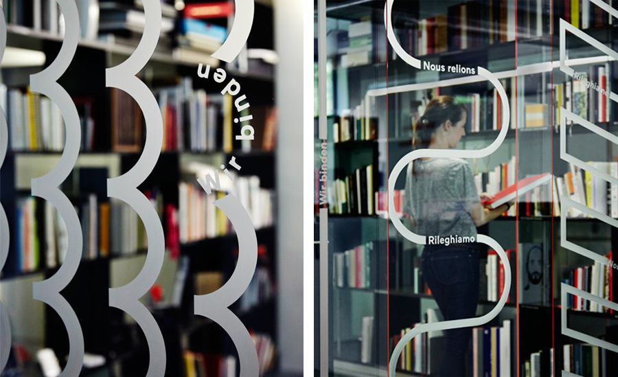
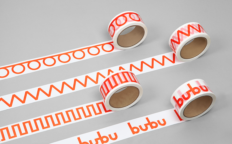
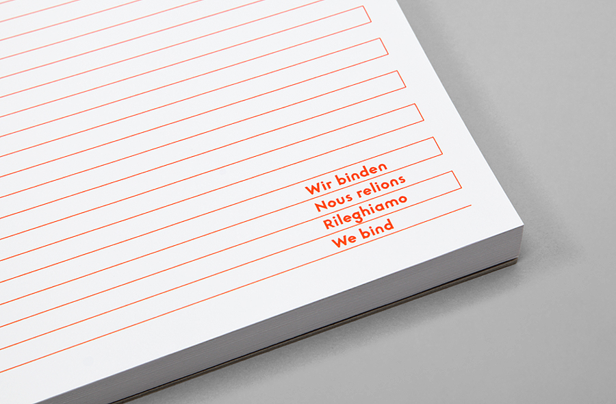
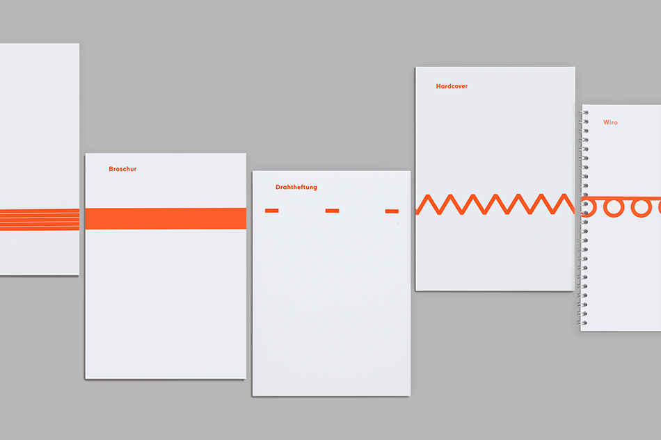
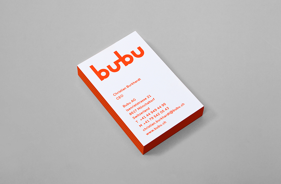
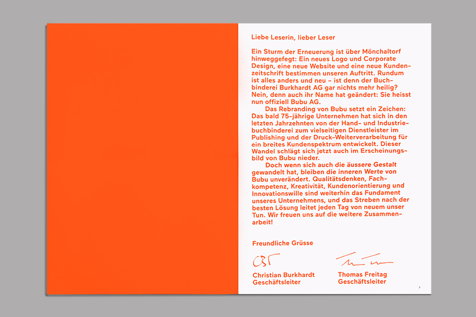
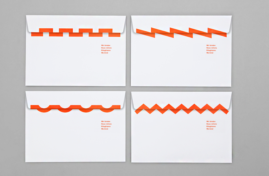
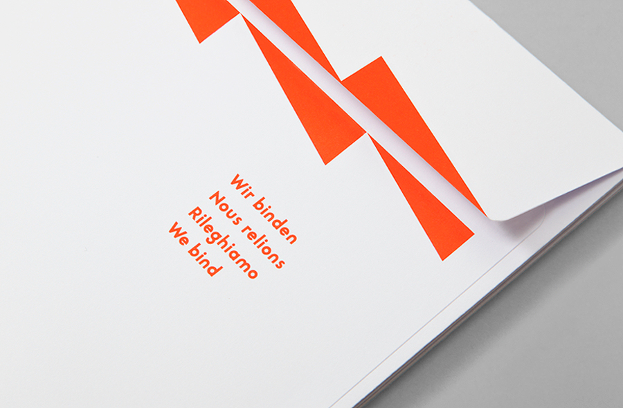
The combination of simple forms, typographical consistency and a limited colour palette derive memorable and relevant visual impact from Swiss origin and service. The use of the font Maax, which moves between a familiar sans-serif practicality and unusual character reduction (check out the t’s, r’s and s’s online), edge painted business cards, the way bind inspired patterns are used across box tape, the seal of envelopes (binds in their own right) and the lines of the notepad, layer the identity with moments of play and creativity with plenty of room for development.
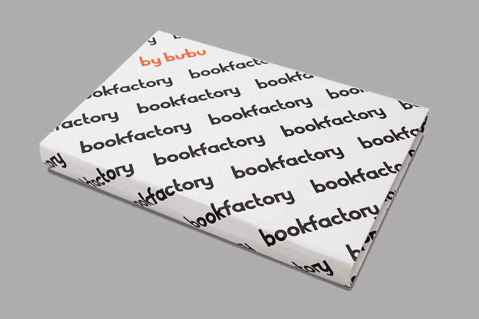
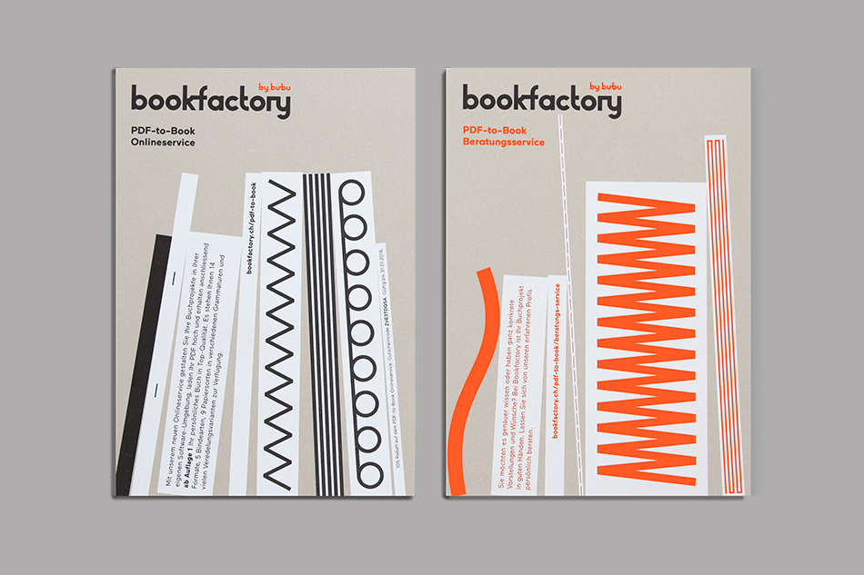
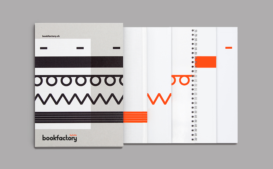
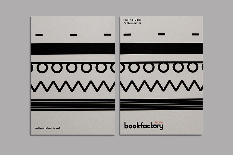
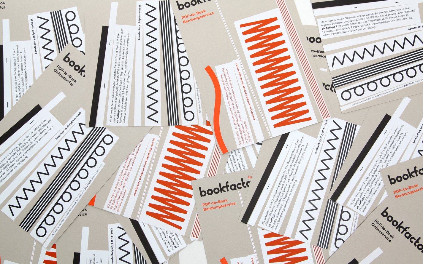
Updated 13/05/16 – Bob Design have updated their site with a variety of new assets that see the identity broaden, from the simple ligature detail continuing in the bookfactory logotype, to the playful graphic expressions across packaging, print communication and notepads. The art and craft that felt less evident in early assets, appears more apparent in the new brochure covers and layouts.
Design: Bob Design. Opinion: Richard Baird. Fonts Used: Maax
