OTHR by Franklyn
Opinion by Richard Baird Posted 20 July 2016
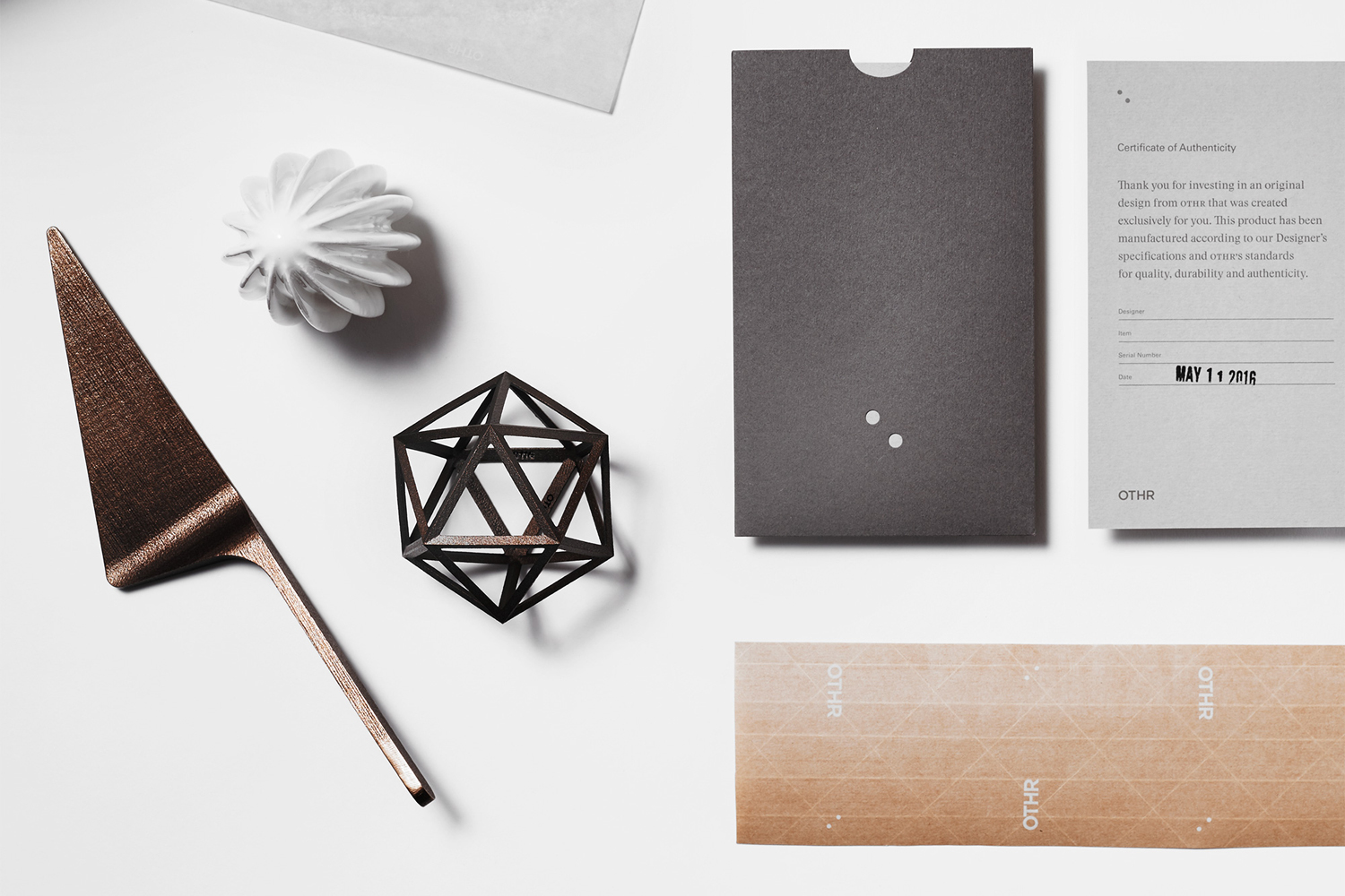
OTHR creates unique objects that take advantage of new production methods and materials, and brings together the world’s best designers and transformative technologies. OTHR’s objects exist at a point where art and design intersect, are simple, practical but desirable in form, and are manufactured and individually numbered to order in a way that has minimal environmental impact.
OTHR designers include British designer Sebastian Bergne, Claessen Koivisto Rune from Stockholm and New York studio Todd Bracher. These designers contribute to a diverse catalogue of objects for juicing, cutting and holding, and share the philosophy of owning fewer but better things.
With simplicity at the centre, New York-based graphic design studio Franklyn created a new brand identity and delivery system to compliment the extraordinary nature of OTHR’s products. This included logotype and logo design, and extended to illustration, packaging and posters.
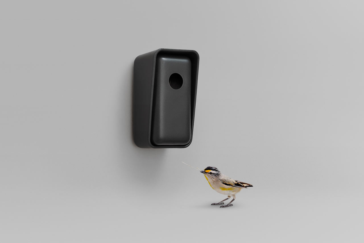

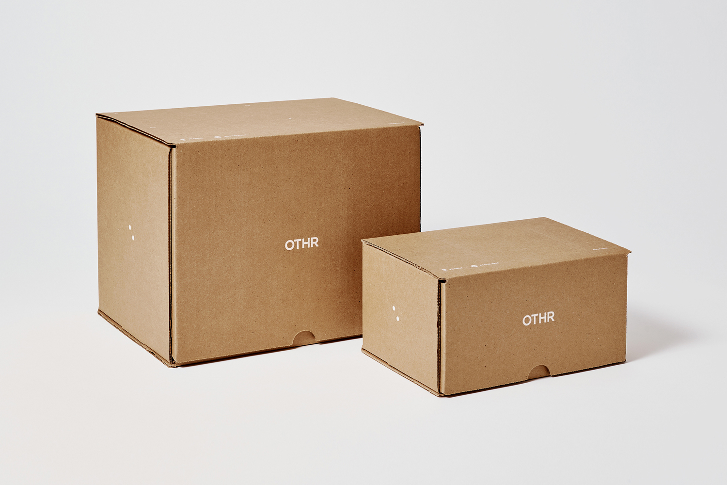
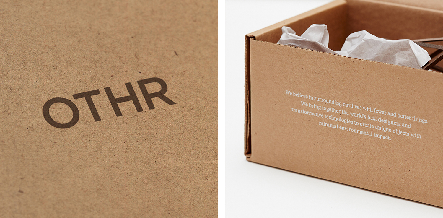
Brand identity clearly and appropriately takes a backseat to products with simple but distinctive and useful forms, unusual details and textures. These can be seen exerting themselves on Franklyn’s type choice; a reductive geometric sans-serif, approach to packaging; a practical but tactile mix of robust and craft boards, and the use of print finish; a combination of white and black ink. A couple of different paper types, weights and colours, each sharing an uncoated surface, adds a bit of variety.
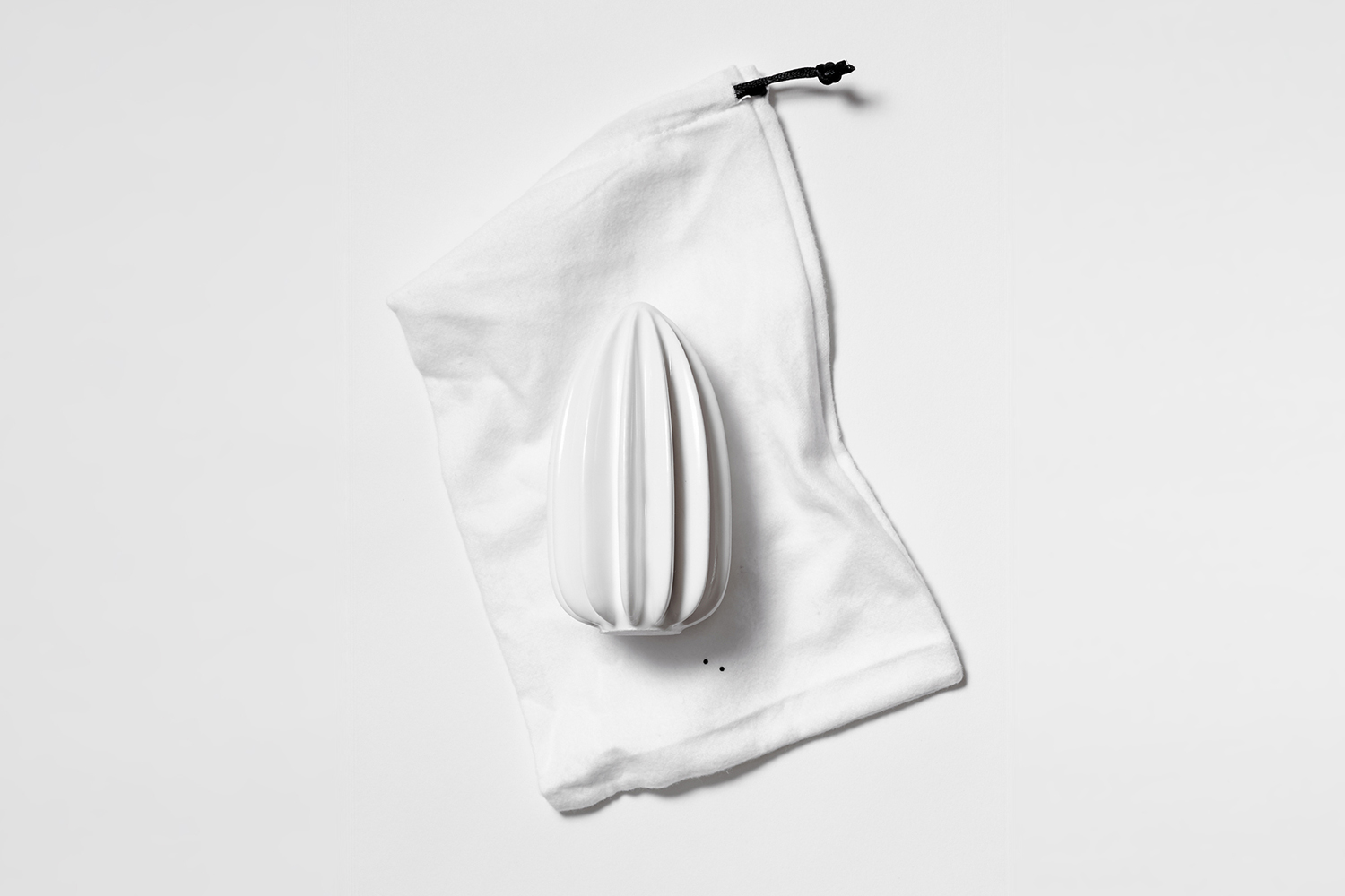
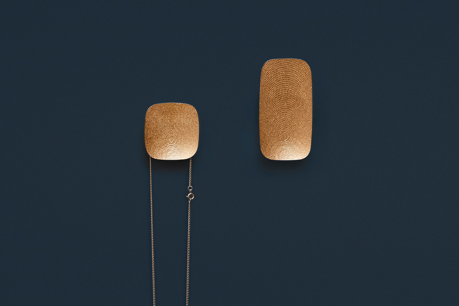
To say that there is an economy of expression would be to understate, and aesthetically impoverished to overstate, so perhaps a quite confidence in the compelling nature of object would be a more appropriate way of articulating Franklyn’s intention.
As an online retail destination, image is effectively used to draw out the individuality of object but shot with a uniformity in composition, colour and lighting that holds these together. Plenty of insight into object and designers, and the values and philosophies of OTHR are clearly articulated. Image and type, object and space are well-balanced and responsive.
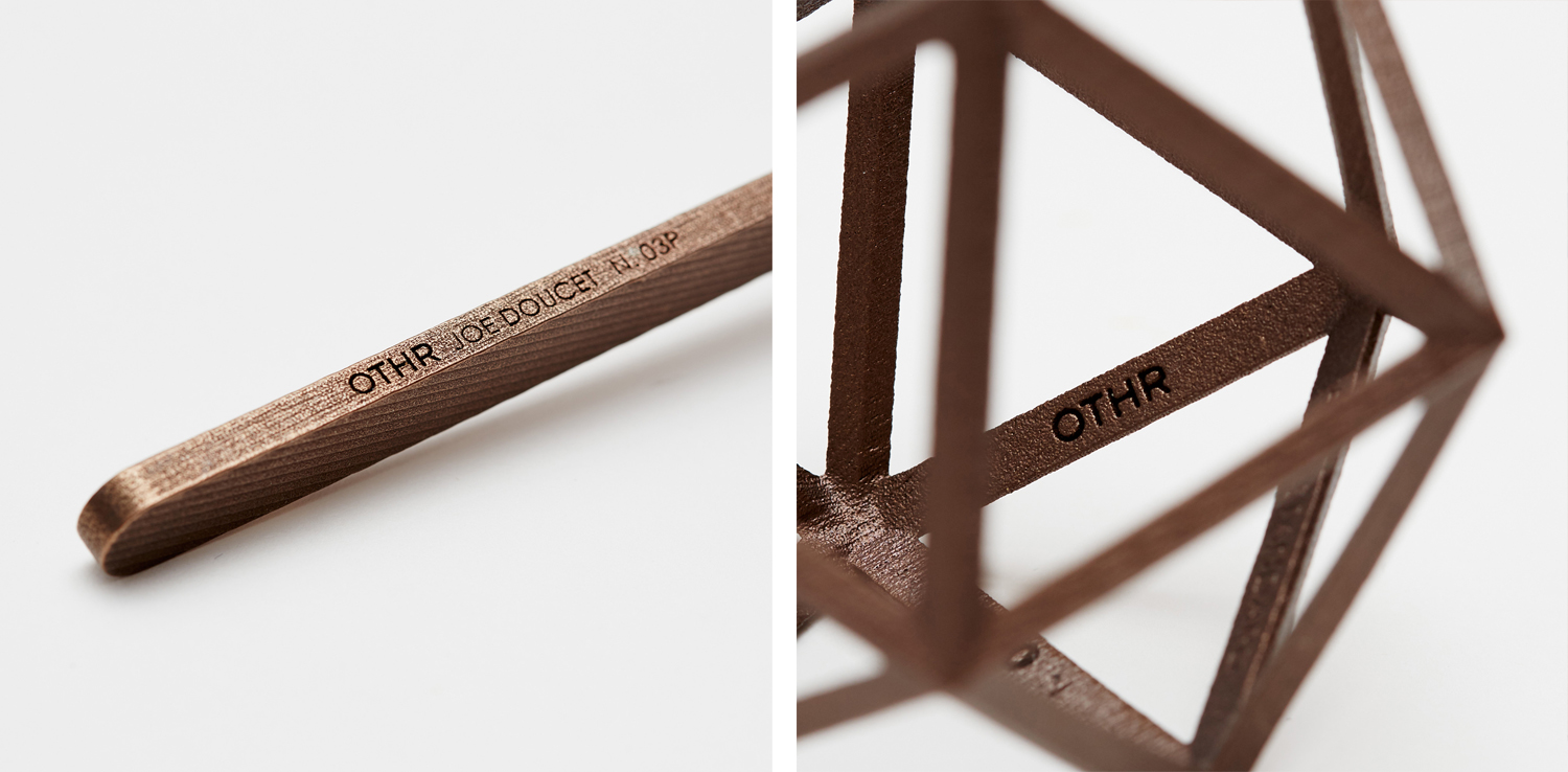
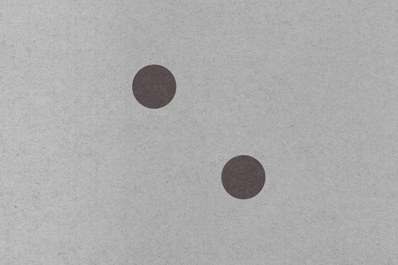
The logotype and logo, a set of simple monolinear uppercase characters, and two diagonally aligned dots, function as an inconspicuous and contemporary take on a makers marks. Their forms and implementation across products, alongside numbering, works well to find that spot where art, craft, design and manufacture comfortably coalesce.
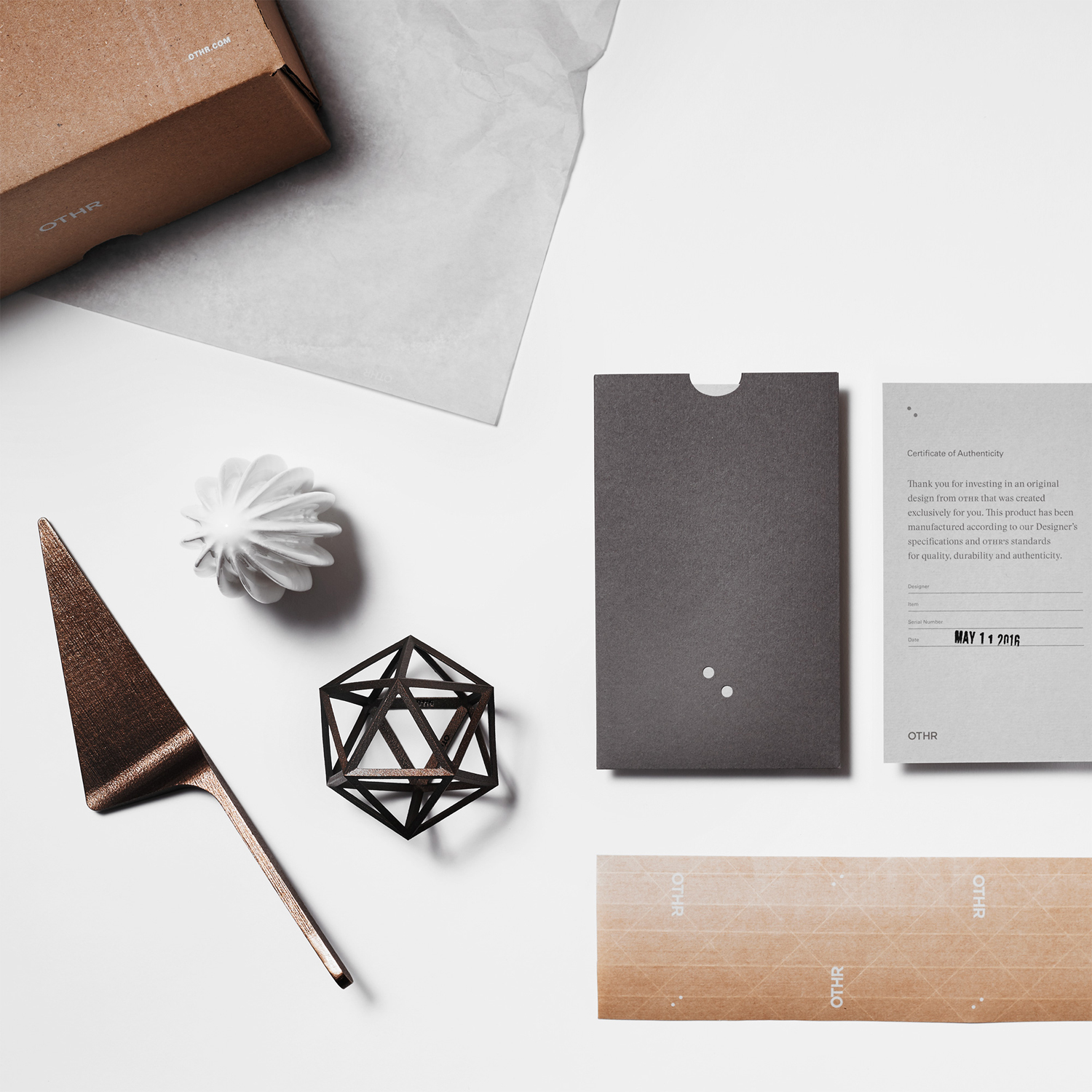
The combination of Univers and Stanley finds a balance between the modernity of form and the traditional, low-volume and to order craftsmanship of each object, but also serves to add a bit of visual variety within the context of a reductive brand identity expression. It would have been nice to have seen these also function to divide the practical elements of the website such as navigation, and the insight into products, designers and brand story.
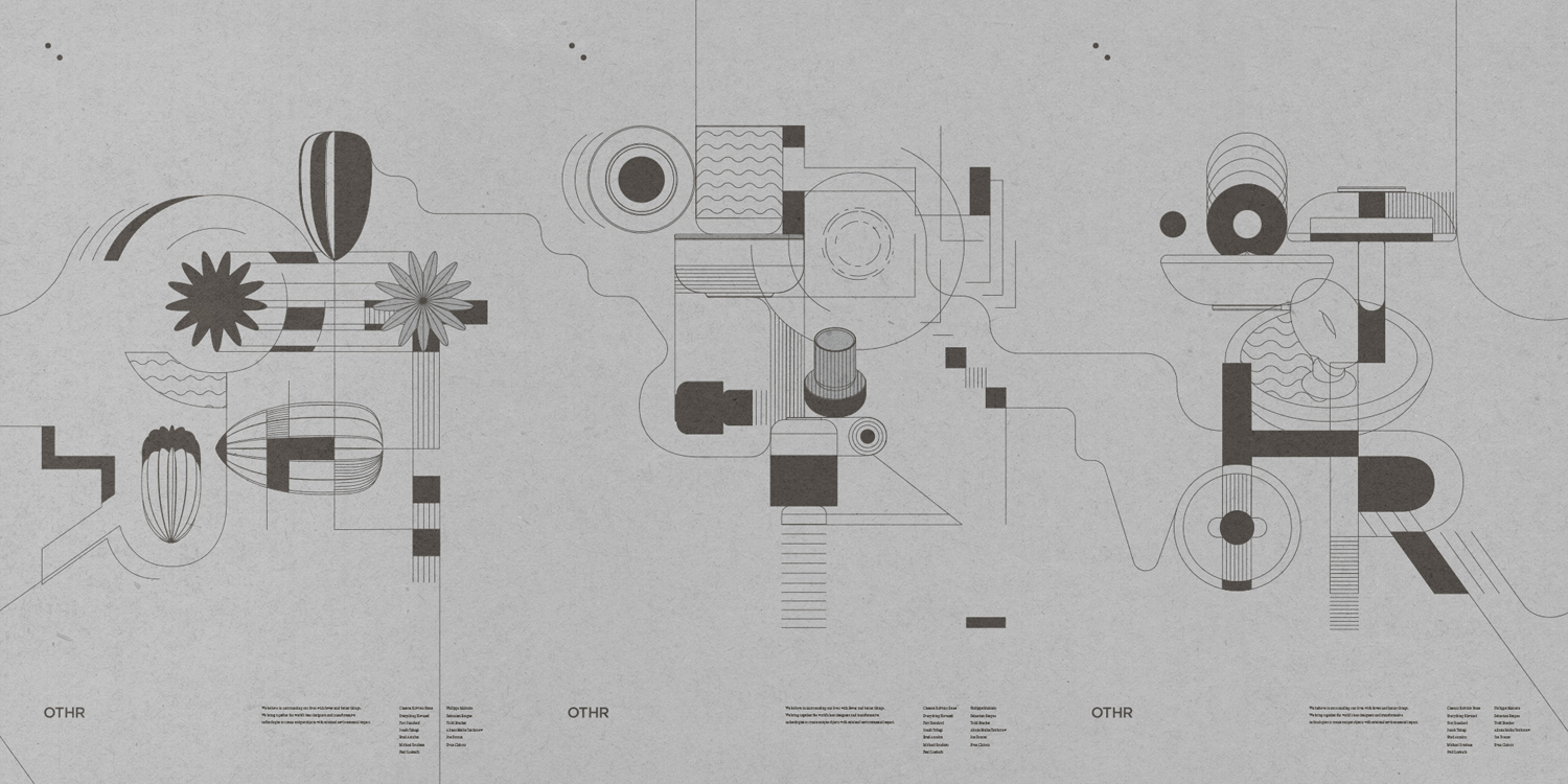
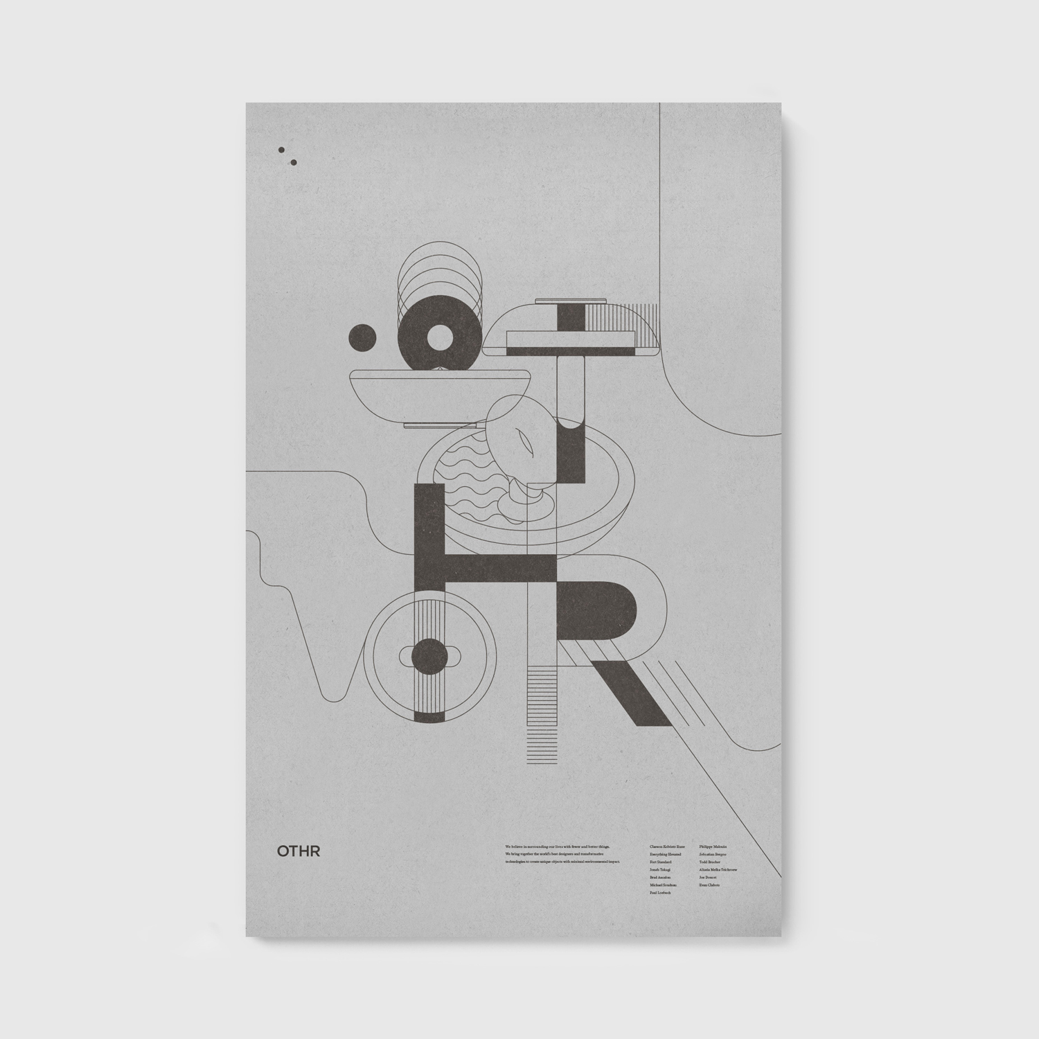
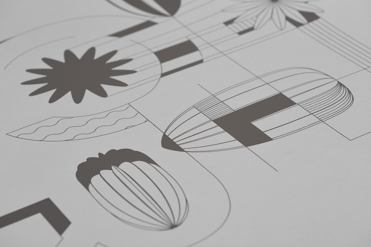
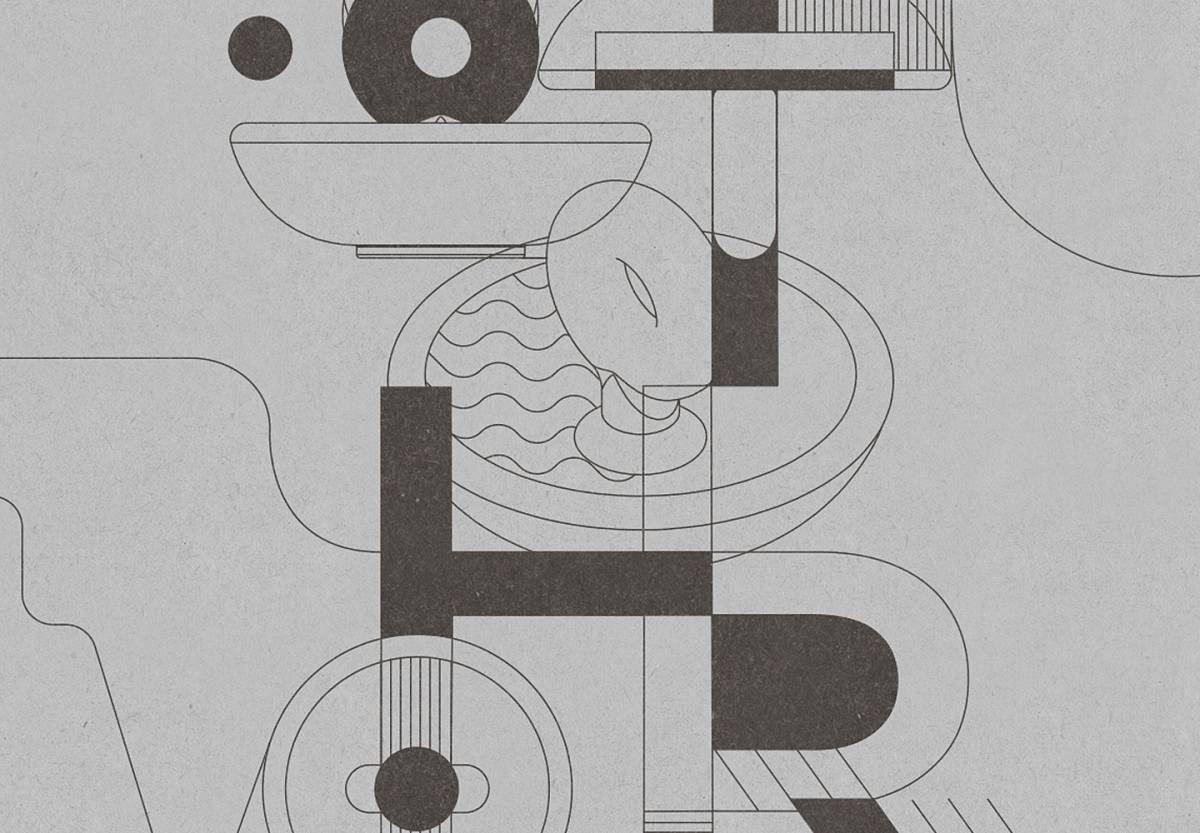
The simplicity of OTHR’s forms often hide the innovative nature of their materials or production processes. An illustrative component of fine lines that link logotype and product form with a creative and technical quality, draws out and expresses this in a richer and more direct way, although it is difficult to divine the context of these, not appearing on packaging or online. More from Franklyn on BP&O.
Design: Franklyn. Poster Design: Mark Francisco. Opinion: Richard Baird. Fonts Used: Gotham, Stanley & Univers.
