Whyte Lilja by Kurppa Hosk
Opinion by Richard Baird Posted 5 September 2011
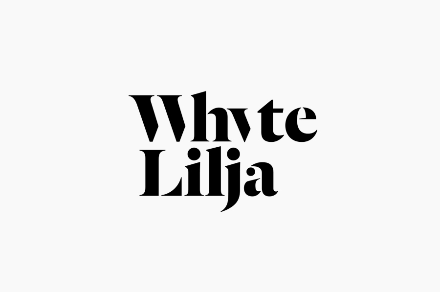
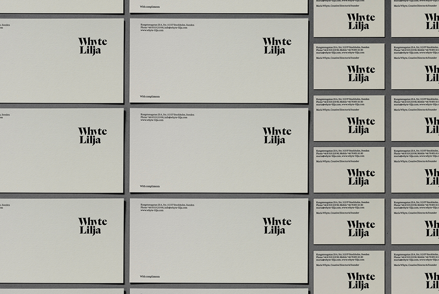
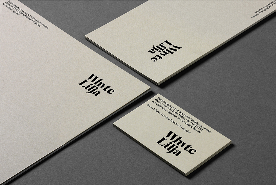
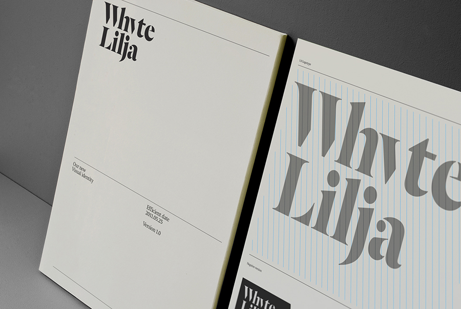
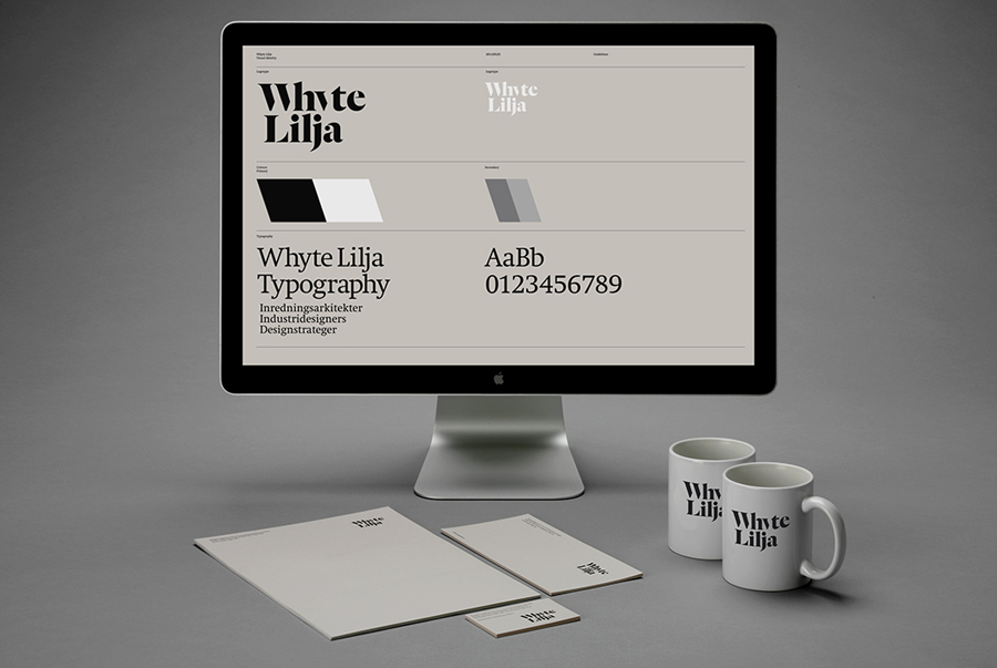
Whyte Lilja is a Swedish architectural firm that specialises in the design and build of exclusive private villas. Their identity, recently updated by Stockholm based interdisciplinary brand and design consultancy Kurppa Hosk, blends classic letter-forms with the concept of reification to create a modern and elegant logo-type.
The holistic approach of Whyte Lilja has been neatly represented in this identity by the interplay and integration of individual letter-forms into a symbiotic whole. The balance of light and shadow has been well handled and adds an interesting dimensionality that appropriately captures the physical aspects of the built environment. A classic type choice and the utilisation of illusory contours to complete the W and Y characters deliver an interesting union of contemporary elegance and exclusivity.
There could be some debate over the effectiveness of the dot (tittle) over the j completing the tail of the y but after some consideration I think it cleverly joins the two names in an analogous display of co-operation. The simple, single colour application of the logo-type across the stationary communicates a clear and confident vision and an uncluttered modernistic approach.
Fonts: Dala Floda & Swift
