George + Powlett by Studio Brave
Opinion by Richard Baird Posted 15 May 2017
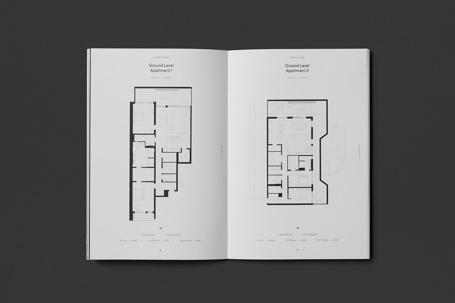
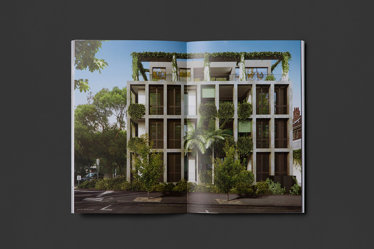
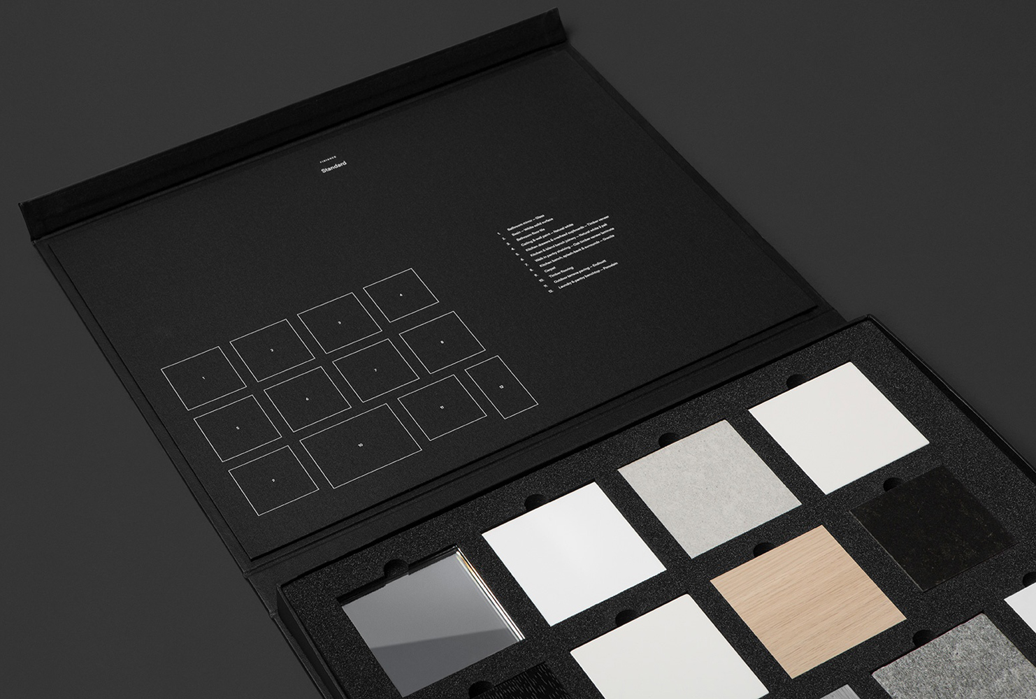
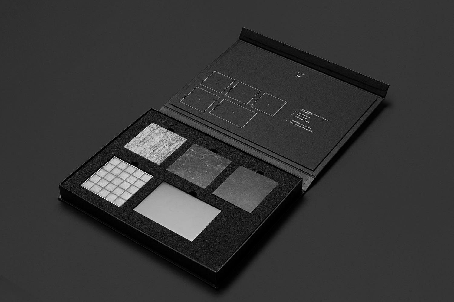
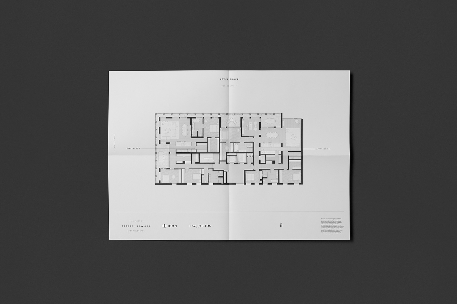
George + Powlett is a residential property development of 11 apartments, created by ICON Developments, and located in East Melbourne. ICON’s properties are described as having a precision and balance, and this continues through to their latest project, which was designed by acclaimed architectural practice Powell & Glenn. The development is set within an environment of what is described as a place of elegant contrasts. This can bee seen in the strong geometric forms of structure, and the surrounding leafy suburb of East Melbourne. Balanced contrast informs brand identity, designed by Studio Brave, with each element said to express the seamless connection between environment and structure. This connects brochure, material sample pack, foldout floor plan and website.
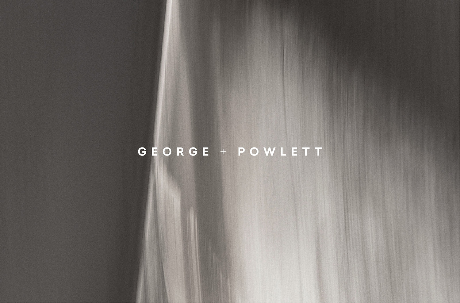
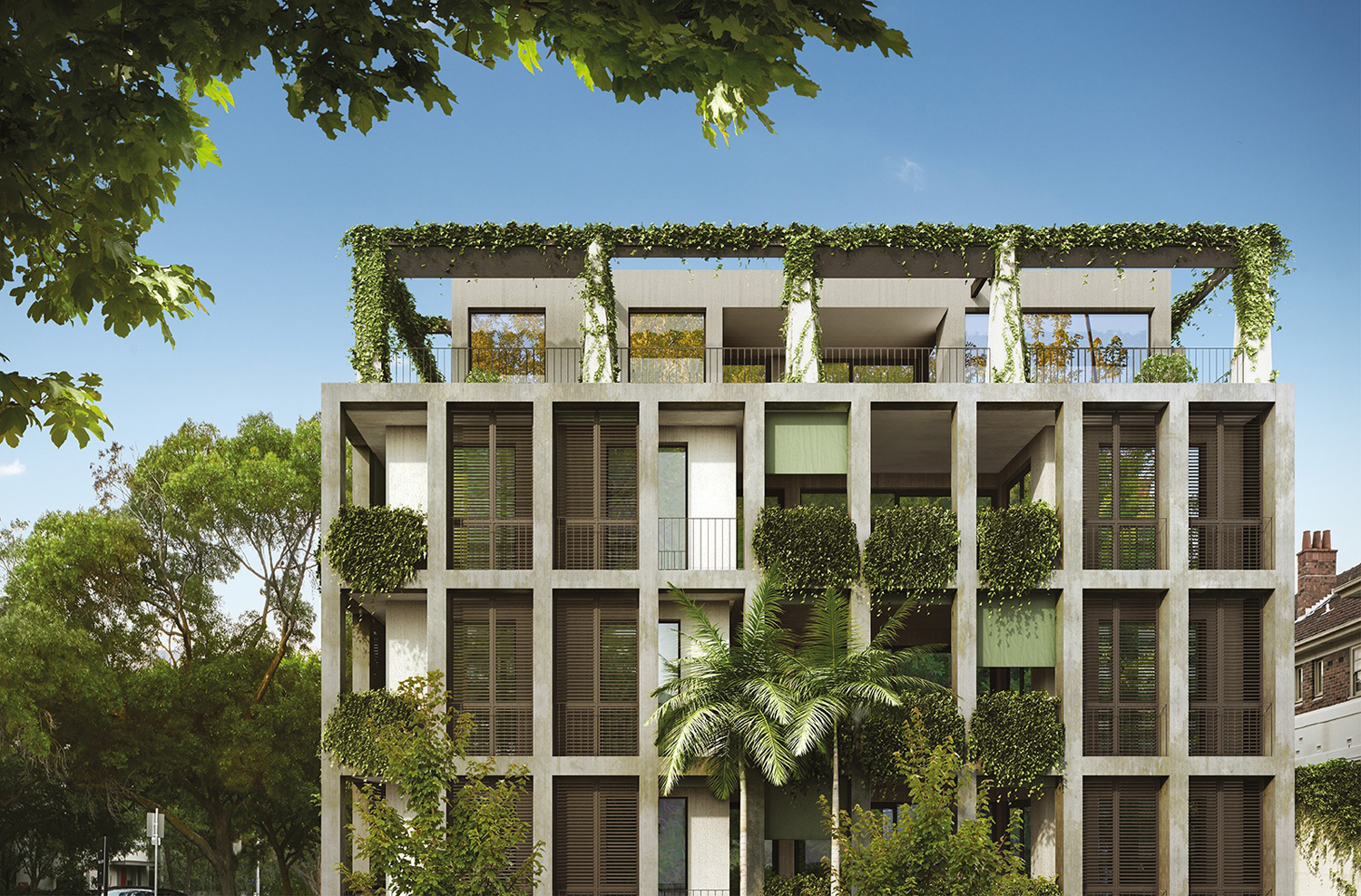
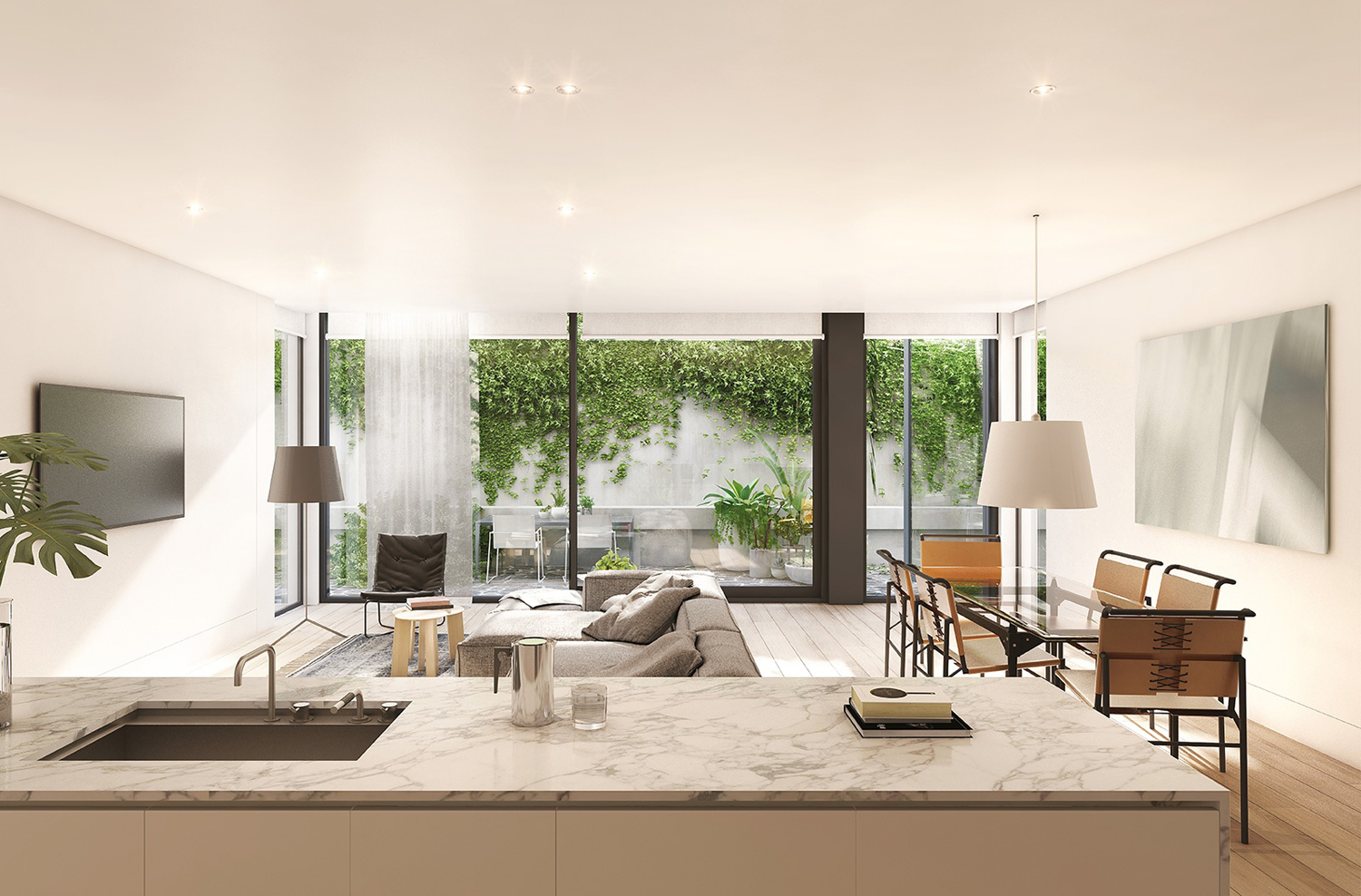
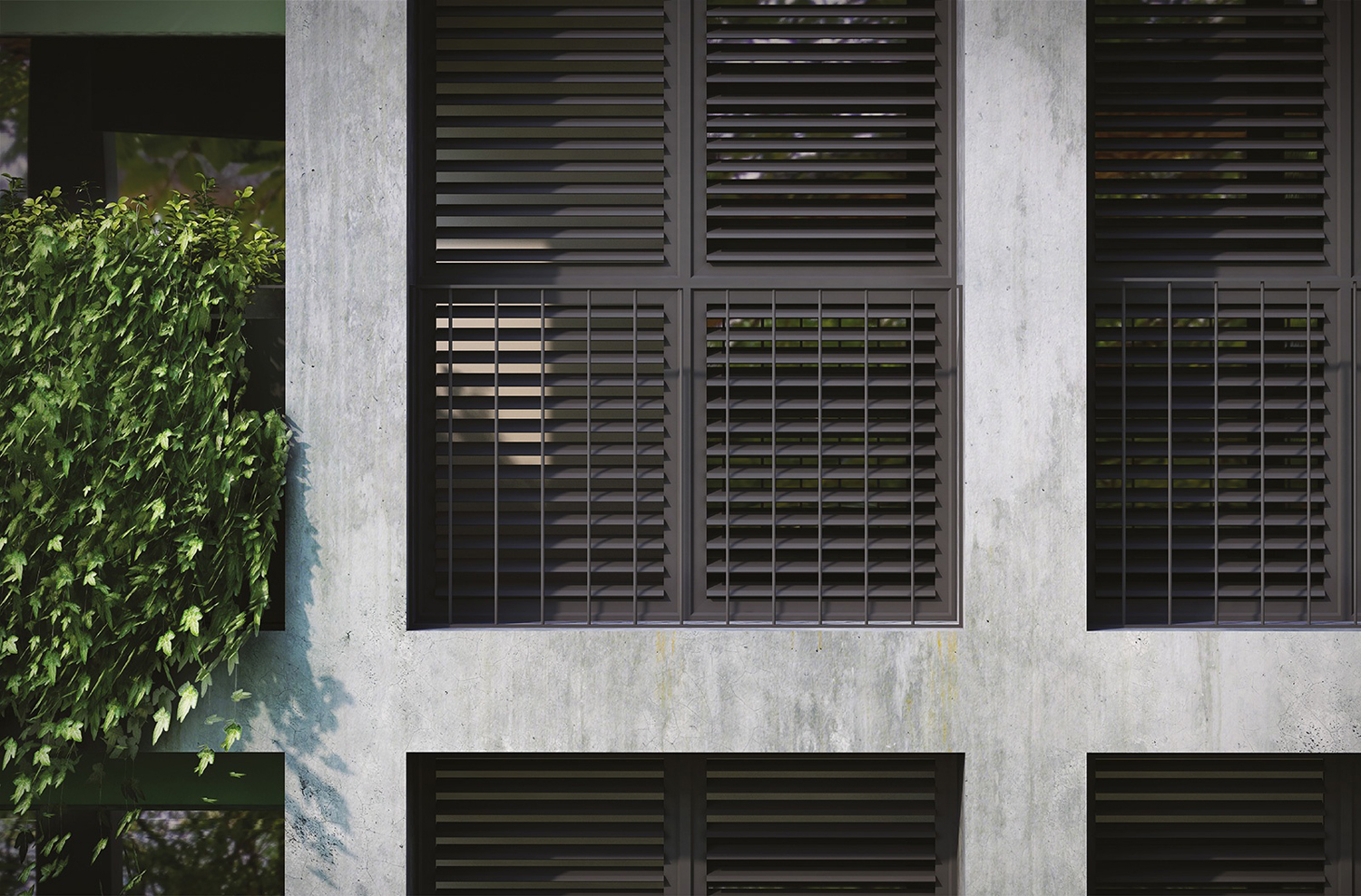
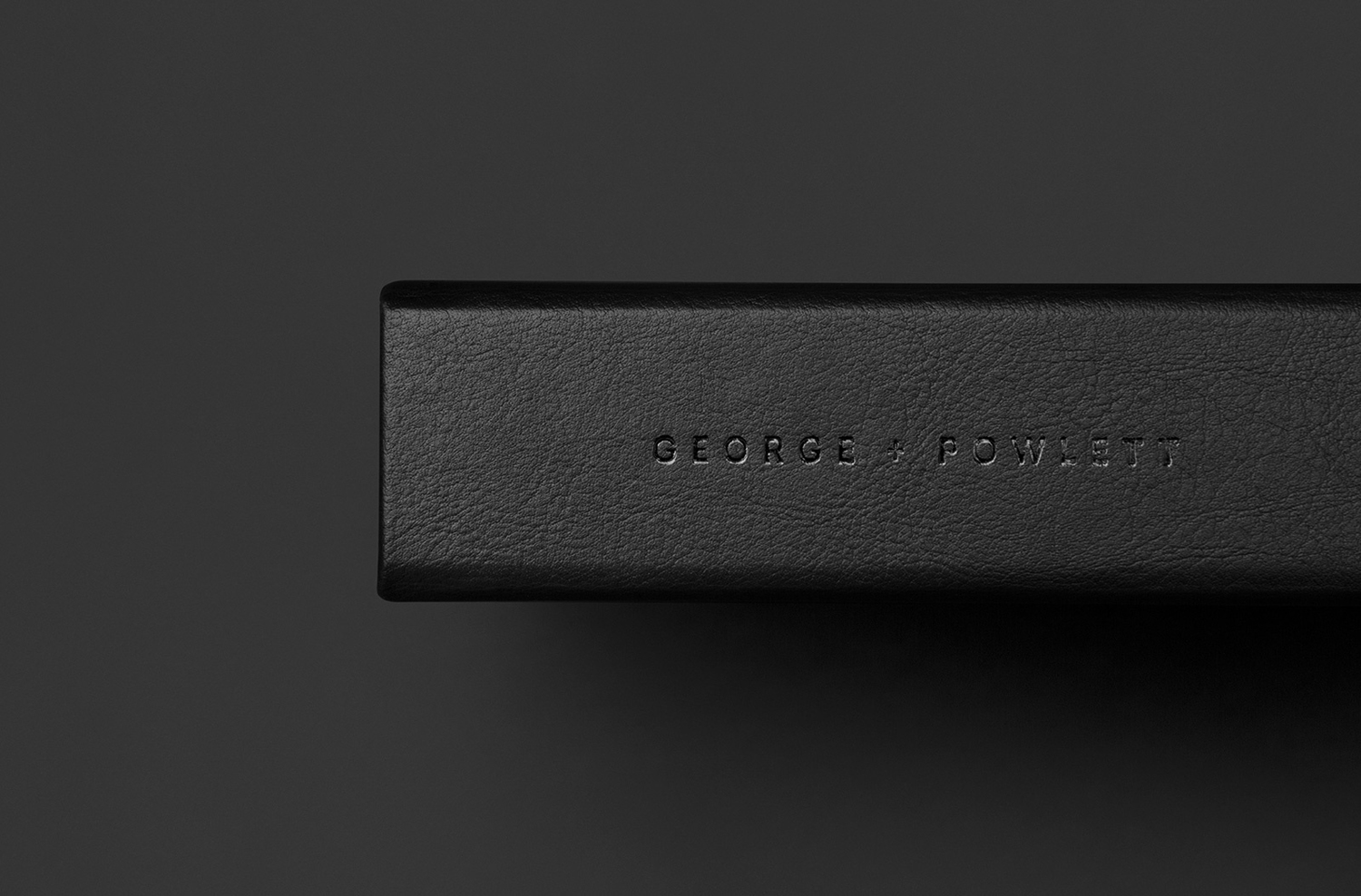
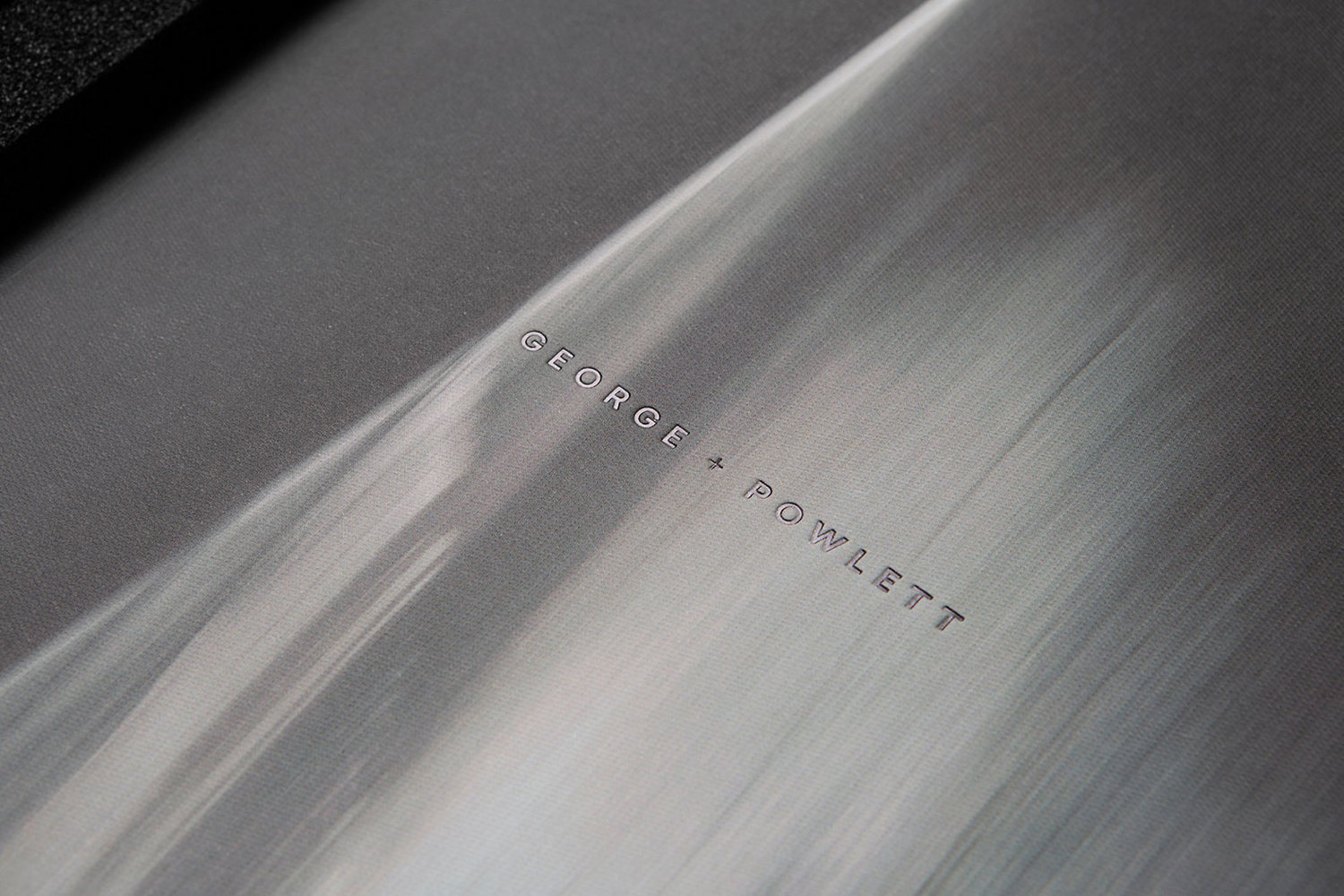
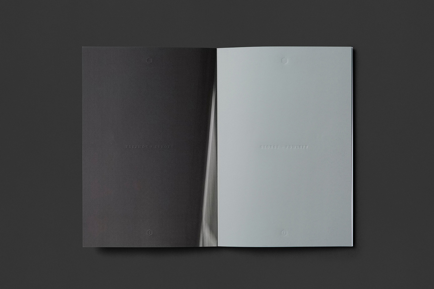
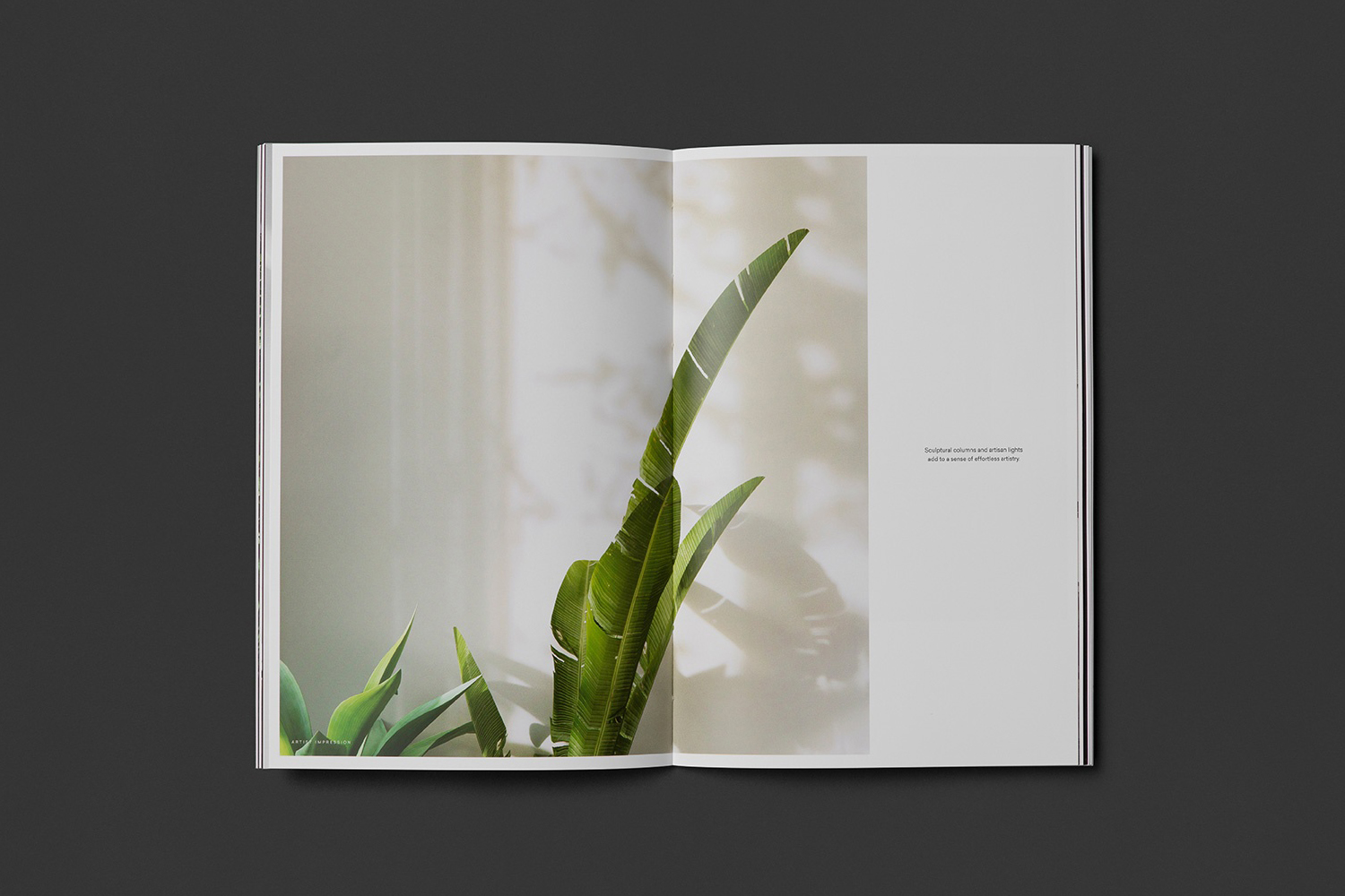
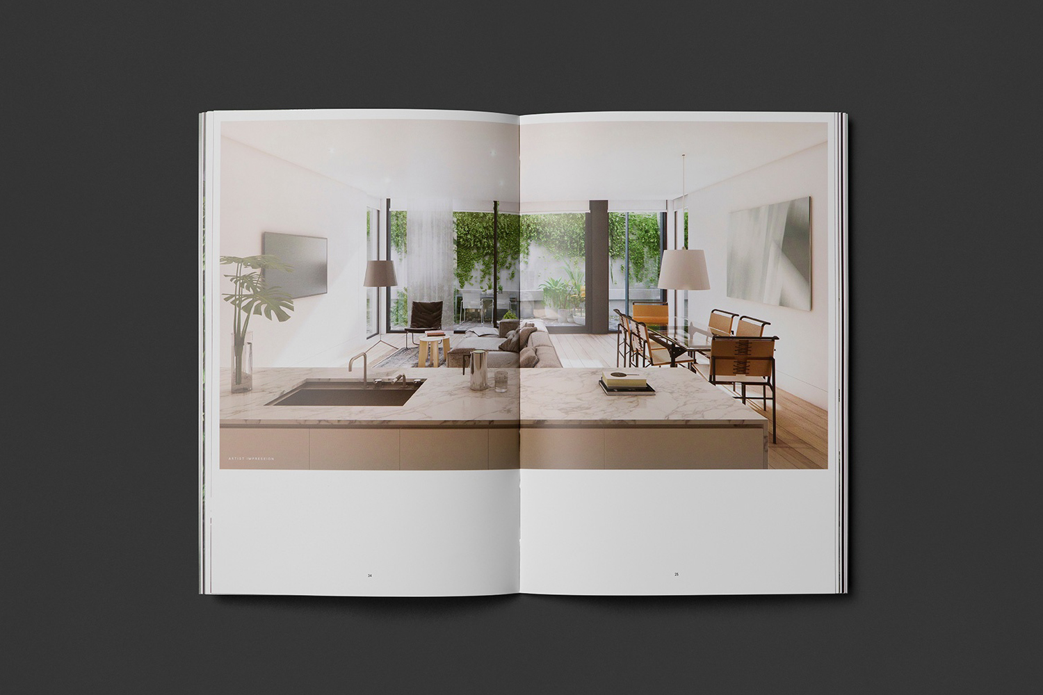
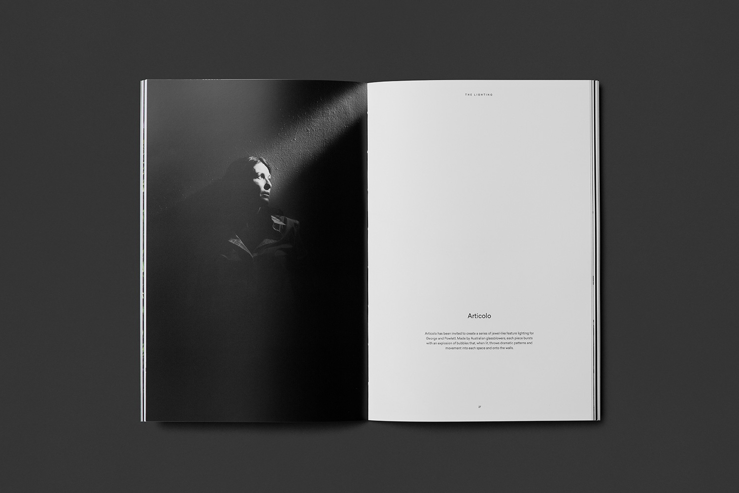
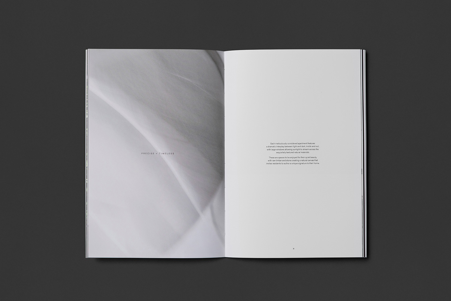
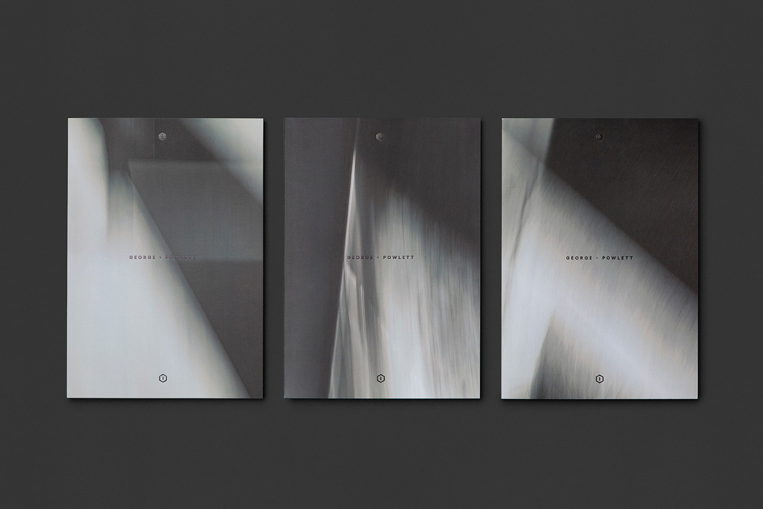
Inspired by the work of architectural practice Powell & Glenn, a tension between light and shade, structure and nature, and a timeless precision became the cornerstone of Studio Brave’s brand identity design for George + Powlett Apartments. This can be seen in the glossy black foil of a generously-spaced sans-serif logotype set across the uncoated and organic embossed surfaces of the brochure box, the logotype’s blind debossing across the white of the brochure’s inside pages, the contrast of textures, and the juxtaposition of a dark and architectural quality, and the lighter, brighter and a more natural elements of apartment photography.
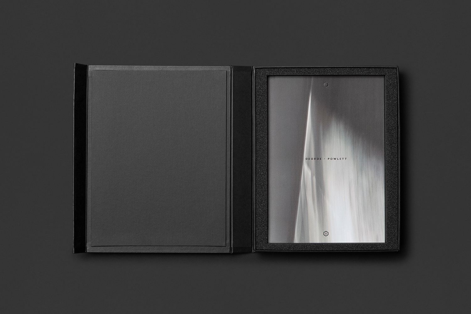
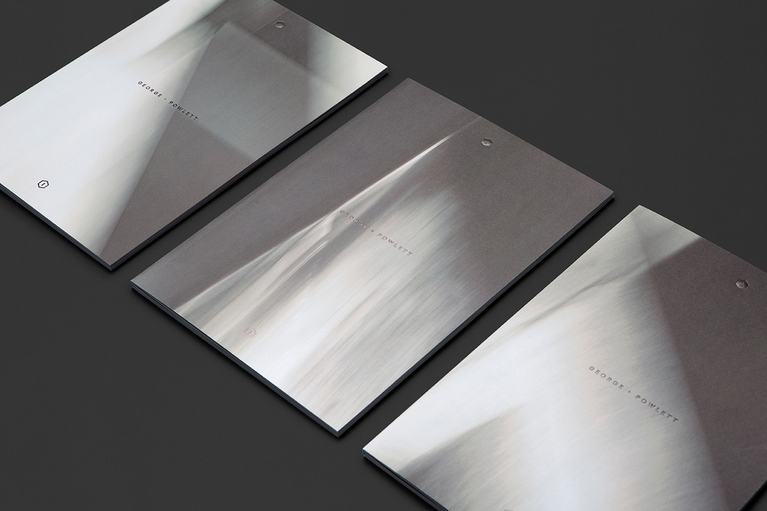
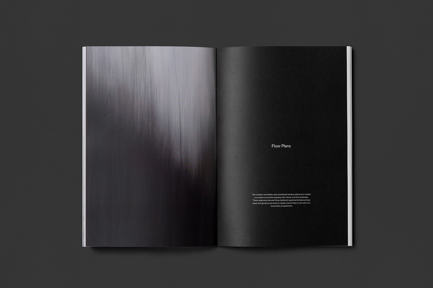
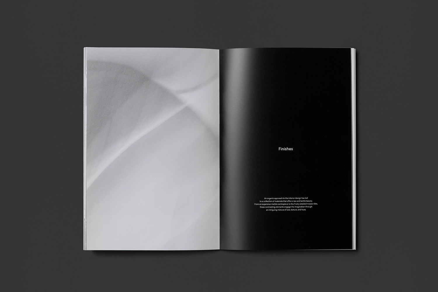
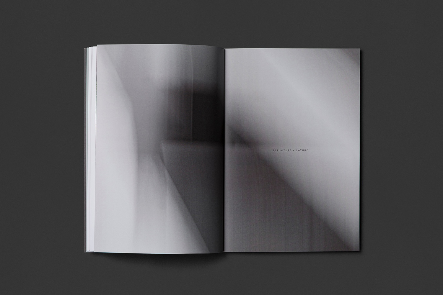
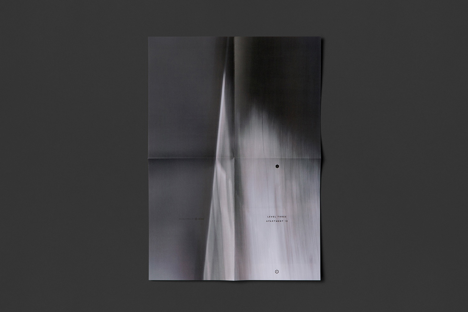
Studio Brave commissioned renowned photographic duo Kate Ballis and Tom Blachford to create a series of abstract architectural pieces. These lend brand identity much of its unique character, effectively playing with familiar architectural themes such as light and shadow, fine texture and structure, but with an unusual painted quality.
Where type, material and finish are familiar yet reassuring, conveying some of the high quality material detail of apartments, and image drawing to light the brighter and natural qualities of space and surroundings, abstracts serve to connect the two in an elegant, distinctive and more visceral way. More work by Studio Brave on BP&O.
Design: Studio Brave. Opinion: Richard Baird.
