January Moon by Perky Bros
Opinion by Richard Baird Posted 28 July 2017
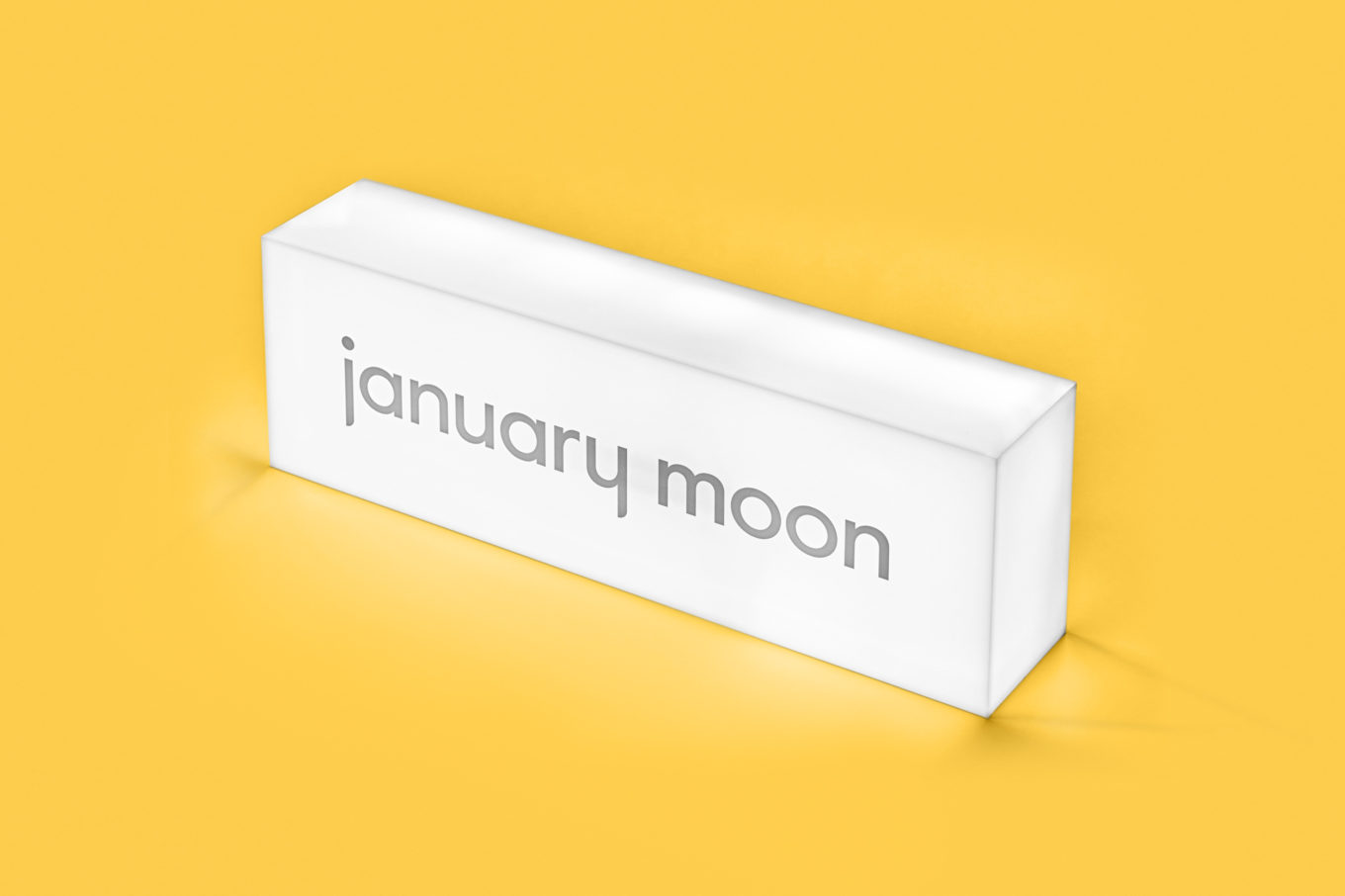
January Moon is a range of contemporary teething jewellery from American artist and designer Jenny Luckett, created in response to the birth of her son and in the discovery she could no longer wear her favourite pieces. The range intends to satisfy the stylistic sensitivities of modern mothers while also aiding their child’s development. The range is characterised by a variety of large soft forms of both natural material detail and bold contrasting colour. Drawing on these qualities and inspired by the phases of the moon and Matisse, graphic design studio Perky Bros created a visual identity for January Moon rich in pattern, colour and hand cut shapes. This finds a balance between modern art and craft, and what the studio describe as a child-like wonder, and links a variety of assets that included tags, packaging, stationery and business cards.
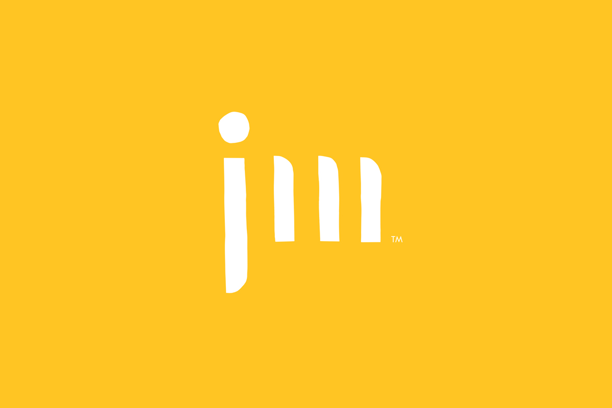
There is an essential a dual nature to the products of January Moon. A modern stylistic consideration and a functionality that serves a young child. Disparate considerations. Form and colour intends to satisfy both. Perky Bros visual identity effectively recognises this and channels it right into visual identity. This can be seen most clearly in the intersection of the modern abstract forms the monogram and its loose irregular cut paper lines. It is a simple, clear and discernible expression.
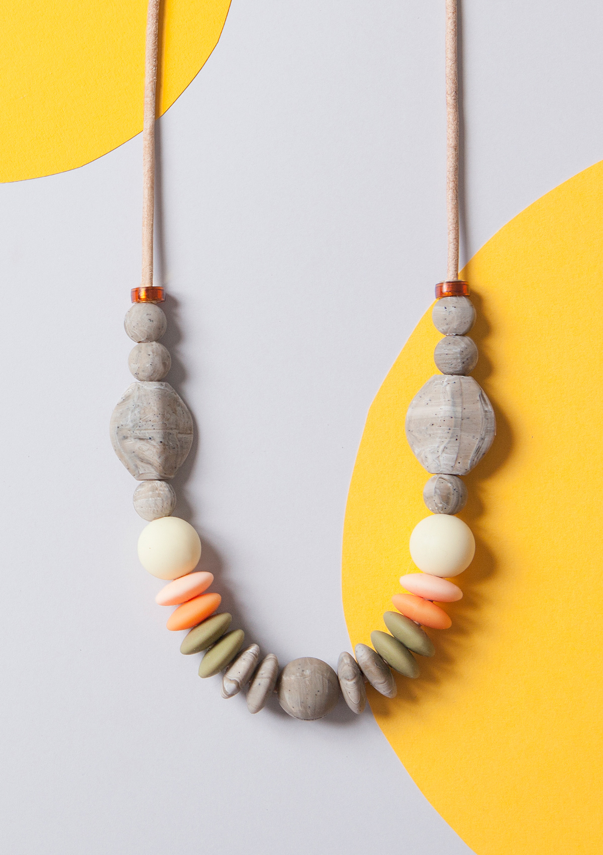
This continues through to colour palette and the forms that make up the compositions that run across and link stationery and packaging. These exist some where between youthful play and the artistic, and call to mind, in colour Mondrian, and in shapes and arrangement, Matisse. These are useful references in their universality and connection to modern art.
The use of a few simple shapes and their paper cut edges establish a continuity with monogram. They adhere to some basic principles when it comes to stimulating child yet, through variety and arrangement, and a sensitivity to space and structure, offers something more considered and sophisticated, and provides visual interest and variation.

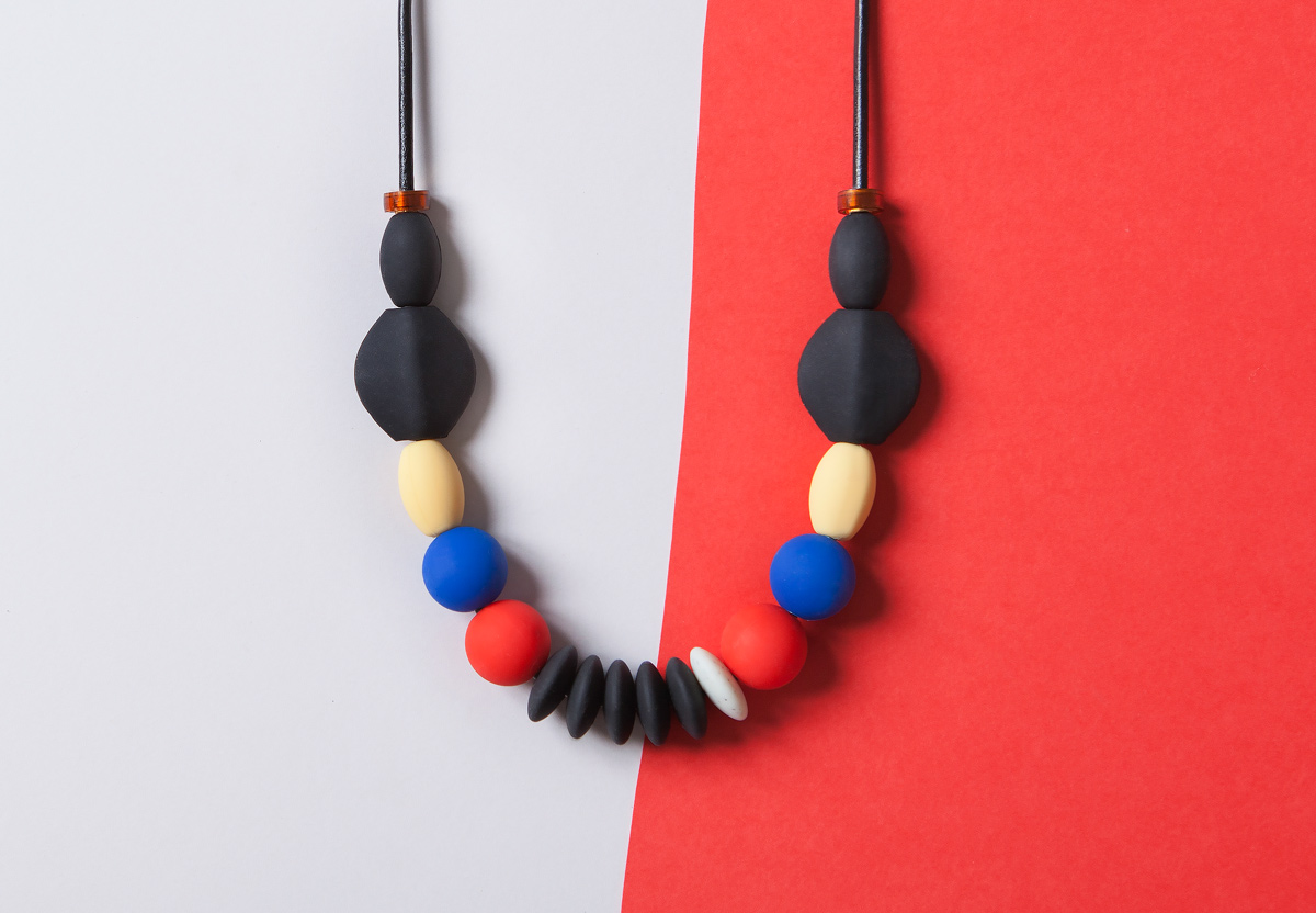
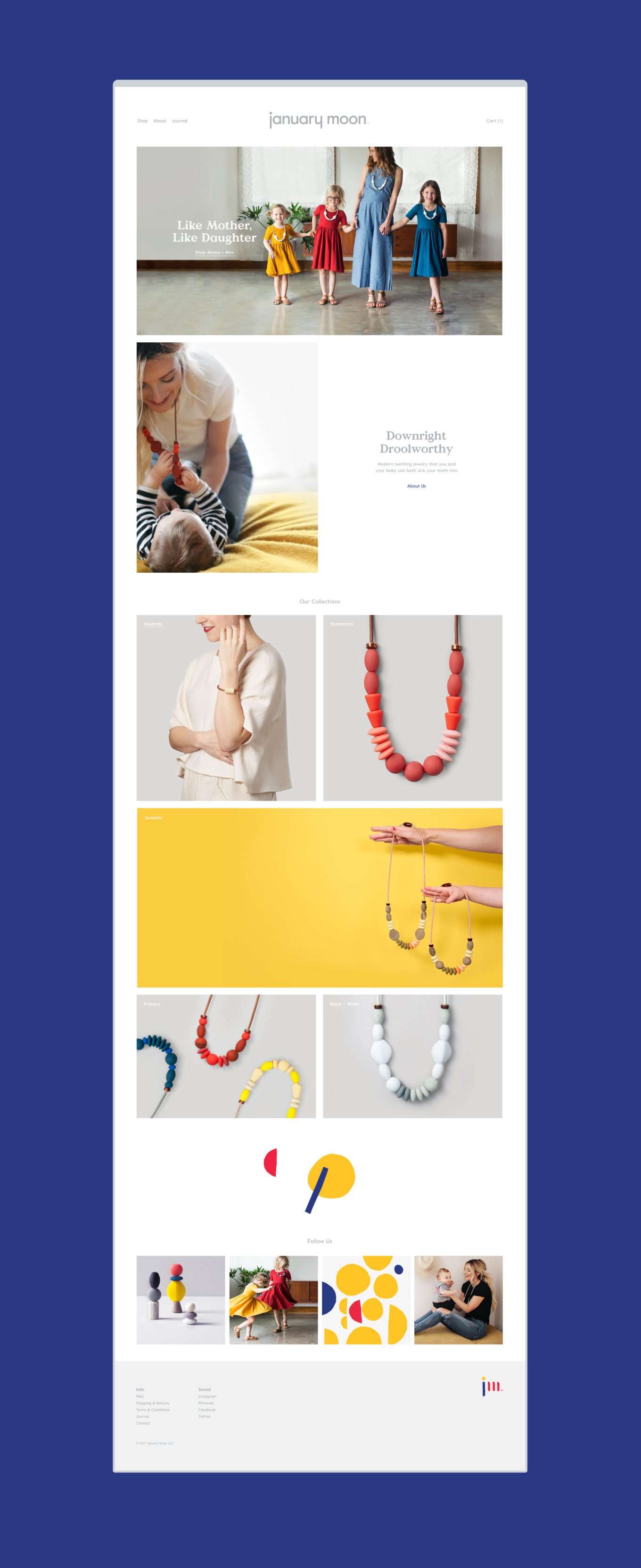
There is often an order to jewellery. A recurrent use of forms and colour, and a symmetry and pattern to arrangement that lends itself well to the systematic qualities of brand identity design. This is certainly the case here. When it comes to art direction, colour and form is reduced down, product appropriately becomes an integral part of brand identity. There is continuity in colour, yet the material qualities and dimensionality of product, the casting of shadow and the catching of light, creates difference and interest. This continues in the still life imagery online which sees beads artfully stacked, continuing to reinforce the artistic and design foundations of brand alongside the practical.
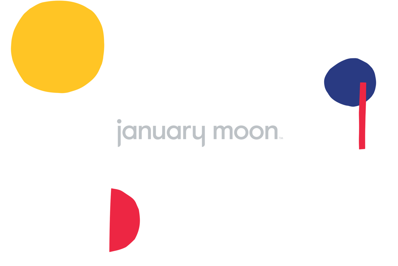
Logotype embraces a slight divergence. It mirrors some of the monogram’s reductive letterforms through the j and y but forgoes the loose and irregular outlines and bright colour. This feels appropriate, offering contrast, working as an anchor amongst the changing arrangement of form, yet retains an accessible and modern quality in lettershape. It also establishes a continuity with the practical typesetting of text online. The chunky serifs and flourishes of Colophon’s Value offers further contrast, something more traditional in its conveyance of art and crafts.
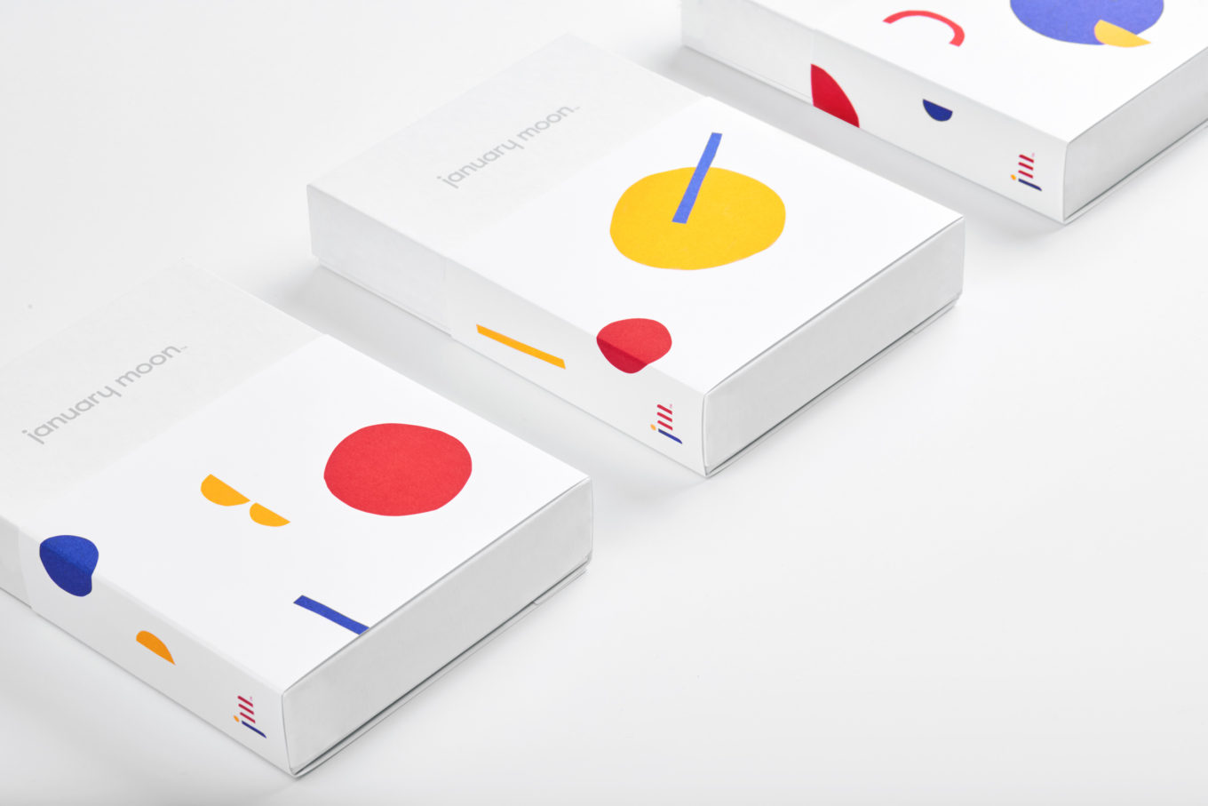
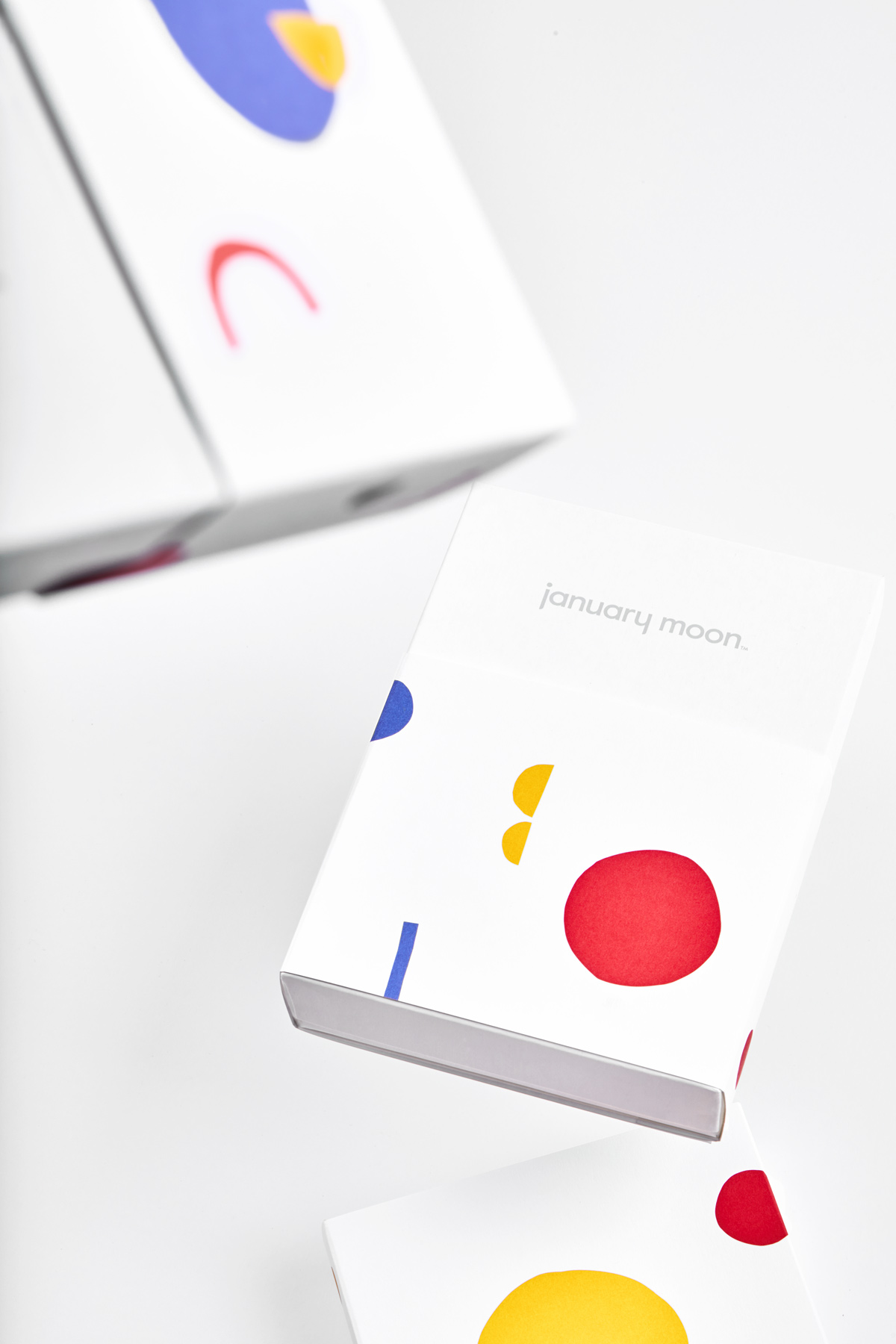
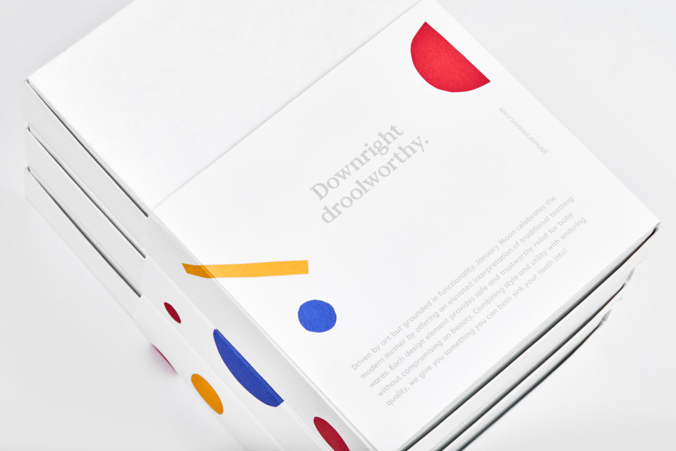
Structural design mirrors the jewellery’s balance of style and functionality in the use of a standard, top opening and logo-printed white box and different sleeves that feature a variety of colourful compositions. The relationship between colour, form and white space is a critical part of identity and consistently applied throughout with variations within this to create interest and avoid repetition.
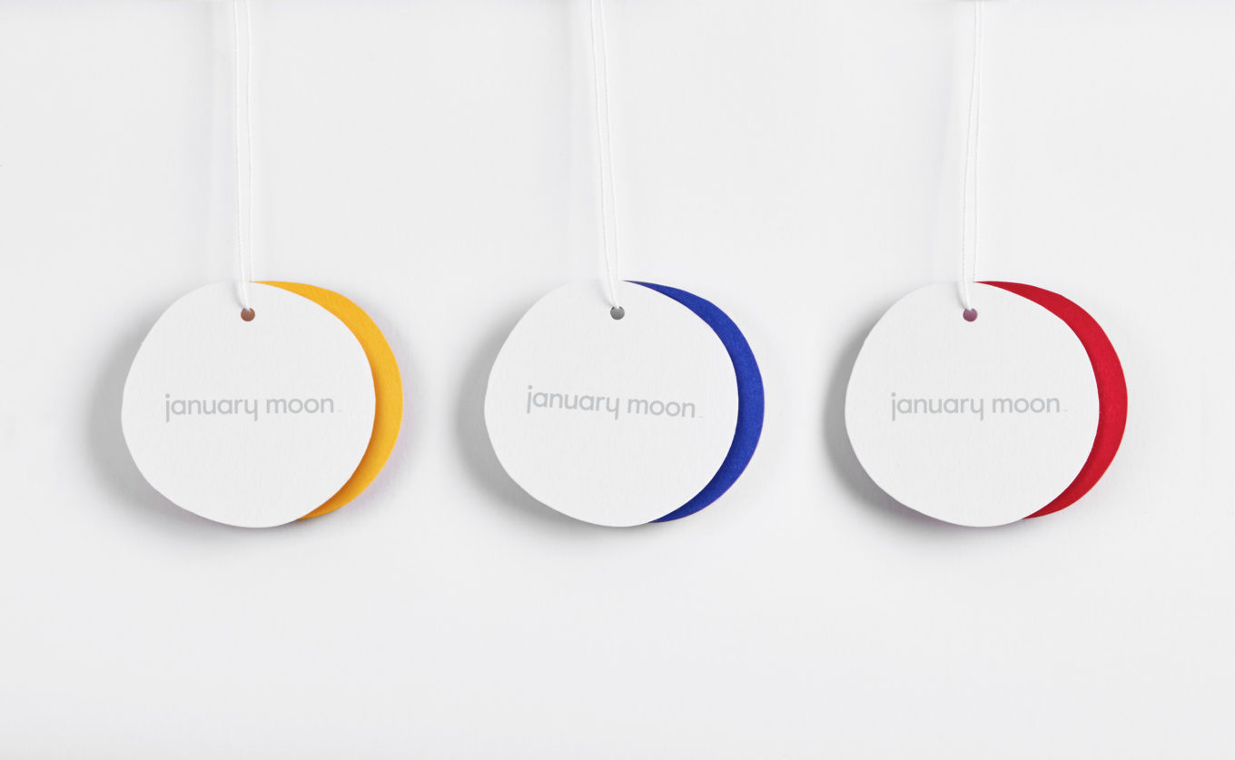
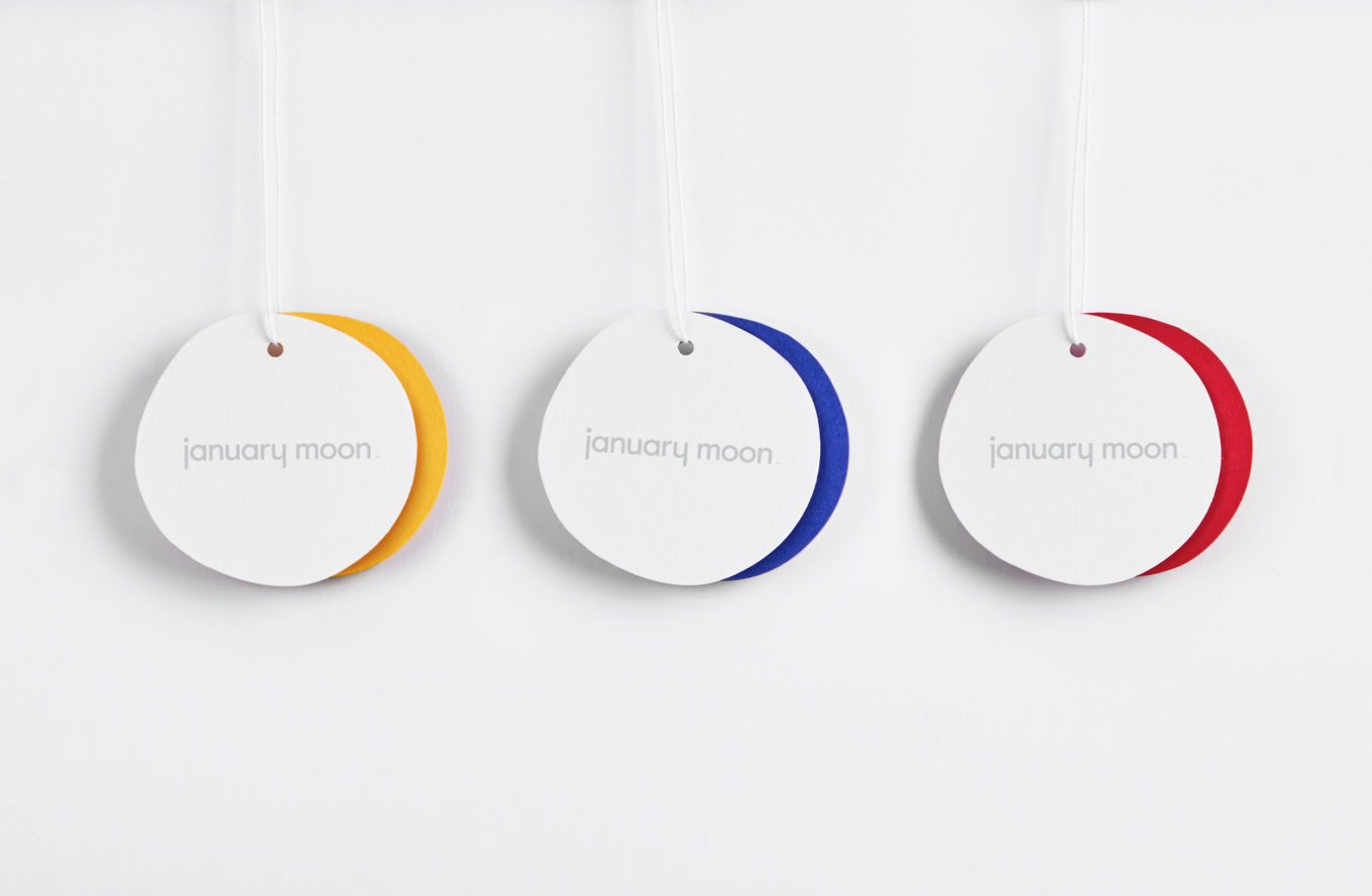
Perky Bros reference the phases of the moon. This does not feel particularly evident, aside from the well-staged, and rather lovely, tag imagery (above). This feels singular in its expression and likely to be lost when actually hung. It is a nice idea, particularly as it marks the passage of time. If it were to also play out elsewhere, through image, in motion or through copywriting this would perhaps be a more justifiable reference and useful layer.
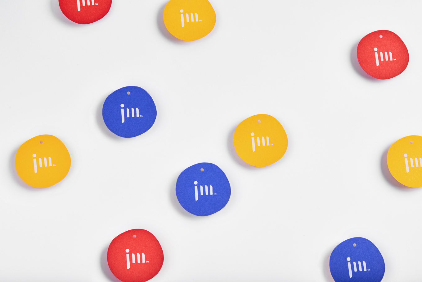
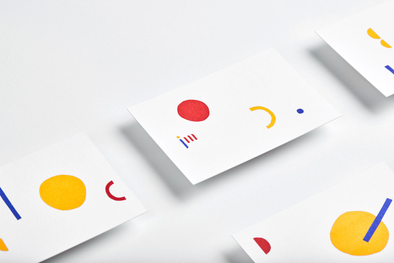
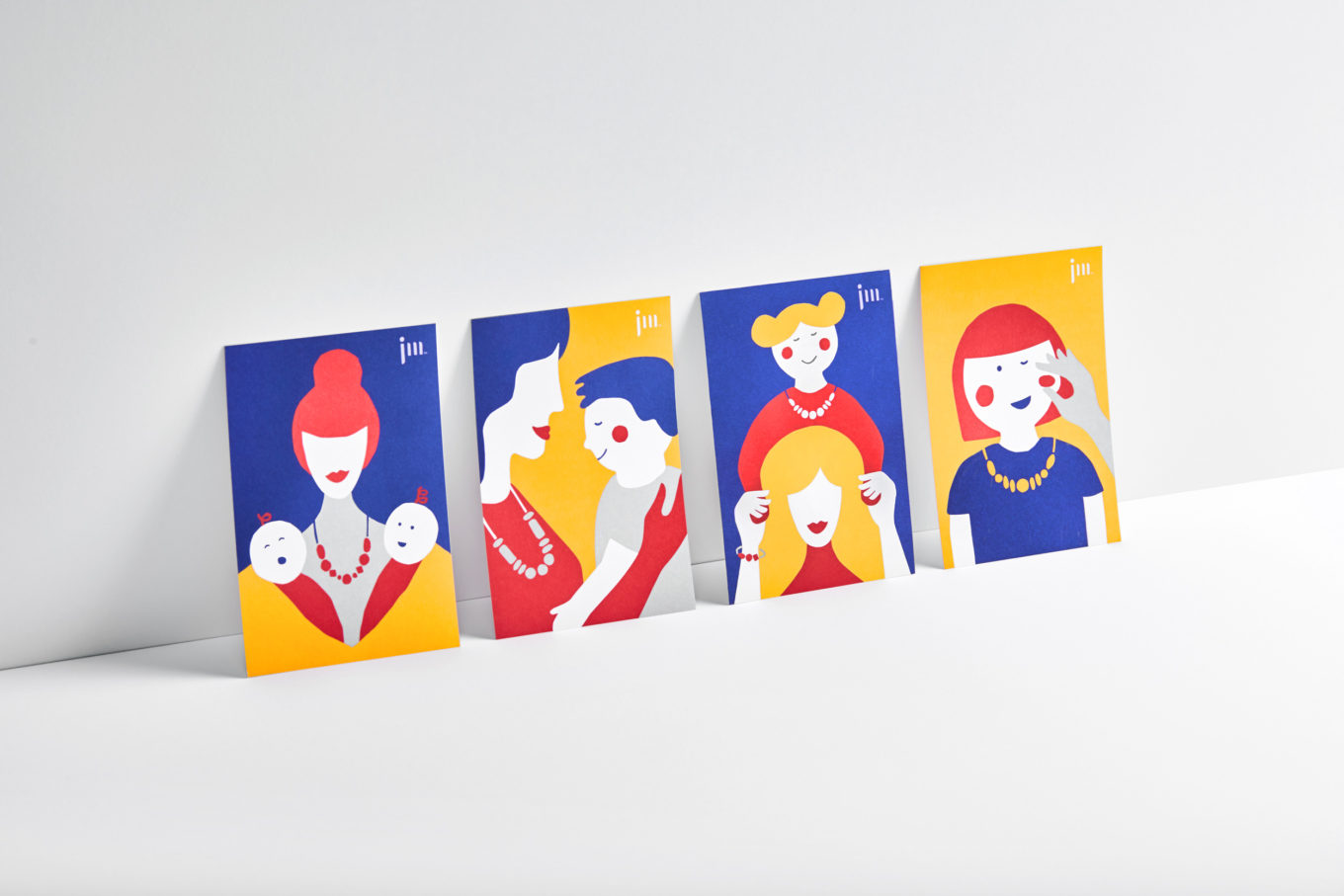
Illustration builds out brand identity. These have a style and a character that fits comfortable within the context of monogram, the use of form and photography. These are personable, manage to highlight the value of form, and play well to the maternal bond. More work by Perky Bros on BP&O.
Design: Perky Bros. Photography: Ashtin Page & Amy Hobbs. Opinion: Richard Baird. Fonts: Value & Value Sans.
