UNSW Built Environment by Toko
Opinion by Richard Baird Posted 16 April 2018
UNSW Built Environment (BE) intends to develop global leaders in architecture, planning and construction, and help shape resilient, connected, smart and inclusive future cities through its undergraduate, postgraduate and postgraduate research courses. As part of this, the faculty also runs an annual programme of events for students, academics, industry professionals and the general public. These serve as a platform to find out more about the faculty and raise the awareness of and seek to address critical issues that concern the built environment.
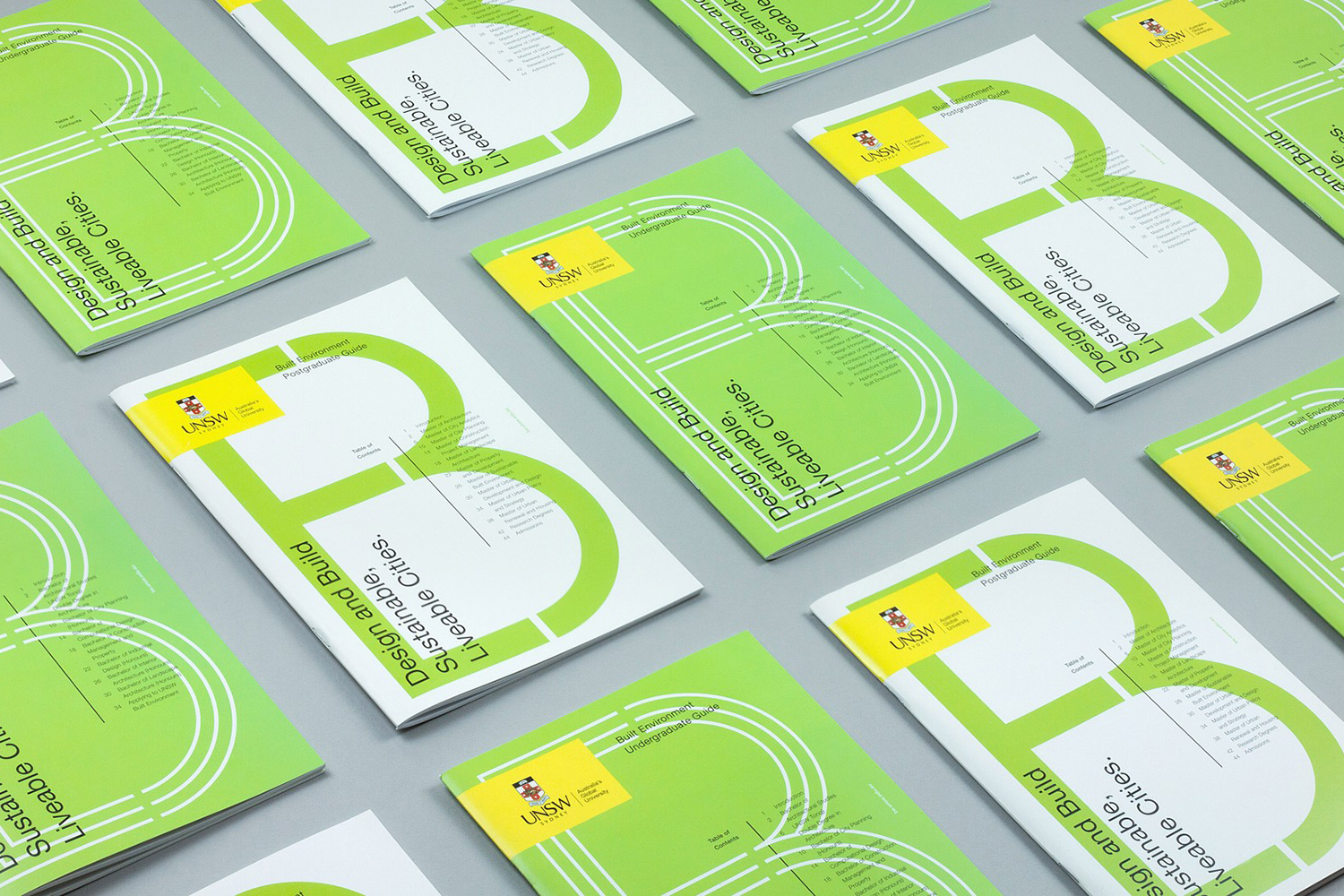
Australian design studio Toko worked with UNSW BE to develop a faculty graphic identity and the spacial design of their Luminocity exhibition; a collection of student projects drawn from all seven degree courses and bring to light what it might be like to design and build tomorrow’s cities. Assets included graduate and postgraduate guides, posters and website, signage, banners, display system and layout.
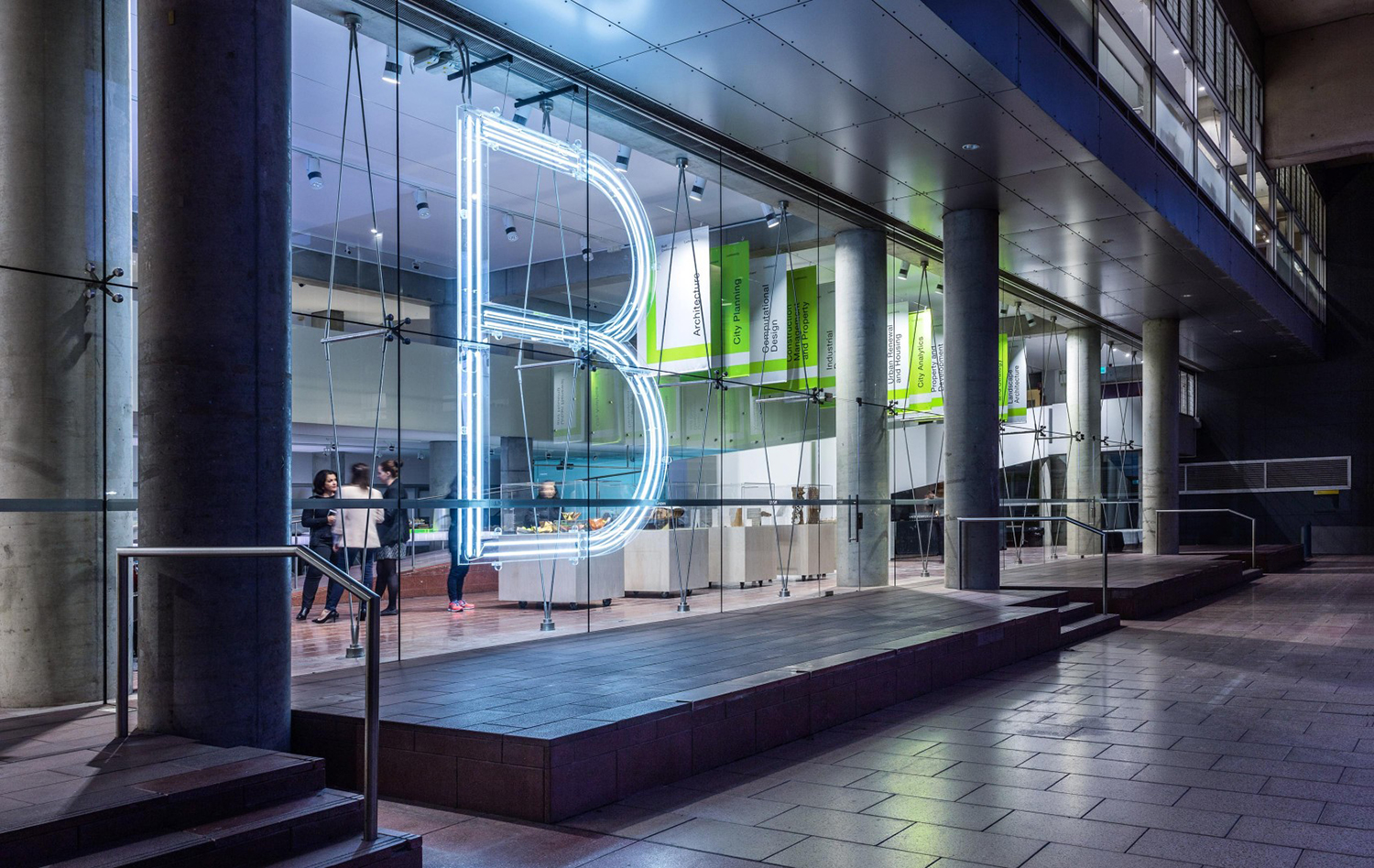
There are two components to the project. The graphic identity for UNSW’s BE faculty which included course guides and website, and the design and promotion of its annual exhibition Luminocity which was made up of posters, signage and display surfaces. The exhibition is a useful format in which to express how the graphic identity of the faculty builds out into an engaging spacial and material experience, and how it functions as a framework to hold a variety of projects from different courses.
There is an argument to be made for a cohesive institutional identity rather than distinct faculty identities. Or at least a more refined and resolved institutional identity and communications platform that affords some degree of individual visual character and communicative specificity amongst faculties, yet a clear continuity. Presently, UNSW does not have this. BE really stands apart, particularly online where it takes on the form of something close to a micro-site—one that establishes a commonality between print and exhibition—quite different from other faculties, but with the disparite qualities of the UNSW header and navigation.
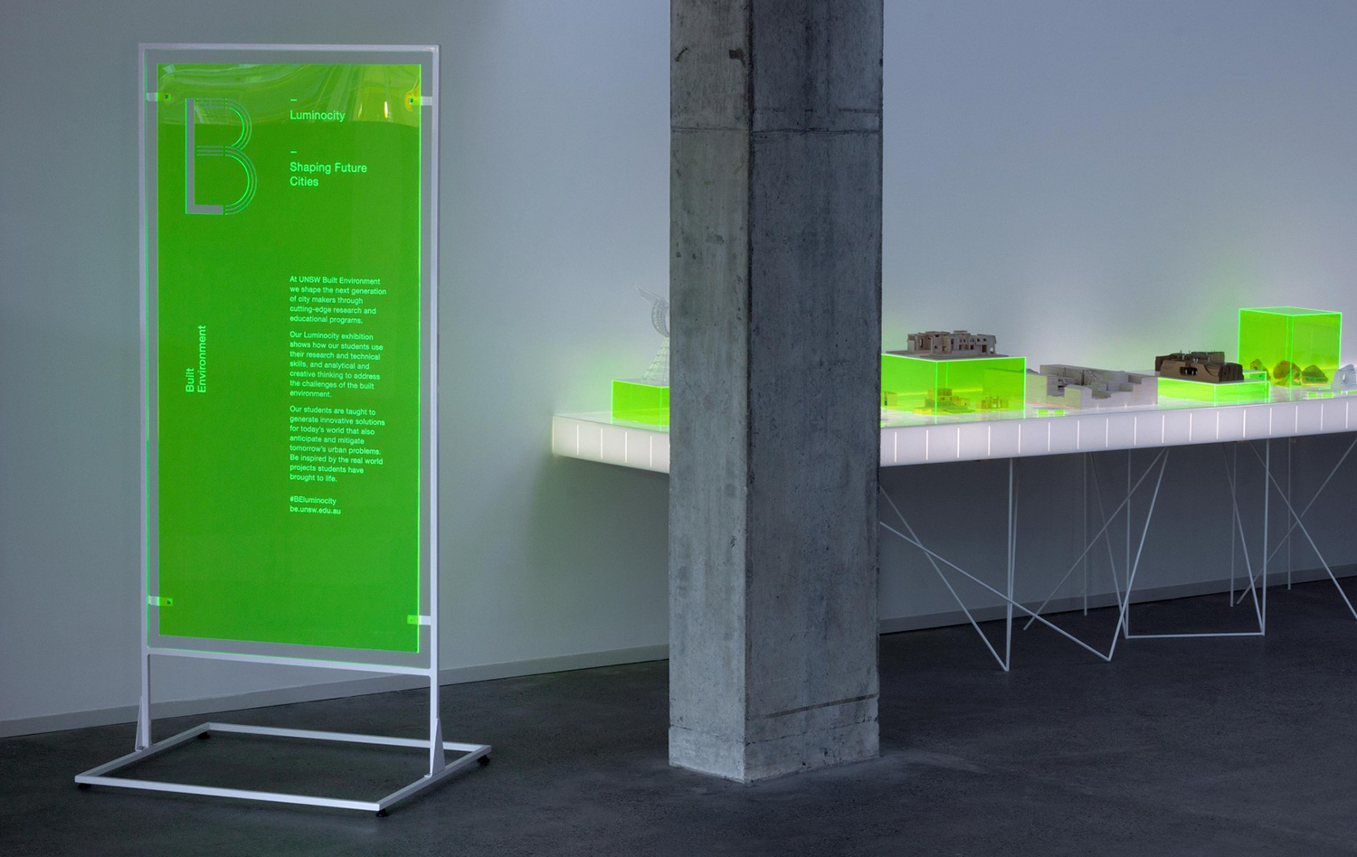
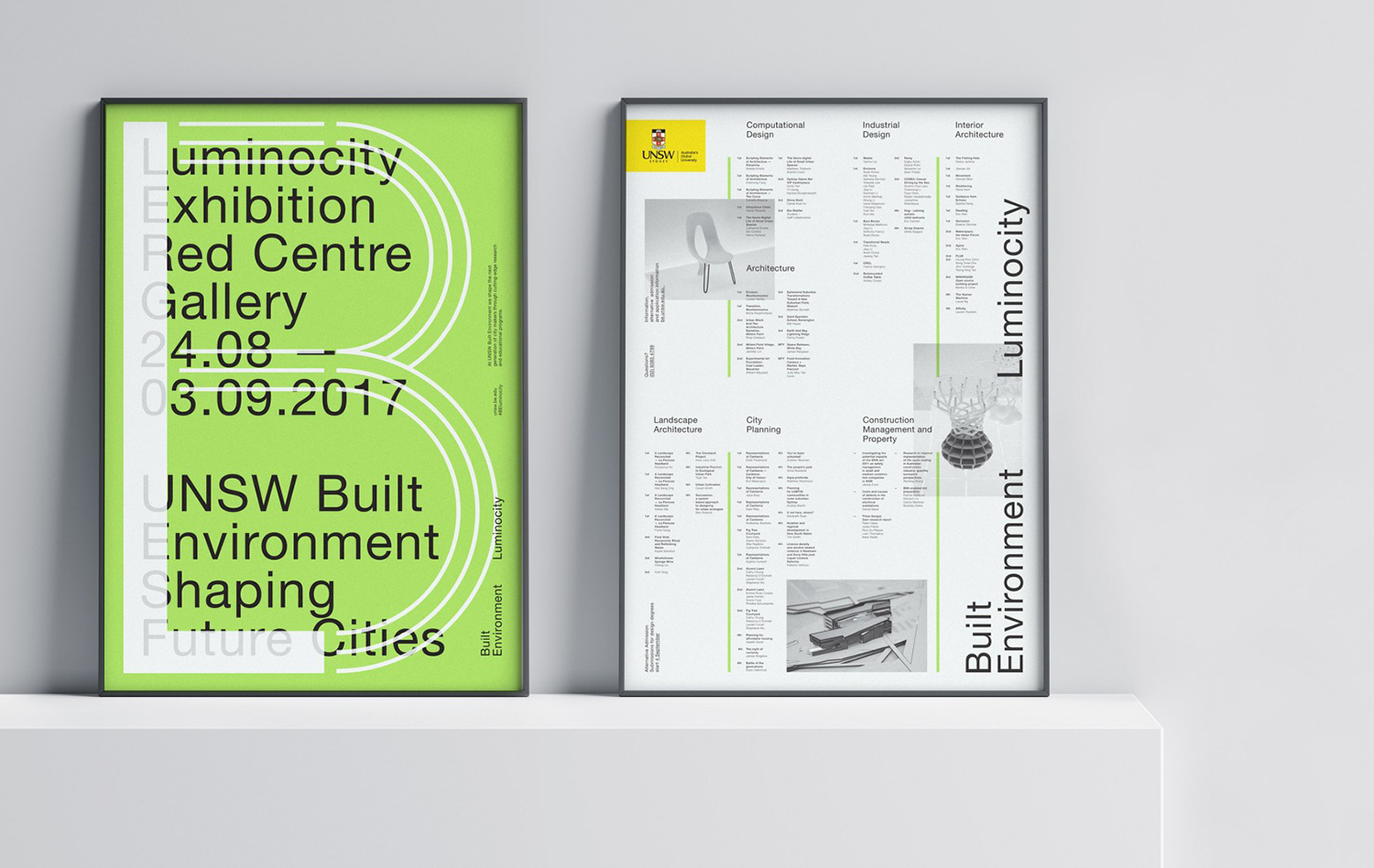
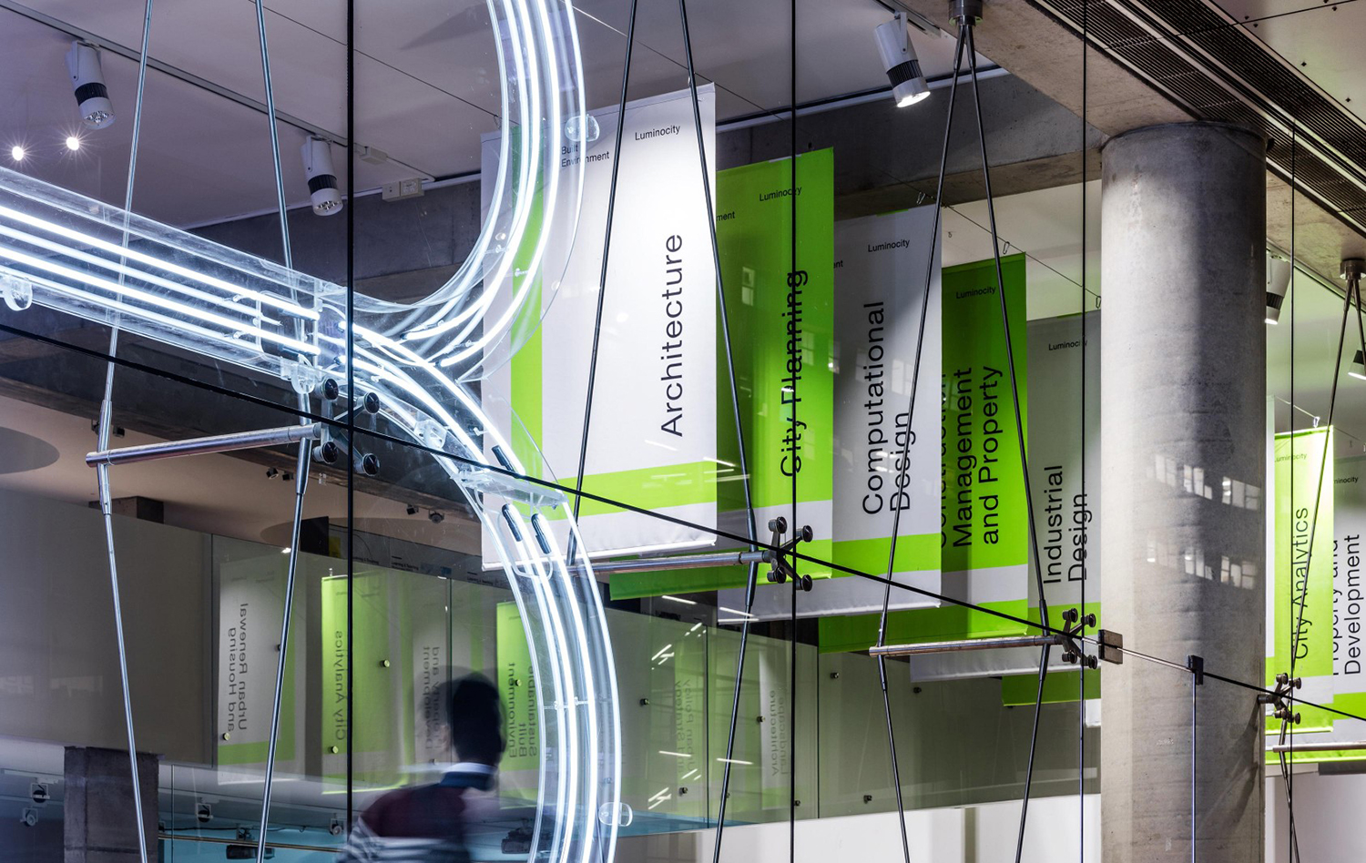
Colour establishes an immediate link between the graphic and the spacial. The relationship between fluorescent green ink and etched perspex is clear. It effectively punctuates a space of concrete grey, connecting displays across space, and is supported by consistent type choice and arrangement, and a pair of monograms for the faculty of the Built Environmnet (BE) and the Luminocity Exhibition (LE). These monograms find a balance between the graphic, the material and the structural in their drawing and application in print, as a large neon installation that shares a lot in common with its architectural context, and cut into the surfaces of signage.
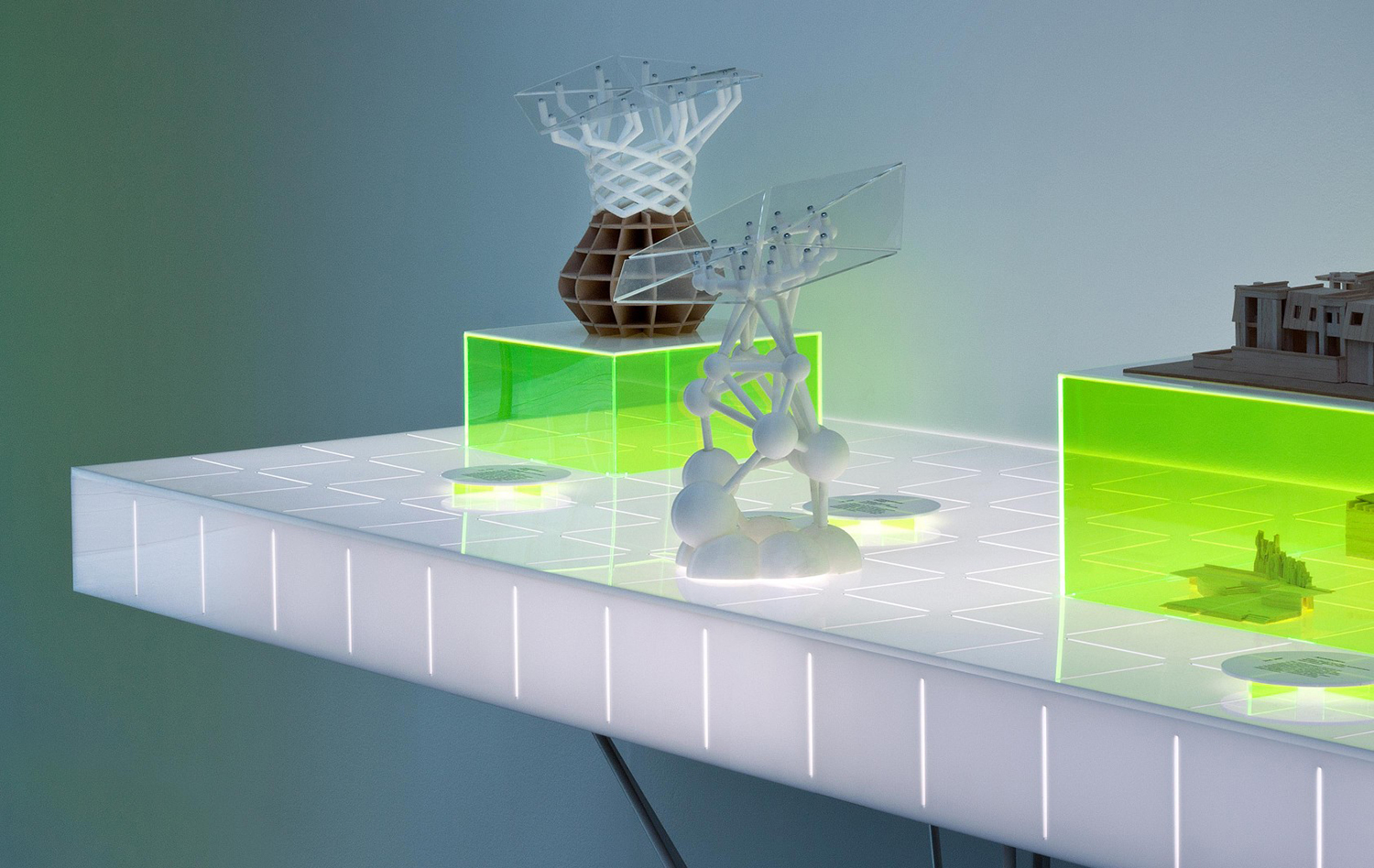
Light, structure and modularity are recurring motifs. Be that in the way light is reflected by fluorescent ink, channelled by perspex, or built into display cases. Structure is implied in the layering of graphic assets in print and in the interplay of form and support throughout the display cases. While modularity appears in the underlying structure and arrangement of posters, guide covers and microsite, and in the visible grids and boxes of the displays.
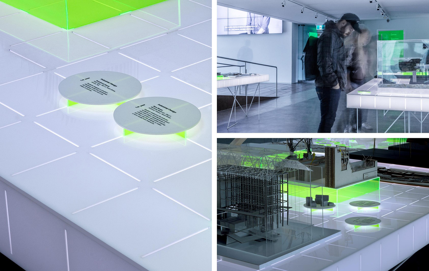
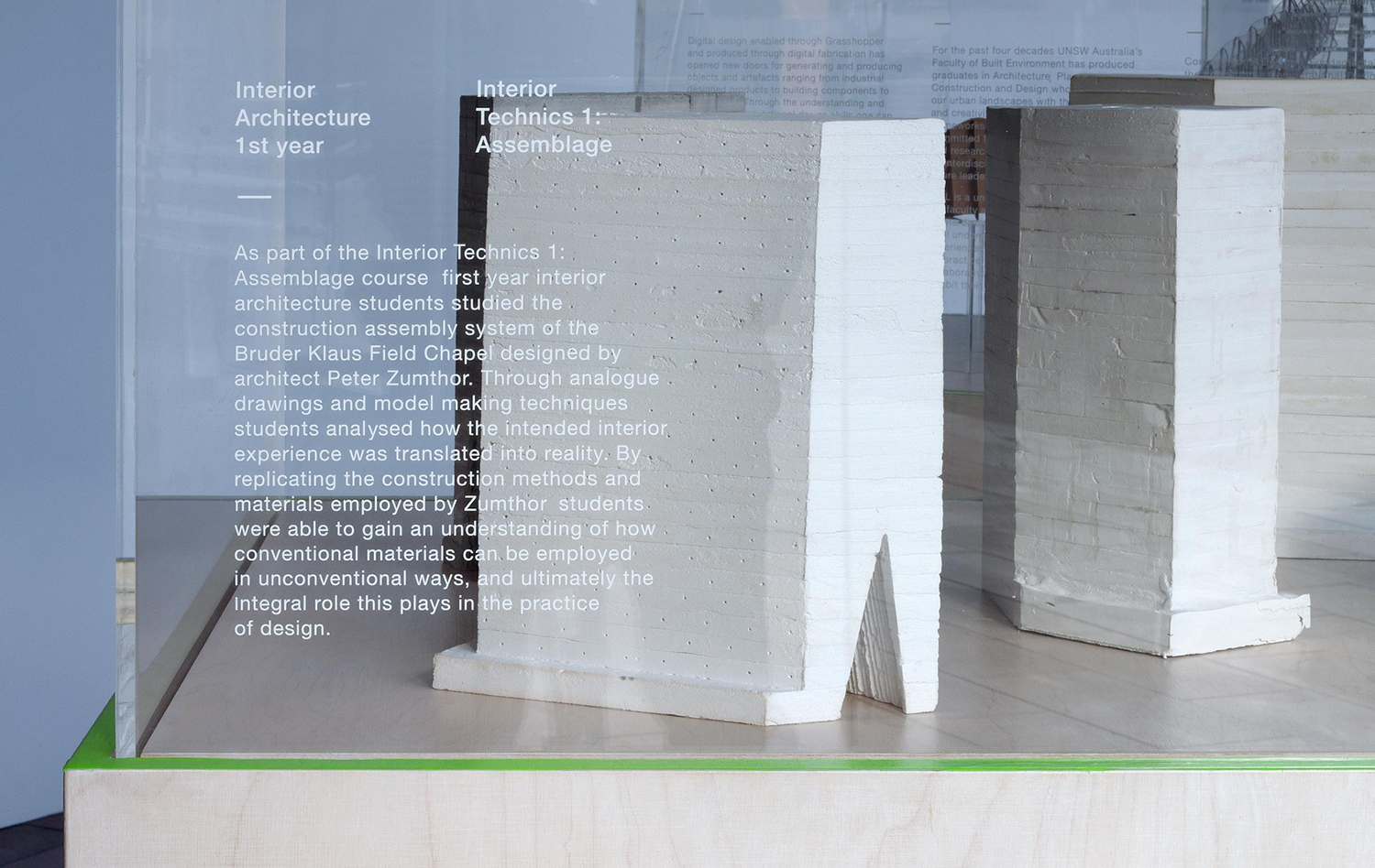
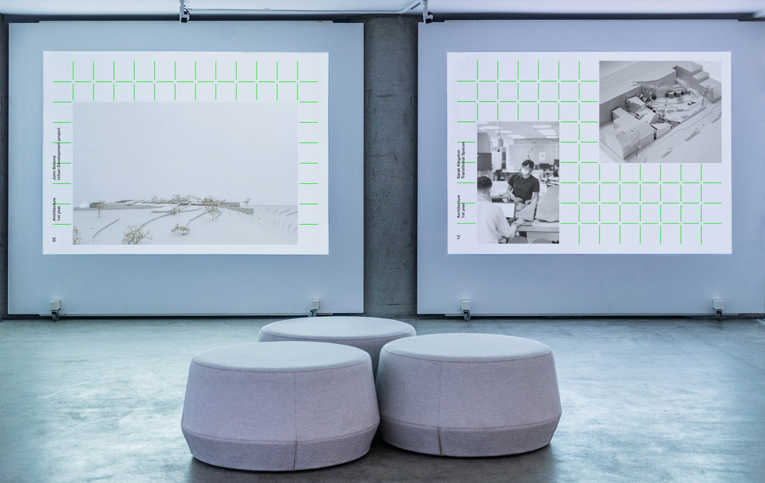
The design of displays, a modular grid-based arrangement of transparent blocks across an illuminated surface provide a consistent and unifying framework for the display of quite different pieces of student work. The surfaces illuminate this work, emphasising shape with light and shadow in an unconventional, interesting and memorable way. There is also an effective play with form in the cross base and circular information disks set into the surface. The way these feedback light and add colour is a particular highlight.
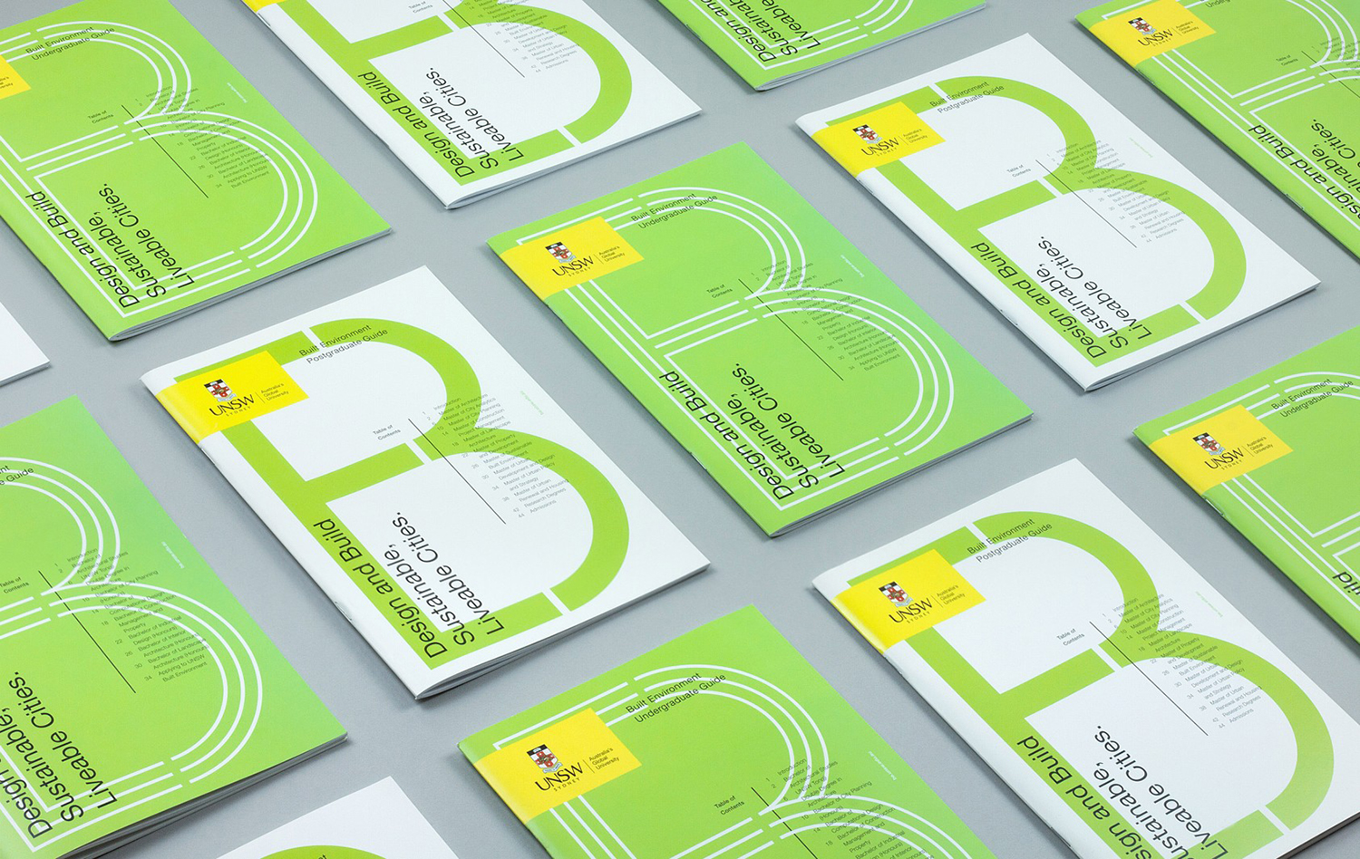
Beyond the immediate impression of colour and graphic form there is a confluence of architectural considerations and themes that while familiar build to something distinctive. These include but are certainly not limited to; proportion and shape, arrangement and orientation, the framing of space and the building up of layers. The UNSW shield is an unfortunate intervention across the cover of undergraduate and postgraduate guide books. Implementing this as a sticker-like overlay is perhaps one of the better approaches to this requirement.
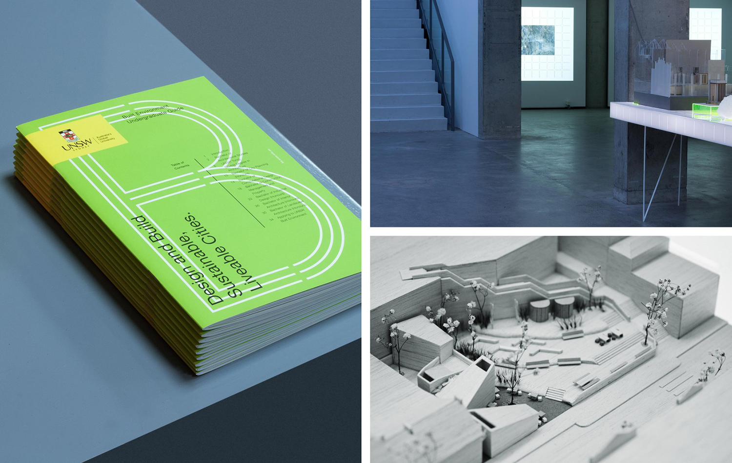
There are a lot of ideas at play. Small detail such as text across clear panels in front of work serves to form a critical relationship between context and response. Visible grids connect photography and screen presentations. The shape, light and shade created by hanging posters. And there is a tension between the glowing volume of surfaces and their light framework below. Yet, colour and light feel the most prominent and immediate, with everything else serving to link to architectural experimentation and practice. Bold graphic expression and colour provide a useful modernity and excitement and followed up by familiar but intelligible architectural cues materially. More work by Toko on BP&O.
Design: Toko. Website: Sons & Co. Opinion: Richard Baird. Fonts: TBC.
