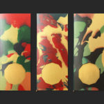
360ME, Montgomery+Evelyn by Studio Makgill
Opinion by Richard Baird Posted 13 March 2019

360ME is the first range of “life-ready” “Mood Nutrition” from Montgomery+Evelyn a new direct-to-consumer nutritional supplement company. Each of the four products focus on an individual and singular benefit with each capsule providing exactly what the body needs without having to purchase multiple products. M+E intends to bring a new level of quality and clarity of communication to a complicated nutrition market.
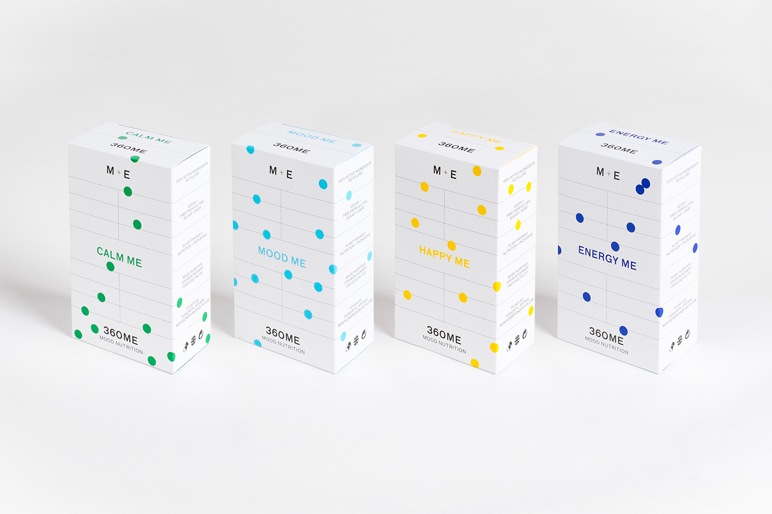
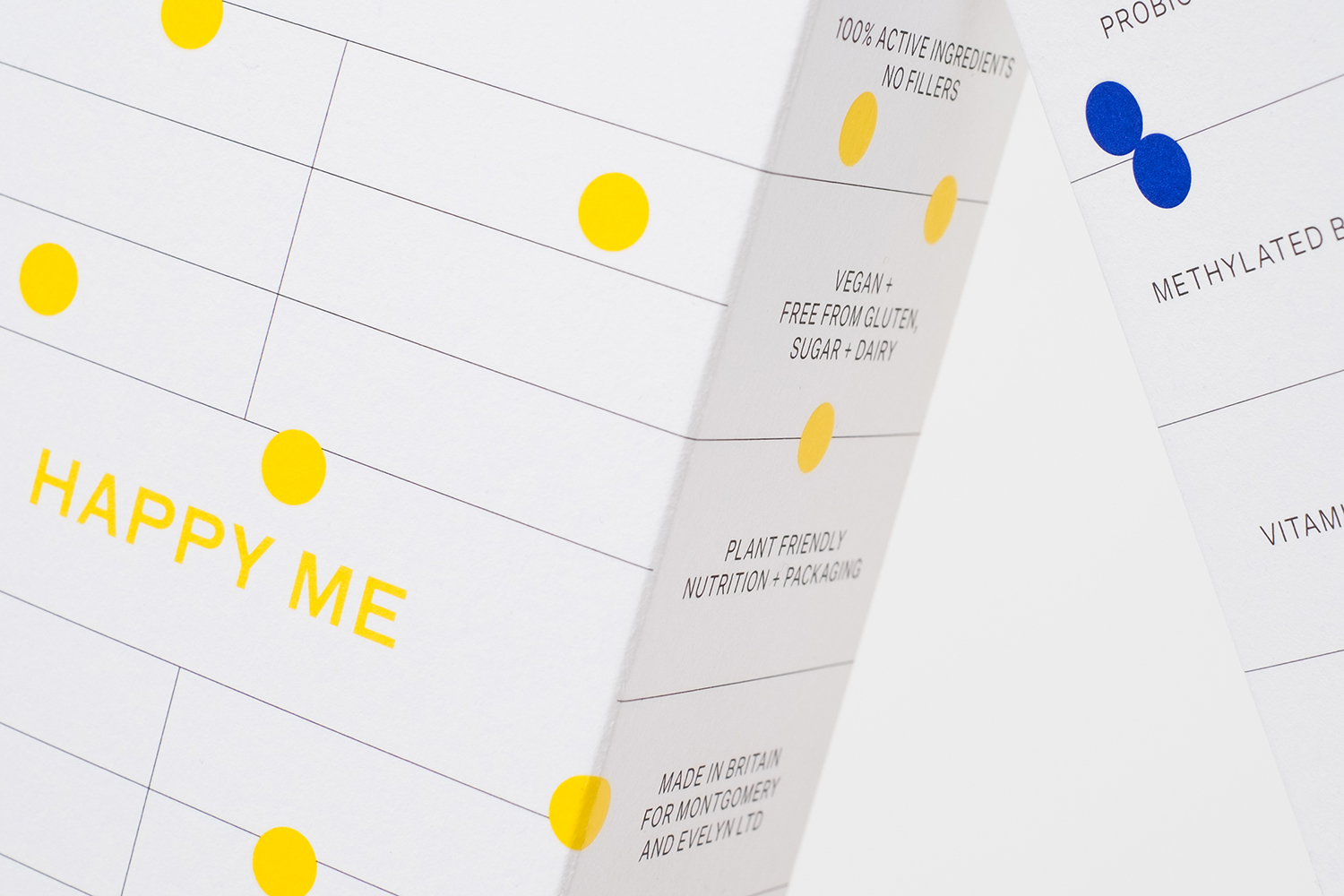
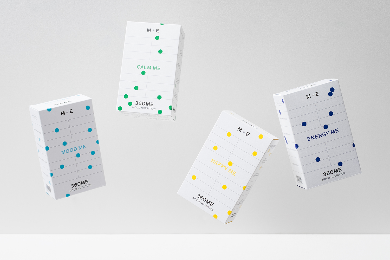
Working with founder, Evie Montgomery, Studio Makgill developed positioning, brand values, product architecture and packaging design, with their strategy emerging from the clarity in Evie’s approach, a beautiful and simple intersection of clinical science and human experience. This was expressed through visual identity by way of visible grid, bright coloured dots and a neutral sans-serif.


The MOOD ME, CALM ME, HAPPY ME and ENERGY ME product naming sets up the high expectation of mood shaping, which is perhaps problematic yet, the ME, derived from Montgomery+Evelyn, serves as a link between the brand and inner self. This is presented within a visual language of a visible grid and a neutral sans-serif which serve as foundational components. Many will clearly read these as being informed by science, clarity of intention and part of a wider move towards visual simplicity as shorthand for quality, as a method in which to seek differentiation and garner trust, away from the communicatively complicated and the visual cacophony that is often seen in the market. Further, while there is no information on price point, this also feels very much rooted in the world of the premium.
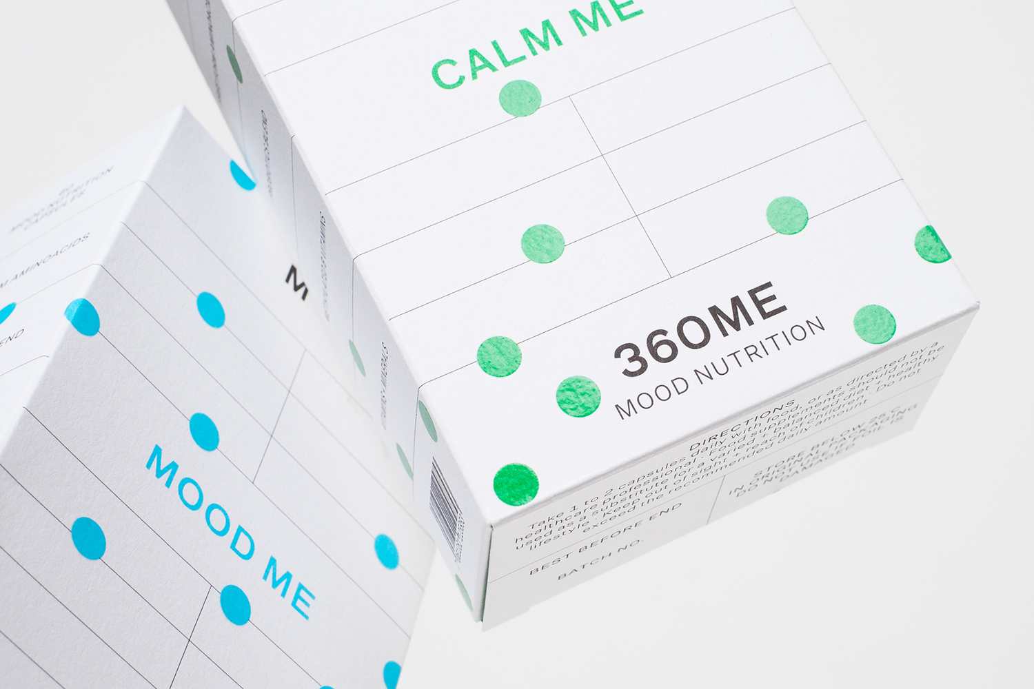
Over the clinicality, and beyond the grid, a confetti of brightly coloured and glossy dots pepper the surface of packaging. There is a joyfulness and an eye-catching visual immediacy to these in service to the theme of moods, but within the grid lead the mind towards the nodes of a graph. This duality, alongside visible grid and product naming, and a framework that seeks to structure just the essential information, nothing more, serves as a concise visual expression of the nature of the supplements and the values of the brand.
Design: Studio Makgill. Opinion: Richard Baird.
