Åhléns by Happy FB
Opinion by Richard Baird Posted 25 February 2019

Åhléns began in 1899 as a small mail-order business. Aside from it being one of the oldest it has also grown to become one of the largest retail chains in Sweden. By carefully collating a variety of items across brands and price categories, the retailer maintains its relevance today, understanding and responding to the many ways in which its customers have changed over its long history. Happy FB, the Scandinavian design studio behind Åhléns new visual identity, puts it simply “to Åhléns’ urbane and socially conscious patrons, shopping and sustainability are not contradictions. Inspiration and trends do not equate to use and discard. Premium can be inexpensive and cheap doesn’t necessarily mean a drop in quality”. The retailer’s new visual identity expresses this by taking the well-established Åhléns wordmark and single red and builds this out into a range of changing graphic expressions, imbuing a variety of touchpoints, material and digital, with more character whilst retaining a recognisable immediacy through simplicity.


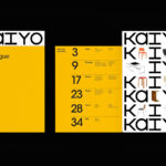
Finding a fresh and flexible way to communicate the Åhléns offering and its core values was the central challenge of developing a new visual identity. A typographical motif; deconstructing and reassembling the Åhléns wordmark in a way that responds to the space of a page, a bag, wrapping paper, signage, magazine cover or screen size reconfigures the graphic language of the brand, getting much more from it. Further, in the disassembly and irregular reassembly, there is the implication of further meaning, a form language beyond just the read word, the suggestion of variety in the stacking of letters and in the way they conform, to some degree, to the material world.

The approach maintains continuity with what came before whilst introducing personality and range. This reconfiguration continues by way of colour, with one shade of red giving way to a multiplicity. This is the joy of the work, it gets a lot from a little.

New art direction of both still life and moving image frames the variety the store offers, and develops the graphic language of type, bringing in material detail. The theme of collation, the equal consideration given to the expensive and inexpensive can be understood in these images, in the equality of their position within an image.
Design: Happy FB. Opinion: Richard Baird. Fonts: Noe Display & Apercu