App Logos
Cute, curious and cuddly
Fitness and health tracking apps are not generally known for their sense of fun. The likes of MyFitnessPal, while great in terms of functionality, for the most part, keep the design stuff resolutely serious, no-nonsense, and perfunctory. Meanwhile the likes of Strava elicit joy through very few things, the main one being when people decide to run in a shape...
Muse Group by Collins
Muse Group exists as a collection of digital products covering all aspects of the creative process in music. This reviewer is familiar with Audacity and has used it in the past, but other platforms include Ultimate Guitar, MuseClass, MuseScore, and MuseHub. These tools are used by a range of professional musicians, budding amateurs, and everyone in between, working across all...
Reveri by Mother
There’s no denying the proliferation of all things that the more curmudgeonly crowds might deem ‘woowoo’ over recent years. Crystals, gong baths, singing bowls, silent retreats, tarot et al were once firmly languishing on the fringes of society, and are now de rigeur among the Stoke Newington set and TikTok classes alike. This rise in self-help-led esotericism has run concurrently...

Wisl by andstudio
Shaking off a hangover on a crisp Sunday morning kick-about with the boys; dunking a perfect basket on a court raked with the long shadows of a high-summer sunset; obliterating Janet from HR in a ‘friendly’ after-work squash game/grudge-match. These vignettes, I am assured by those who participate in such wholesome activities, capture both the hazy idyll and everyday reality...
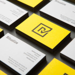
Ritualize by Shorthand
Ritualize is a cross-platform fitness and lifestyle app that utilises leaderboards, education, challenges and exercises to establish and track small habits that should lead to improved physical and mental health, and a sense of well-being over time. Shorthand, an independent brand identity and graphic design studio based in Newcastle, Australia, were recently commissioned to help bring the app to market. This included naming,...
Great British Chefs by Hat-trick
Great British Chefs is an application that gives its users access to videos, cooking tips and shopping lists from a range of customisable menus built from over 180 dishes created by twelve of Britain’s top chefs. The apps identity, designed by London based studio Hat-trick is a series of ‘C’ shaped logo-marks created from kitchen implements that resolve the ideas of...