Design for Architects
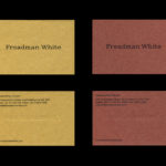
Freadman White by Studio Hi Ho
Freadman White is a Melbourne-based architectural practice, led by Ilana Freadman and Michael White, that seeks to embed a curiosity-driven and experientially charged tension into their architectural work, reveal beauty in simple and overlooked settings, and design contextually informed structures with a disciplined whimsy. Further, rather than responding literally to physical surroundings, the practice develops spaces that are visually intriguing,...

The Architect’s Bookshop by Garbett
The Architect’s Bookshop is a new design-focused retailer, located in Sydney’s Surrey Hills, devoted to the books of architecture and interior design, landscaping and urban development. The space was conceptualised as being more than a bookshop but a place to take time out to browse, a chance to engage with the material and form of the books, and as a place...

85 Spring Street by Studio Ongarato
85 Spring St is a residential property development of 132 apartments by Golden Age Group, designed by Bates Smart and located in the Australian city of Melbourne. It will be marked by its total work of art philosophy, or Gesamtkunstwerk, which embraces a multitude of artworks to compose one singular piece, but also its distinctive, sculptural and high-rise modernity within an area of...

Repair by Studio Round
Under the title Freespace the 16th International Architecture Exhibition, Biennale Architettura 2018 in Venice, asked international participants to “encourage reviewing ways of thinking, new ways of seeing the world, of inventing solutions where architecture provides for the well being and dignity of each citizen on this fragile planet”. The response from Australia; a pavilion titled Repair and a collaboration between...

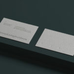
David Collins Studio by Bibliothèque Design
David Collins Studio is an award-winning interior architecture practice working with brands, businesses and private clients who share their passion for detail, craft and refinement. These include Harrods, Nobu Berkeley, The Connaught Bar and those working within the hospitality, residential and retail sectors. The studio’s work is described as being iconic, timeless and having a dramatic glamour rooted in a...

Morris+Company by Bob Design
Morris+Company dovetails the individual strengths of founder Joe Morris and the talents of a wider company of designers. This is expressed by a recent renaming, moving from Duggan Morris Architects to Morris+Company, and throughout the studio’s new graphic identity, designed by Bob Design. This is codified within a brand guidelines document of type, imagery, texture, pattern, words (by Emma Keyte) print finish and material...

Enter Arkitektur by Lundgren+Lindqvist
Enter Arkitektur is a Swedish two-office architectural practice located in the cities of Jönköping and Gothenburg. It has a rich history that goes back to the 1950’s and a portfolio that moves between residential housing and commercial building projects. In response to restructuring and expansion, the practice worked with Lundgren+Lindqvist to develop a graphic identity that would better represent their...
UNSW Built Environment by Toko
UNSW Built Environment (BE) intends to develop global leaders in architecture, planning and construction, and help shape resilient, connected, smart and inclusive future cities through its undergraduate, postgraduate and postgraduate research courses. As part of this, the faculty also runs an annual programme of events for students, academics, industry professionals and the general public. These serve as a platform to find out...
CCA Architecture by Manual
The Architecture Division of the California College of the Arts (CCA) is an internationally recognised leader in architecture and interior design education. Its programs, which focus on digital technologies and material systems, design research and urban agency, were developed to prepare students for creative practice where material innovation and formal experimentation meet social engagement and cultural collaboration. CCA Architecture strives to...

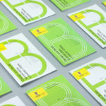
Architects Accreditation Council of Australia by Toko
Architects Accreditation Council of Australia (AACA) is the national voice for architect registration boards around Australia. The council runs the Architectural Practice Examination, assess overseas qualifications, collates data on the profession throughout the country, facilitates international mutual recognition agreements and provides alternative pathways to registration for local practitioners and architects from overseas. The AACA worked with Sydney-based studio Toko to clarify the complexity...
Planned Living Architects by A Friend Of Mine
Planned Living Architects (PLA) is located on Australia’s Mornington Peninsula and has an architectural portfolio that shows a sensitivity and responsiveness to the uniqueness of each site, is environmentally-consciencious, materially mindful, beautiful and functional. The studio is well-regarded, has decades of experience and expertise working within coastal and rural areas, is known for its pared-back style, and has a philosophy that is...
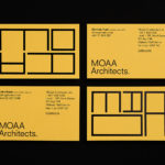
MOAA Architects by Inhouse
MOAA Architects was founded in 2010. It has an office in Hamilton, New Zealand, and a portfolio of new builds and renovations that span the residential, education, commercial and public sectors. Highlights include their work on St. Johns Church, a square plan rotated 9 degrees off the street grid, and Piako House, a renovation and extension of 1940s domestic planning to meet a 21st...