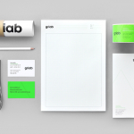
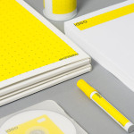
Griab by Kollor
Griab is a Swedish engineering firm, founded in 1957 and located in Helsingborg, Sweden, that specialises in delivering a holistic design and build service that includes land planning, wastewater management, architecture and construction. Developed by multidisciplinary design agency Kollor, Griab’s visual identity, “inspired by the the straight lines and shapes commonly seen in architecture” and created to help reinforce the firm’s environmental...
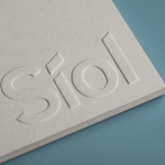
Síol Studio designed by Mucho
San Francisco-based architecture studio Síol recently commissioned multidisciplinary design agency Mucho to develop a new visual identity solution that would embody “their philosophy of conceptual, clean architecture for both interior and exterior design.” Based around a customised sans-serif logotype executed as a blind deboss, the identity conveys the familiar architectural themes of light and shadow formed within three-dimensional space and a practical, corporate efficiency....
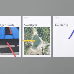
Tegn_3 by Neue
Tegn_3 is a Norwegian, multidisciplinary, architecture design studio that, through inclusive methods, process-oriented and competent project management, deliver holistic solutions that encompass the fields of architecture, planning and landscape, to large clients across Scandinavia. Their visual identity, developed by Neue, draws together the themes of technical knowledge, structure, connections, collaboration and creativity through neutral typography, a modular and expanding geometric...

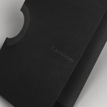
K2LD Architects by Studio Hi Ho
K2LD is a small Melbourne-based architecture and interior design firm with a project history that includes individual private homes, community precincts, multi-unit developments and large-scale commercial projects. The firm’s identity, an abstract, structural and modular amalgamation of initials (check the ideation animation here), uncoated materials and a monochromatic colour palette – developed by brand and communication studio Hi Ho – unapologetically embraces the established and reductionist cues of the industry....
O Architecture by Heydays
O Architecture is a small, Lille-based multidisciplinary studio whose practices extend beyond traditional architectural services to include artistic installations, educational courses and editorial work. Their visual identity, ‘a solid circle with a disruption that creates a triangle reminiscent of an A’ – created by design agency Heydays – , unites the broad remit of the studio under a simple symbol with a revolving, holistic quality that...

Krohn by Commando Group
Krohn is a young but experienced Oslo based furniture, interior and architecture design studio that develops holistic solutions that strengthen and add value to businesses through interior environments. Krohn’s visual identity, website and stationery—created by visual communications agency Commando Group—captures the multi-disciplinary nature of the studio and juxtaposes bold architectural structure and simple interior spaces with fine, high quality detailing, through an abstract,...
Ideo Architekci by For Brands
Polish design studio For Brands (formerly Artentiko) have published images of their latest visual identity project commissioned by Wrocław based architectural studio Ideo Architekci. Based around a modular and dynamic grid based framework, modernistic typeface and a bright industrial colour palette, Artentiko’s solution manages to capture the fundamental aspect of architectural planning and a consistent but expansive approach....
Architecture PLB by Sea
Architecture PLB is a design-led practice working across both the public and private sectors with offices in Winchester and London. Their new brand identity, designed by communications agency Sea, unites the three dimensional aspect of the architectural world and a sense of sculptural creativity with a gradated ‘A’ logomark and the utility and corporate neutrality of a well-spaced, light grey san serif...