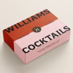
Williams Cocktails by Offff
In the last five years, canned cocktails have become ubiquitous, with offerings from MOTH: (packaging by Pentagram) and Whitebox (cans created in-house) among the strongest designs competing on the shelves of off-licenses, delis and bottle shops. Convenience and a post-pandemic demand for ‘on-the-go’ experiences have helped drive this trend, with Mintel data demonstrating that sales of spirit-based ready-to-drink beverages increased...

Tameko by DutchScot
Founded by Dominika Leveau and Chim Sonne-Schmidt in 2021, textile brand Tameko feels thoroughly ‘Scandi’ in aesthetics and ethos – it’s all clean lines, a singularly restrained stance on beauty. It’s form following function. Tameko embodies that very contemporary take on the luxury sensibility that never shouts about its status. It doesn’t need to: luxe quietly but confidently oozes from...

Hello Klean by Two Times Elliott
Beauty is, of course, in the eye of the beholder, but there’s no denying that objectively, its branding and identity design has undergone some huge changes over the past decade or so. Gone are the days of faux-luxurious designs that were all about swathes of abstract silk; women coiffured to within an inch of their life; a microscopic lens on...
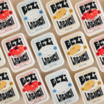
Bezi by Red Antler
Bezi was founded by Ilay Karateke – an Istanbul-raised, New York-based, ex-McKinsey consultant turned cheesemaker – and Hasan Bahcivan – a Berkeley-trained engineer from one of Turkey’s largest and most legacied cheesemaking families. Both grew up in large families, with their lives punctuated by big family-style meals shared with friends and neighbours. Labneh, a Middle Eastern spreadable cheese, was ever...
Olympic Museum by Studio Blackburn
Few things have a design legacy quite like the Olympics: it’s hard to think of another event or organisation that has both a history spanning more than 120 years (the first modern Olympics’ was in 1896), and a distinct graphic identity each time it takes place. Since every Games has its own unique ‘emblem’ logomark device, the events become sort...
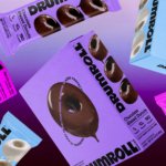
Drumroll by Gander
Donuts are one of life’s simplest pleasures, but they haven’t historically been the healthiest choice. Vegan – sorry ‘plant based’ – donuts are nothing new (Krispy Kreme’s been selling some non-dairy alternatives for a while now, and very nice they are too), but until now, we weren’t aware of donuts that also boast high-protein, low-sugar, gluten-free credentials. That is, until...
Reveri by Mother
There’s no denying the proliferation of all things that the more curmudgeonly crowds might deem ‘woowoo’ over recent years. Crystals, gong baths, singing bowls, silent retreats, tarot et al were once firmly languishing on the fringes of society, and are now de rigeur among the Stoke Newington set and TikTok classes alike. This rise in self-help-led esotericism has run concurrently...
Fluz by Koto
It can’t be easy designing the identity for a brand or company that’s hard to define, or which isn’t easily explained by that ‘new product, familiar ideas’ trope – the sorts of things described as ‘Like Tinder, but for cats!’ or ‘CityMapper for life decisions’, or ‘Uber for people who want to try dogging but can’t drive’ (if any investor...
La Mia by Papanapa
In recent years, we’ve seen artisanal ice cream brands make an obvious departure from the maximalist, saccharine branding that their mainstream counterparts are so known for. In particular, the typeface-heavy, superimposed ice cream tubs of US-based brands have become a benchmark for exactly the kind of branding that more gourmet confectioners are keen to avoid. While Ben & Jerry’s iconic...
Imperia by Landor
As well as being a coastal city in south west Italy (formed in 1923 by none other than Benito Mussolini), Imperia is a pasta machine company that was formed from a ‘little artisan workshop’ in 1932. Imperia soon began to distribute pasta machines around the world; mainly catering to the US’ large Italian community. From its plant in Sant’Ambrogio, Turin,...
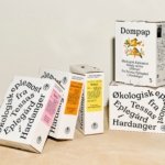
Tessas Eplegård by Olssøn Barbieri
One of the many brilliant things about the world of branding is that to work in it, write about it, or just take an interest in it forces you to learn something about pretty much everything. Maybe that’s how LEGO might actually be a better investment than gold; or that Murray’s Parmigiano Reggiano cheese pairs well with a nice New...
Matheson Food Company by Wedge
If nostalgia is a powerful force, arguably ‘fauxstalgia’ – that sense of longing and yearning for something that we never actually experienced – is even more so. Fauxstalgia isn’t the same as trend cycles – the baffling realisation that Gen Z is suddenly, unironically, into Nu Metal, for instance – it’s an internal sensation rather than an external observation. It’s...