PURLOM’s ¡A LA MESA! by Onmi Design
Opinion by Richard Baird Posted 19 March 2024
I’m reluctant to bring up the pandemic again, four years later. But I can’t help think back to that period when seeing images related to gatherings, which are employed to great effect in Onmi Design’s work for PURLOM, a family business with more than 40 years of experience producing and distributing a wide variety of meats. This kind of imagery has, for a long time, been a powerful advertising tool but, perhaps, more so now we’ve collectively had a sense of what it is to lose these moments over night. Anyway…
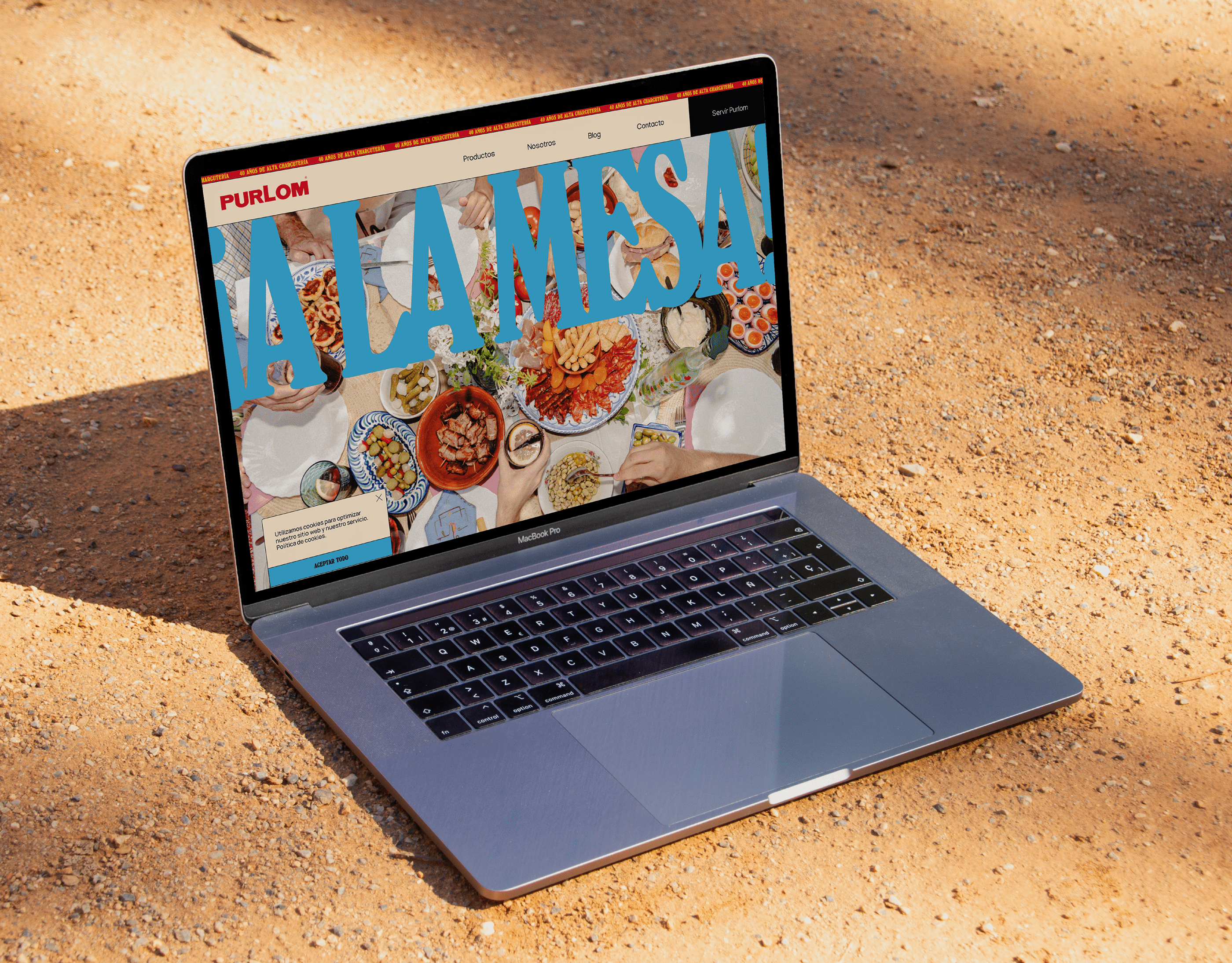
…no brand is built around ‘distributing meat’ but rather, the occasions for enjoyment, and the people it’s shared with. Within this, there are motifs, rituals and associations. These are what PURLOM’s ¡A LA MESA! brand is built around. There’s a lot going on here, and that’s the crux of the idea: ‘all at the table’. ‘All on the website’ might be a better description as type, colour and photography coalesce into a bright, bold and familial visual cacophony. It’s stimulating, exciting and, yep, effortlessly authentic.
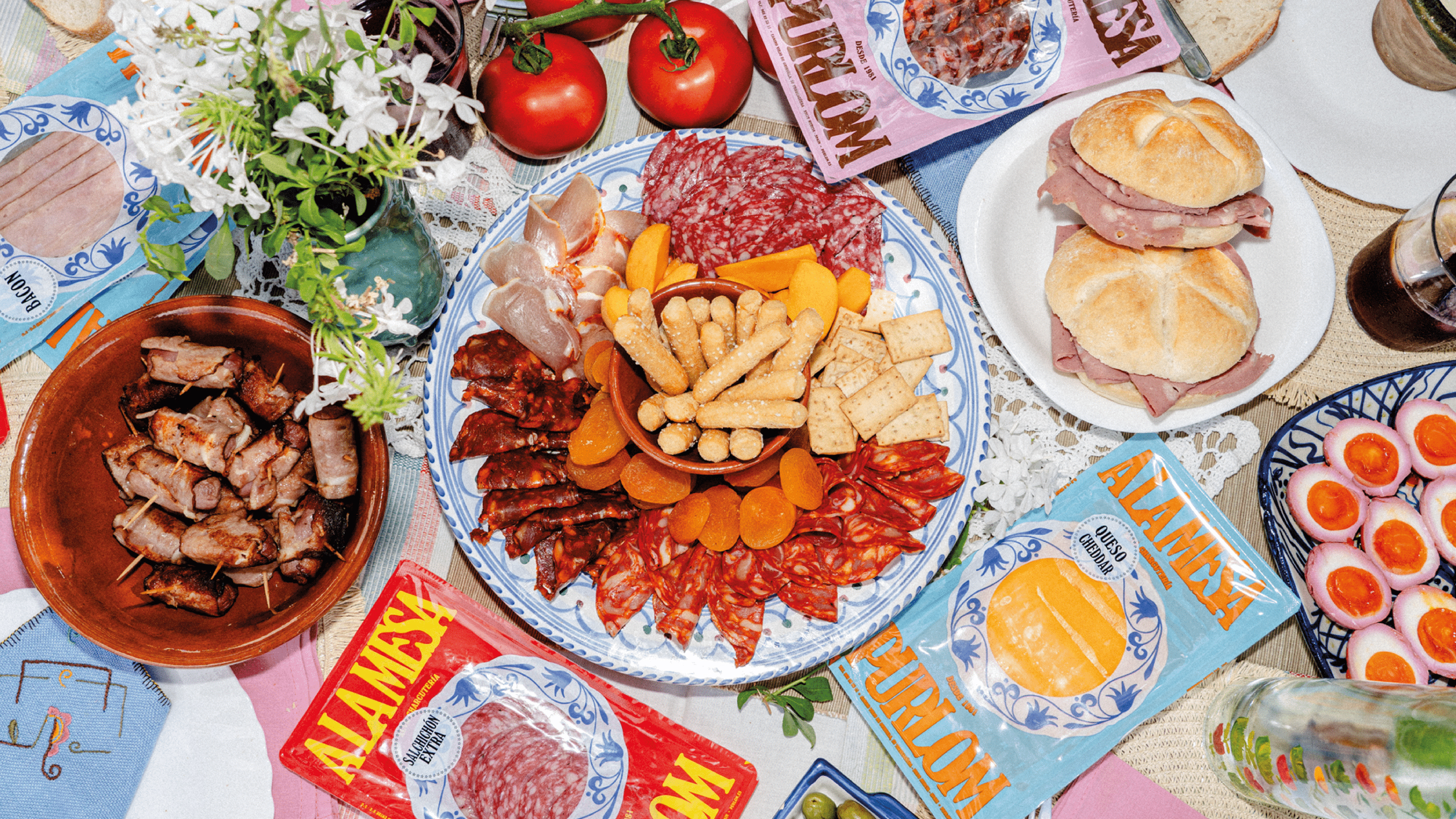
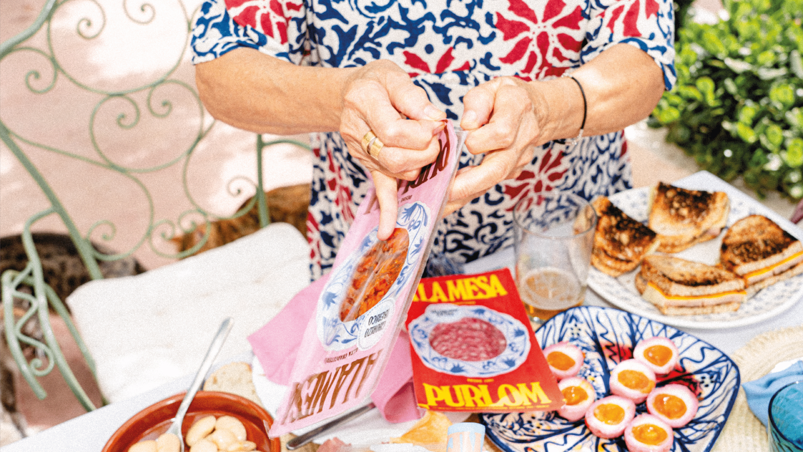
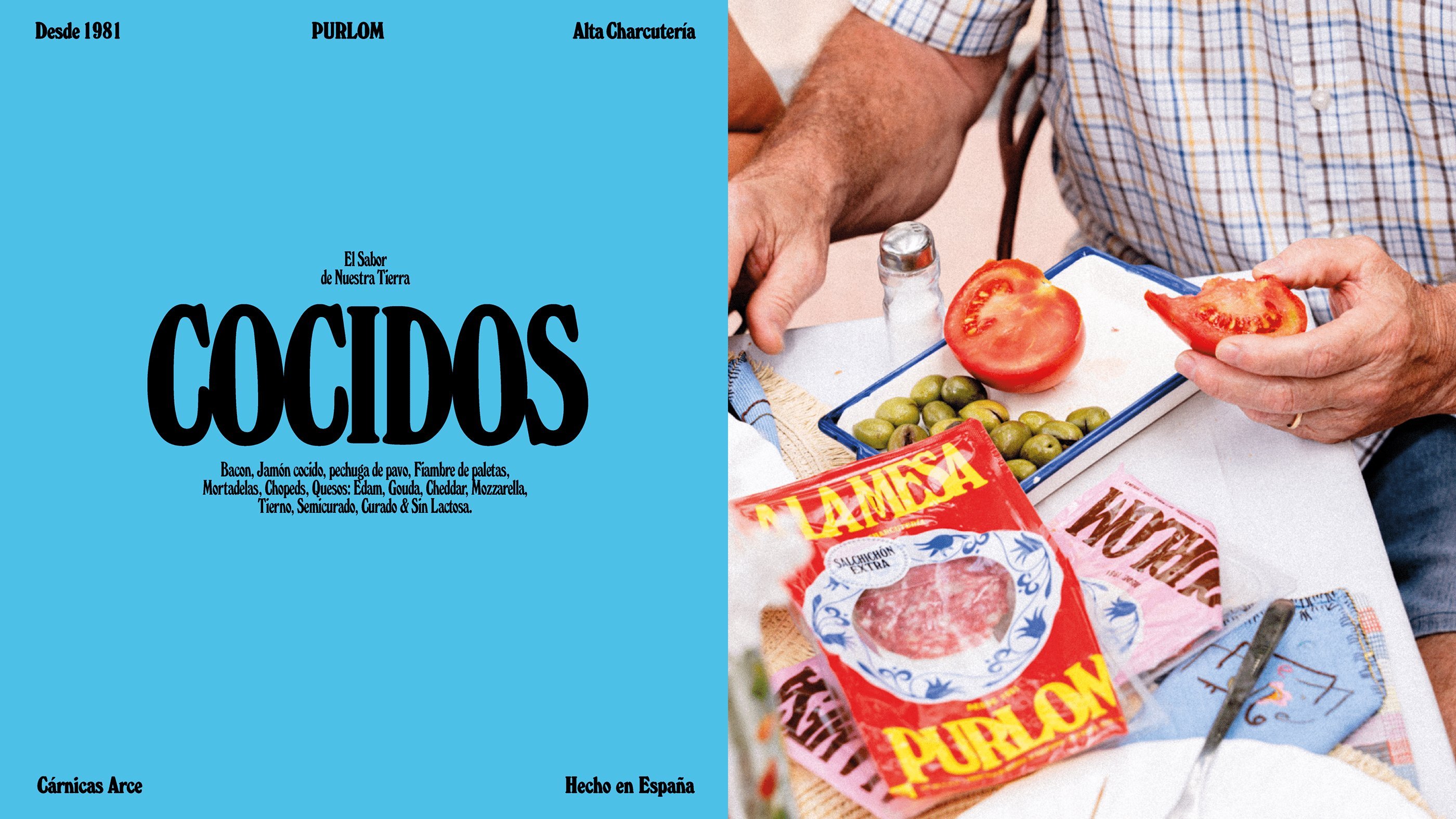
‘A story of disorder’. Hands everywhere, talking across the table, across people, loud voices and hushed gossip, a dog stealing food, a cat fed under the table, chaos. There’s a pop-culture freneticism. The art direction is wonderful, somewhere between the familiar and fantastical (depending on your own experience!). There’s enough detail to give the table scenes a sense of life, without stealing the possibility of imagining yourself into the image. And that’s the trick.
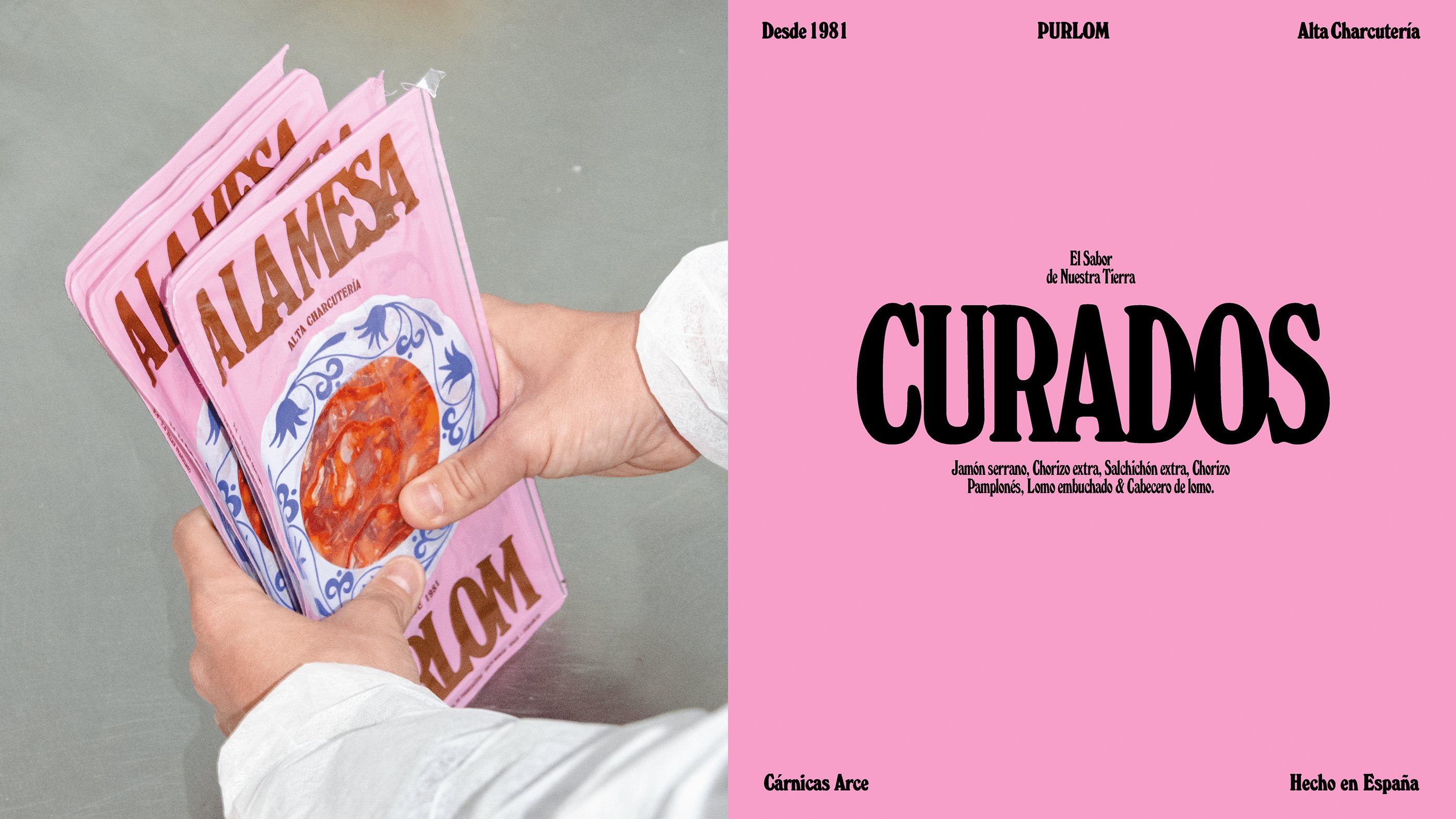
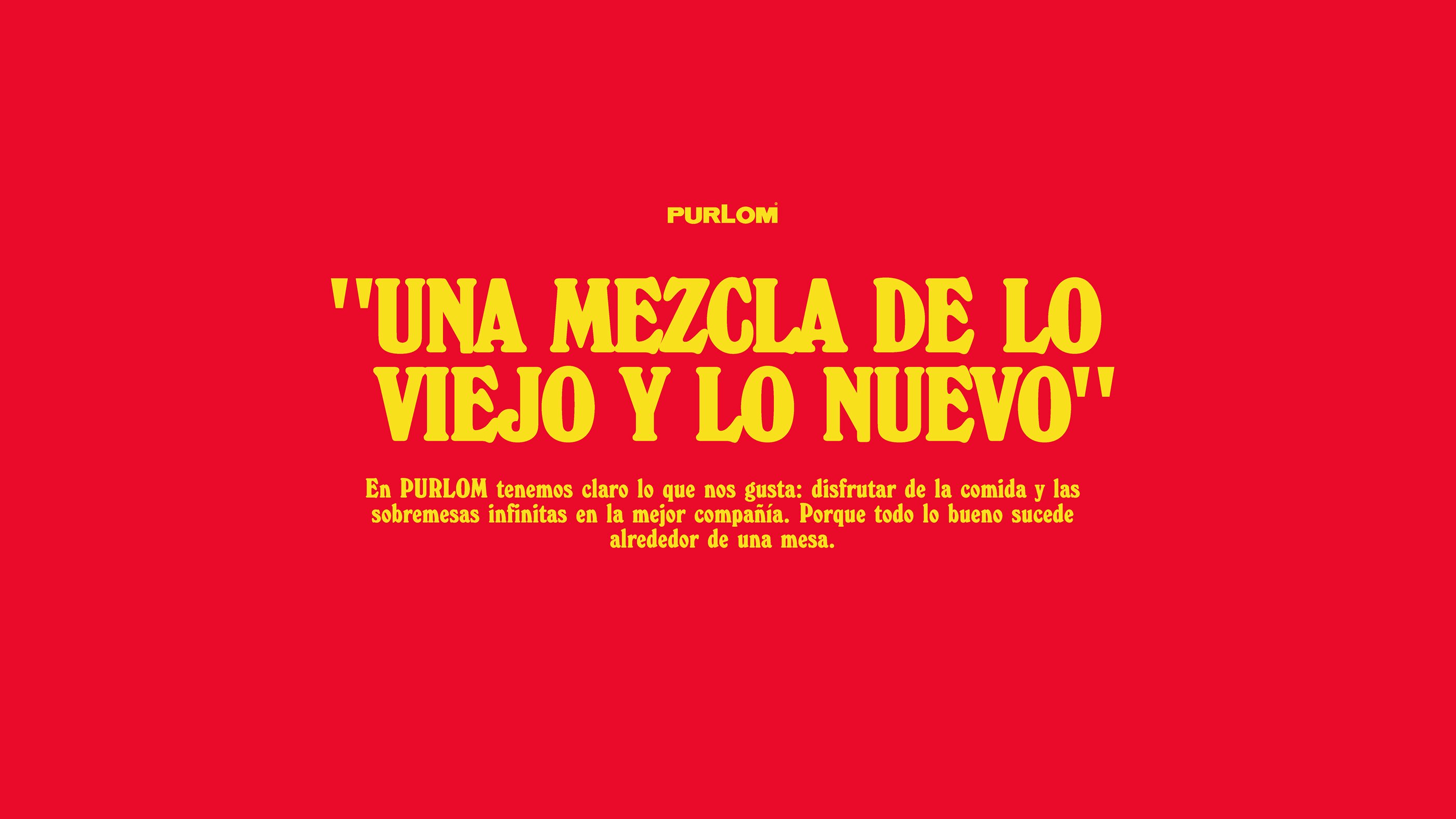
Everything flows from this, from the high contrast colours – they’re vibrant, fresh and fun, feeling both retro yet also thoroughly of the moment – to the typeface, Windsor – condensed, tightly set and large in application, creating a loud vocal quality. There’s a vague sense of mass market magazine mastheads (also check the website) and pulp fiction of the late 70s and early 80s. It’s not trashy, but placing the product in the period of the brand’s founding.
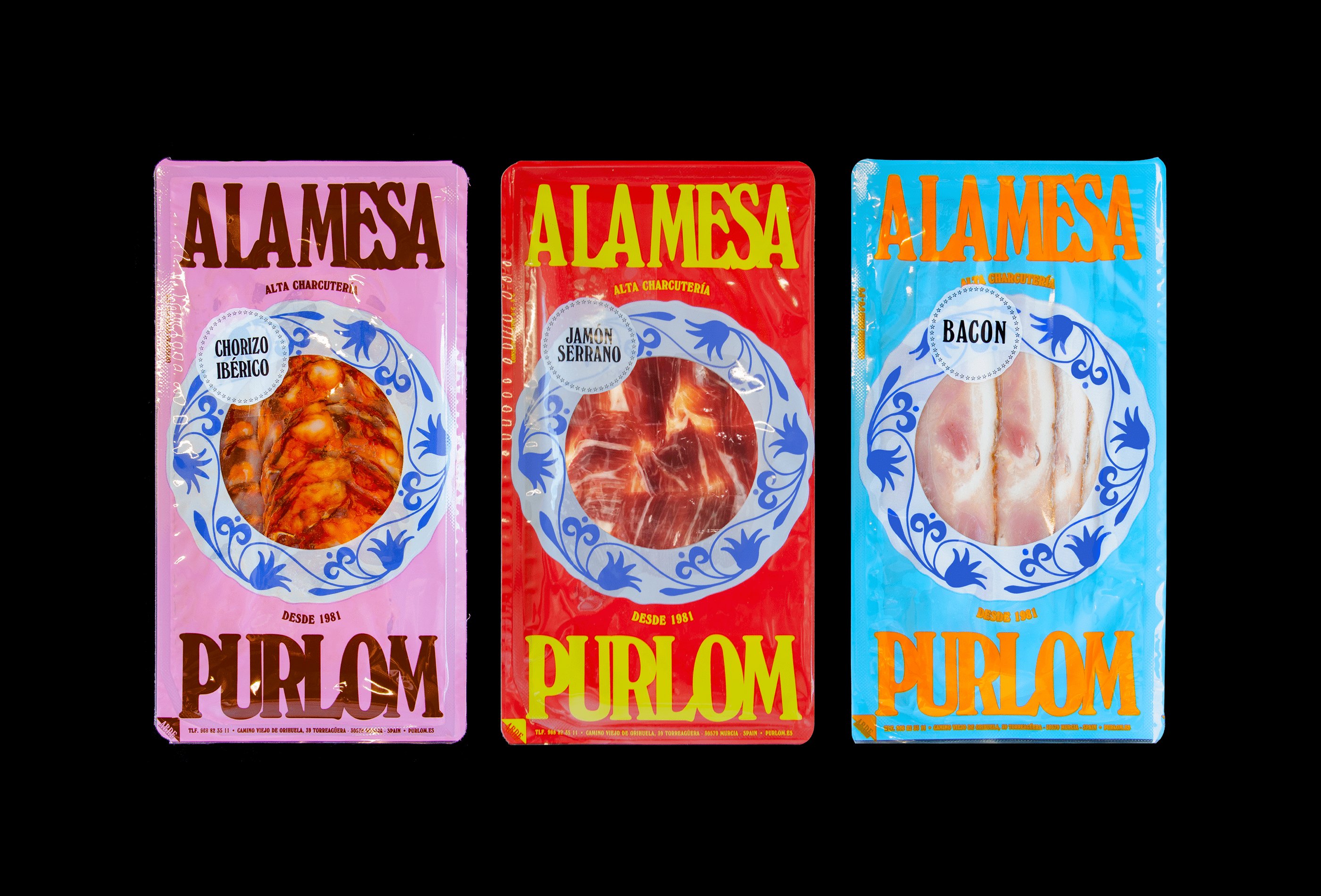
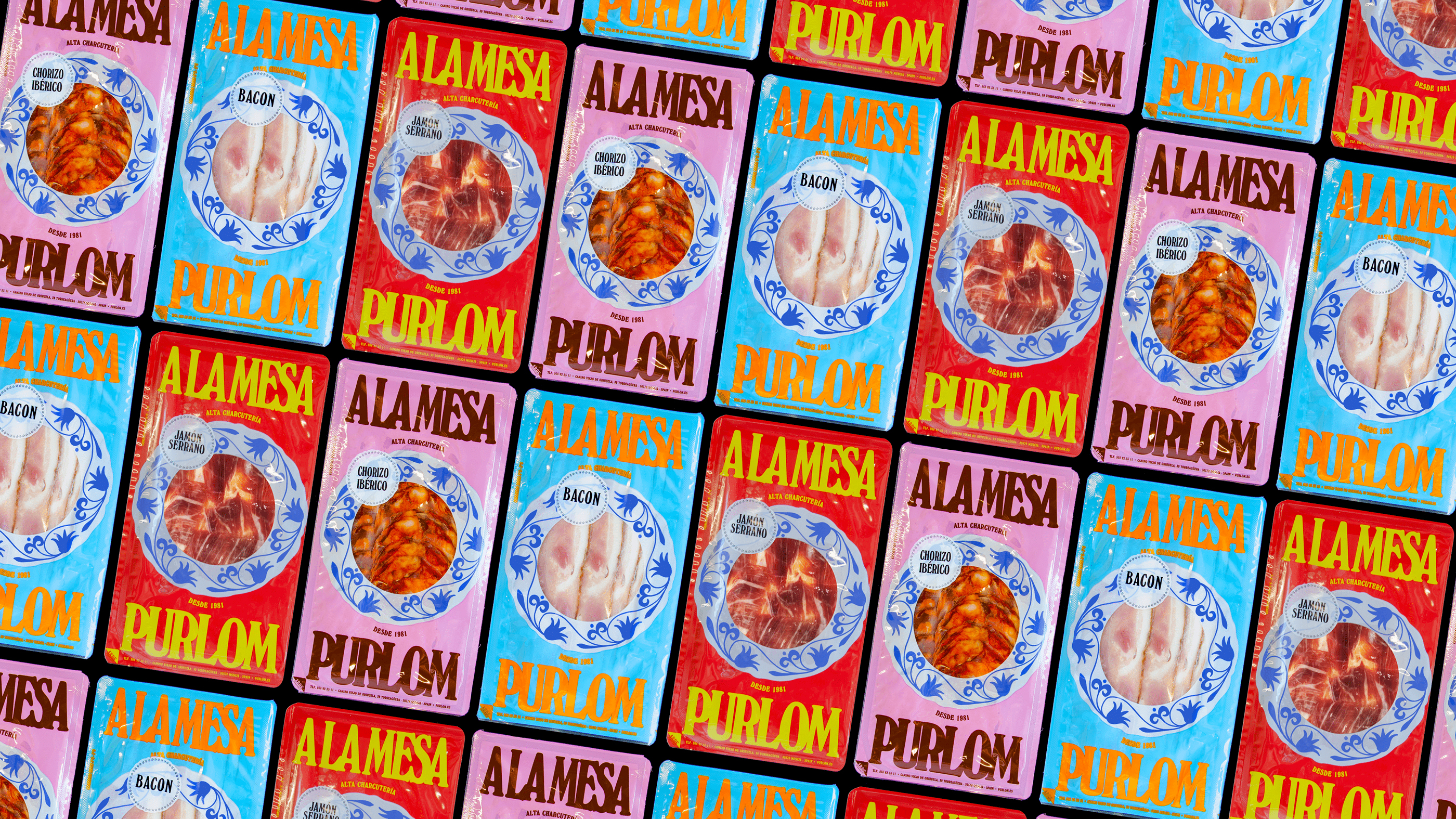
Much of the volume contained within the photography is reduced down to some basic elements across packaging. Type remains large, eye-catching and surprising, supported by colour. The shelf-presence must be incredible. The addition of the plate border to the product window does some of the other lifting, the connection between food and plate grounds product in occasion, and the blue-wash illustration draws it towards some collective sense of ‘family’ tableware. It’s blunt as a motif, and doesn’t quite have the same power as the photography used online, but build outs the visual assets, functioning as both a focal point and a buffer between product and the colour blocked packaging. The kicker is when packaging is placed into the photography, you get a really nice integration of product, it almost sits, like a plate within the scene.
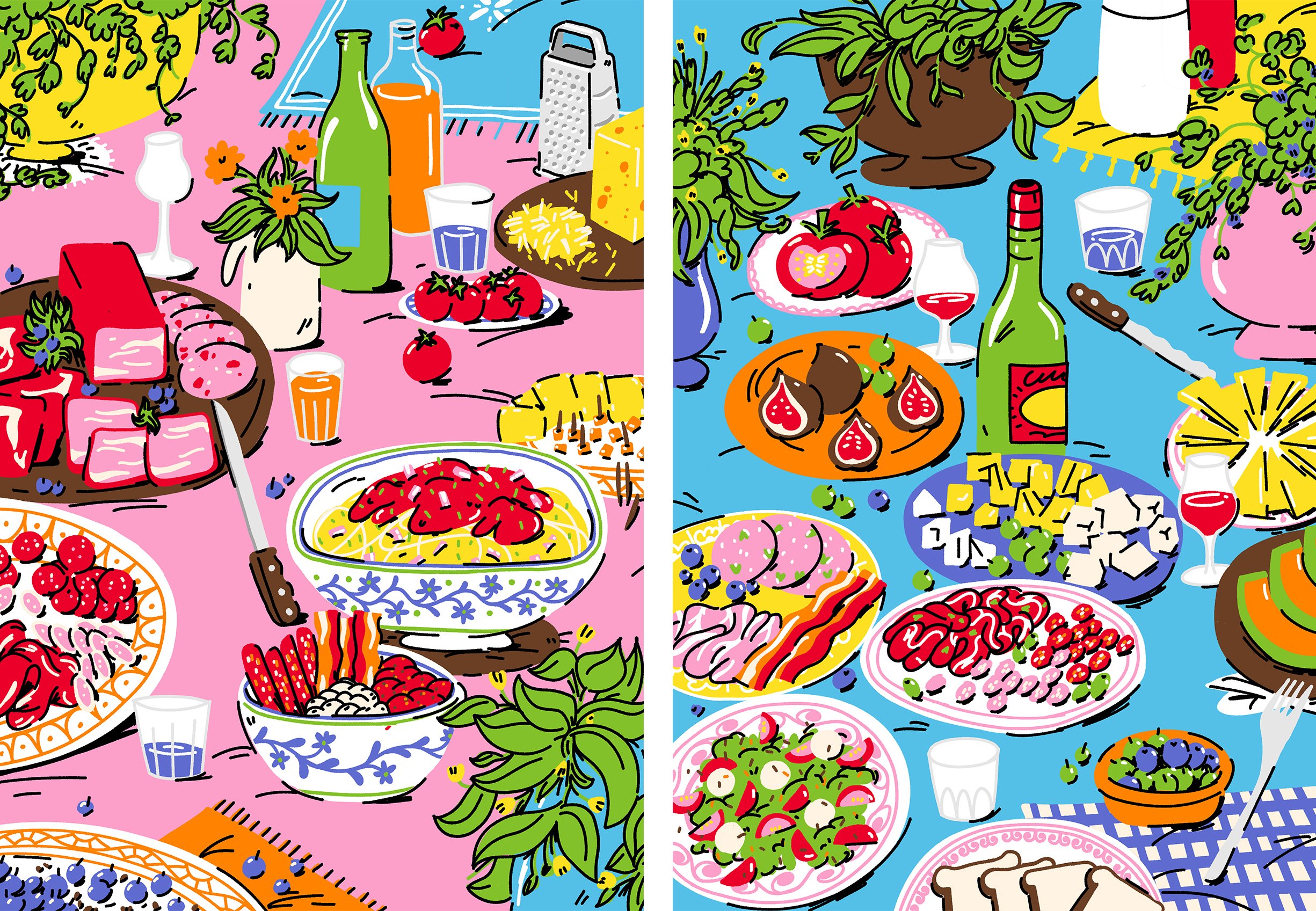
There’s lots more in this that pushes and plays with the scope. My initial response to the illustrative direction (loose, irregular, spontaneous, freehand and not over-thought), the half-tone thrown in the mix as a quick historical allusion, and photo treatment was ‘ here’s an everything but the kitchen sink scenario’, but there’s something full-hearted about it, it’s further chaos. It’s stripped down when it needs to be, such as across transport packaging, but not at the expense of character, with logotype and colour palette giving what is often overlooked as a potential surface for brand continuation or props for case study photography.
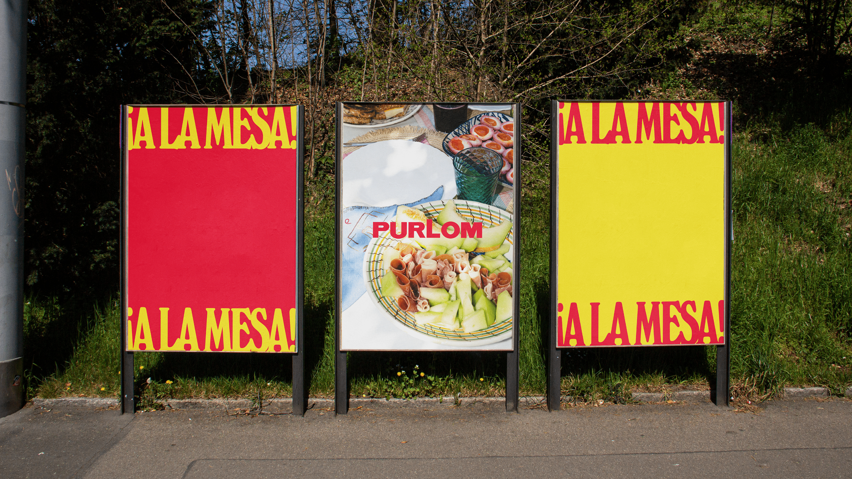
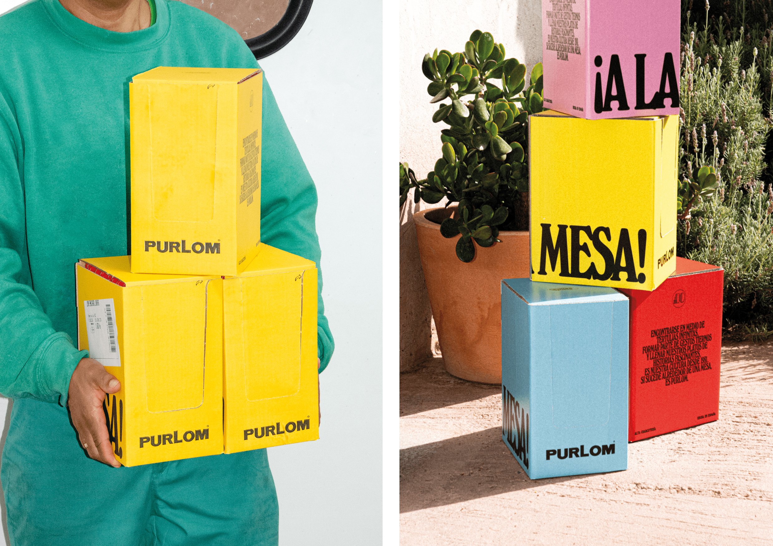
Gatherings don’t alway make sense, they can be loud, chaotic, triggering, confrontational, but it’s all in the spirit of coming together and seeing what happens. Onmi’s work captures that energy and possibility. It’s more than just meat, it’s what happens when we meet.
