Richard Baird
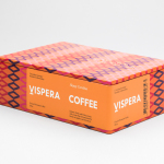
Víspera Coffee by Stockholm Design Lab
Víspera is premium coffee brand that intends to bring together the best of two worlds, a blend of 100% Arabica coffee beans sourced from the high altitude plantations of Colombia and a Swedish eye for quality and craftsmanship in its roasting. This meeting is visually articulated through type contrast, colour and pattern across Víspera’s packaging, developed by Stockholm Design Lab....

Roster Bar & Restaurant by Bond
Roster is a bar and restaurant on the corner of Pohjoisesplanadi and Unioninkatu in the Tori Quarters of Helsinki. It features an impressive interior made up of custom furniture with a vintage twist, raw and refined materials and hand-picked design objects. Although sophisticated in its design, Roster is a casual rather than formal dinning experience. The eclectic but cohesive style that proliferates interior, its high-quality food...
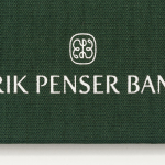
Erik Penser Bank Cookbook by Bedow
Erik Penser Bank provides its clients with independent financial advice and a high-level of personal service. While large banks do provide similar services, Erik Penser Bank is Sweden’s only dedicated private banking business. Professionalism, experience and an individualised service practice is expressed throughout the bank’s visual identity, created by Swedish studio Bedow, in the personable and less corporate association and aesthetic qualities of a new monogram. This then informs some...
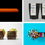
BP&O Collections — Minimalist Packaging Design
A collection of minimal packaging designs reviewed and published on BP&O. Featured studios include Bond, BVD, and Neue, and cover a variety of clients and categories, from confectionery and coffee to soaps and technology. The work featured is reductive but not sparse, aesthetically restrained and communicatively precise. These often rely on simple and singular expressions, few type choices and solid colour. Be sure to click...
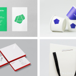
BP&O Collections — Minimalist Brand Identity Design
A collection of some of the more reductive brand identity programmes reviewed and published on BP&O. Featured studios include Mucho, Brief, and Neue, and cover a variety of clients, industries, and categories, from fashion and tech start-ups to architectural studios and product design companies. The work featured is reductive but well-intentioned, aesthetically restrained and communicatively precise. These often rely on simple...
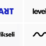
BP&O Collections — Creative & Minimal Logo Designs
A collection of minimal but creative logo and logotypes published on BP&O. Between them these play with lettershape, positive and negative space, form language, duality and the compounding of image whilst remaining visually simple. This selection features work by graphic design studios Werklig, Perky Bros and Mucho. Be sure to click through to see how each logo contributes to a broader brand identity...
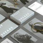
Tilly Sveaas Jewellery by Bond
Tilly Sveaas is a London-based jewellery designer, and the designer behind Silver Service Jewellery. This year sees the launch of her first collection under her own name. This features a brand identity created by the London office of international design studio Bond, and included art direction, postcards, business cards and packaging. Through typographic form, colour, material, print finish and image, Bond’s...
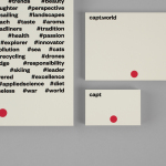
Capt by Bunch
Capt is a San Francisco-based start-up that connects creators wanting to monetize their videos with brands looking for new content and talent. The platform is made up of an app that allows creators to shoot, upload and license their videos, and a website that acts as a market place for buyers. This website also serves as a place to connect creatives with those...
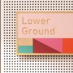
East Sydney Early Learning Centre by Toko
East Sydney Early Learning & Community Centre is a state of the art space located on Bourke Street. It provides childcare places for parents living or working in the inner city suburbs of Sydney. The centre, designed by ABA Architects, features five play rooms set over three levels, indoor playground on each floor and an open-air play area on the top floor. The space...
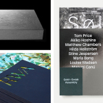
BP&O Collections — Brochures No.6
The sixth collection of brochures, lookbooks, brand guidelines, catalogues and invitations published on BP&O. These mix layout, material choice and print finish, and between them effectively utilise colour, type, proportion, image, texture and paper contrast to communicate, compel and contribute to a distinctive brand identity. This selection features uncoated and coated papers, spot colours, blind deboss, die cuts and open stitching, and...

Sardine by Here Design
Sardine is a restaurant, located on London’s Micawber Street, with a simple menu of rustic, Southern French and Mediterranean-inspired dishes cooked over a wood fire. It features an interior design of bent wood chairs, open kitchen, steel and light wood table tops and a brand identity created by Here Design. This adds a touch of a mediterranean colour to interior through menus and tile detail, while also linking other assets such...
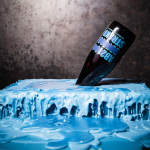
Brewdog Abstrakt by O Street
Brewdog’s Abstrakt is a limited edition craft beer concept that has released 20 different varieties since it began in 2010. Each beer is bottle-conditioned (bottled with a small amount of yeast, providing further fermentation and maturation), brewed and released just once, individually numbered and known only by their release code. It is a concept described as more art than beer, as boundary pushing and blurring...