Richard Baird
Ascui & Co. Architects by Grosz Co. Lab
Ascui & Co. Architects is an Melbourne-based studio with a rich history, depth of experience and a vision they describe as being a true perspective rather than one founded on intuition. Their projects are considered smart and environmentally sustainable, unexpected yet grounded by purpose, and range from residential additions to multimillion-dollar commercial developments. Anchored in the concept of Process & Possibility — a maxim that refers...
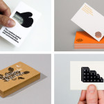
The Best of BP&O — Business Cards No.5
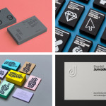
The fifth collection of business cards reviewed and published on BP&O. Between them, these highlight how colour, type, form and texture contrast, delivered through a combination of graphic design, material choice and print finish, can contribute to a distinctive and communicative brand identity. As with earlier sets, this selection includes uncoated and coated papers, edge painted detail, surface embosses, foils and a variety...
Café Royal by Pentagram
Once recognised as having the greatest wine cellar in the world and understood to have introduced French gourmet food to London, Café Royal, located on Regent Street, has been described as being the place for the avante garde to meet and dine for over a century. This year, to coincide with its reopening and reposition as a luxury five-star hotel...
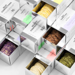
Neat Confections by Anagrama
Neat Confections is a San Pedro-based pastry shop creating handmade biscuits and cakes using organic spices and fruits, are absent decoration and specifically developed as a wine or tea accompaniment. Neat Confectionery’s brand identity and packaging solution, designed by Anagrama, draws its inspiration from the theme of perfection and craft, which is then visualised through what the studio describe as a “pureness” of their...
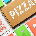
PizzaLuxe by The Touch Agency
PizzaLuxe began in 2011 as a single restaurant located on London’s Brick Lane hand making good-value, freshly baked pizzas using locally sourced, ‘deluxe’ ingredients. To coincide with an expansion into the Stratford’s Westfield Centre, the brand approached Edinburgh-based design studio The Touch Agency in 2013 to develop a new visual identity that would communicate their core values within a more ‘polished’ environment. In 2014, The Touch Agency continued...
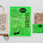
Streat Helsinki by Kokoro & Moi
Streat Helsinki is a festival that looks to explore and question what street food can and should be. It began this year with three events — a series of talks, opportunities to eat and time to party — held at different venues across the city. Eats, the largest of the three, was held in the Tori Quarters and included 40 food...
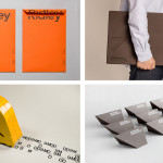
The Counter Press by The Counter Press
The Counter Press is a letterpress studio and workshop located in an old chocolate factory in the East End of London. They work exclusively with hand set wood and hot metal type on antique presses to create contemporary typographic design, artwork and limited edition prints. While taking on small outside projects, founders David Marshall and Elizabeth Ellis are keen to stress they are not...
The Best of BP&O — Architecture
A collection of the best brand identity and graphic design projects reviewed and published on BP&O for architecture, architectural lighting and interior architecture businesses and related exhibitions. This post covers logo, stationery and business card creation, books, portfolios, websites, and the occasional wayfinding and signage system. By balancing graphic design, material choice and print finish, utilising colour, type, form and...
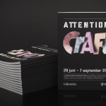
Attention: Craft by Snask
Attention: Craft was an exhibition of innovative and experimental art created by eleven leading Swedish and Norwegian artists, and part of an annual programme run by and held at Stockholm’s Liljevalchs, the first independent public museum for contemporary art in Sweden. The exhibition took place between June and September this year and featured artists such as Karin Bengtson, Linus Ersson and Hanne Friis....
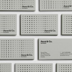
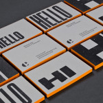
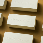
The Best of BP&O — Business Cards No.4
The fourth collection of business cards reviewed and published on BP&O. These typically balance graphic design, material choice and print finish, and utilise colour, type, form and texture contrast to contribute to a distinctive brand identity. As with earlier sets, this selection includes uncoated and coated papers, edge painted detail, surface embosses, foils, metallic inks, dyed, mixed fibre and unbleached boards as well as duplex material processes. Featured studios...
Huckle & Goose by Cast Iron
Huckle & Goose is an online food service that delivers weekly seasonal recipes to subscribers with the intention of making it simple and easy for the conscientious home cook to plan meals according to what’s in season at the local farmers’ market. Colorado-based Cast Iron Design were appointed to bring Huckle & Goose to life, developing a brand identity which included a...
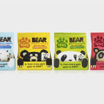
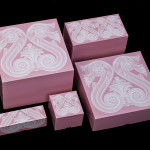
Bear Paws by B&B Studio
Bear Paws is a baked and shaped pure fruit snack range available in four distinct flavour combinations and produced by the British health food brand Bear Nibbles. To draw attention to endangered species such as pandas, polar and sun bears, the brand recently launched a limited edition pack design alongside a pledge to donate 5p per sale to the WWF. This limited...