Posted: | Author: Richard Baird | Filed under: Business, Banking, Law and Finance, Graphic Design Reviews | Tags: Banking Logos, Book Design Review, Brand Guidelines, Brand Identity, Brand Identity Reviews, Colour in Use: Green, Coloured Paper, Copper Block Foil, Corporate Identity Design, Design For Print, Design Opinion, Design Reviews, Designed by Bedow, Designed in Stockholm, Fonts in Use: Plantin, From Europe, From Scandinavia, Graphic Design, Graphic Design Blog, Logo Design & Branding Blog, Logo Design Inspiration, Logo Design Resource, Logo Designs, Logotypes, Metallic Paper, Minimal Design, Minimal Logos, Minimalist Brand Identities, Responsive Websites, Typography, Web Developer Logos, Website Design, White Block Foil | Opinion by Richard Baird.
Erik Penser Bank provides its clients with independent financial advice and a high-level of personal service. While large banks do provide similar services, Erik Penser Bank is Sweden’s only dedicated private banking business.
Professionalism, experience and an individualised service practice is expressed throughout the bank’s visual identity, created by Swedish studio Bedow, in the personable and less corporate association and aesthetic qualities of a new monogram. This then informs some distinctive pictograms, is paired with a custom typeface and set across uncoated papers and boards.
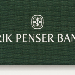
Bedow continue to work with Erik Penser Bank, drawing its brand identity across a Christmas gift for the bank’s clients; a cookbook that holds eighteen recipes from the resident chef. Titled Matnyttiga råd, this is a limited edition 130×210 mm hardbound book of 32 pages with a green fabric cover and a white block foil print finish.
Continue reading this article
Posted: | Author: Richard Baird | Filed under: Business, Banking, Law and Finance, Graphic Design Reviews, Logo Reviews | Tags: Banking Logos, Brand Guidelines, Brand Identity, Brand Identity Reviews, Colour in Use: Green, Coloured Paper, Copper Block Foil, Corporate Identity Design, Design For Print, Design Opinion, Design Reviews, Designed by Bedow, Designed in Stockholm, Fonts in Use: Plantin, From Europe, From Scandinavia, Graphic Design, Graphic Design Blog, Logo Design & Branding Blog, Logo Design Inspiration, Logo Design Resource, Logo Designs, Logotypes, Metallic Paper, Minimal Design, Minimal Logos, Minimalist Brand Identities, Responsive Websites, Typography, Web Developer Logos, Website Design, White Block Foil | Opinion by Richard Baird.
Erik Penser Bank provides its clients with independent financial advice and a high-level of personal service. While large banks do provide similar services, Erik Penser Bank is Sweden’s only dedicated private banking business.
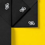
Professionalism, experience and an individualised service practice are expressed by the bank’s new brand identity, created by Stockholm-based graphic design studio Bedow, through the personable and less corporate qualities of a monogram, which informs some distinctive pictograms, custom typeface, an earthy colour palette and some good quality papers, boards and print finishes. These are implemented across business cards, folders, forms and print communication.
Continue reading this article
Posted: | Author: Richard Baird | Filed under: Business, Banking, Law and Finance, Logo Reviews | Tags: Banking Logos, Brand Guidelines, Brand Identity, Brand Identity Design, Brand Identity Reviews, Branding, Branding Blog, Branding Reviews, Custom Typefaces & Logotypes, Design For Print, Logo Design & Branding Blog, Logo Designs, Logo News, Logo Opinion, Logotypes, New Logo, Sans-serif Logotypes, Spot Colours, The Best Brand Identities of 2014, The Best Custom Logotypes, The Best Logo Designs of 2014, Visual Identity Design Blog |
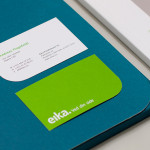
In response to the financial crash the Terra-Gruppen, a Norwegian financial group owned by and in alliance with 80 local banks, looked to take positive steps to reaffirm its commitment to local customers and the continued contribution it makes to the growth and development of the communities it serves. This came in the form of a rebranding exercise that led to the name Eika and the creation of a new visual identity system, developed by design studio Mission, that extended across print, digital and environmental experiences. While leveraging many of the corporate responsibility, accessibility and locality design cues that now saturate the industry, Mission adds a little craft into the mix with uncoated papers, blind embossed detail, a bright but limited number of spot colours and a bespoke typeface.
Continue reading this article