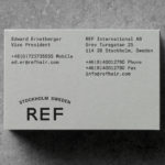
REF by Kurppa Hosk
REF is an environmentally conscientious Swedish hair care brand with a range of products that are made from high quality organic ingredients. With a desire to enter the international market of the US and further into the Nordic regions, both dominated by well-established FMCG, Scandinavian design studio Kurppa Hosk were commissioned to rejuvenate REF’s visual identity. This included packaging design, art...
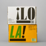
¡LoLa! by Neumeister, Sweden
¡LoLa! is a craft beer collaboration between Brutal Brewing and Supper, a restaurant that serves inventive South American food with a Swedish twist, and has locations in Stockholm, Gothenburg, Visby and Åre. The beer draws its inspiration from the fusion nature of the restaurant, and is named in honour of Lola, a woman who cooks food on a beach in Brazil and is...
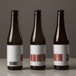
O/O Long Boil Barley Wine by Lundgren+Lindqvist
O/O Brewing is a craft brewery set up in 2011 by Olle Andersson & Olof Andersson. They presently operate out of the facilities of Stigbergets Bryggeri in the Swedish city of Gothenburg, but are due to open their own brewery in the Autumn of 2017, with the intention of increasing volume and gaining further control over quality. O/O worked with Scandinavian studio Lundgren+Lindqvist, who have created packaging design for a...
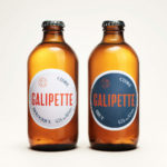
Galipette Cidre by Werklig
Galipette is a premium cidre made from 100% pure fermented apple juice (pur jus) pressed from apples that are hand picked from orchards in Brittany, Northwest France. Galipette is available as a Brut and a sweeter Biologique. These are free of gluten and added sugar and created for the international markets of Europe, North America and China by the Cider Supply Company,...
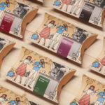
Talor&Jørgen Coffee by Bielke & Yang
Talor&Jørgen is a Norwegian speciality coffee roastery and coffee subscription service delivering small boxes of freshly roasted beans, sourced from across the globe, to subscribers based on their drinking habits rather than to a schedule. Product naming focuses on bringing to the forefront flavour notes rather than bean provenance, variety and preparation (although this is online and on pack) with the intention of making speciality coffee...
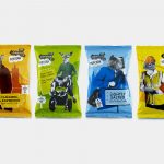
The London Popcorn Co. by B&B Studio
The London Crisp Co., a hand cooked British crisp brand available in local pubs throughout the capital, has expanded to include popcorn. Local graphic design studio and packaging specialists B&B Studio returned to the project that they help establish the visual language for. This time, introducing anthropomorphised animals inspired by what the studio describe as modern London tribes, and include yummy mummies, Hoxton...
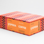
Víspera Coffee by Stockholm Design Lab
Víspera is premium coffee brand that intends to bring together the best of two worlds, a blend of 100% Arabica coffee beans sourced from the high altitude plantations of Colombia and a Swedish eye for quality and craftsmanship in its roasting. This meeting is visually articulated through type contrast, colour and pattern across Víspera’s packaging, developed by Stockholm Design Lab....
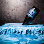
Brewdog Abstrakt by O Street
Brewdog’s Abstrakt is a limited edition craft beer concept that has released 20 different varieties since it began in 2010. Each beer is bottle-conditioned (bottled with a small amount of yeast, providing further fermentation and maturation), brewed and released just once, individually numbered and known only by their release code. It is a concept described as more art than beer, as boundary pushing and blurring...
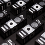
Allsorts Black & White Edition by Bond
Bond continue to work with Scandinavian confectionery brand Cloetta, owner of liquorish brand Allsorts, on the packaging for their Allsorts Black & White edition. The packaging for Allsorts’ originals range looked to bring the distinctive shapes and colours of the liquorice to the forefront using geometric forms and bright colour, enhanced by the black background of a simple card box. It was an approach rightly described...
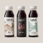
Hatch Cold Brew Coffee by Tung
Toronto-based Hatch is a coffee roaster producing ready-to-drink cold brew coffee from high quality natural ingredients using a craft-oriented twice-filtered manufacturing process and a unique bottling technology to seal in fresh flavour. Hatch intends to bring cold brew coffee from a niche but growing market into the mainstream and worked with Canadian graphic design studio Tung to help them achieve this through brand identity and packaging....
Tangent GC Soap by Carl Nas Associates
Tangent GC is a Scandinavian organic garment and shoe care company developing products that intend to ensure longevity. The company’s brand identity, a simple utilitarian typographical expression, designed by Essen International, delivered a sense of informational immediacy through the absence of superfluous stylistic detail and colour, dividing content in the arrangement, orientation and typesetting of Akkurat Mono. Venturing into organic personal skincare, Tangent GC worked with...
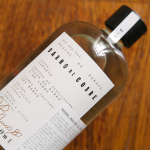
Barro de Cobre by Savvy
Barro de Cobre is a mezcal from Oaxaca, Southern Mexico, distilled twice; once using a clay pot and the second in copper. It is a unique process that takes time, but produces a strong yet smooth, clear but earthy character. The name Barro de Cobre, Copper Clay roughly translated, is an expression of this process, which also goes on to inform brand identity...